Graphic Design 2.1: Professional Practice, Project 3: ‘Understanding Visual Identity’ Assignment 3
Your local wildlife park wants you to develop a logo that supports the idea of a popular and fun family-centred experience, but also helps to make people more aware of the conservation work they do.
The trustees of the park have recently visited Toronto and London Zoos to see how they balance the need to attract visitors and funding with a commitment to educating people about animal welfare and habitat issues. They liked what they saw and have put together a small budget for the design of a new logo for the wildlife park. This logo will be the starting point for future work the wildlife park will be undertaking in conservation work. The new logo needs to appeal to families with young children and also convey the commitment to serving wild animals through conservation work.
The logo will be used in many contexts and across different media. Visitors to the wildlife park will see it on wayfinding signage and the park map, there will be a smartphone application, advertising and merchandise in the giftshop. Supporters of the wildlife park, including members of charities and corporations, philanthropists and partner organisations for conservation work will see the logo on letterheads, business cards, reports and conference materials. Therefore, the design needs to be versatile. You will need to ensure the design can stand alone, for example when people enter the park. It will also need to work alongside other visuals, for example, each habitat (arctic, desert, rainforest, or temperate) across the zoo might have a slight variation of the logo to show which animals live in the habitat.
Start by finding out more about your local wildlife park. If there are no zoos or wildlife parks in your area you can select any wildlife park you have been to in the past or one that you find online. You will need to follow the design process that you have been introduced to throughout the unit. This includes:
First stage — initial idea generation and visual experiments (both based on your research).
Second stage — idea development and testing.
Third stage — idea selection and refinement.
Final stage — reflection.
Your final logo design will need to be presented in a lookbook (if you are not sure what a lookbook is, read this article from Design Shack: What Is a Lookbook?). The trustees of the wildlife park need to be able to get a sense of how the logo will be used in different contexts. This means that they need to see exactly what the logo will look like when visitors enter the park, the need to see what the logo will look like on the map and smartphone app, and they will also need to see a range of other applications from stationary to toys and gifts. You can use digital mockups to show the logo being used in context, or if you can print the logo and photograph the objects you create.
The lookbook can be a PDF document, slide deck, or you can use your learning log and create a page or section where you host the final lookbook. The purpose of the lookbook is to present the logo design in context to the trustees of the wildlife park.
I then watched a video by Abi Connick who goes through her design process, highlighting the importance of considering the clients purpose, mission, overall vision and brand values prior to even beginning to sketch ideas.
I continued researching Toronto Zoo, I particularly liked their use of varied icons across social media. The icons used the same colours as their logo making their brand cohesive.
Despite London Zoo being ran/funded by ZSL and Toronto zoo being government owned, they look extremely similar. Their icons used across social media are almost identical, I initially assumed that they were ran or funded by the same global charity. I aim to create a logo/brand that is distinguishable and interesting, but still represents a zoo well.
I particularly liked Chester Zoo’s typography. The typography used was fun and playful, perfect to attract younger audiences and to keep them interested. The type also works well for parents and adults ready as it feels fresh and changes quite a lot with different embellishments or weight of type used.
Lincoln Park Zoo’s logo stood out to me (Figure 15), especially when compared to other Zoo logos from around the world.
Its simple shape represents architecture in the area, grass, wildlife and almost resembles an abstract animal face and reminds me of zebra stripes for example.
My local Wildlife park/zoo is Twycross Zoo. I began to research the zoo including their history, branding, mission, values and conservation strategies. Twycross Zoos’ branding is some of the best I have seen for a zoo, which will be a huge challenge to re-brand. I really like their colour scheme, it is different from other zoos (stays away from greens and blues) but works very well. The purple feels regal and the pink playful, paired with the white silhouette logo and icons, it definitely stands out among other zoos and brands.
On Twycross’ website (shown in Figure 18) they include a link to a pdf document which presents their conservation strategy for 2023-2030. This document was very informative and helped me begin to understand the zoo more as a movement, brand and charity. I made some quick notes and jotted ideas whilst researching via their website and looking through the conservation strategy document.
I was excited for this assignment as it sounded like a challenge. I made notes of the key elements from the brief, highlighting important phrases such as conservation, families with young children, versatile, habitat issues etc.
Whilst researching Toronto and London Zoo (along with others) I consumed as much content on branding, pitching to clients and logo design as possible. I initially went to ‘The Futur’ and listened to a brief video where they go over pitches to clients, this helped me consider where ideas come from and to have reasoning behind everything.
@yozdesigner creates some interesting minimal logos and creates great short form content explaining his thought process and how he came to his final design by referencing visuals related to the clients business.
When researching the meaning behind Toronto Zoo’s logo I came across an article which briefly discussed different zoo logos from around the world, including the thought process behind the meaning of the logos (figure 4).
Many Zoo logos include similar colours such as green and blue, almost all also include imagery of animals, which makes perfect sense, but is it definitely necessary to convey the feeling of a zoo to the viewer? I look forward to exploring varied visual ideas for this brief.
I continued collating mood boards, researching ZSL and other wildlife conservation programmes. I wanted to have as much reference material as possible for inspiration before I began to brainstorm.
A common trend between zoos/conservation brands is the use of rounded typography. The type looks friendly and inviting, this is definitely something to note when considering the typeface for my design.
San Diego Zoo (shown in figure 11) is a great example of a clever logo, that represents a zoo well and works cohesively with the brand. The logo shows a silhouette of 3 abstract animals, a lion, rhino and a bird. The animals form a untiy into an S shape. The green and white colours (or orange and white) used are friendly, both representing exotic animals and an ‘alliance’ with wildlife.
Mandai Singapore Zoo has some interesting typography. I also liked the way the illustration interacted with the image, sparking ideas for logos and branding in general.
I continued to research Twycross and their associated organisations such as the ‘World association of of zoos and aquariums’ and ‘European association of zoos and aquariums’. Again both of their logos were interesting and using animals to represent them. ‘WAZA’ used an elephant and a fish icon side by side in a circular shape. This circular shape was a theme throughout the logos I have researched that I found the most engaging. When considering designing my logo, this circular shape could work well and would relate closely with a conservation focused zoo.
‘EAZA’ had a map on their website noting all members, tagging links to their websites. I continued to research zoo logos, websites, maps, typography and colour schemes using this tagged map as a reference to further zoos.
I collated further logos and websites that I found visually interesting. Again, a lot lot greens and yellows are used, this is interesting as I would expect more variation, perhaps the reason is simply because green/yellow/orange works and conveys the feelings of nature/zoos?
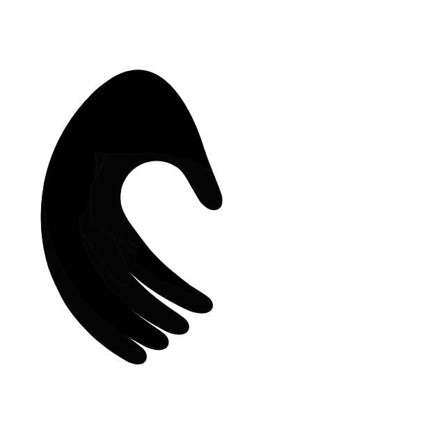
This design did not translate as well as I had hoped, it look messy and confused. I continued to develop another idea of a more representative circular design depicting a hand and a plant/tail. The initial overall aim was for the logo to look like an abstract yin and yang symbol, representing peace. The tail was designed as an attempt to look like both a plant growing and a monkey tail, with the hand above caring for it. The circular shape was to represent conservation and to add movement to the logo, showing people caring for animals ‘in action’.
I made notes of key words, referring to my previous research. I aimed to encapsulate the brief and what I felt Twycross Zoo represented. When researching, a few branding elements that were more obvious or expected kept being used such as depictions of whole animals or not very stylised/abstract animal figures. Again I wondered is the reason for this because it is the easiest and most simple way to convey that this is a zoo for the audience? I was interested to see if I could create a more representative brand for a zoo, but one that still conveyed that it was a zoo,. I began to sketch quick logos, shapes and any ideas that came to me.
A few reoccurring shapes were hands, leaves and a monkey tail. The monkey tail represented Twycross’ legacy with looking after all 4 types of ape, the hands represented human care and help for the animals and the leaves nature, life and conservation. I was interested if I could combine these elements into a functional logo/brand for Twycross.
I moved to Illustrator, beginning with a hand and leaf/tail logo. I aimed for the leaf to be less curved and more ‘bushy’ like a tail and for the over all design to feel more tactile and be interesting/appealing to families and children.
I felt that this logo was quite versatile, it was visually interesting and made the viewer question what it was (I was unsure whether this was a good branding move or a bad one at this stage). The logo would work well within a more corporate setting and would appear professional to the park trustees, but would still work well within a more fun setting at the zoo, being attractive to families with children.
I moved forwards with this logo and tested it with various typefaces, changing their weights and capitalisation.
It was important to develop a typeface that encapsulated Twycross’ ethos, represented their conservation strategy but remained fun and visually interesting. I designed a typeface in Illustrator based off the typeface ‘Agrandir’ including elements from the icon with an aim to make the type cohesive with the icon and visually interesting/fun.
I developed multiple potential colour palettes, referring back to my research for inspiration. I then created a brand pattern using elements from my logo with a hope to draw the brand together making it cohesive and visually strong. I tested the colour palettes, creating different variations and comparing them. I created multiple palettes based off of Twycross’ original colours, tweaking the pinks and purples, testing them with blues and other shades. I felt that these variations, despite looking fun and engaging, did not convey the sense of a zoo. My logo is already quite abstract and if paired with a more abstract colour palette, this could be too confusing and not representative of Twycross’ values, or the design brief. I did like the colour pop of the pink colour, but felt that the more minimal colour palettes (3-4 colours) were most effective. I liked the green and gold colour palette a lot and felt that the gold represented Twycross’ legacy as well as their level of care for animals but this looked too luxurious for a zoo brand. The yellow and green colour pairings I felt were most effective. They are predictable colours, but the pop of yellow (inspired by the pink from Twycross’ original branding) I feel makes it more fun and interesting, especially for families, while remaining related to a zoo with the green colours. The yellow represents the sun, nature, light and has happy connotations, everything I wanted to convey with this brand.
I wanted to design all elements of the zoo brand together to make sure that they were cohesive, especially between the more fun zoo side of the business and the more corporate side.
I collated further visual inspiration into mood boards of zoo signage, billboard layouts and look books to reference whilst sketching layout ideas.
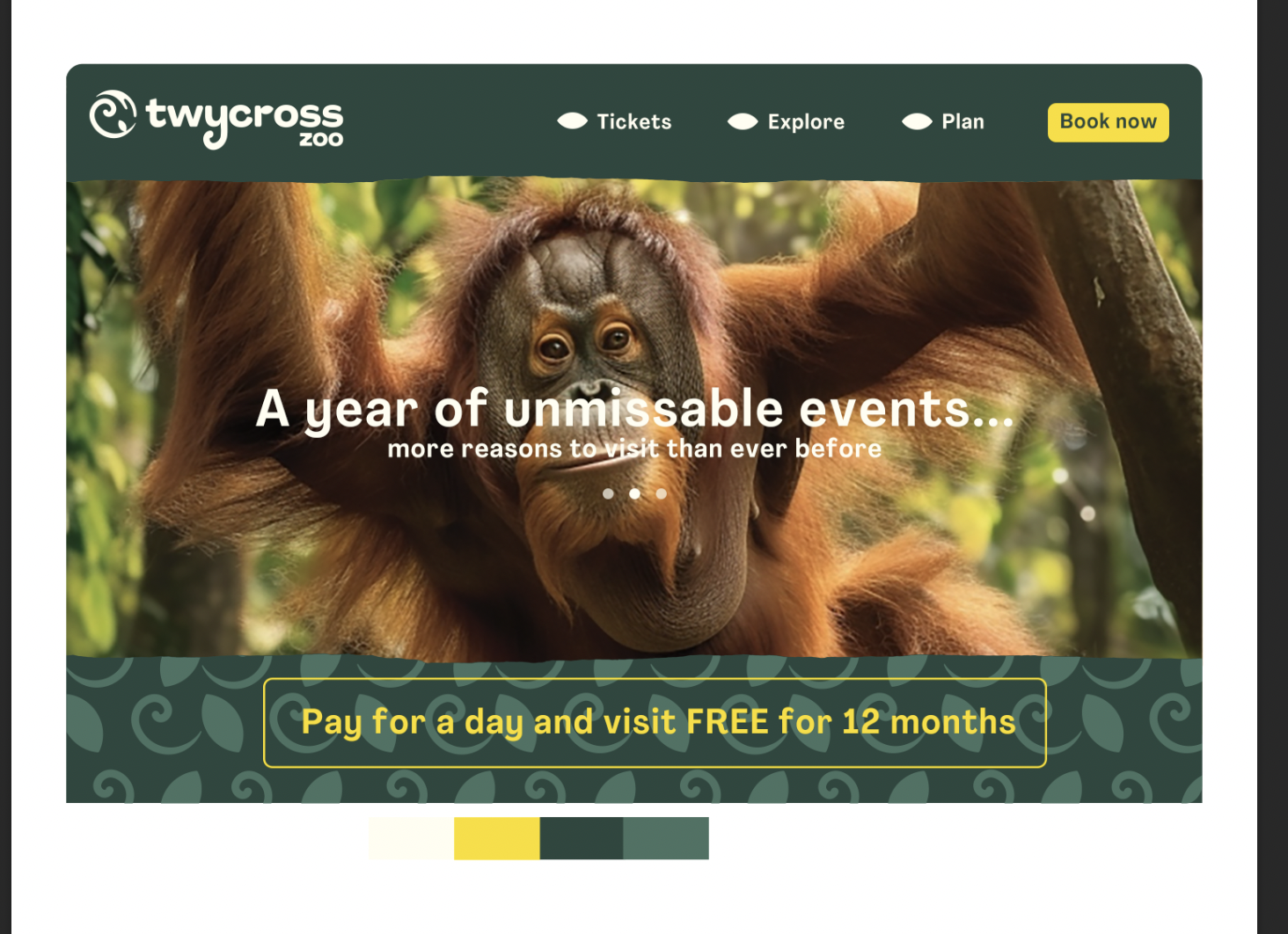
Once I had designed examples of all elements such as the website, billboard adverts and merchandise etc I laid them out in a simple presentation like format to gauge the size canvas I would need to create for my final look book. From my research I had decided that I wanted to create a one page digital look book which could be sent to people such as the park trustees for review, or presented in person. I aimed for the look book to be fluid and to capture a happy/caring feeling- the values of Twycross zoo. I wanted the look book’s style to stand out, hopefully showcasing the logo and brand in a visually interesting way. I omitted a contents page and any explanation text/subtitles composing the designs in the most self explanatory way as possible.
I had decided to try and inject a slight collage theme to my designs, with a hope to create a fun and engaging looking brand which families could enjoy. I then worked on designing the website mock up and all other elements.
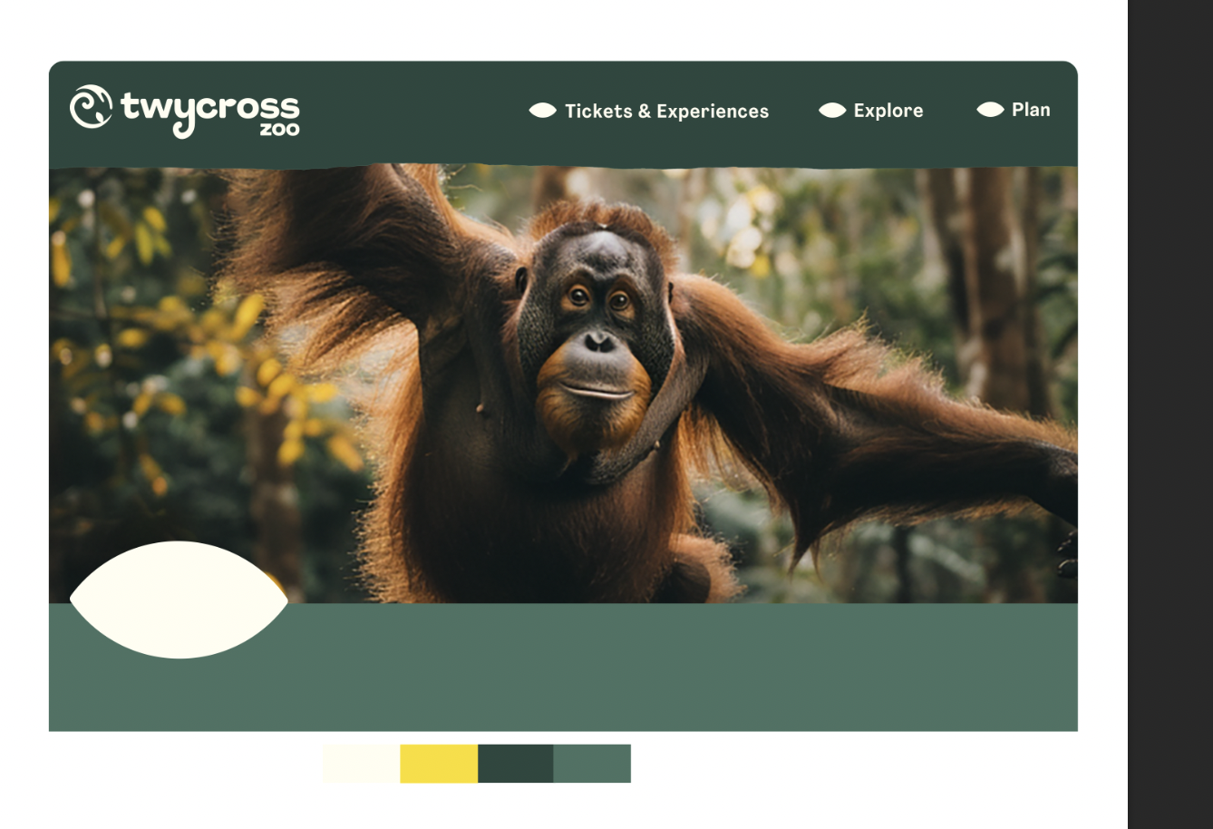
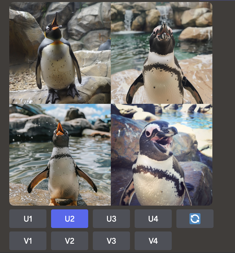
All of the animal imagery used throughout my designs was created using Midjourney. The images took many attempts to get right, after inputting various prompts to get the desired outcome for each animal position and background etc.
At the beginning of the look book I included a sketch of the visual inspiration for the logo. This was in hope to convey a greater understanding of the concept of the logo without using any words. The brand pattern is also included at the top with a paper rip splitting it apart from the green background. I wanted to include this collage-like element across the brand designs to add a playful element to it, in hope to appeal to families and children. The rip texture reminds me of a different terrain, such as a jungle floor or desert sand, it also visually represents waves, tying all areas of animal habitats together.
The colour palette I had chosen I feel works well and clearly represents a zoo. The greens and yellows pair well together. A downside to this is that it is a more obvious choice of colours, which may make it less visually interesting and less likely to stand out from the crowd. I had decided on this colour palette due to the more conceptual nature of the logo itself. I did not directly include imagery of animals within the logo, which is something typical with zoos, I therefore did not want the brand to come across as representing a different sector instead of a zoo, and thought it was best to stick to a more obvious colour palette such as greens. I used the yellow colours to highlight important information throughout my designs such as on the website the ‘book now’ button and to highlight the ‘first aid’ area on the signage.
Looking back at my overall final look book I still debate whether the choice of having a single page visual including all of the mock ups was the best way to present the information or not. Perhaps a pdf slide document may have been easier for the viewer or easier to present each element individually without it feeling crowded. Perhaps including a brief analysis of each design on the actual look book may have been a better idea and again be easier for a viewer such as a trustee of the park to view and understand the choices made if I was unable to explain in person.
I still debate the choice of colour palette, despite the fact that it works for both the corporate and physical zoo signage sides of the design, it definitely would get lost in the crowd when compared to other zoo designs. Perhaps a use of an orange colour/palette could’ve worked, including darker reds and almost browns. These were originally colours I had avoided as I felt that they had connotations of other business sectors such as finance or airlines but perhaps different tones could’ve worked.
The mock ups themselves work but I feel as if I should’ve included some more (and again less obvious) examples such as different types of adverts on the side of a bus or show an example of a branded zoo car. I also could’ve used different elements to present the merchandise designs such as toe bags, used the brand pattern for socks, bracelets and hats. There were obviously time constraints for the task but if I had of taken slightly longer when planning the mock up ideas I may have considered these alternatives. This is something to consider moving forwards- how can I make my design presentations stand out?
Overall I found this task a challenge, I am still very new to logo and brand design and I have came across many learning curves during this task. Particularly with my speed when designing the logo within Illustrator. I had chosen quite complicated shapes to make work together within a circle, which took a very long time for me to be able to make work, something that will be quicker in the future after more practise.
As always I need to continue to reassess my work as I make my way through the brief. I need to set up deliberate ‘checkpoints’ along the way to stop, look back at what I am doing and try other designs etc. I need to make more time for this throughout future tasks. I look forward to moving forwards with everything I have learnt from this assignment to work on future branding tasks.
Resources:
Figure 1: The Futur (2017) Pitch This! How To present design work to clients like a pro! Youtube. Available at: https://www.youtube.com/watch?v=rOGAJwm3n_M (Accessed: 21 March 2024).
Figure 2: Connick, A. (2024) How to add Strategy into your Logo Designs! Youtube. https://www.youtube.com/watch?v=YoYiW0sz-R0 (Accessed: 1 April 2024).
Figure 3: @yozdesigner (2024) Logo design process. Instagram. https://www.instagram.com/p/C4k6Db6Pkkh/ (Accessed: 1 April 2024).
Figure 4: 16 famous zoo logos around the world. (2022, August 19). Brandcrowd.com; BrandCrowd blog. https://www.brandcrowd.com/blog/16-famous-zoo-logos-around-the-world/ (Accessed: 1 April 2024).
Figure 5: Toronto zoo (no date) Torontozoo.com. https://www.torontozoo.com/ (Accessed: 1 April 2024).
Figure 6: 16 famous zoo logos around the world. (2022, August 19). Brandcrowd.com; BrandCrowd blog. https://www.brandcrowd.com/blog/16-famous-zoo-logos-around-the-world/ (Accessed: 1 April 2024).
Figure 7: London Zoo. (no date) Londonzoo.org. https://www.londonzoo.org/ (Accessed 1 April 2024).
Figure 8: Science & research. (no date) Zsl.org. https://www.zsl.org/what-we-do/science-research (Accessed 1 April 2024).
Figure 9: EDGE of existence : Evolutionarily distinct & globally endangered. (2017, February 3). EDGE of Existence. https://www.edgeofexistence.org/ (Accessed 1 April 2024).
Figure 10: Whipsnade zoo. (no date) Whipsnadezoo.org. https://www.whipsnadezoo.org/ (Accessed 1 April 2024).
Figure 11: San Diego Zoo. (no date). San Diego Zoo Wildlife Alliance. https://sandiegozoowildlifealliance.org/ (Accessed 1 April 2024).
Figure 12: Chester Zoo. (2020, May 6). Chester Zoo. https://www.chesterzoo.org/ (Accessed 1 April 2024).
Figure 13: The Alaska Zoo. (no date) The Alaska Zoo. https://www.alaskazoo.org/ (Accessed 1 April 2024).
Figure 14: National zoological garden, Pretoria – SANBI. (no date). Pretoriazoo.org. https://www.pretoriazoo.org/ (Accessed 1 April 2024).
Figure 15: Wildlife experience in the heart of Chicago. (no date). Lincoln Park Zoo. https://www.lpzoo.org/ (Accessed 1 April 2024).
Figure 16: Mandai singapore Zoo. (no date) Mandai Singapore Zoo. https://www.mandai.com/en/singapore-zoo.html (Accessed 1 April 2024).
Figure 17: Twycross Zoo & the gruffalo discovery land (no date). Twycrosszoo.org. https://twycrosszoo.org/ (Accessed: April 1, 2024).
Figure 18: Twycross Zoo & the gruffalo discovery land (no date). Twycrosszoo.org. https://twycrosszoo.org/ (Accessed: April 1, 2024).
Figure 19: European association of zoos and Aquaria (no date). Eaza.net. Available at: https://www.eaza.net/ (Accessed: 3 April 2024).
Figure 20: WAZA World Association of zoos and aquariums (no date). Available at: https://www.waza.org/ (Accessed: 3 April 2024).
Figure 21: Steirischer Landestiergarten (no date) Tierwelt-herberstein.at. Available at: https://www.tierwelt-herberstein.at/ (Accessed: 3 April 2024).
Figure 22: Zoo Brașov & Planetariu (no date) Zoobrasov.ro. Available at: https://zoobrasov.ro/ (Accessed: 3 April 2024).
Figure 23: Zoo Warszawa (no date) Waw.pl. Available at: https://zoo.waw.pl/ (Accessed: 3 April 2024).
Figure 24: jaszberenyzoo.hu (no date) Jaszberenyzoo.hu. Available at: https://jaszberenyzoo.hu/ (Accessed: 3 April 2024).
Figure 25: Зоологическа градина София - Начална страница (2015) Зоологическа градина - София. Available at: https://zoosofia.eu/ (Accessed: 3 April 2024).
Figure 26: Manor wildlife park (no date) Manor Wildlife Park. Available at: https://www.manorwildlifepark.co.uk/ (Accessed: 3 April 2024).
Figure 27: Home Page Zoo de Lourosa (2016) Zoo de Lourosa. Available at: https://www.zoolourosa.com/ (Accessed: 3 April 2024).
Figure 28: Animaniacs Cultural References Guide (no date) Raptormaniacs, Blogspot.com. Available at: https://albertonykus.blogspot.com/2019/07/ (Accessed: 6 April 2024).
Figure 29: Yeahlifestyle, W. (2024) ‘Half-Term fun Exploring the Native Exhibition at Chester Zoo’, Travel, Beauty & Food Review ! Available at: https://www.yeahlifestyle.com/half-term-fun-exploring-the-native-exhibition-at-chester-zoo/ (Accessed: 6 April 2024).
Figure 30: A Trip to the River (No date d) Edu.sg. Available at: https://blog.nus.edu.sg/sowjengwei/2020/10/02/a-trip-to-the-river-safari/ (Accessed: 6 April 2024).
Figure 31: Pittsburgh Zoo & PPG Aquarium (no date) Zooinstitutes.com. Available at: https://zooinstitutes.com/signage/106681.html (Accessed: 6 April 2024).
Figure 32: Zoo Media (no date) Zoo Media bring new ideas to Zoos Worldwide. Available at: https://www.zoomedia.us/product (Accessed: 6 April 2024).
Figure 33: Exhibitions & interpretation (2019) Schools. Available at: https://www.chesterzoo.org/schools/our-zoo/biographies/interpretation/ (Accessed: 6 April 2024).
Figure 34: Behance (no date i) Behance.net. Available at: https://www.behance.net/gallery/97618913/Identity-Jess-Brohier (Accessed: 6 April 2024).
Figure 35: Joe Chakravorty (no date) Behance.net. Available at: https://www.behance.net/gallery/26449171/Myspace-Fashion-Editorial (Accessed: 6 April 2024).
Figure 36: StreetArt - pop art lookbook magazine (2020) Design Template Place. Available at: https://designtemplateplace.com/product/streetart-pop-art-lookbook-magazine-162764 (Accessed: 6 April 2024).
Figure 37: Penguin image. Mid Journey. Image created (11/4/24).
Figure 38: Orangutan image. Mid Journey. Image created (11/4/24).
Figure 39: Tiger image. Mid Journey. Image created (11/4/24).
Figure 40: Meerkat image. Mid Journey. Image created (11/4/24).


