Graphic Design 2.1: Professional Practice, Project 4: ‘You Are The Brand’ Assignment 4
First, consider what your talent, creativity and ideas might look like. Are you colourful, freethinking, orderly and neat? Are you a risk taker pushing the boundaries with innovations? What metaphors, symbols and other kinds of visual language can be explored to represent your individual practice? What might clients expect to see when they encounter your work?
Next, investigate how other designers promote themselves. You will encounter a wide range of media, from websites and digital portfolios to mailouts, large scale murals, and animated showreels. Note down what you think is the most appropriate media for your work to show it in the best possible light. You will also come across supporting materials like personal logos and monograms as well as stationary and collateral like business cards, booklets, and packages.
Next, plan what your personal branding and self-promotion will include. Mindmap, draft ideas, and revisit your earlier work. Don’t get caught up in creating a logo, a website, a business card, and a printed portfolio just because ‘everyone else is doing it’ – if the best way to reach the clients you want to work with is via Instagram, why would you be printing an expensive portfolio? You might create some fun freebies for your followers like screen backgrounds and photo filters to draw attention to your work. On the other hand, if you plan to attend networking events and connect with people locally you will need a small and portable memento. You can leave behind a business card, but this might not make much of an impact. Consider making something more unique to you, for example, if one of your strengths is paper folding, you might create a card that uses folds in a clever way to reveal your contact information.
Finally, create the core set of promotional items you will use to connect and share with potential future clients and employers. As these items may be used for job applications, don’t forget to design your CV. The way it is written, as much as the way it is designed, will need to reflect your image.
You may wish to emphasise a growing specialist interest, such as typography, advertising or information design. You will certainly be aiming to leave a strong impression with the recipient, so don’t hold back. Make it fun, interesting, informative and innovative.
The self-promotional items will demonstrate your individual creative talent, as well as your personal interests and ambitions in design. Your items should share visual continuity, exactly like you would expect from a brand. From 3D models to printed promotional material, to animated clips and your website. There should be a sense of cohesion and the items should look or feel like they represent you.
Whilst continuing to make notes and jot down ideas I looked further into graphic designers personal branding. Allan Peters’ personal branding is some of my favourite (figure 5), his logo is simple yet looks fluid and encapsulates the concept of movement of idea to design.
Will Paterson (figure 6) uses a word mark and an icon across his website and social media. The use of both is interesting as it allows the viewer to become familiar with Will’s name, as well as his icon, associating them both together. The design of the logo and word mark work well together, with the end of the ‘W’ of the logo being more figurative, in the same style as the word mark.
An element that most these websites have in common is their simplicity. They are all either single pages, or have a simple landing page, pushing focus onto the visuals they are there to promote. Even Virgil Abloh’s ‘chaotic’ style website has an information hierarchy with elements to close view.
The brief for this assignment is challenging but I am excited to move forwards to create a personal brand. I began by jotting down some key notes to reference and moved on with some in depth research into personal branding.
I came across some great long form videos by The Futur which discussed personal brands and how to be successful with self promotion. Figure 1 shows a great graphic from the video demonstrating the ‘real’ elements that compose your personal brand.
I continued to watch multiple videos focusing on branding, logo designing and personal brands. A common denominator between them all were that they exaggerated the importance of authenticity.
I researched and collated some of my favourite creatives’ websites including Designer: Roy Cranston (figure 8), Multi-disciplinary: Samuel Ross (figure 9), Multi-disciplinary: Virgil Abloh (figure 10), Photographer: George Muncey (figure 11), Artists: Mike S Redmond and Faye Coral Johnson (figure 12), Design Studio: Variable Systems (figure 13), Fashion House: Bottega Veneta (figure 14), Multi-disciplinary: Mike Ballards (figure 15).
These ‘brands’ whether strictly commercial or personal all use their websites to extend their creative reach with their audiences in order to promote their physical products or services. Each website works cohesively with their social media presence.
Bottega Veneta (figure 14) is a great example to me of perfect, cohesive branding, which conveys to me a clear design pathway to designing my personal brand and making sure it flows and has the voice I want it to.
Bottega Veneta’ logo and type face used is a custom serif font with a luxury feel to it. The serifs used within the letters are emulated physically throughout their clothing collections, representing and featuring their classic ‘knot’. Bottega Veneta does not use bold graphics or large branding to convey their brand, but subtle textures and shapes. This cohesive branding and fluidity is something I would like to emulate between my logo and other branding media.
When researching into alternative/new personal branding ideas, I came across various companies promoting digital business cards. ‘V1CE’ was an example of a company that stood out to me, who offer a digital business card platform. You design your physical business card, which includes technology that when tapped onto a smartphone, brings up a landing page with V1CE promoting all of your information e.g social media, website, portfolio.
Despite the fact that physical business cards are valid in certain situations, most are definitely lost, forgotten about or just thrown away. Having a digital version would make you stand out, or at least make you memorable for a short amount of time following the interaction.
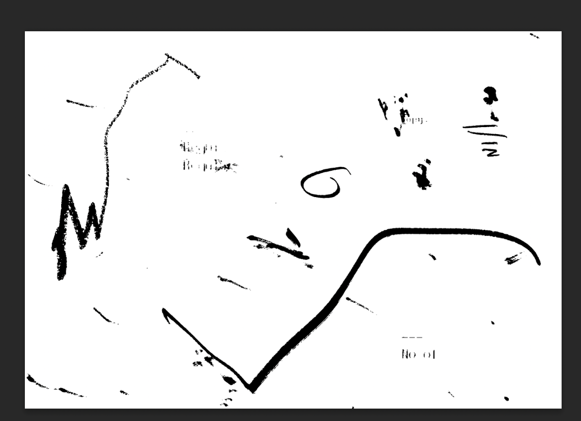
I began with sketching logos. I wanted to focus on letters ‘G’ and ‘T’ standing for my initials, and to try and make them visually represent ‘individuality’ and ‘experimentation’. I also wanted it to be fluid and almost circular, representing the exchange between clients and myself.
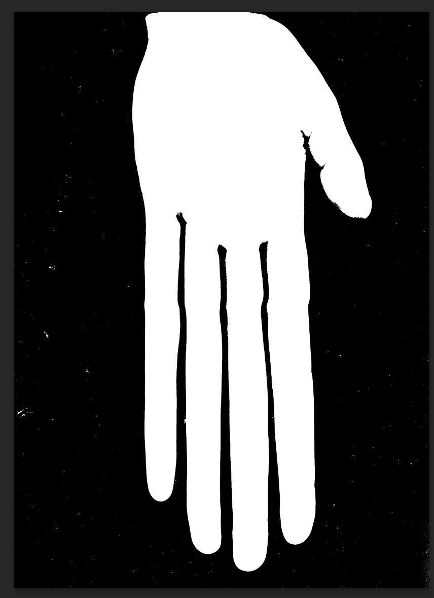
I also created various designs originally based from a scanned photo of my hands in positions to form a ‘G’. Using my hands to literally make the shape of a ‘G’ I felt could be an interesting start point for the visual, representing literally my hands/ideas creating designs.
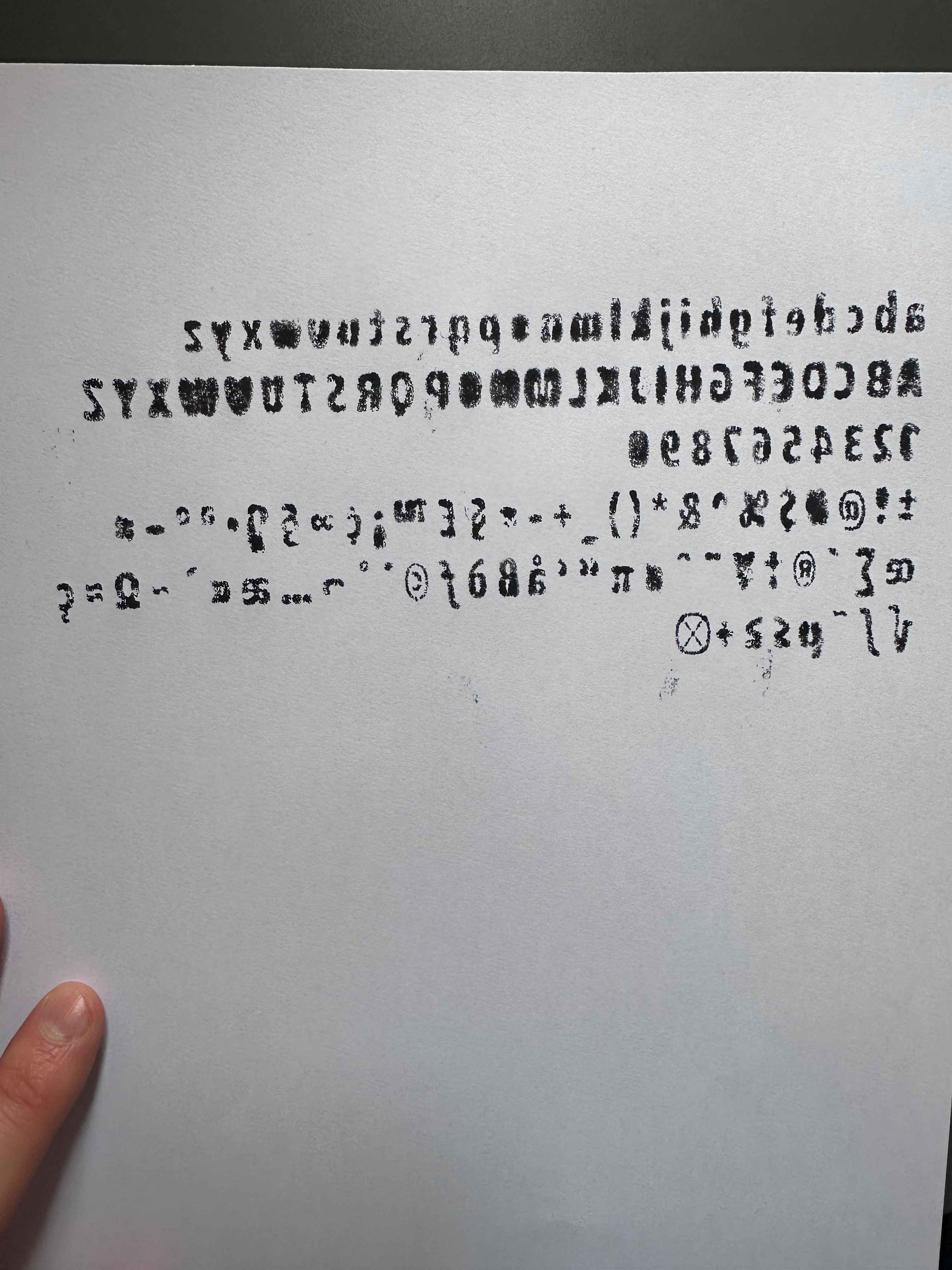
I worked on this design going back and forth using physical prints, re-scanning and digitally manipulating, then repeating the process. I created some interesting textures and visuals. The end result of a ‘G’ was individual and had character to it. I was unsure whether this could or would be suitable or if the texture would be able to translate properly when viewed at smaller sizes on social media for example.
My design process here was physical and digital, again printing, scanning, digitally manipulating and re-printing the type. Once I was happy with my final design, I then had to research what typeface creating software to use in order to turn my letters into a useable font.
I created various mind/word maps to boil down to the essence of what my ‘brand’ would be and what design style I would like to create for my logo etc. I wanted to create a logo and type design that encapsulates an experimental and individual style. I currently am unsure as to what area of design I would like to specialise in, so would like to design a brand that could be good to use as an umbrella for multiple styles of design.
A goal of mine for a while has been to develop a typeface and get to know how to use type design software. I took this assignment as an opportunity to experiment with this. I began with one of my favourite typefaces called ‘Fact’ then started to digitally manipulate it. I wanted the type to be rounded and abstract in shape, with each letter being different weights and having different spacing. I was particularly inspired by figures 17-19 showing interesting custom type faces.
From what I had gathered ‘Fontself’ seemed to be one of the leading softwares to use, which integrated into Illustrator. I played around with this, learning broadly how to use it and then altered the heights and spaces of my alphabet and glyphs, creating my first useable custom type face.
I aimed for the design of the type to be visually similar to my logos (at this point I was unsure of which version to move forwards with) being rounded and abstract in form. I named my final type ‘Fiction’ referencing the original type ‘Fact’ as it was an unclean, distorted version of this type I felt ‘Fiction’ as it’s name suited it.
When considering my website, business card and further promotional material design, I wanted to design an interesting pattern to use to make my brand feel cohesive.
I used various materials to create abstract shapes and textures which I then scanned in and manipulated digitally.
This was again in line with the sense I wanted to portray from my brand, an experimental and visually interesting form of design. I included an abstract ‘G’ shape to further relate to my ‘G’ logo etc.
My digital business card which would link to my website needed a physical design for the actual card to tap onto peoples phones- I began to mock this up, moving forwards with the more digital style ‘G’ and ‘T’ designed logo. Here I experimented with various colour palettes. I settled for a simple charcoal black and off-white colour which are 2 colours I constantly use within my work. This may appear to be boring or less interesting but to me I really like these tones of colours. All of my design/colours etc can be updated as I move forwards which is something I had to keep in mind to prevent myself from being bogged down with trying different colours etc.
I then moved onto writing my CV and collating it into a design. I used the same brand pattern layout as the business card for my CV in an attempt to make it visually interesting and be cohesive with my business card design.
The next stage was to create my website. I am familiar with creating basic websites using website builders such as Shopify or Squarespace, for example this learning log is hosted by Squarespace and my business’ website by Shopify. Referencing my research of websites I enjoy, I moved forwards with Squarespace and created a simple 2 page site. I collated some of my favourite work, including screen prints, collages, website design and book cover design. The work is not targeted or specific but it serves as an example of what I can do and can be updated as I improve.
I used some custom CSS I had previously had help with installing from another website to add my custom type face to be used on this website. I also still had the domain name ‘gregthake.com’ from an old website I used to promote my Photography via and transferred it to this site. I experimented with using my brand pattern in the background of the site, but this did not work well with the already busy page showing images of my work so I left the background as one simple colour.
The link to my website is here: www.gregthake.com and the password to access it is lower case: ‘gregthake’.
When I initially read the brief for this assignment I was very anxious to start as anything (as for most people) that even remotely involves self reflection or promotion is daunting. For me it’s very out of character to put together something like this task has made me do and I am grateful for the challenge. I ended up enjoying the challenge of creating a logo for myself that included a ‘G’ a ‘T’ and represented the core values I felt my designs and myself as a designer represents. I have also not even considered creating a CV for years due to being self employed so this was also a massive challenge.
Looking back there are many extra elements I could’ve added for this task such as extra mock ups of further promotional material, possibly tried a promotional video and more alternative designs but I am relatively pleased with my outcomes, even if more obvious/simple ideas such as the website and digital business cards. I feel that my final designs are cohesive and give a sense of an experimental designer, which was my goal. As I move forwards with this course and as a designer I can update and re-design where necessary, so I consider this as a starting point at least!
Resources:
Figure 1: The Futur (2023) Personal branding—most important thing you do. Full video AdobeMAX 2023. Youtube. Available at: https://www.youtube.com/watch?v=MVz9mm0Z-7g (Accessed: 9 April 2024).
Figure 2: The Futur (2023) How to build A successful personal brand in 2024 (full masterclass). Youtube. Available at: https://www.youtube.com/watch?v=1kUCm1JPzxg (Accessed: 9 April 2024).
Figure 3: Ros, A. (2021) How to design A personal brand logo (and make it GREAT). Youtube. Available at: https://www.youtube.com/watch?v=isjmCr1z0gw (Accessed: 9 April 2024).
Figure 4: Connick, A. (2020) Branding yourself as a graphic designer | personal brand identity. Youtube. Available at: https://www.youtube.com/watch?v=RmmcgimIoRM (Accessed: 9 April 2024).
Figure 5: Peters Design Company (no date) Peters Design Co. Available at: https://www.petersdesigncompany.com/ (Accessed: 9 April 2024).
Figure 6: Projects - Will Paterson design studio (no date) Willpaterson.design. Available at: https://www.willpaterson.design/projects (Accessed: 9 April 2024).
Figure 7: Chittco (no date) Chittco. Available at: https://www.chitt.co/ (Accessed: 9 April 2024).
Figure 8: Roy Cranston (no date) Roycranston.com. Available at: https://roycranston.com/ (Accessed: 9 April 2024).
Figure 9: Samuel Ross (no date) Samuel Ross. Available at: https://samuel-ross.com/ (Accessed: 9 April 2024).
Figure 10: Virgil abloh (no date) Canary---yellow.com. Available at: https://canary---yellow.com/ (Accessed: 9 April 2024).
Figure 11: George Muncey (no date) George Muncey | Photographer and Director. Available at: https://www.georgemuncey.com/ (Accessed: 9 April 2024).
Figure 12: Msrfcj (no date) Msrfcj.com. Available at: http://www.msrfcj.com/ (Accessed: 9 April 2024).
Figure 13: Variable unit® (no date) Variable.store. Available at: https://variable.store/products/unit (Accessed: 9 April 2024).
Figure 14: Bottega Veneta (no date) Bottegaveneta.com. Available at: https://www.bottegaveneta.com/en-gb (Accessed: 9 April 2024).
Figure 15: Mike Ballard (no date) Mike Ballard. Available at: https://mikeballard.co.uk/ (Accessed: 9 April 2024).
Figure 16: V1CE (no date) V1CE. Available at: https://v1ce.co/ utm_source=google&utm_medium=cpc&utm_campaign=Brand&utm_id=13167398762&utm_term=%3DPPCBrand&utm_source=google-ads&umt_medium=cpc&utm_campaign=&utm_agid=&utm_term=v1ce&creative=600818735424&device=c&placement=&gc_id=13167398762&h_ad_id=600818735424&gad_source=1&gclid=CjwKCAjwoa2xBhACEiwA1sb1BKEv2TC6FP0sFQisZ7B2O_ZR7f8PnbYp7alyEfx7rpZuWnDcHyJGQRoCoUoQAvD_BwE (Accessed: 16 April 2024).
Figure 17: YeezyxGap (no date b) Instagram. Available at: https://www.instagram.com/yeezyxgap/ (Accessed: 21 April 2024).
Figure 18: BOTCH typeface (no date) Studio 2am. Available at: https://studio2am.co/en-gb/products/botch-typeface (Accessed: 21 April 2024).
Figure 19: Point two (no date) Pointtwo.co.uk. Available at: https://pointtwo.co.uk/ (Accessed: 21 April 2024).


