Graphic Design 2.1: Professional Practice, Project 2: ‘Principles of Branding’ Assignment 2
For this assignment you will redesign the corporate identity for a traditional confectionery company. The objective is to modernise the design of the identity while keeping the heart of the brand. You will select a company that has a wide selection of products and has established its brand for many decades - or at least multiple years.
Research the modern confectionery landscape.
Research the industry, and sector. Who are the competitors? What products are available in the shops next to this company's products? What are customers deciding between when they are making the decision to purchase a certain brand?
Select an existing company.
Research the brand values, what the company stands for and how the brand is perceived by customers. Research the family of products the brand distributes - are the products aligned and clearly related to the parent brand? Explore the current corporate identity or any previous identity designs and redesigns. Look at visuals as well as news reports, public relations statements, and social media channels. Compile this research in your learning log.
Explore different directions.
Draft ideas for at least three different directions that the corporate identity might evolve. One direction might be an attempt to stay exactly the same while modernising, another might be to create an identity that will better align with the changes in the industry or sector, and a third might be an exploration of how the company will differentiate within the sector.
Develop one of the directions.
Select one of the three (or more) directions you explored and develop this further. Based on what you know about the brand and the competitive landscape, design a corporate identity that will differentiate this company from the competition while staying true to the original values and brand promise. Refine the visuals, rationalise your choices, and support your decision with the research you conducted. Demonstrate how the new identity will translate across three specific products the company manufactures.
Prepare a corporate identity brand guide.
This document will serve as the source of truth for the company going forward. It will be a reference manual for the marketing and PR teams, it will inform the presentations at strategy meetings, and it will be the benchmark against which new products are introduced.
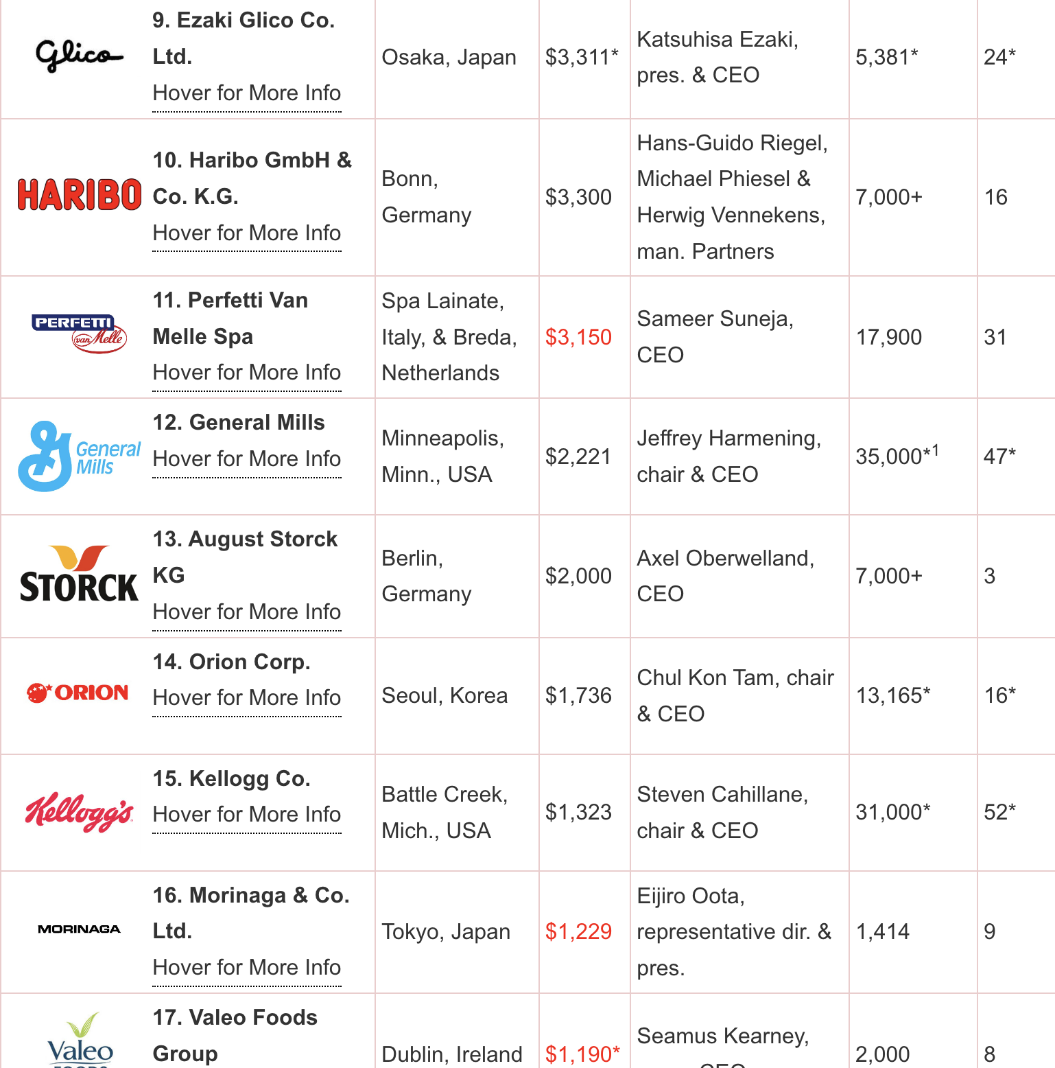
This list made more sense to me, the popularity of Haribo in the UK is massively different from the global ranking. I looked into the UK’s top brands products, packaging and advertising, collating them into mood boards for reference.
Nestle’s brands, particularly when their adverts are shown side by side, appear very similar. Their use of bold colours and light/shades of a main colour within their adverts allows all of their products to appear cohesive and feel a part of one.
Storck is a company whose products are growing more popular , with Toffifee and Werther’s being popular in the UK. Storck’s branding is more premium, and has a more professional/nicer feel than the other brands mentioned. They focus on chocolate based products and promote a ‘sharing’ sense with their adverts, often depicting people eating the product together.
Confectionary aisles are full of colourful packaging it seems as if almost none of them stand out. The more premium brands are generally higher up, with the most popular at eye sight level. The customer chooses the brand that they like, not just based on flavour preferences, but by advertising.
I began this assignment by noting the key points, making a rough plan. I went onto researching confectionary companies, starting with a list of the top 100 global companies.
The top companies were surprising to me, especially with brands like nestle and Haribo being lower down. I then was interested as to what the top brands were in the UK.
Haribo’s products, advertising and branding are all cohesive, they are colourful and fun. The idea of ‘fun’ is synonymous with their brand identity, which is clever. The main selling point cannot be anything health related, or positive in any aspect within that sphere so enjoyment and fun is their best option.
Mars’ products have some iconic branding and advertisements. The adverts are particularly interesting because they are very well produced, funny adverts that again you can tell they are promoting a Mars product. Similarly to Haribo they really lean in to the ‘fun’ aspect of advertising.
Mondelez’ brands such as Cadbury, Milka, Maynards and Daim are varied, but all have many things in common. Within their branding and advertising they use a lot of characters that have a surrealist feel. Again they are leaning into ‘fun’ but more on a quirky and different side. This is a clever way to be distinct and stand out from other companies.
Lindt’s branding is more premium, focusing on a more artisan/hand made feel. Their packaging is different from other confectionary brands, using a more muted colour palette with less colour diversity. Their logo uses the colour gold, again giving off a premium feel.
For example they may be in the shop and remember a recent advert and how they wanted to try a new or old product by a certain brand. Packaging appears as if all possible outcomes have been exhausted but I feel like a lot of brands just repeat the same style. This may simply just be because it works and they are so well established. This assignment will be a challenge to rebrand such iconic companies.
What are customers deciding between when they are making the decision to purchase a certain brand?
The main contributing factors to the customer making a decision between confectionary brands are the price, brand identity/ethics, taste, packaging and the ingredients.
I would argue that the brands price is possibly the strongest factor that the customer makes their decision based from as people do not want to overspend. Every day budgets are tight with people having to stick to strict amounts of money they can spend today more than ever. When buying confectionary products people are aware that these are indulgent purchases, which often comes with feelings of guilt, with this negative sense being there already, people do not want to exacerbate their feelings by over spending on the products.
I feel that the brands perceived identity and ethics by the buyer are the next most influential contributing factors to consumers when they make their decision on which confectionary product to buy. How the brand is perceived is everything, if they advertise as a fun, joyful or indulgent product/company people are likely to remember this when making their purchases. If the company produces memorable adverts, these will play into the consumers choice, for example with skittles advertisements, to me they are memorable, being surreal and humorous. The brands ethics also come into play, especially in relationship to how they deal with any environmental impacts they have and how sustainable their practises are. People are becoming more savvy to these issues and will actually change which products they consume based upon them.
The products taste is obviously massively important as nobody wants to treat themselves with something that they don’t like! Many people have favourite sweets/chocolate and are unlikely to deviate from their normality. This is also where the importance of packaging comes in, if a products packaging is different or appealing to the consumer when directly in front of them, they may make an impulse purchase or want to try something new. Alongside the products taste, sustainability and packaging, the brands ingredients are very important. Some people have allergies or are against the use of certain ingredients/chemicals for environmental reasons, therefore choosing a product that does not include certain ingredients may be integral to them or at least impact their choice of product to buy.
Lindt:
The golden and brown colours are seen throughout each brand, they definitely appear as part of the same ‘family’ and are positioned as premium products to the consumer.
I looked into the history of Lindt’s logo, I came across some great articles here and here. Surprisingly they haven’t really changed a thing! Their logo still works and like it’s product it has stood the test of time. The iconic ‘L’ serif type face combined with the dragon logo work really well. Looking back, I personally prefer the old dragon logo, it is very simple but effective.
The ‘old gold’ colour palette is something to keep in mind when brainstorming, do I want to stick with something traditional or try different colour schemes?
Lindt’s social media content shows their own products and their different uses, focusing on indulgence. They show different foods being eaten with Lindt products or being made from them, such as cakes and spreads. This all feeds into the premium brand identity. These uses are also ideas I will note for re-branding.
Moving forwards I decided to research further into Lindt. The idea of re-branding a classic chocolate company really interested me and would be a big challenge.
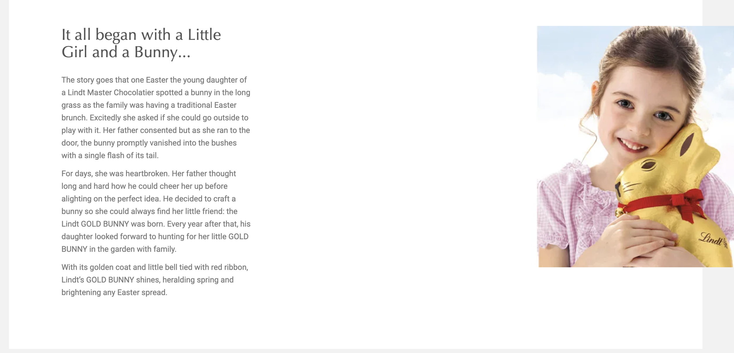
I began by researching Lindt’s history. Their website has a lot of information on their brands story, which itself only adds to it’s iconic brand identity.
I also researched other brands that Lindt owns, including Ghirardelli, Hofbauer, Russel Stover and Caffarel. Looking at the brands side by side, their branding, particularly logos are very similar. They all have the same classical feel, conveying luxury products. Perhaps I could try to create a design that is the opposite of this, using a modern Swiss typeface?
Throughout each brands websites and social media, brand heritage is shown through imagery and even timelines documenting how the brands came to be. This all feeds into their positions as premium products, the story behind each of them adds value and proves that their product is worth it as it has stood the test of time. This style of imagery could be included within by re-brand.
Lindt’s social media icon is a continuation of their classic logo but with a gold circle around the edge. This simple shape really sets it apart as an icon and again makes it feel more premium. The gold and white also work very well together, if the gold circle was not around the edge, the logo would blend into the rest of the page and be less visually striking.
I looked into where Lindt sourced it’s chocolate from and came across ‘The Lindt and Sprungli Farming Program’ where they sustainably and ethically source their cocoa. This is great to know as a consumer and positions the company well from a branding perspective and their is less guilt involved when consuming their product.
I look at various classical logo styles, including some luxury brands that have stood the test of time. I was particularly interested any iconography they used and how it relates to the brand, whether it’s simply letters such as ‘CC’ for Chanel, or the crest for Burberry.
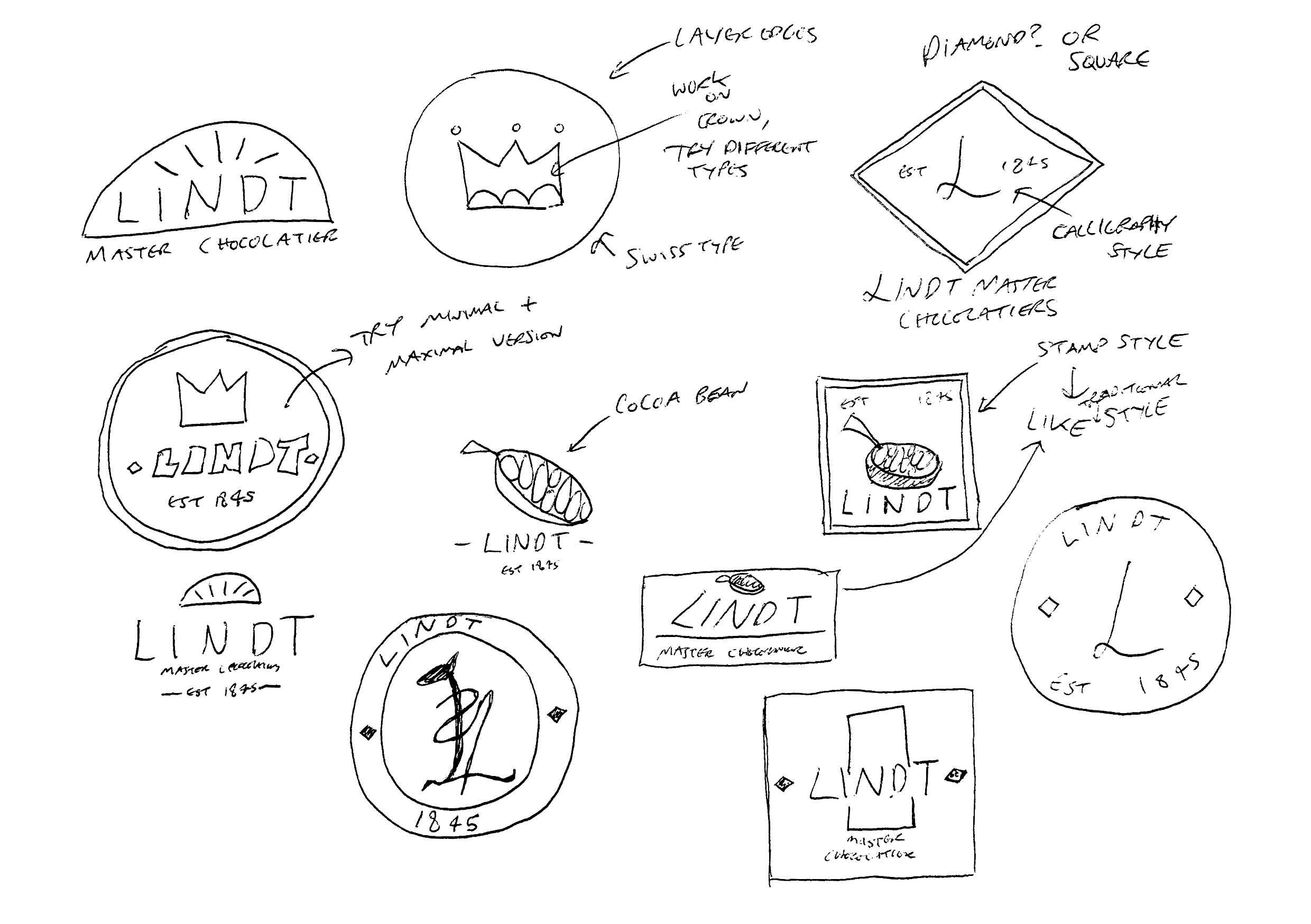
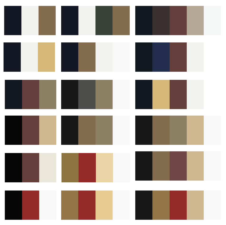
I began to jot some logo ideas and also looked into developing a colour palette for the brand. Lindt uses a lot of ‘rich’ colours, such as strong reds, browns and gold. These have a luxurious feel to them, a feeling that is integral to the brand, being a key element I feel I should keep in mind when designing.
When developing the colour palettes I tested with various ‘royal’ and ‘luxurious’ feeling colours creating palettes of 3-5 colours.
I listed various type faces and experimented with different kerning lengths. The wider kerning has a more luxurious feel to it.
I wanted to design both a modern version and a more classical style, the serif type logos were for the classical and the Swiss type faces for the modern.
I began designing the logo digitally, choosing 2 icon elements to focus on. The first was the ‘L’, I aimed to have the ‘L’ shaped almost like a dragon, referencing Lindt and Sprungli’s historical logo. I wanted the letter to have a luxurious but also historical feel to it, I paired this with various typefaces and in different compositions.
I then moved onto designing the crown icon. I originally used a very simple shape version consisting of 3 triangles and a rectangle, pairing it with font ‘Archivio Black’. I quite liked the look of this logo style but continued testing and developed a slightly more detailed crown, again referencing Lindt and Sprungli’s historical logo.
I went back and forth with pairing different elements together, the more historical style crown worked well with the serif typefaces but I also liked the contrast of the sans serif typeface paired with it.
I created a few initial mock ups to see how certain colours look and how well the logos work. I went back and forth with designing different layouts and colours.
I initially felt that the modern logo style worked well paired with the crown pattern I had developed but also felt that the classical logo and brand style was more true to Lindt and what they represent (referring to brand values).
When researching brand identities/guides and how to present them I came across a very informative video by ‘The Futur’. They go into detail about how to and how not to present a brand identity guide to the client. I took notes from this for designing my own guide.
This second video by company ‘Kayla’ was also very informative, including what to and what not to include but showed a slightly different style of presentation to ‘The Futur’s’ guide.
I went onto researching further into branding, brand identity and logo design. I wanted to improve from my previous assignment logo design with this task, and came across various videos, short and long form with great tips for logo design and the overall branding process.
I found this logo critique video very helpful and also his Youtube series where people send in logos for his critique. Hearing what other people could improve on helps me gain helpful information to apply when designing my own logo.
Lindt’s brand identity is a luxury, indulgent company with a long history. Their products are premium and artisan, being enjoyed globally. These are key ideas to consider when designing their brand identity, I want to convey a sense of luxury, being modern but also nodding to the history of the brand.
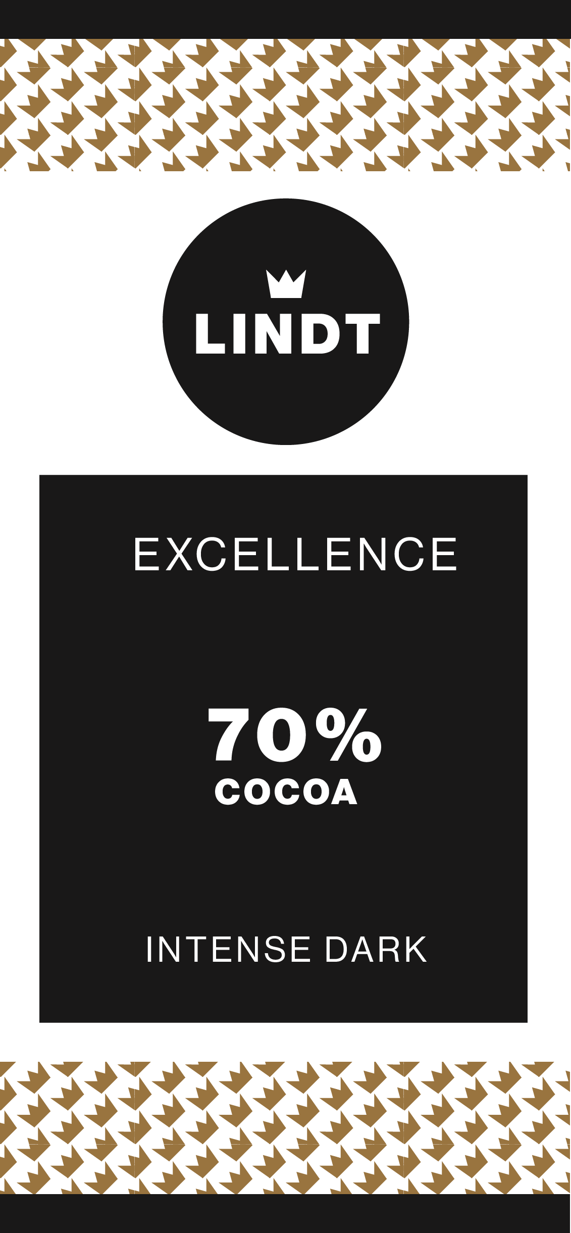
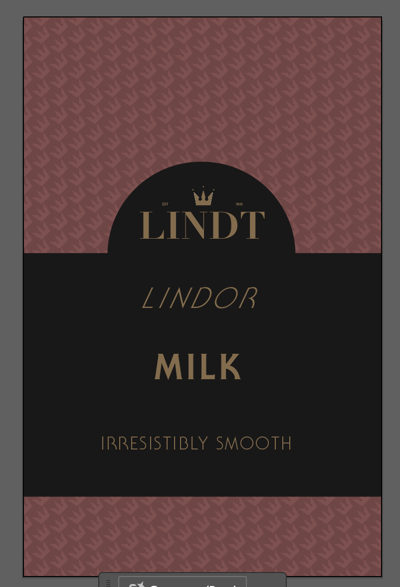
The 3 product types I chose to design for are Lindt’s ‘Excellence’, ‘Selection’ and ‘Lindor’ I developed different colour palettes with these main products in mind, also considering Lindt’s other products and overall brand identity.
I continued to research packaging, logos and colours, collating a few mood boards for reference.
Referring to my research I jotted some thumbnail references for packaging compositions. I then went onto testing the logos with the colour palettes I had developed, making changed to the logos and colours as I experimented.
I then combined my favourite elements from both designs (the crown pattern and classic logo) aiming to create a combination of the minimal/clean look and the classical luxurious look.
The final logo uses adapted colours from Lindt’s current packaging and includes the crown element which references Lindt and Sprungli’s history and logo.
Looking back at my final designs I am relatively pleased with the outcomes but feel that the ‘Excellence’ design should be a different colour as it blends in too much with the logo. I had initially aimed for this to be a similar gold/champagne colour as this is Lindt’s key range, therefore I wanted it to directly reference the gold Lindt logo but I feel that the end result isn’t very effective.
The packaging label designs were intentionally minimal to contrast the busy crown pattern background but I feel as if they need some texture, perhaps this is something that could’ve been explored.
I feel that this assignment is a slight improvement on assignment 1, I tried to slow down and experiment more, particularly at the logo/testing with mock ups phase. I still feel that I should try further ideas and maybe manage my time in a way that allows me more space to experiment.
Overall I enjoyed this task but found it very challenging. Brand design is something I hadn’t delved into completely before this section and I am now definitely interested in developing my skills in this area of graphic design.

