Graphic Design 2.1: Professional Practice, Project 1: ‘Graphic Design Now’ Assignment 1
For this assignment you are asked to design various forms of information and promotional media on the topic of careers in graphic design, aimed at school leavers. The various forms of media will be accessed from a stand and table, enclosed by free-standing display screens, at a careers event at a school or university. Please also provide a mock-up of what the stand may look like.
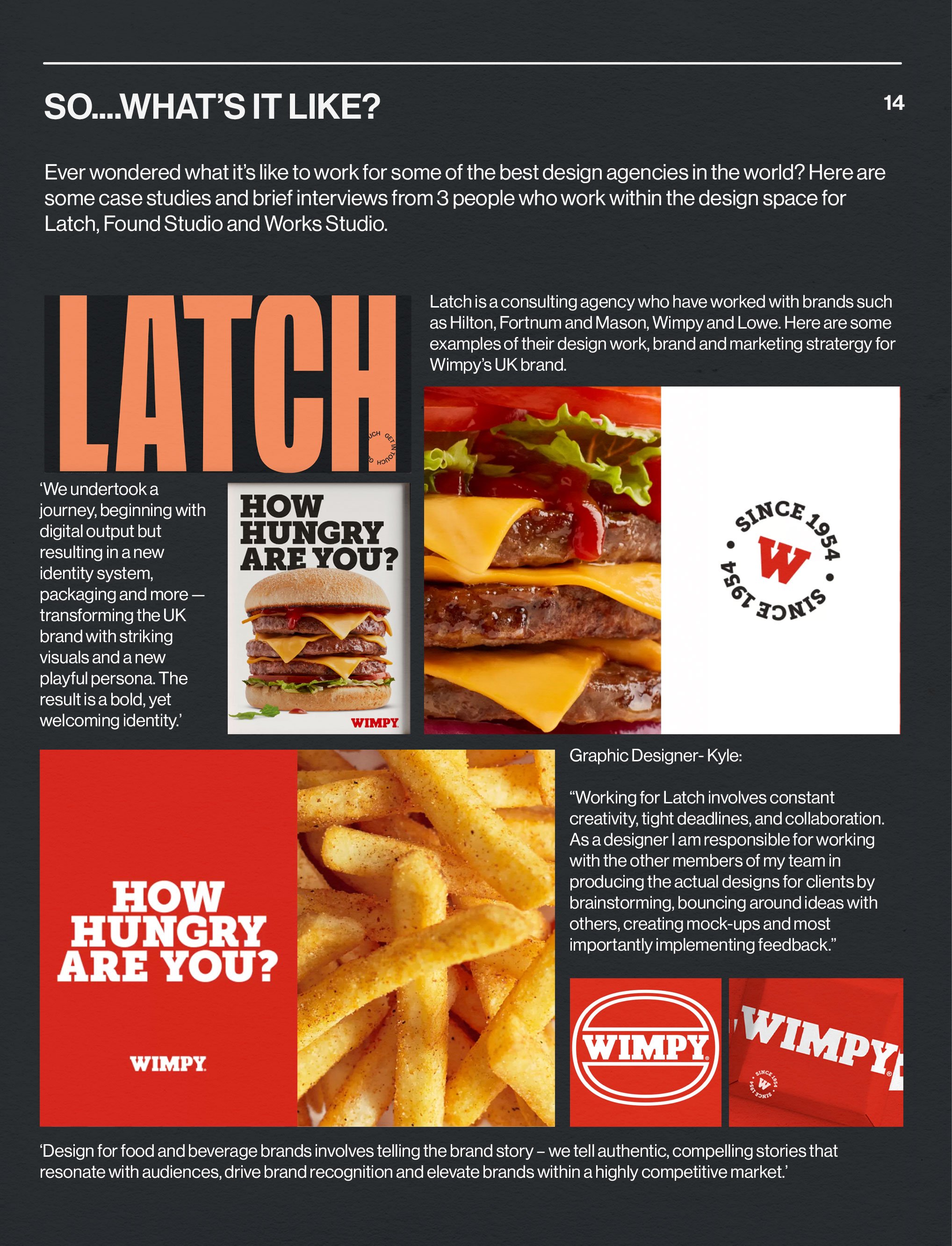
The content of the marketing media should contain guides to the many different specialist areas of design, examples of the breadth of work produced by designers, and three case studies of real, or made-up design agencies which include short statements from a designer about what it’s like to work in their area, along with samples of work. Look back at the research and the exercises you have already done for content and inspiration.
The printed media will also feature information on how to find out more, along with some useful contacts and supporting images. You are also required to design a landing page for an interactive, on-line version of the promotion. A screen running a loop of relevant material will be on the stand. The screen media may be presented as a mock-up. All printed, or screen based media, must show visual continuity with a strong, creative identity suitable for a visually savvy audience.
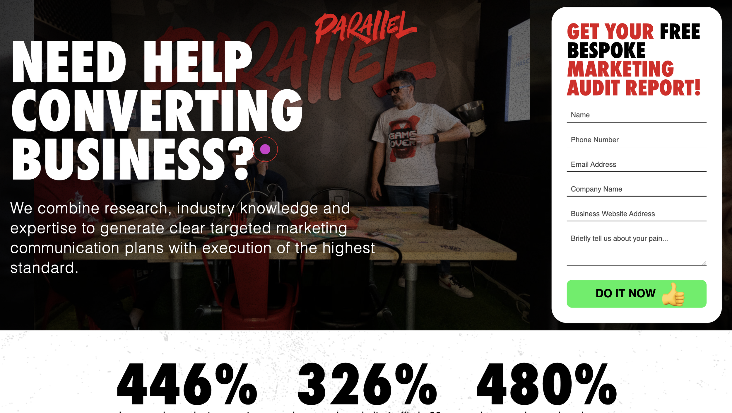
I particularly liked the bold typeface, colours and branding of Latch and their website landing page was also engaging- something to keep in mind and reference.
I continued to research promotional media; stands, business cards, booklets, leaflets, branding of pens/pencils, cups, mugs. I collated some of my favourites into mood boards to refer to.
The first video was short but was a nice catalyst to get going, the second I particularly liked the mood boards they made, displaying inspiration and colours together. The third video was by Adobe and time stamped at different sections such as ‘designing a logo’. This lead me onto sketching ideas whilst I watched/listened.
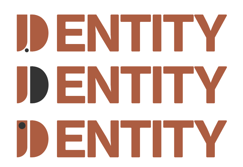
After further thinking and having some initial logo ideas, I decided on a name combining the 2 words ‘design’ and ‘identity’- ‘Dentity’ a company who helps people begin and further their graphic design careers.
Inspired by the layout of Abi Connick’s mood boards I collated some visuals to refer to, colouring them using various palettes I felt could work. I really liked the layout of the mood board this way with the palette in the middle, it helps give you an idea of the feeling the imagery gives.
I liked the idea of using simple shapes to create the logo, conceptually with the idea of ‘building’ using simple elements to create something interesting (to represent graphic design) and to represent building your dream career as a ‘brick by brick’ approach. The physical shape of the logo I wanted to be a ‘D’ for ‘design’ and including an ‘I’ for ‘identity’.
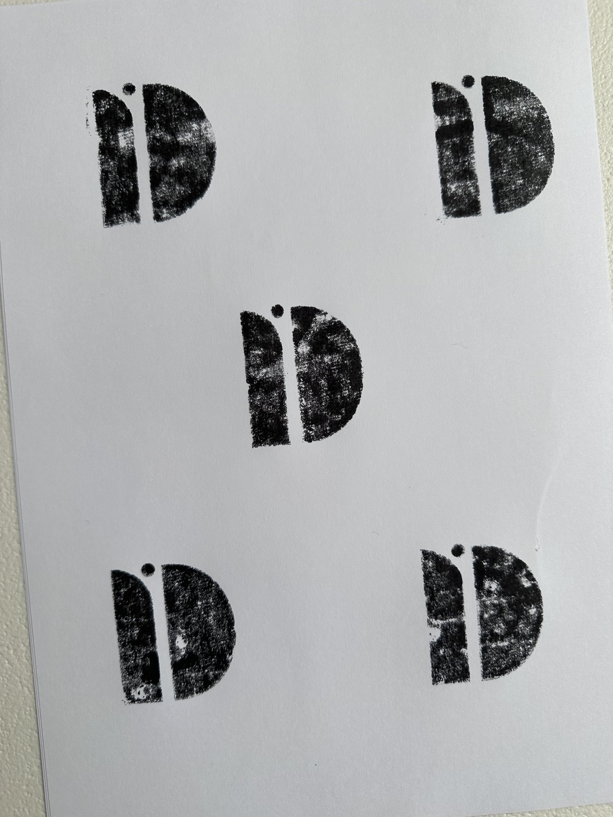
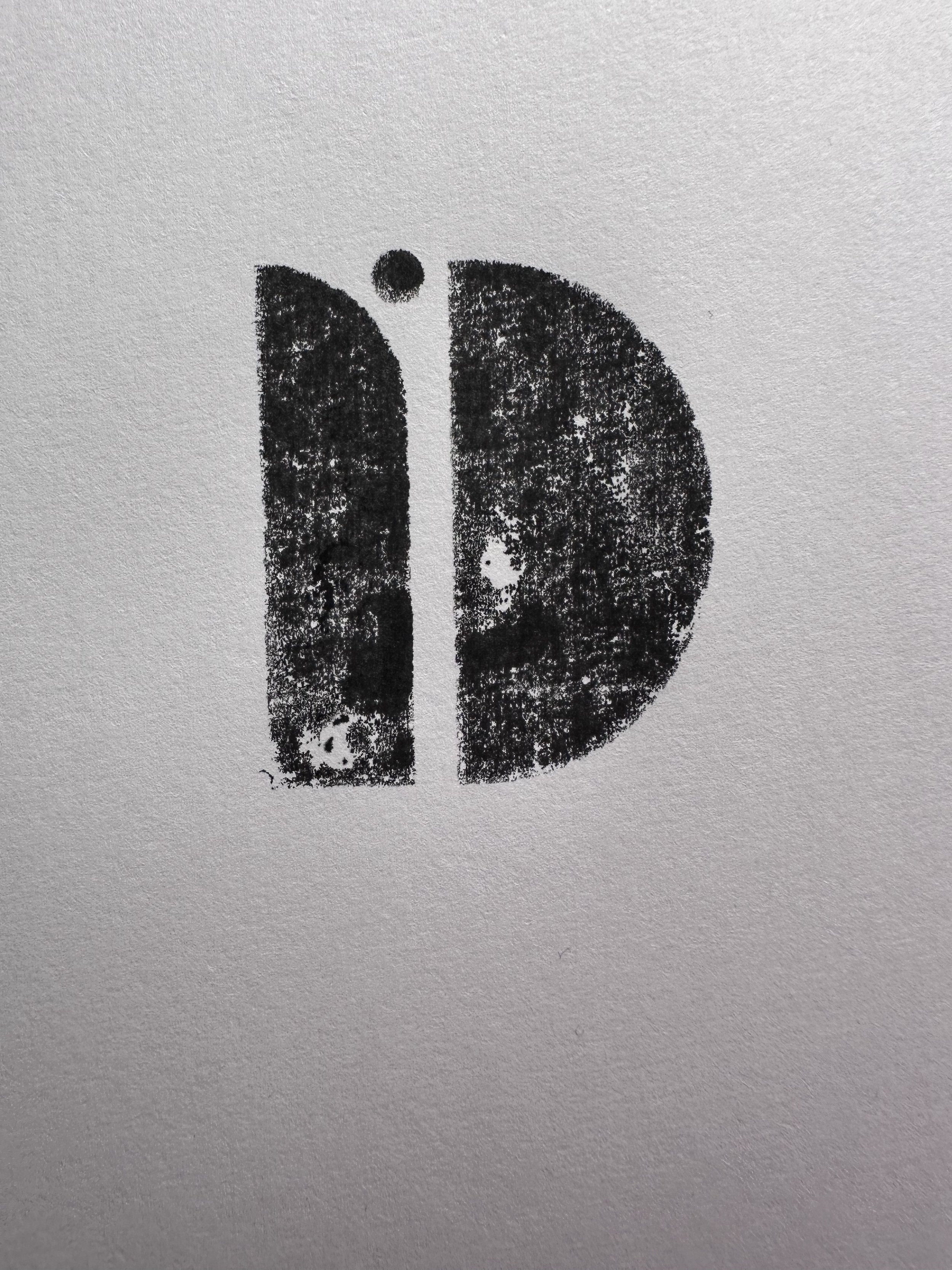
The final logo I wanted to represent a life/job pathway, which ‘Dentity’ would help the student navigate. I also aimed for the logo to stand out and wanted it to look and represent individuality. The ‘D’ and upside down ‘I’ open to create a pathway and the dot of the ‘I’ represents the person going on the journey. I printed the logo multiple times and layered them, creating a vector in Illustrator.
I didn’t want to design the booklet silo to the other marketing materials such as the stand, business cards etc so I carried on collating further mood boards of each marketing material and landing pages.
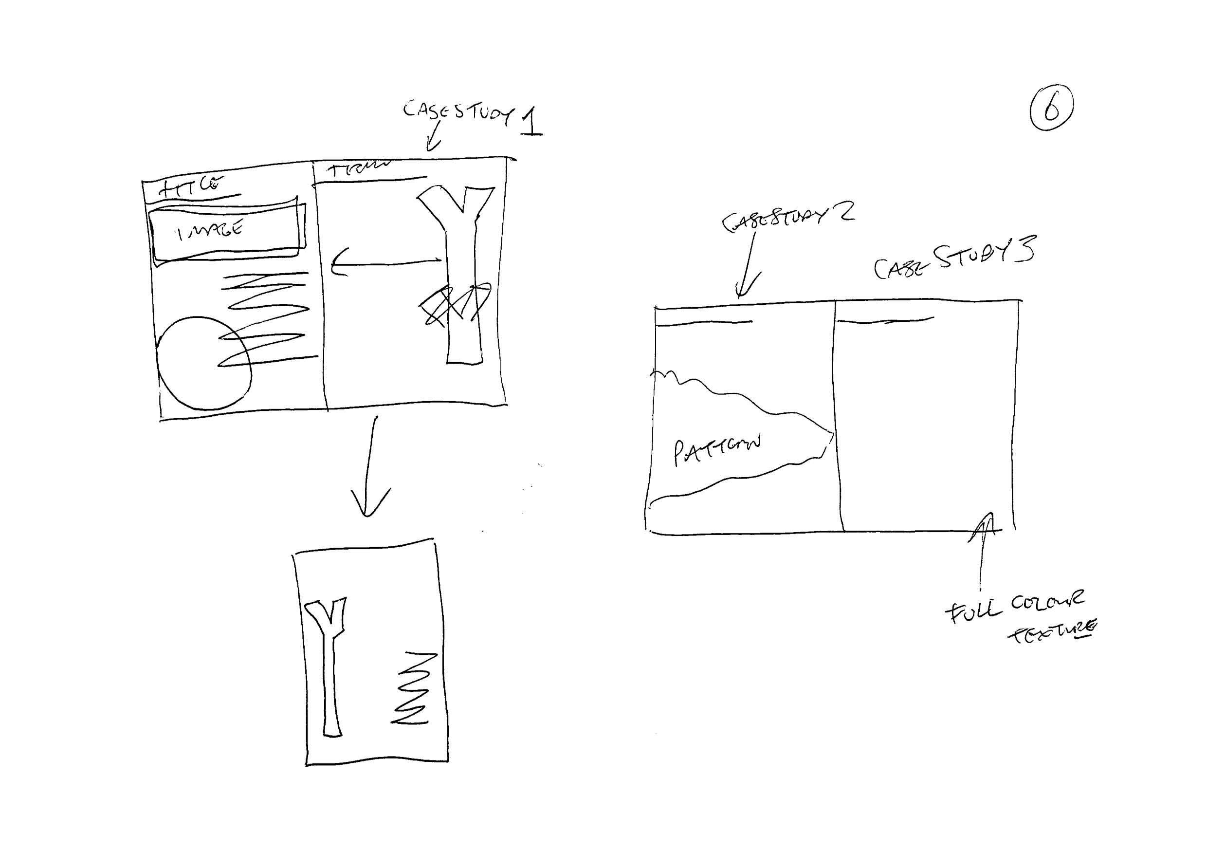
Whilst researching I jotted some thumbnails showing compositions and adding any notes I felt were necessary. The most important thing is for the designs of everything to be consistent, showing a strong brand identity.
I began to design the booklet, moving onto the banner then business cards and other material.
I was really interested to begin this task as I would like to practice/improve my branding and marketing material design skills. I began by making notes and highlighted the most important elements to focus on. Promotional material, cohesive branding, design work examples, designer quotes, landing page.
I began to look back over the previous few tasks where I had collated a lot of information on specialised sectors of graphic design, design agencies and job roles etc.
I looked again at JKR branding agency and also came across Latch. I used them as inspiration when beginning to consider the name of the careers advisor/organisation along with colour palettes, a logo and brand mission etc.
Whilst researching I began to note name ideas and highlighted my favourites. ‘Design Destiny’ stood out initially, I liked the sound of the alliteration despite it sounding quite cheesy/cliche, I felt it could work for a careers advice company/organisation. I continued to research and make notes of my ideas.
I continued my research into branding and found some videos which further helped and acted as inspiration for brainstorming the information/promotional material.
I drafted some ideas for a brand slogan, again focusing on those 2 words. I also noted the colours I felt could represent the brand, something energetic e.g orange or yellow.
I continued to sketch some rough logo ideas, I needed to create a logo that was visually interesting in order to represent the creative side of the company, but also be professional looking as their goal is to help people (in this case students) with a career in graphic design.
I continued to play around in Illustrator, eventually coming to 3 potential logo ideas. I also compared them with various type faces and styles of type. I ended up using Neue Grotesk and adjusted the edges to be slightly rounded and the stroke thicker.
When comparing colours, taken from my mood boards, the yellow and blue had a different feel to it, and did not feel like a company that cares for or represents creative people. I liked the orange colour, even though it was more muted, with the slight navy grey.
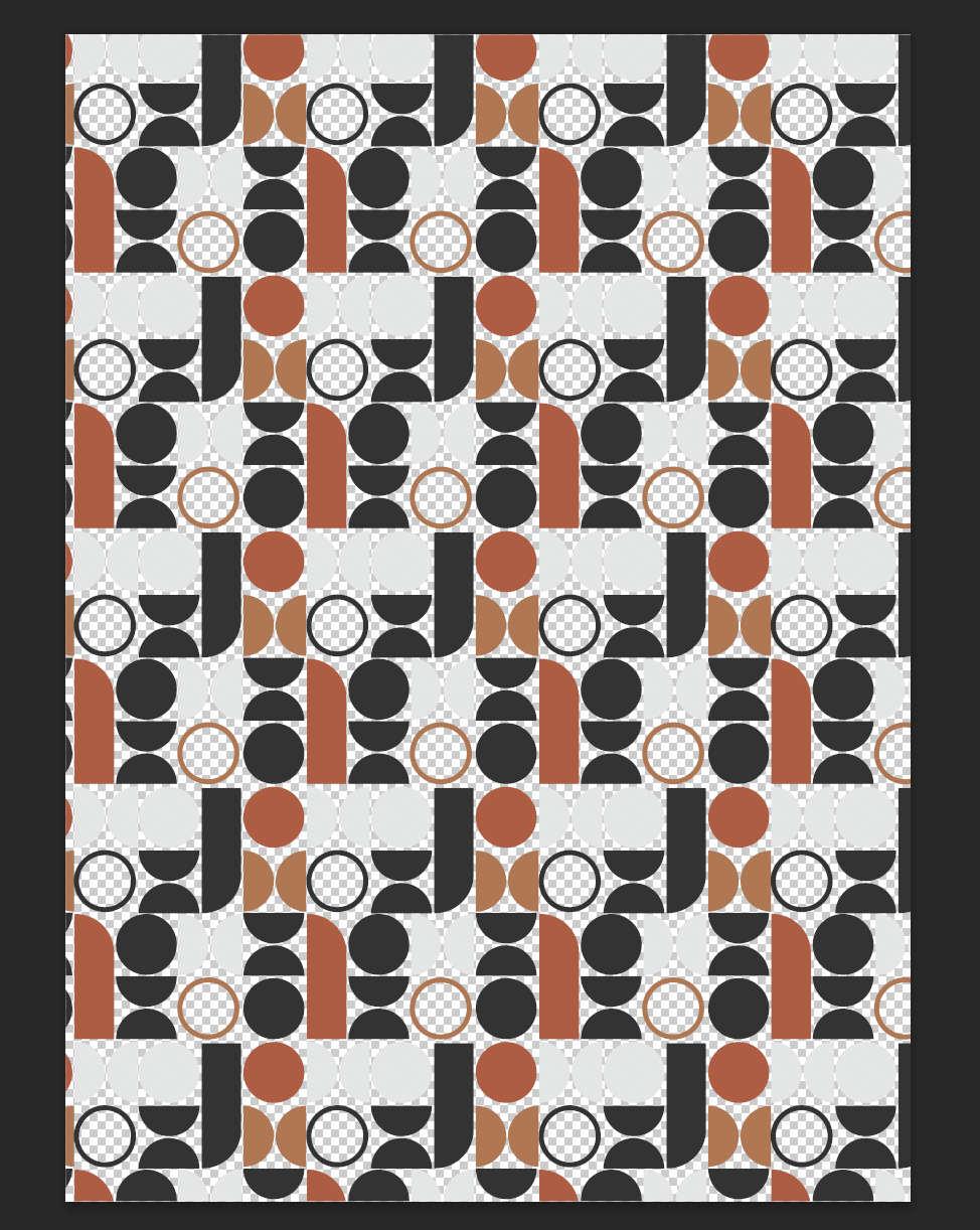
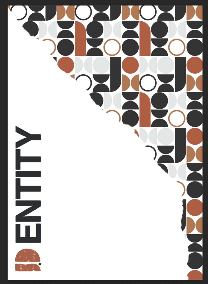
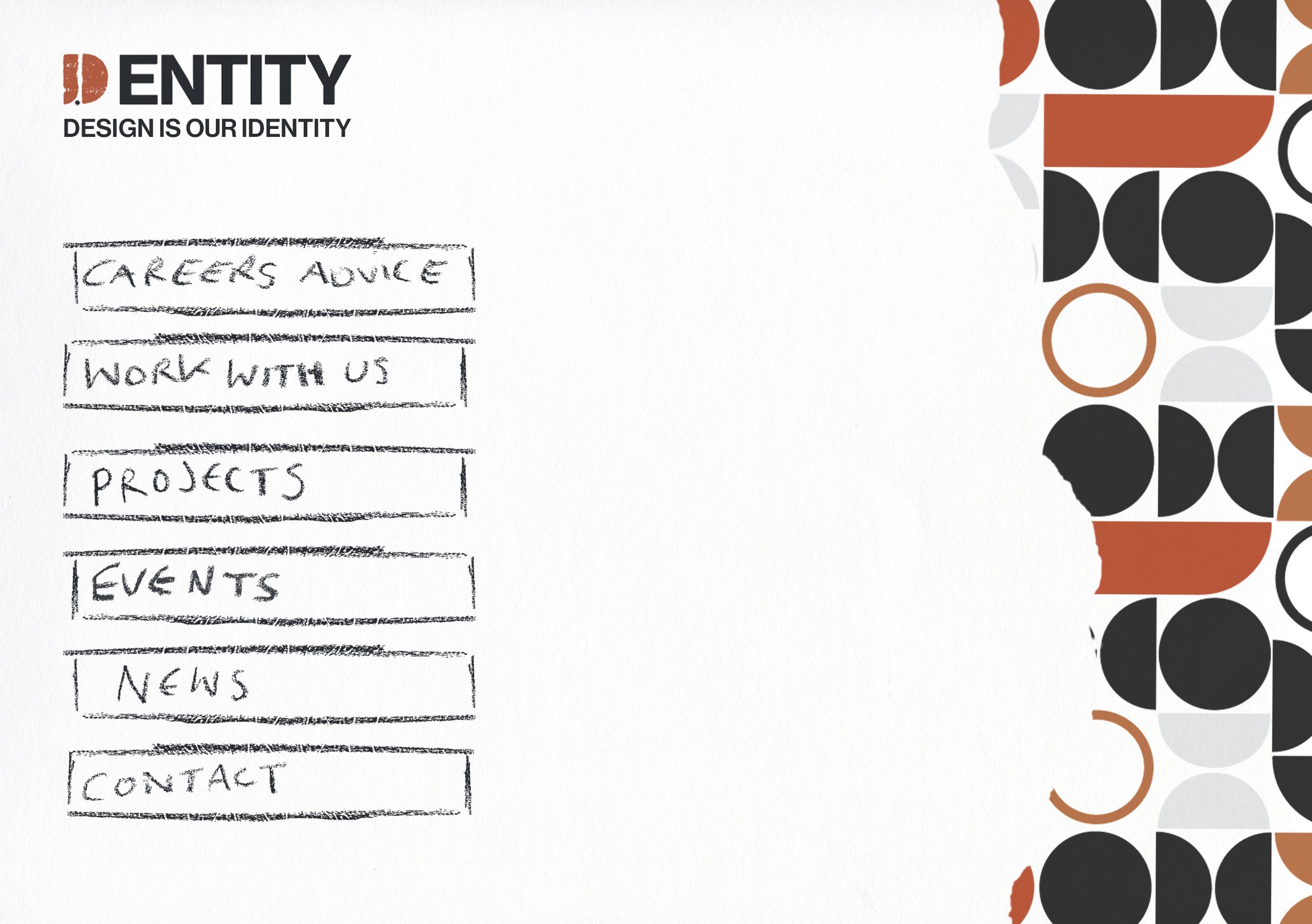
Sticking with the theme of simple shapes, I used elements that made up the logo to create a pattern, which has the potential to be used across various marketing media such as pens, bottles, business cards etc.
I continued to research leaflet/booklets in various styles, some more abstract and others more corporate. I compiled my favourites to refer to and went onto sketching some thumbnails describing content and it’s positioning within the booklet.
By now I had a good idea of the main visuals I would like to push forward, being the use of the pattern and sticking to the colour palette.
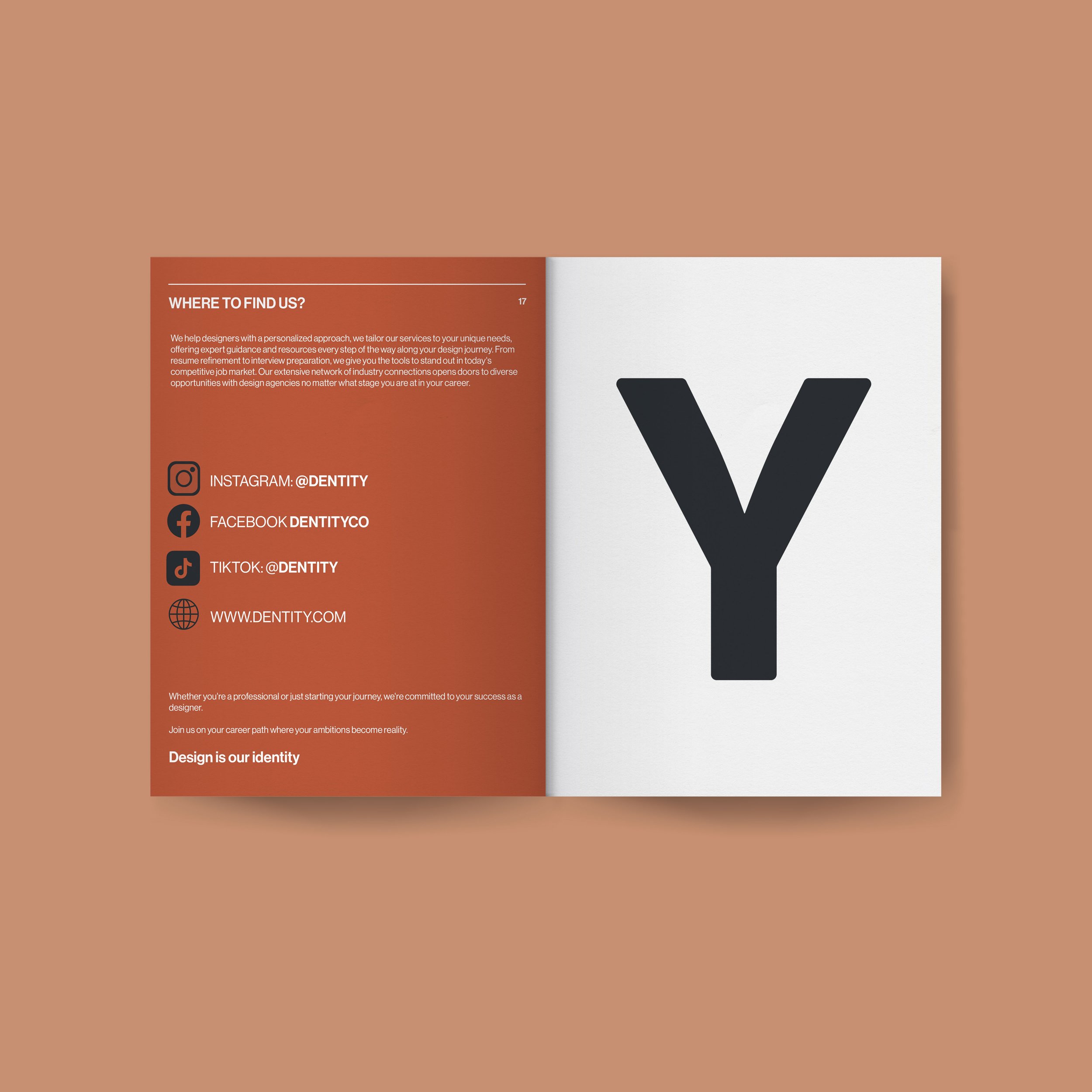
Final mock up designs:
Overall I am relatively pleased with my attempt at designing promotional material aimed at school/university leavers.
This was a good challenge to come up with a ‘brand’ which was professional but also appealed to a ‘design savvy’ audience. I felt as if my planning and research were quite thorough but I moved forwards too quickly when designing a logo and brand pattern. It was at this point where I should have slowed down and maybe tested further with some other ideas and potentially done some quick mock-ups to see how they would look etc. Looking back at my design I think that the non-printed and purely digital logo would work better, but the logo itself feels incomplete despite me liking the concept behind it. I think this may be because the 3 elements are not connected, this could have been explored further.
I like the colour palette and feel it is effective in representing a brand focused on helping people move forwards within the graphic design world, but looking back at the pattern, it seems flat and not very interesting, again if I had slowed down this may have given me time to improve or try other ideas. Perhaps instead of the hand drawn elements within the booklet I could have had the pattern add the texture/interest to the design.
The booklet, business cards and other promotional materials are consistent design and concept wise but again look flat and too corporate, they should be more interesting and exciting especially being aimed at people interested in or within the graphic design world.
Throughout the booklet I wanted to spell out the word ‘Dentity’ across the pages making the letters into abstract shapes or as part of the composition. I like the idea but again not the execution, it leaves the booklet feeling incomplete.
Moving forwards with future tasks I will give myself more time to deliberately stop and reflect on my work at certain points, giving myself time to try other ideas and make improvements. I look forward to working on future branding tasks as this was enjoyable and challenging.


