Illustration 1: Key Steps in Illustration- Assignment 4: Magazine illustration
This assignment should give you the opportunity to show off your developing style and use of tools and materials. If you decide to work digitally save the early stages of your image and print out key points of your experimentation.
Often illustrators working editorially for newspapers and magazines will be given a very loose brief such as this one. The conversation with the art director would normally reveal more about the complexion of the written article, as would your own knowledge of the context in which the illustration would be seen. For many illustrators working with such an open brief is the best way to operate. In this instance your interpretation of the theme is a flexible one.
Lost
Disaster
Discovery
Guilty
secret
They want an illustration based on a still life. You have the freedom to select the items for the still life and are given creative free rein. The rest of the content, the method you use to produce it and the colours you use are all for you to decide.
Working at a maximum A3 size, produce a well-observed, objective drawing of your set up. Consider the materials to use and do thumbnail alternative compositions to explore variations and formats. Allow yourself to distort your drawing to convey the essence of the word. Each decision you make – choice of subject, arrangement of subject, placing of subject in the frame, choice of media – should contribute to the overall description of the theme you have chosen.
Either trace, scan or photocopy this drawing and then do a tonal version of it. You may choose to totally eliminate the line from the drawing or to build tone around it.
At this stage you may wish to introduce a character or be more specific about a location to suggest a narrative. Alternatively you may continue to work with and modify your original still life.
Create a line visual that should communicate clearly the final artwork. Take this visual through to final artwork.
Terry Urban is an LA based artist who uses mixed media techniques including digital methods. He usually has a central focus to his work and uses texture/colour to convey meaning. The use of textures and various media is what I really like about Urban’s work. The mixed media approach is definitely the direction I am interested in taking this assignment.
I chose the word ‘lost’ as I felt there were various avenues this could be portrayed with my illustration. I used a spider diagram to note my ideas and moved onto collating ‘lost’ objects from recent times- ‘lost in time’.
Joost Stokhost is an illustrator based in Amsterdam. I really like their loose illustration style, how they give their art character but still are able to present details. Their use of colour is very interesting, using limited palettes, something I am a fan of. The limited palettes is something I will keep in mind for this task.
Barbara Ziselberger uses various methods to produce their art and similarly to Terry Urban she uses mixed media. The abstract forms and lines in limited colour palettes are really interesting. She again uses texture to convey meaning, from a plethora of sources, including packaging and found posters.
I used old magazines, video tapes, film and an old camera with an old style glass for my still life. I liked the idea of things lost with time-technology.
I laid out my items in various ways, then sketched thumbnails from a few different angles also experimenting with the photos and felt that the higher angle worked better.
Initially I thought that the higher angle would represent looking ‘down’ and ‘back’ on the technology/ephemera lost in time but more of a slight angle from above worked better in showing the details of the items. I produced my initial line sketch from the image that worked best.
I used pencil for the preliminary sketch followed by a fine tip pen. I then scanned in the line drawing and converted it digitally in Illustrator. I quite liked the initial line work, keeping it loose inspired by Joost Stokhost.
I then reprinted my line sketch but with a low opacity so the lines were barely visible. I used this as the basis for my tonal illustration. I used water colours, a medium I was interested in from a previous task in a black colour. I felt like this was a good medium for the tonal image as the aesthetics of water colour remind me of older paintings and appears more free flowing, with the aim to convey the theme of ‘lost in time’. I again wanted to use a mono colour to show the highlights and shadows the best I could. I again wanted this to be loose, with a goal of creating an interesting illustration and again being fluid and changing as the technology has through time.
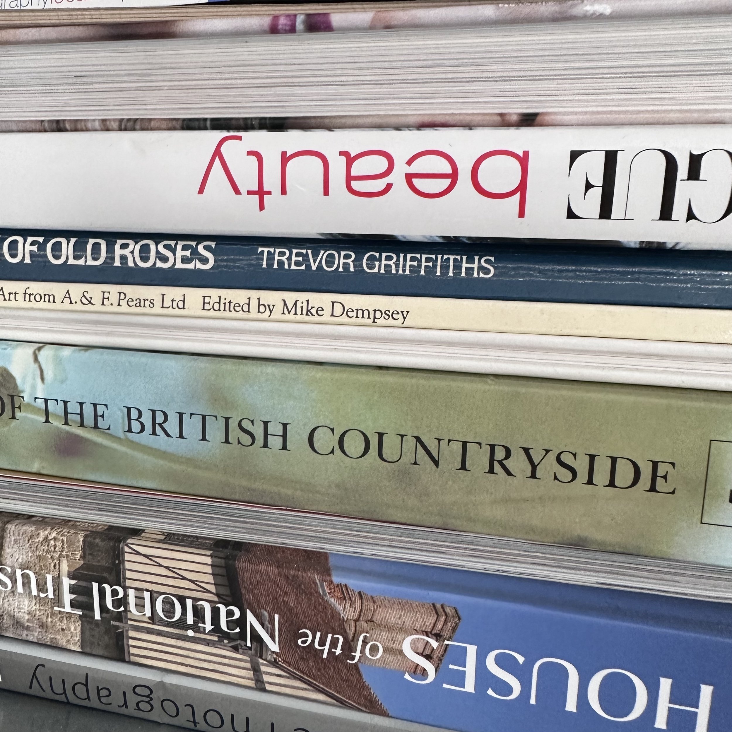
I collated various images and textures from books/magazines ranging in ages. To the right are some examples. My goal was to sample images/textures from various sources throughout time, this included from 1930-2020. The goal was to have enough source material to create a collage which abstractly conveys ‘lost’ and particularly ‘lost in time’ in multiple ways. I also aimed to include imagery which presents ‘lost’ in a more literal sense e.g. lost on an island, in a forest, unsure of where to go etc.
The initial final outcome of this I felt worked, but I did not like the composition. I was aware that the sizing was maximum A3 but the assignment did not specify that the final image had to be exactly scalable to this size. I then experimented with a tighter, square shape canvas. I reduced the elements in the composition down to the camera, magazines, film roll and video tapes.
For this final outcome I scanned and reprinted the watercolour version, making the work appear smoother. I then used an oil pastel and added some white highlights, exaggerating these parts on the illustration. The outcome was not as I had initially desired, the image appeared quite flat and less loose than I had aimed for.
With this in mind I moved forwards with a collage style design, a method I had moved towards more with recent tasks and something I feel could work well with conveying the themes more abstractly and interestingly.
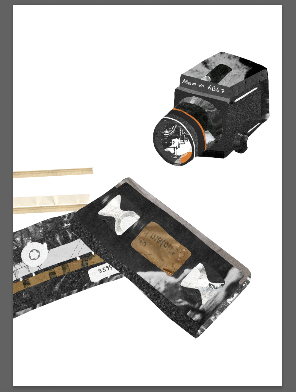
As this Assignment is to take inspiration from a still life, I continued to use my still life line drawing as reference and produce the images literally but in a more abstract way including collage. I wanted to try this digitally, again to represent the fusion of new technology with old.
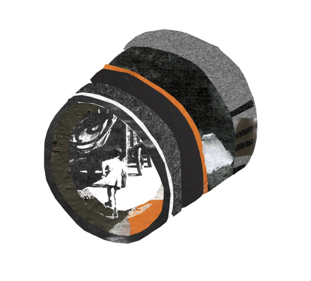
I began with the camera, an element I wanted to be the focal point. I included an image I had screen printed previously of a 1950’s young boy running away from something. I wanted the image to be captured in the lens of the camera and be a focal point as I feel like it represented being lost literally and from the technology angle.
I experimented with various textures and imagery to show the tonal values of the image, I edited the contrasts of most images to have more dramatic shadows/highlights.
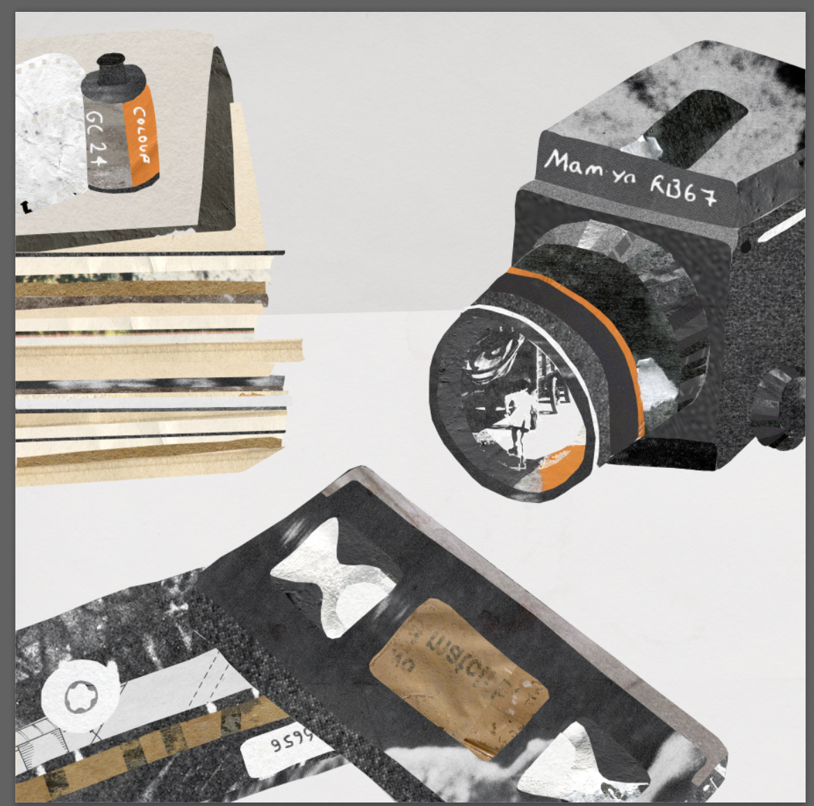
I added various layers and textures, including a background with the goal of adding more depth to the image as it appeared quite flat.
I quite liked this final outcome and felt like it conveyed the concept. Inspired by Joost Stokhost, Ziselberger and Urban for this assignment particularly I included various textures/images. I feel like this could of been reduced down to a few textures and images, with the rest being filled with block colours. This could perhaps allow there to be more of a focal point, as I feel that the initial aim of the camera lens being the focal point has been lost.
Looking back at this design perhaps more loose line work could be incorporated, including more abstract drawing around the individual images and to represent highlights/shadows. This paired with more block colouring may work better aesthetically.
I enjoyed this assignment and continuing to experiment with different methods and combinations of illustration styles. I will continue to text and aim to improve on this particular method.


