Illustration 1: Key Steps in Illustration- Assignment 3: A poster
To design an illustration for a poster for a music event. An Early Music concert, a Jazz evening or for a pop group. You can choose.
The finished poster will be reproduced at A3 size, but you can work at the size, in proportion, that you feel most comfortable with. You will need to provide your working drawings – the thumbnails and visuals – with the finished piece.
The poster will include the title of the event, the date, time, place and any other information you think appropriate. You can either include this on your artwork or indicate where it will be positioned.
Start by brainstorming and create a moodboard. Produce a range of alternative thumbnails in which you consider viewpoints and various arrangements of the content you have selected.
Choose the two compositions you like best and create two line visuals. Don’t get bogged down by detail that doesn’t help you to describe the main structure and content of the image. If you are including type are you confident that you have chosen the right typeface? If you are not including it indicate where it will go. Check that when added it will neither get lost or obliterate or compromise your composition.
Take the composition you think works best and create a colour visual. Use your mood board to help you to establish a colour range to work within. Be selective.
I reference Concepcion Studios often and again here the poster styles are great. I really like this minimal style with pops of colour, it is very affective and could be referenced for either genres of music listed in the brief.
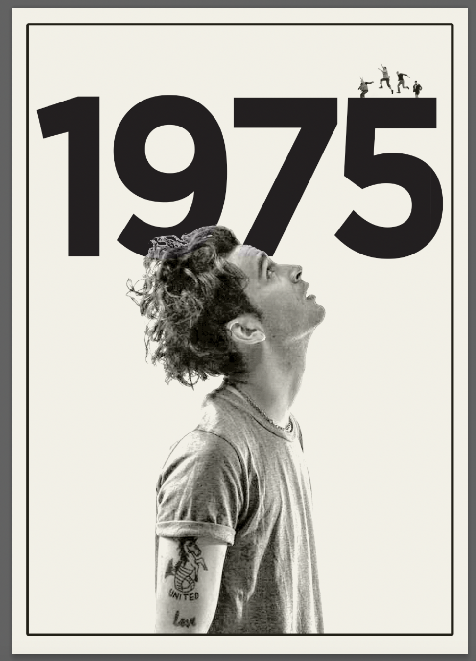
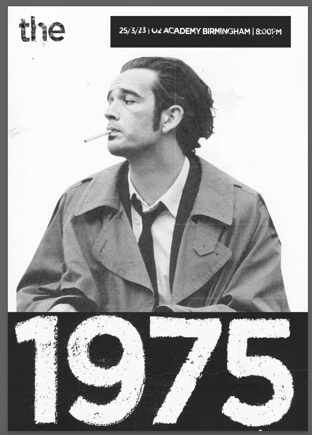
I jotted my initial ideas via a spider diagram and then continued with noting some thumbnails with composition ideas etc. I chose my initial 2 favourite layouts and tested in Photoshop with the ideas/compositions. I wanted to begin more simply and later experiment with more abstract/interesting ideas.
The poster needs to be eye catching enough to bring in an audience but also clear with the relevant information. I decided to use the typeface ‘Gotham’ in various ranges of boldness as it is modern, clear and could potentially be manipulated to create more interesting textures but remain legible.
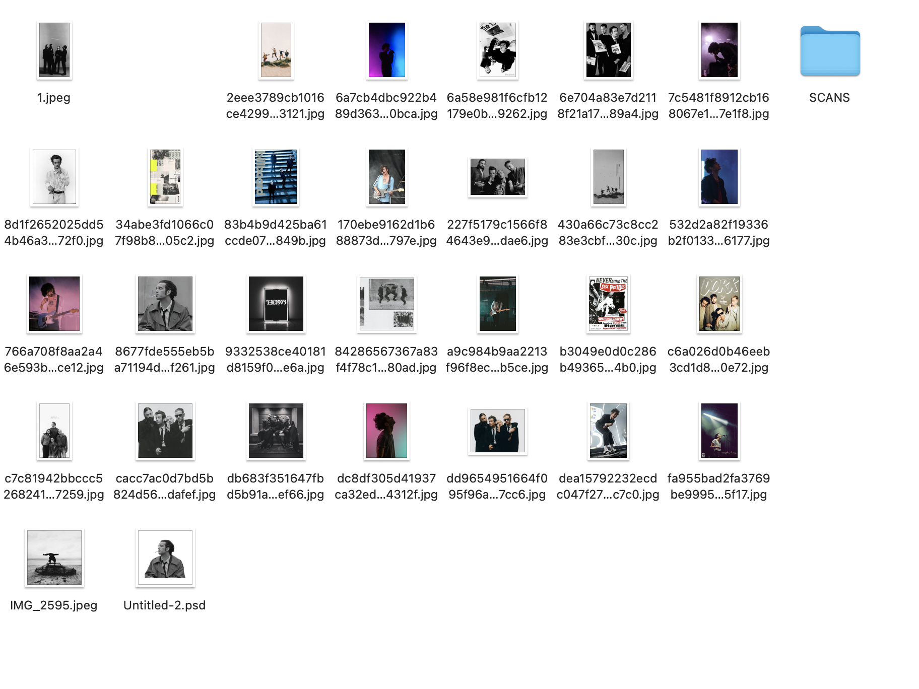
I collated various examples of posters from different eras exploring multiple styles of design before I decided which type of music to design for. I was immediately drawn towards the Jazz style as I love the design of the older style posters- a style which could still work today as an effective poster.
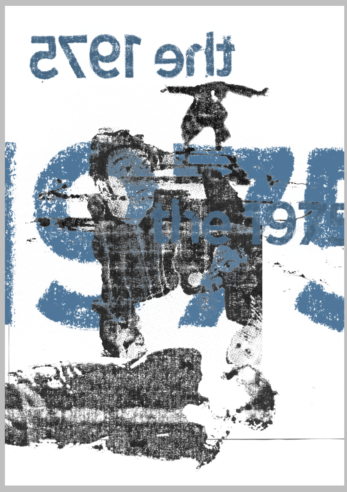
I collected various textures using paper, stained paper, cardboard and coloured paper. I also created a couple of layered paper textures. I then went onto editing images in Photoshop and using various printing methods to create various textures. I used an old inkjet printer and acetate to transfer print some images. I also used a xerox printer and re-printed multiple images/prints.
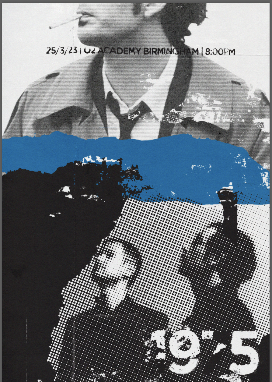
I went onto creating the next design, again layering imagery and textures, including the printed type faces. I included drawn elements over the image in a blue colour with an aim to add a more expressionist element to the simple composition.
After a few days I looked back at my designs and went over my research for further inspiration. I then experimented with a more abstract style poster, combining elements from Final 1 and 2.
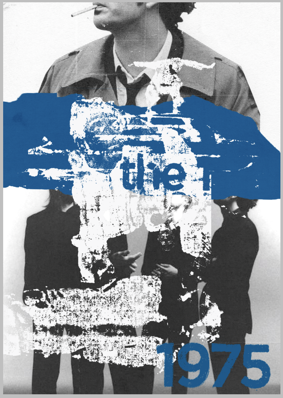
Looking back at my references- Concepcion Studios film posters for example, my final is less clear with the hierarchy of information. The date/where the event is taking place is at the top of the poster, having your eye drawn to it immediately, with the band name in the bottom right hand corner. I was initially thinking that as this is was an attempt at something more abstract, combining the typography with the design itself will be a good idea, and hoped that the slightly more ambiguous typeface would draw attention to it. Looking back I am unsure whether this is a positive or a negative result. A positive factor would be that the audience is aware of the appearance of band members from the illustrations and the ‘1975’ in the bottom right would confirm this and hopefully be enough to evoke excitement. The issue with this is that it may be unclear, especially from a distance.
I wanted to produce abstract/ripped poster style collage with different imagery and mark making that would present the poster/band/event in a way relating to the bands music.
Referring back to my thumbnails I created the composition planned and tested with different images. I chose a more ambiguous image which may or may not work as it doesn’t represent a band exactly. The target audience would know the band, so the ambiguity may still be functional. I tested with various colours, I leaned towards the blues as I feel it represents the band more accurately, I also liked the black and white versions. I used multiple layers and textures compiled along with my printed imagery and continued to experiment with what works/what doesn’t.
I continued to experiment with the print illustrations I had made by layering them with other images and type. I would then take that collage made and place it onto a new canvas with an aim to create multiple layers.
At each ‘stage’ of layering and experimenting I saved ones that I liked and created potential final ideas. I looked at all 3, one being in just black/white and chose the one which I believed to be most effective.
The blue colour I like and I feel it being in the middle of the page draws the viewers attention to the information above and below by creating a sort of divide. The downside to this is that it may look unbalanced and a random/unthoughtful addition to the poster. Looking back, perhaps smaller amounts of blue could be added to the top and bottom of the illustration, enough to draw the poster together and make it feel complete.
I initially aimed to add more drawing to produce my final image as suggested previously by my tutor, which I feel like I was closer to achieving with the markings around the imagery in final 2, but I focused more on the printing of images using various methods and image distortion. Moving forwards with the next section I will try and combine these methods alongside drawing.


