Illustration 1: Key Steps in Illustration- Assignment 5: Seven days
The exercises that you’ve completed in this part should have helped you identify the forces which shape a commission and the processes to go through to create an illustration ready for print. You should now be ready to work as an illustrator.
This assignment is an opportunity to consolidate the understanding you’ve gained so far, reflect on the work you’ve enjoyed, the successes you’ve had and the areas of illustration you feel most drawn to. It allows you to create certain parts of the brief yourself so that you have the maximum capacity to show off your interests and talents.
As you think about what you’re going to produce, keep on with your ongoing visual research by looking at examples of existing work or contexts. Above all, be open-minded and analytical and try several variations until you arrive at a brief which feels most interesting for you.
The Brief:
The title is Seven days.
These can be the seven days of the week or random days that tell a story. Your interpretation can be objective or subjective. You can produce seven separate, one large diagrammatic or a continuous strip illustration. You can decide on the media and methods you will use; the context – magazine, newspaper, book, brochure or poster; and the intended audience. You need to write yourself a brief that is clear and challenging but manageable.
Be aware of the processes which have so far led to your development in ideas generation, visual research, image construction, understanding contexts and media usage.
Make sure that you are clear what the final size should be, but you can work at any proportional size. Use worksheets and sketchbooks to explore solutions and refer to examples of work which solve similar types of problems. Think back to how you have treated similar briefs.
I felt as if the 7 sins/days of the week idea could be a good opportunity to experiment with various illustration methods and a magazine could be a good way to present this. I collated various works from different artists/designers I am interested in to use as inspiration.
This made me consider Rothko as inspiration. Rothko uses ‘simply’ colour and brush strokes to convey emotion. Rothko is one of the most known abstract expressionists and I really enjoy his work/will take inspiration from this for the 2nd side of my zine.
I collated various imagery/textures, referring and adding to my thumbnails.
I began to experiment with a collage style I had used before, but in a more linear way cutting from imagery and textures aiming to represent ‘Gluttony’.
For the next illustration I wanted to represent Lust, inspired by a photo from an old movie magazine of a couple sat on a bench. I combined various imagery and textures, focusing on a photo of a scorpion. I wanted to show how a relationship could be damaged by lust, having the sting of the tail of the scorpion going through the couple.
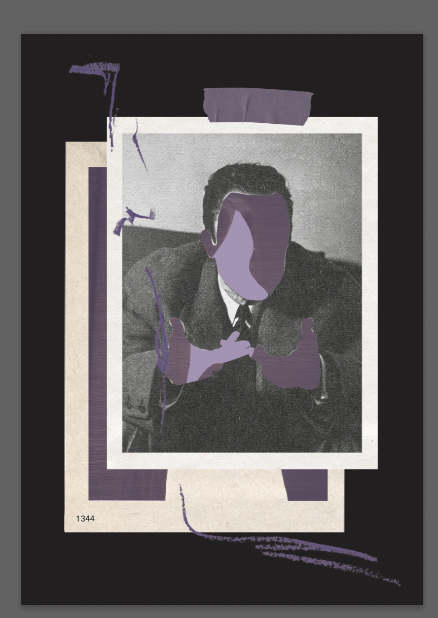
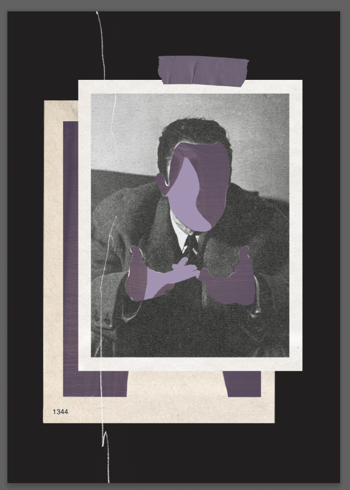
The illustration on the right represents ‘pride’. I tried to convey a selfish/narcissistic feeling using images of people in different positions/speaking/communicating layered on top of each other. I used purple as it is quite a regal colour, again trying to show a sense of grandiose.
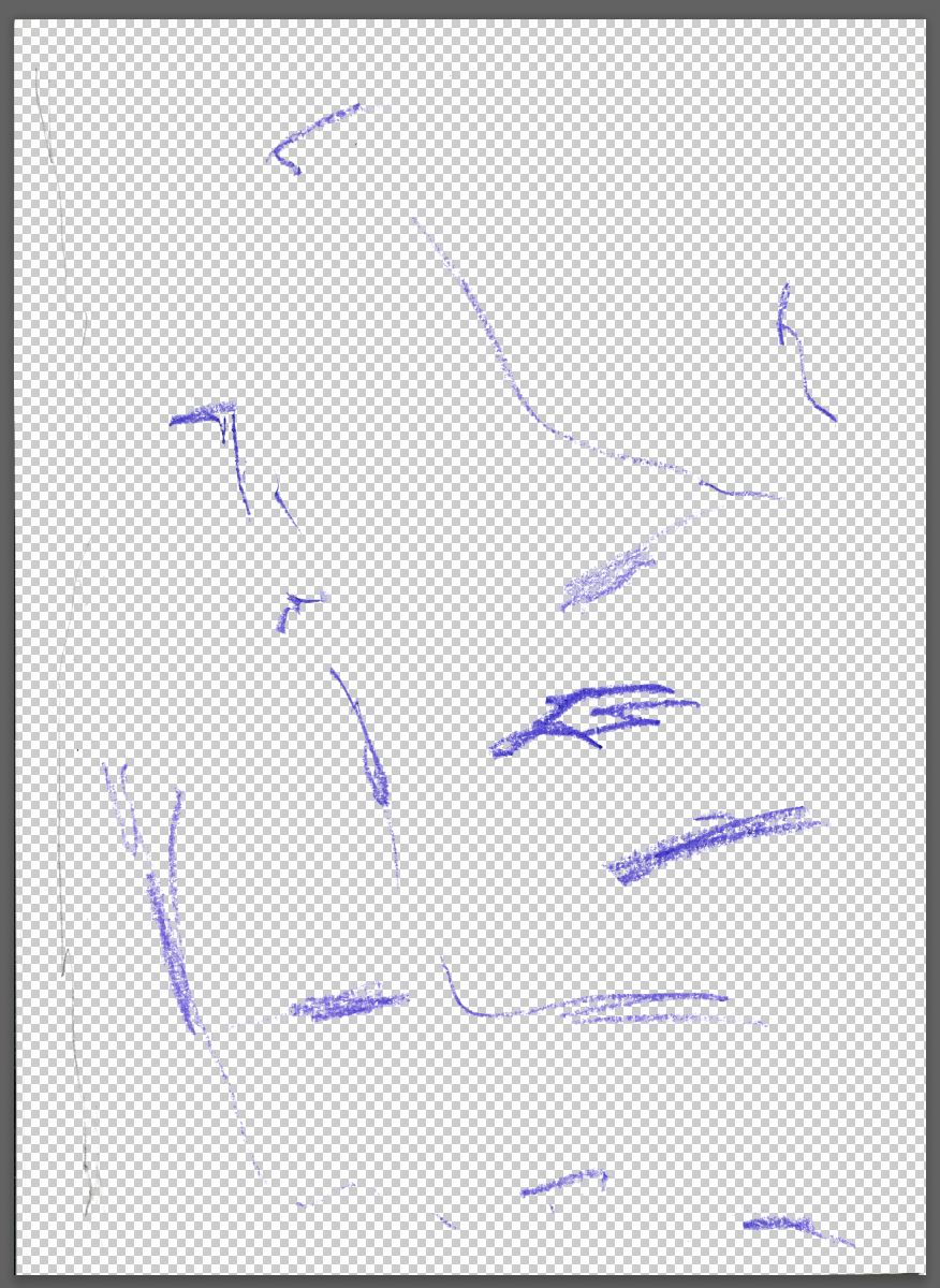
I went onto producing the 2nd page of the spread for each illustration. I decided to do this digitally using various textures and layers I had created previously using paints and cooked paper. I decided to do this digitally instead of physically painting so the colours were better matched and for the ease of editing texture to be cohesive with the illustrations.
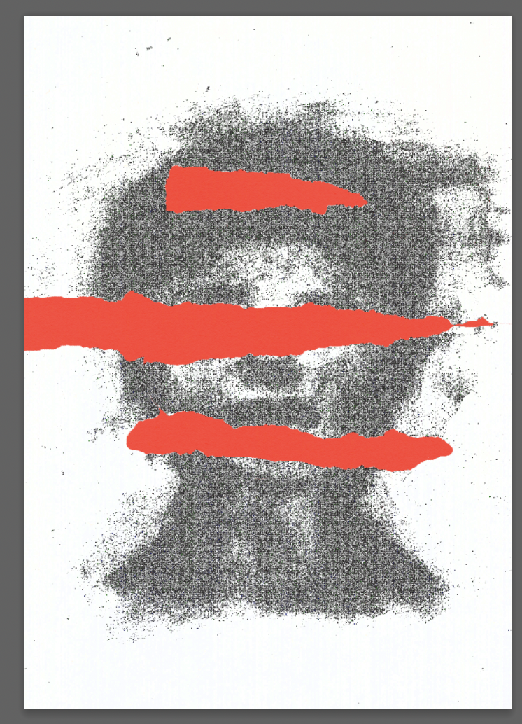
I continued to work on the layer behind the face for the Wrath illustration. I went with a textured dark red hue, matching the colour with the page next to it (double spread).
I began this assignment by making initial notes whilst reading the brief. I went onto noting further notes on the 3 main ideas that I felt could be interesting.
I looked into Lucasz Geida a deisgner I have mentioned previously who uses various printing methods and creates maagzines/books. His use of texture to convey emotion is something I would like to focus on.
I liked the idea in my initial notes for the concept for this assignment of there being 2 pages per day (a double spread) one with an illustration on, and the other an abstract painting/colour representative of the illustration.
I continued to make notes and rough thumbnails of my ideas. Here I focused on the 7 sins idea further, considering a single character moving through their week, or more representational illustrations.
I moved forwards with the more representational concept of the brief. I felt like this would give me the opportunity to experiment further with various illustration styles.
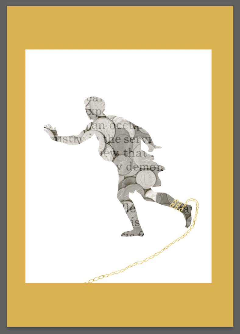
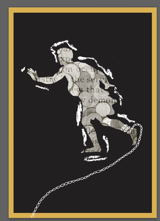
I wanted the above image to represent Greed. I used imagery from a painting by Nicolas Poussin, layering other found imagery and textures, including a hand drawn chain.
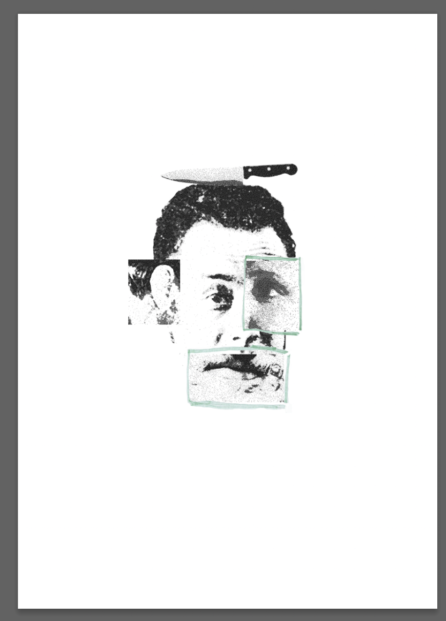
For the process on the left I wanted to represent envy, combining different parts of the face, from sculptures and various film screenshots. Previous feedback I had been given by my tutor mentioned printing methods for images. Here I experimented with this using acetone, printing the image using a xerox and re producing the type adding texture.
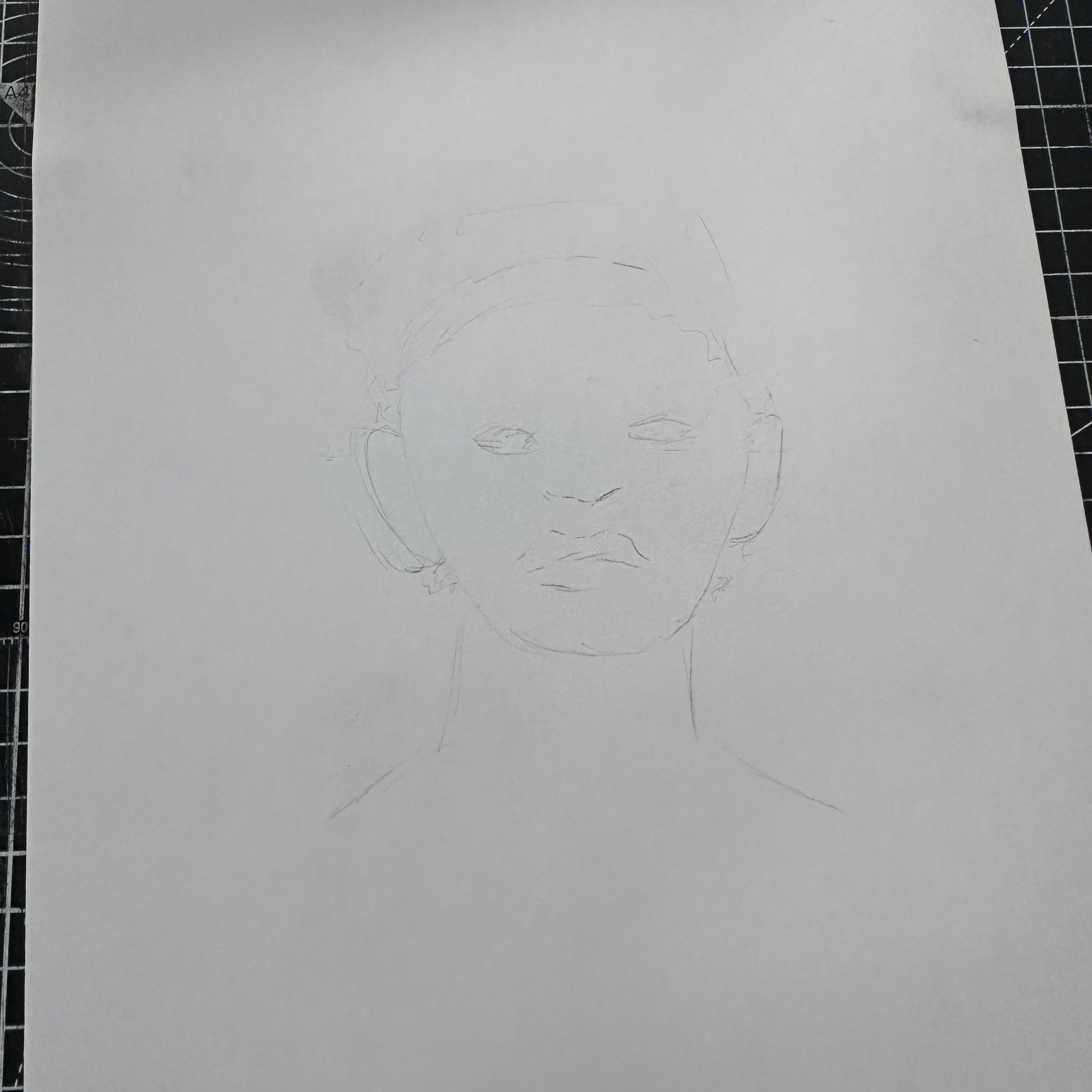
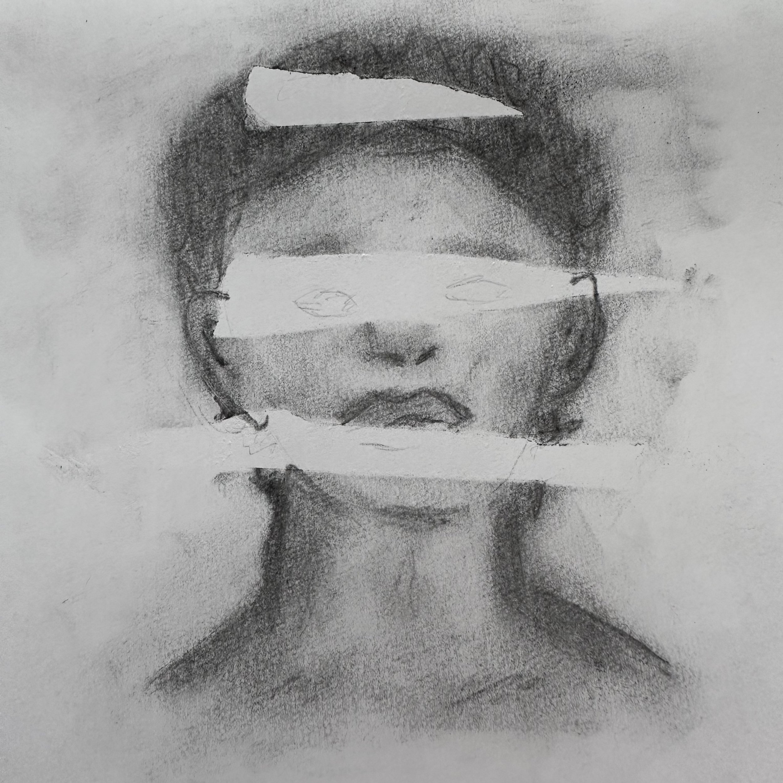
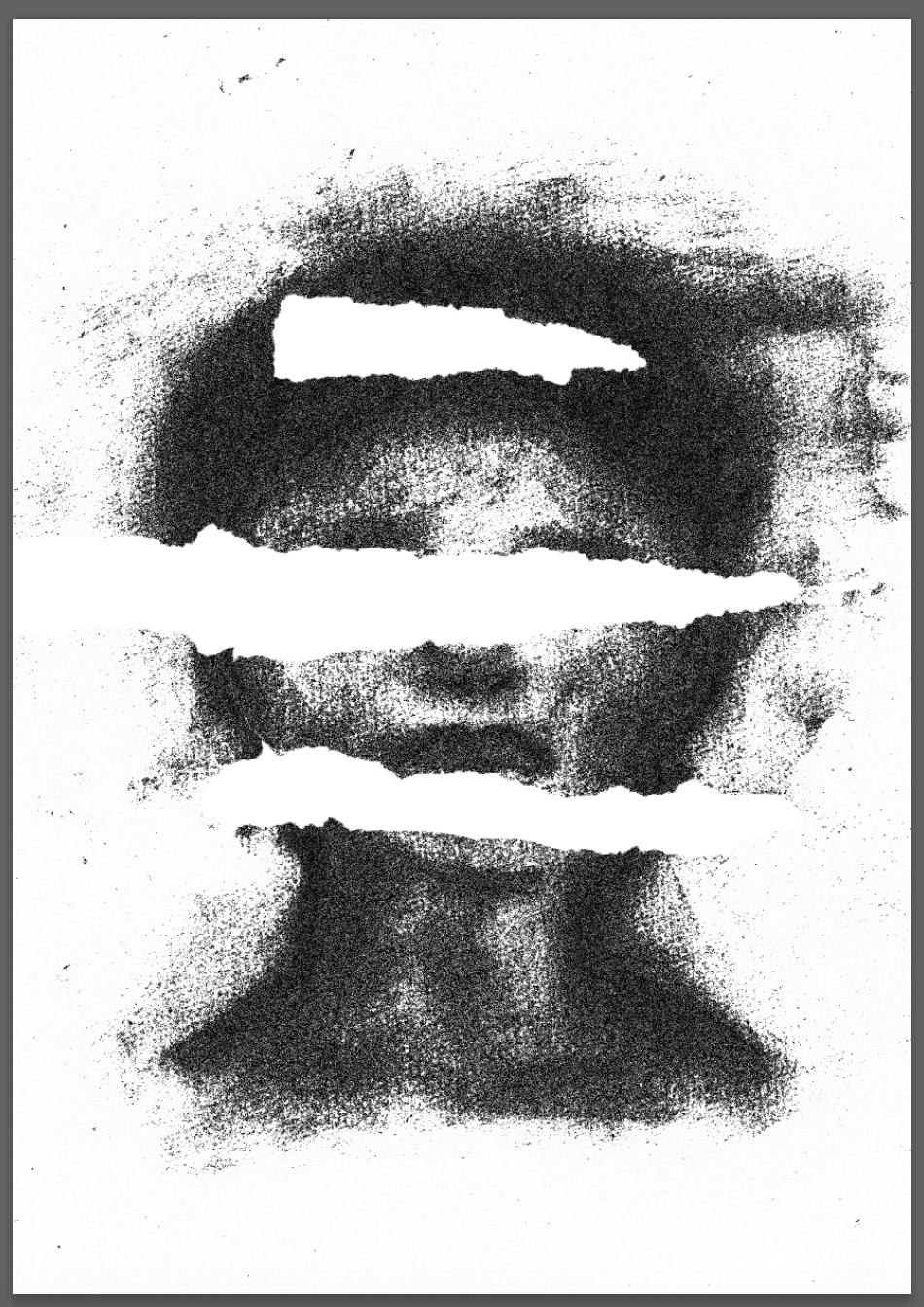
I aimed to show ‘wrath’ through a distorted portrait. I used charcoal to go over a sketch of a face, covering areas with masking tape. I removed the tape leaving the negative space, I planned to fill this with text as shown in my initial thumbnail.
I scanned in the image and used various layers/filters and re-productions to create a more digitised image.
Referring to my thumbnails I had a few ideas for Sloth and chose to combine 2 ideas/adding other elements for this illustration. The pose/style of the character was Egon Schiele inspired, aiming to show either laziness or an inability/motivation to get up and go.
I looked back over my designs whilst creating their layout throughout the book in correlation with the days of the week and which would work for each day. After looking at my designs I re-worked some of them. Beginning with the one for Gluttony.
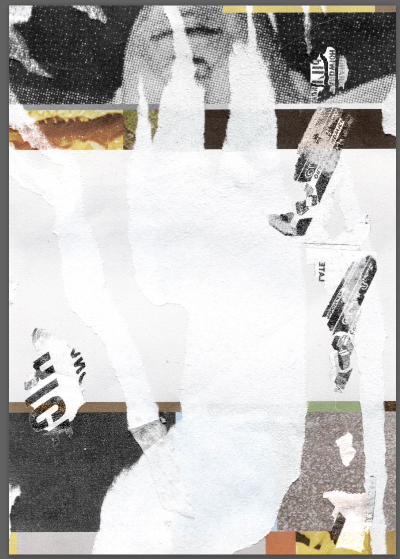
I printed out some advertisements from old magazines onto stickers. I then removed the stickers from pieces of paper using tape and scanned in the results. I added these layers in Photoshop blended with the rips on the page.
I printed my pages and experimented further with the layout.
For my final layout I arranged the double spreads with colours correlating to my designs. I tried to create a narrative between the pages, beginning with envy. The envy related to greed as the person was envious and wanted more. The greed went onto lust as they accrued more resources and neglected their partner. This moved to sloth as they have ruined their life. The next stage is pride as they still remain arrogant, looking back at the person they were with before (the silhouette behind the person in the illustration). The next is wrath, they are angry and out of control with their situation, the final being gluttony, a ‘resolution’ resulting in them consuming more, more food and indulging in all of the previous ‘sins’.
Some of my final works I felt worked with my concept but some, looking back appear as if they could’ve been taken further/experimented with more, such as the ‘wrath’ illustration. I like the colour over the drawn face but feel that the image could have more depth and texture. Greed I like the concept of the illustration but feel that this could be worked on further and experiment with different compositions.
An issue I had when printing was making sure the pages were all aligned. I mis-printed the ‘sloth’ illustration’s matching brown colour, but ended up quite liking the white box’s misprint as it brought the colours from the main illustration across. This made me feel as if the Rothko inspired block colours could of included even more of the colours from the illustration itself.


