Creative Book Design- Assignment 2: Form and Function
Design the book format and cover artwork for two different versions of Daniel Defoe’s classic 1719 novel Robinson Crusoe. The publishers, Viking Press, have decided to re-release this title as a new pocket edition for readers on the move that reflects the adventurous nature of the story within a contemporary setting. This paperback version should have a modern visual feel that can compete with new titles in the bookshop. They also want a deluxe edition for armchair readers and classic book collectors that references the historical nature of the story and its associations.
As a side project to accompany the re-release of Robinson Crusoe, Viking Press has also asked you to design a new book called Washed ashore: The ultimate guide to surviving on a desert island by Rik Bennett. This is a ‘how to’ guide that should reflect not only the practical advice it offers, but something of the adventure of being a castaway.
The scale, stock and binding of these publications are up to you. The pocket edition needs to celebrate the functionality of the book as a lightweight, transportable object, and to connect to the story’s travel or survival themes in a contemporary way. The deluxe edition can present the content in a larger, finer, more luxurious, considered or expanded way, that perhaps makes reference to the history of the book itself. Your designs need to be seen as part of a series across both versions, so think about how you adapt your designs to fit each format. The shipwreck guide needs to be seen as a separate genre, piggy-backing on the success of Robinson Crusoe. Develop visual ideas that can distinguish the survival guide from your Robinson Crusoe designs, while at the same time making some thematic connection between them.
I began by producing a loose plan/jotting down key points. I had never read Robinson Crusoe before so took this as an opportunity to do so. The book was excellent, it always amazes me how literature from so ‘early’ so eloquently presents internal narratives and questions everyone experiences/poses within their lives, even 300 years later. I marked pages where I felt inspired by the imagery or feelings evoked to refer back to. I am interested to attempt to incorporate the hero narrative/religious ideals/structure and struggles with juxtaposing feelings such as hope/nihilism within my cover. These themes will extend onto the ‘survival guide’ version but could possibly be less obvious due to it’s more contemporary, lighthearted format.
Mendelsund’s approach to design as looked at in exercise 3 was particularly inspiring. Moving into this Assignment I would like to try different ‘styles’ of working that all present the narrative of Robinson Crusoe in different ways.
I collected other visual inspiration by artists such as Jimmy Turrell and Carl Middleton. These artists both have a very tactile approach focusing on imagery through screen printing. Texture was important to remember for this task, as imagining the physical book when planning is something I have to do. I really liked Julia Hasting’s design approach, again looked at in exercise 3 in regards to how she plans the physical appearance of the book in synergy with the design.
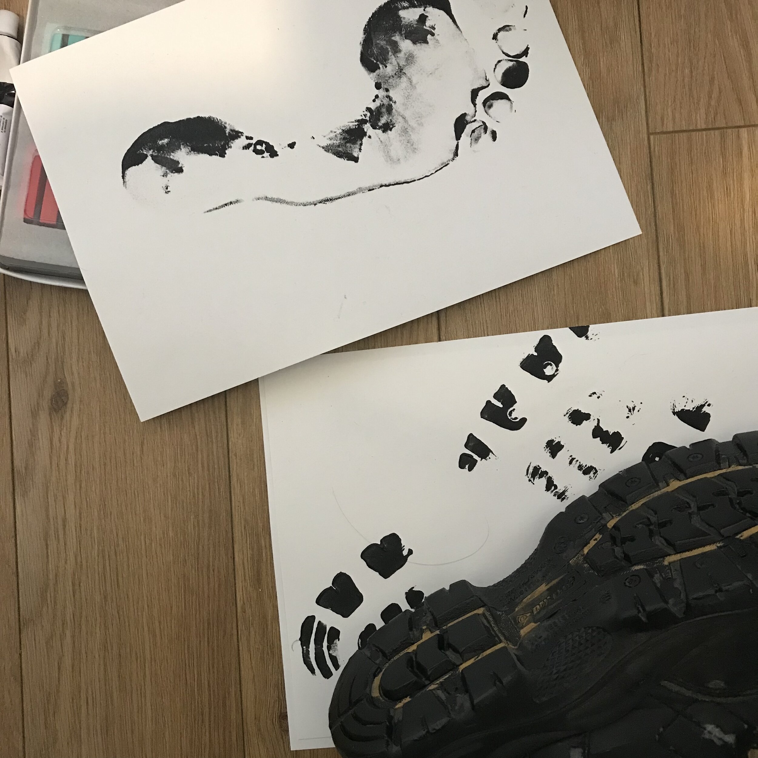
I began to sketch some further thumbnails whilst referring to my initial notes. I then went onto producing some abstractions focusing on colours I could potentially incorporate within my designs, especially for the more contemporary versions. I was inspired by a previous cover including the use of a foot print. I feel like this imagery greatly represents Crusoe and his journey in life/religion. It is a ‘bare footed in the desert’ biblical motif that represents Defoe in Crusoe. The use of 2 types of foot print- one from a bare foot and another from a shoe can be a link between the ‘Washed Ashore’ and classic version, showing more natural elements (bare foot) and more of a guide (boot print).
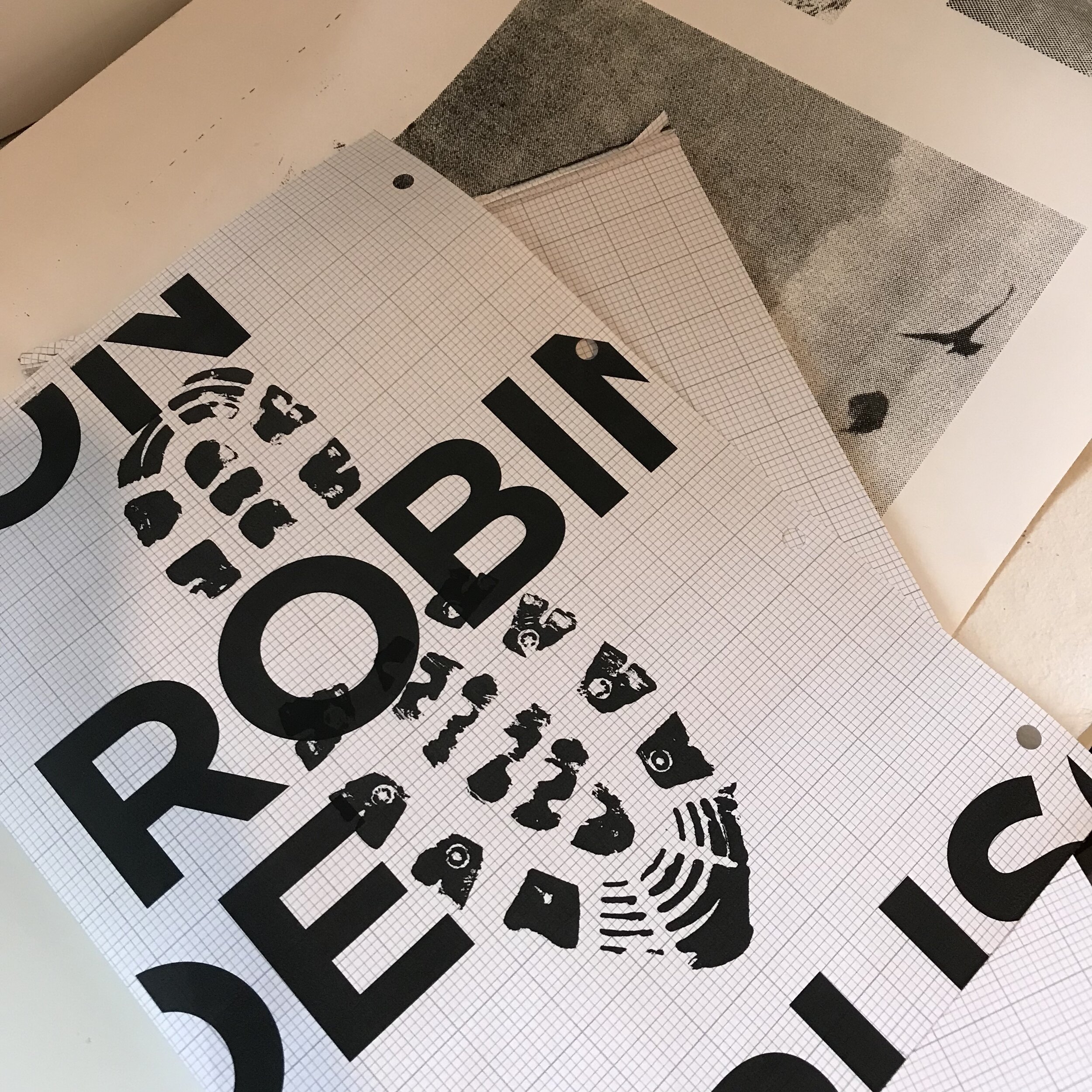
I found some imagery in an old nature magazine, printed it out in black and white, along with some typography/image tests and began to play with composition physically. I had the quote “On what account did you go to sea?” in mind which I feel represents Robinson Crusoe well. I decided on a blue colour in tissue paper to represent the sea, and hidden/ broken up elements of the book title to show how parts of Crusoe’s personality are hidden to begin with but become integrated within his personality throughout the narrative. I then took this into Photoshop and continued experimenting.
I came across a website called Masters Book Binding which presented some very interesting materials to think about when designing/ what would work and look best if the product were to be produced.
I began to test with different typefaces, keeping in mind the deluxe versions being more classic and the contemporary versions. I think I will distinguish between the two (Washed Ashore included) with Serif fonts being used for the classic versions and Sans Serif for the contemporary.
It was at this point in testing with compositions and imagery that I thought I should look into the physical appearance of the books and what materials/paper I would use, which could inform the way I proceed with designing.
It is quite hard to translate my ideas for the physical version of the deluxe and contemporary Crusoe covers into words. The deluxe version would have a leather spine which continued slightly onto the front and back covers. The main material would be the canvas material in white (as shown in ‘Textilepedia’ book in mood board above). The inner front and back of the cover would have a leather margin around the edge, with the canvas material again in the middle. The conceptual idea behind the leather and canvas materials is to show Crusoe (Defoe) and people in general stepping between comfort into the unknown, again thinking of the quote “On what account did you go to sea?”.
The contemporary versions would be made from a 200gsm paper with a matte finish.
I found a great Youtube tutorial which explained how to edit the board within Indesign in order to make it custom sized to your book cover.
After thinking about the potential physical attributes of the book, I moved away from my initial collage designs into something more simple, again inspired by Mendelsund’s simplicity approach discussed in Exercise 3. Considering the audience for Crusoe, it would generally be an older audience, but this was a brief for a more contemporary cover, which in turn has potential to attract a younger audience as well. I wanted to produce a design that would attract new eyes, but include obvious conceptual elements. I liked the idea Mendelsund had of not including certain information on front covers, which would work well for a contemporary cover. ‘Once the book is in their hand, it’s almost sold’.
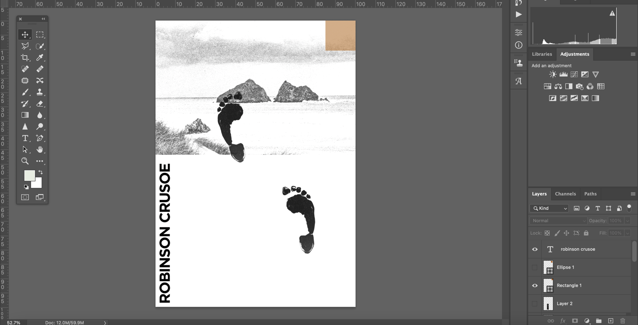
‘Crusoe’ is the obvious word that people would recognise, I wanted to include this part of the title, and tested with leaving it clear within the design, and with hiding it. I prefer the ‘hidden’ version conceptually. The bottom half of the design is empty, negative space with one foot step forwards, moving from comfort into the unknown. The unknown is also empty (of people as it is a personal journey) but full of new elements such as ‘Crusoe’ (being hidden and finding himself) and stepping towards ‘light’ or enlightenment (colour).
At this point I thought I should not think of the cover in silo to the rest of the book, so began designing the spine and front cover, then looking at the whole design together.
Final 1:
My final contemporary cover for ‘Robinson Crusoe’ is 14.5x20.8 cm (the size of the bible, inspired by Jan Tschichold’s The New Typography.
I wanted to capture the interesting themes explored by Defoe within this cover, focusing on a foot print inspired from a biblical quote “But craved intensely in the wilderness. And tempted God in the desert” -in this case a desert island. The island represents the journey of exploration and growth everyone experiences during their lives. Crusoe is Defoe’s embodiment of this. I aimed for the abstraction in the top left to be the ‘light’ whilst striving for enlightenment, and also to represent the colours of the island and the immediate troubles Crusoe faces, as well as their metaphorical meanings. ‘Crusoe’ text is hidden within the top half of the screen, whilst the foot steps move towards it, in search of who Crusoe/Defoe/we are.
I chose the Sans Serif typeface ‘Gotham’ for this cover. The fonts within Gotham are contemporary and clear. I wanted a clear hierarchy of information on the back cover, presenting the books title, the author in an italic version of Gotham and the text in a light version. I chose to continue the iconography of the foot print to break up space in between the text and as a visual link or ‘walk’ between them. The spine is quite simple, often being the first element seen from a book, I still feel that this could stand out. ‘Gotham’ is a bold font, paired with a plain white background it presents information clearly, allowing a potential buyer to see ‘Crusoe’ and potentially being draw in to take a closer look. I added the abstract element to the top of the spine instead of the authors name to represent striving towards a higher purpose. The markings at the top hopefully would add to potential reasons that a viewer may be intrigued by the cover.
I am unsure if the composition of this cover works visually. It began as a conceptual planned thumbnail but the end result came more intuitively and is more expressive. I feel as if I could’ve tested with more typefaces, imagery and definitely focused more upon the front, back cover and spine in terms of how they could function together in synergy instead of being separate elements. Perhaps the abstraction in the left could continue over the spine, and the ‘Crusoe’ text could continue onto the inside of the book cover.
For the remaining 3 covers I wanted to work on them all simultaneously in order to create a similar style to allow them to work together as a series, but still be separate styles of book.
I jotted down some further thumbnails, referring back to my original notes and inspiration. I went into Photoshop and started to play with some imagery and compositions similar to exercise 4 (‘light bulb’ style task).
I felt that for a more classic deluxe book cover that the use of a standard layout for the front text was best, so kept with this ‘template’ as I continued with designing. I used handmade textures and digital editing in an attempt to create a weathered look for the text.
I continued looking through old magazines for imagery, and came across an image in ‘The Human Figure’ by Erik A. Ruby. I felt that this image represented vulnerability and stepping into something new. The image also reminded me of Crusoe’s father explaining to him about staying comfortable in his ‘middle station’ before he went on a boat for the first time.
I continued to test using different imagery, referencing historical elements of Robinson Crusoe such as slavery. I intended to create a simple deluxe cover but felt that the imagery so far was too much of an obvious connection towards certain themes which disregarded other more prominent themes of Crusoe that I felt were more representative of the book as a whole such as, the striving for freedom and a journey within yourself.
Final 2:
I intended to keep within the same style as the contemporary cover but to create something more ‘classic’. By designing within the same style I feel as if my final design may be too contemporary looking as opposed to a book for collectors.
I feel as if the typography used works well, but is potentially incoherent with the more contemporary editing of the imagery.
I aimed to produce a cover that would reference the broad themes explored within Crusoe without being too explicit, focusing on Crusoe’s father talking to him before he leaves.
I found an early 1800s style boat image and paired this with a beach horizon. The boat itself represents Crusoe’s journey, ‘his’ and Defoe’s personal experience with slavery and the beach horizon itself being a goal to move towards/moving into the unknown. I fear that the use of a naked body may be taken comically instead of its intended purpose to represent vulnerability.
I decided to use the same blurred colour as within the contemporary cover, this time choosing blue to represent water (focusing on his father speaking to him before he began to explore on a boat) and that blue has connotations of isolation/sadness.
I came across an image I liked, which I thought could potentially be for the deluxe version. This showed the practical side of survival and the adventure. I also liked the narrative of people travelling uphill (self exploration linking to Crusoe). The lake in the background could relate to the search for water on a desert island.
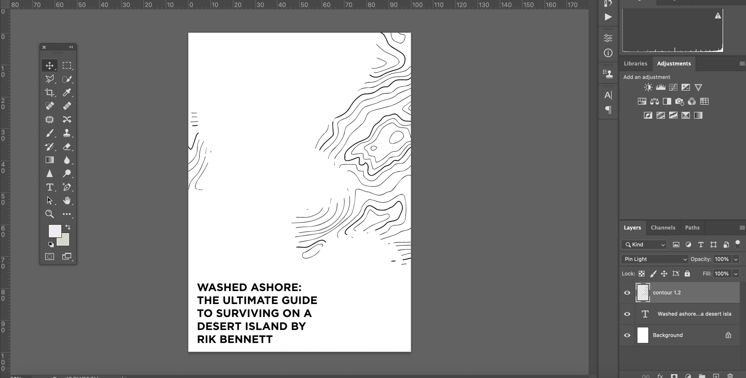
Again thinking about the deluxe cover I went back to the contour design and played with that. I used the shape of ‘Crusoe Island’ and tried various compositions with the typography to see if any were interesting.
For the next cover (contemporary washed ashore) I began to test with a contour map pattern/vector I initially intended to use for the Crusoe ‘deluxe’ books. I felt that this could be quite fitting to the practical side of the survival guide. I then went onto testing some collage styles and included a hand written title, which I also felt could add to the practical feel of the book.
I didn’t like the direction that this was going in initially, but the idea of a collage I felt could be a good way forwards. A collage could include the practical nature, adventure feel and the historical side to books. I continued looking through old nature magazines for other potential imagery.
I went onto looking at the contemporary cover, creating a collage including a person walking from the image tested with previously. I included 1455 broken up as a reference to the Gutenberg Bible and also to appear as a co-ordinate or a reference to show the practicalities of the book.
I went onto digitally editing the title of the book to make it appear weathered. I decided on a horizontal heading to represent the abnormal or ‘sideways’ situation of being stranded on a desert island. I feel that this works better for the contemporary version.
Final 3:
I aimed to continue the shapes throughout the cover, but I am unsure whether the abstract style works for a survival guide, or whether it takes away from the more informative, serious side of the book.
I kept the use of the same textures/colours as the Crusoe series in order for them to feel connected, but to show that this is a spin-off and not directly a part of the Crusoe books.
I chose to use 2 boot marks instead of the abstract line work for the final cover. The boots work to present adventure and practicalities of the book and also link to the Crusoe series (including a barefoot).
My choices of colours (orange and blue) were to show the heat/landscape of a desert (orange) and the search for water (small amounts of blue). The connotations of these colours also present adventure (orange) and isolation (blue).
Final 4:
I am unsure whether the collage style is affective for the style of book. I feel as if the colours could work, but again I am unsure whether a more ‘serious’ or standard approach would’ve been more effective.
Looking back at my designs from this assignment, I do feel as if I should’ve worked across them as one single ‘canvas’ and perhaps had elements travelling around the spine to the front, tying the designs together. This is something I will keep in mind with future book cover designs.
I would also like to add more physical elements, perhaps using screen-printing and/or lino printing to create more interesting textures dependant upon the subject of the future design.
For my deluxe final cover I decided to focus on the bird of prey imagery. To me it looks like a vulture which is fitting with the desert survival theme of the book. Vultures dead dead carcasses, which is quite sinister, but the imagery of them flying is quite adventurous and makes the cover seem more dynamic. The more simplistic ‘serious’ version is better for armchair readers.
Continuing on from the previous design, I included similar collage style elements. The large amount of negative space is to show isolation and how there would be danger near (the vultures).
I decided to use a blue line from the previous hand drawn title to underline the author. This was intended to balance the colours, but again show less blue (lack of water).


