Creative Book Design- Assignment 1: Your zine
Your first assignment asks you to create a small publication or fanzine based on your interest in books and their design. It allows you to introduce yourself, and your interests in book design, so that your tutor can get to know you and your work better.
Your fanzine can be digitally printed, photocopied or handmade. Aim to design a sixteen-page simple folded and stapled A5 fanzine, though you can add more pages, or change the scale, if you want to. You can use any medium or materials to generate your artwork and make your publication. You may want to work much larger and reduce your artwork for the fanzine. While visually it doesn’t have to look like a punk fanzine, try and embrace the lo-fi ‘cut and paste’ attitude, so you’re making the work relatively quickly and not too preciously. Be creative with this task both in terms of the content and how you choose to present it, this could extend to challenging some of the assumptions about what a fanzine should look like, or how it’s made.
As a guide, your fanzine should contain the following elements:
● Introduce yourself - say something about your relationship with books. Why are they important to you? Communicate this through writing and images.
● Your creative process - how do you like to work creatively, what sort of process do you follow to research and generate ideas, and what are your preferred mediums to work in. Say something about you as a creative practitioner and your approach. Show your approach to book design through your design decisions and the hands-on sense of immediacy and energy that is an attribute of fanzine design.
● Looking at books - present the most interesting books you’ve looked at, or those you find influential as a reader, designer or both? Present a selection of books, or focus on one particular example to present in more depth. Think about how you can present these books, and your reflections, in visually engaging ways.
● Global influences - which books with a wide reaching scientific, artistic, historical, political, geographic, fictional, poetic, religious or other impact have you chosen. Present them along with a brief rationale as to why, or how these books have affected you personally. Again, can your designs echo the ideas in these books in anyway?
● The future of the book - where do you see the book heading? Show and tell. Try and summarise your thinking into a series of short statements, quotations, images or ideas. Be creative in how you approach this.
● How can you creatively respond to one or more of following book related sayings - Bookworms, A closed/open book, The oldest trick in the book, You can’t judge a book by its cover, In someone’s good/bad books, or, by the book. Use your fanzine to present your ideas. Can any of your images, text or ideas also feed into your cover designs?
Expanding on a previous test from an earlier exercise with the word ‘typography’ I looked back at my mind maps and produced a response to ‘The oldest trick in the book’.
I chose the word ‘deception’ to represent the phrase. To deceive is to convince someone that something is true, when it is false. This represents an issue of people lying/tricking/deceiving etc that humans have contended with throughout history, making it an example of ‘the oldest trick’.
I wanted the paper to have a distressed and worn look as if it is old, representing time and history. I wanted to be less particular with producing this collage so once I had stuck an element down, it was not moved.
I went onto editing the collage digitally, to compare with other designs to create a coherent design style throughout the zine, particularly inspired by my earlier research of Mark perry’s ‘Sniffin Glue’, David Carson’s collages and Chris Ashworth’s typography/work with Ray Gun magazine.
David Carson collages mood board, referenced when creating this design
I looked back to Exercise 7 and noted 4 of my designs to develop that could work within my final zine.
I noted further ideas that linked to the guide of which elements to include within my zine to expand on. I wanted to create a lo-fi tactile, black and white zine printed on standard office paper as tested with in the previous task. My designs so far also haven’t been as ‘cut and paste’ and I would like them to be, so moving forwards I will create further designs being less particular.
My designs so far weren’t very coherent, when placing them into Indesign to view potential layouts it revealed that I had to focus more on the composition of the work and layouts within the zine.
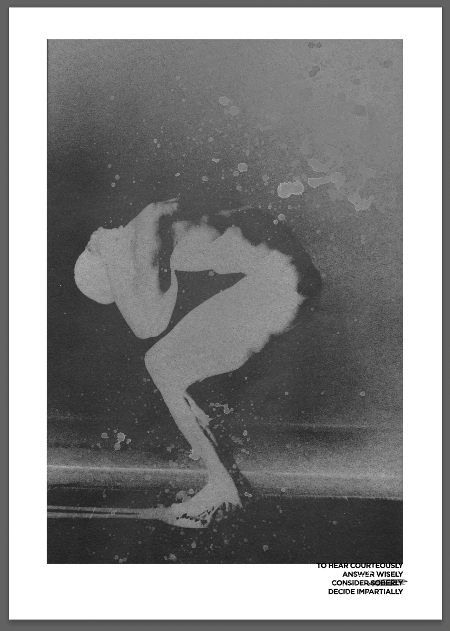
I wanted to expand on this idea created during exercise 5 in response to the statement ‘You can’t judge a book by it’s cover.’ I chose a quote from Socrates (as cliche as it is) which describes the ideal judge. I liked this quote paired with digitally edited imagery by Robert Farber. The image to me shows an internal feeling of sadness or anxiety, which people may not see when ‘judging the cover’ of someone, or not seeing past a ‘brave face’. The quote exaggerates how you should judge people and not make any assumptions. I used various layers of textures I had created by flicking coffee over paper, and dust collected onto acetate. The ‘splatter’ affect represents tears, pain (blood) and the ‘inverted’ look shows the relationship between inside and outside feelings, again relating to how someones judged.
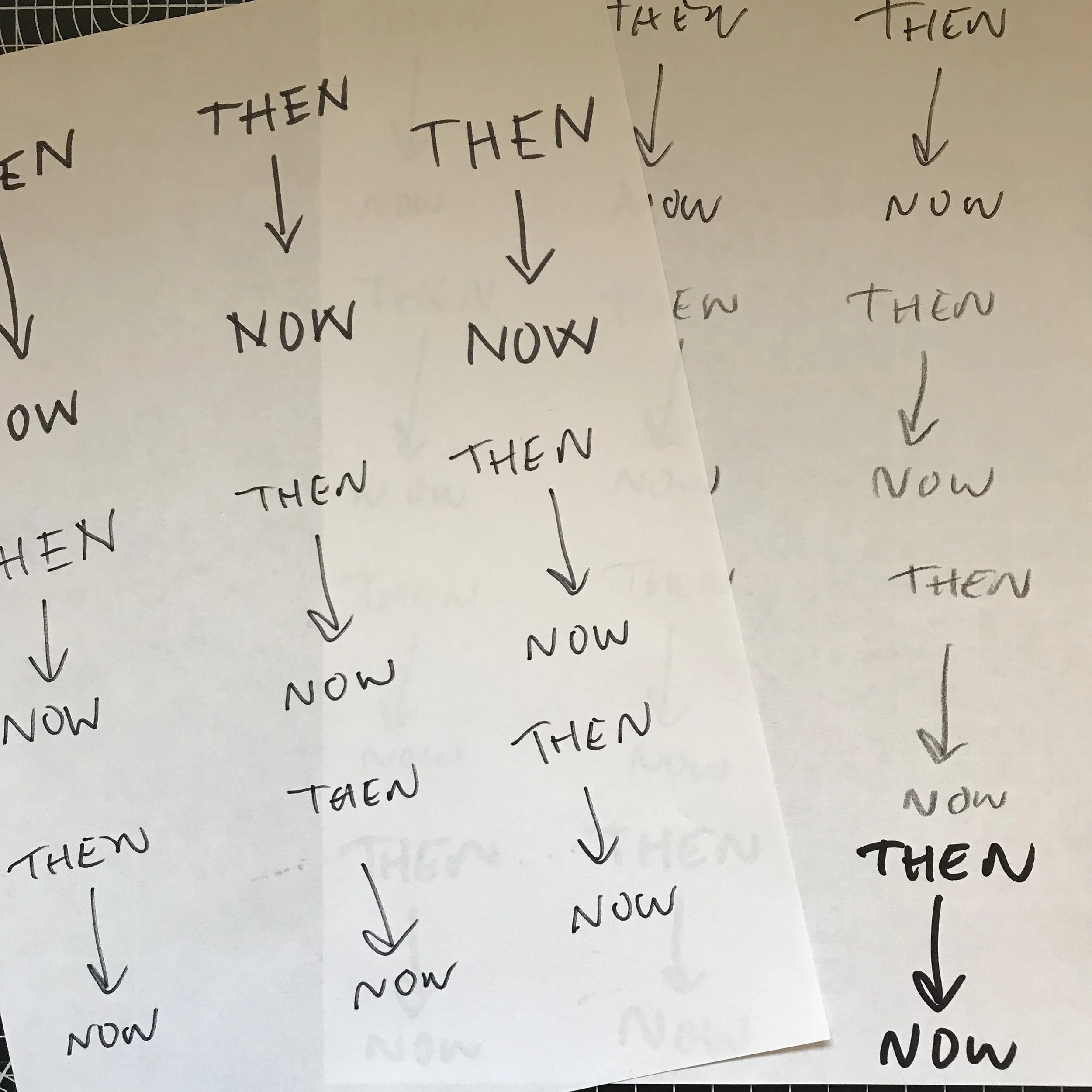
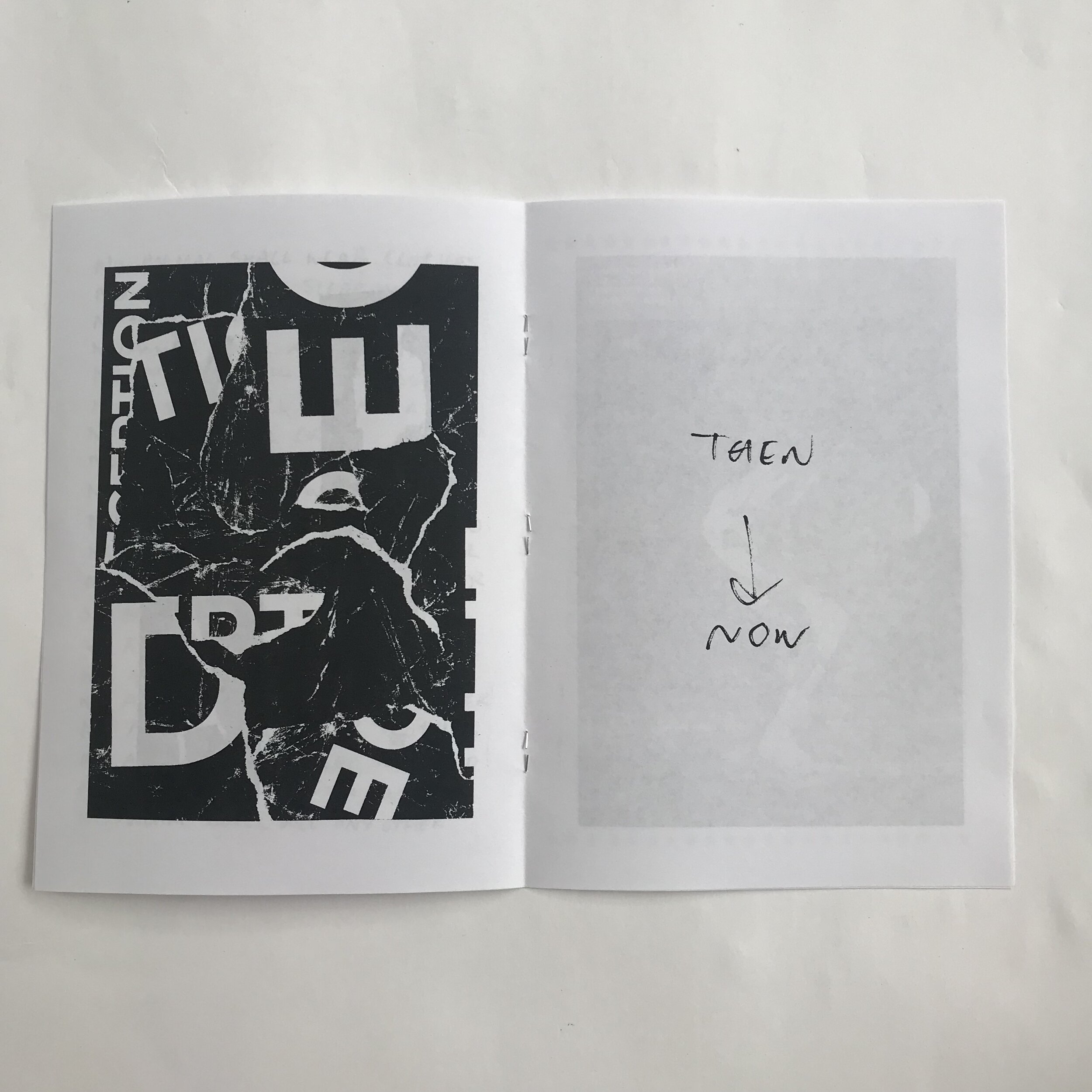
Stephen Hawking mentions the importance of simplicity, calling it ‘the mark of genius.’ This made me want to produce a response that encapsulates ‘A brief history of time’ in the most simple way. ‘Then - now’ was drawn using a fine tipped felt pen that was running out of ink. The broken up lines this produced represented time, the then being ‘history’ and now being present. The lack of words or explanation makes it ‘brief'.
When looking at the layout in Indesign during exercise 7 it made me notice that the pages seemed too ‘full’ when next to each other.
This gave me the idea of including some extracts from some books that are important to me, including a. lot of negative space. This also adds to my ‘cut and paste’ narrative, taking extracts from books and ‘pasting’ them into my zine. I didn’t want to reproduce cliche quotes being hand written etc, so I thought which would be the best suited to being hand written.
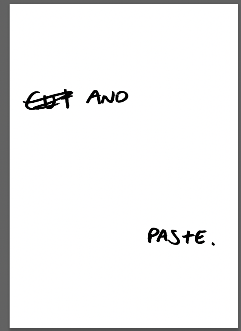
The quote from Alexander Mcqueen (an English designer, founder of ‘Alexander Mcqueen’ and the creative director at Givenchy from 1996-2001) also suited to be hand written. My handwriting isn’t exactly conventionally aesthetically pleasing, making it perfect for this quote. When thinking of page layout I will consider a suitable design for it to be paired with on the opposite page, one showing unconventional beauty.
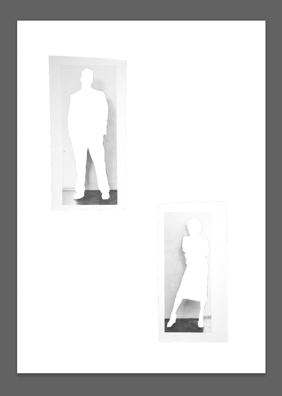
I used the images of Jay Jopling and San taylor to represent (although not obvious with their heads covered) the ‘establishment’ (White cube) and the people (Sam Taylor). Despite the fact that I like both of the people in reality and don’t think that this is true, I still like the use of them for this design.
When cutting out the collage the negative space left was quite interesting, and would pair nicely on the opposite page to the original design. The ‘empty’ centre leaves a ‘shell’ of a person, a result of being oppressed.
George Orwell’s ‘Animal Farm’ as mentioned in the first exercise was and is a significant book to me.
I came across an image of Jay Jopling (founder of White Cube) and Sam Taylor (photographer) which inspired the idea for animal heads. I chose a dead pig head to represent the ideologies behind Orwell’s animal farm. I chose a rabbit head (despite it not being a character in animal farm) because of Sam Taylor’s photography work, she has a known photo of her holding a rabbit:
I wanted this design to be ‘cut and paste’ and therefore didn’t want to spend too much time changing compositions and the design despite it’s flaws. The pigs head is too large, and I would’ve liked to try different compositions, but decided to stay with the original for the sake of it feeling tactile and ‘effortless’ even if it doesn’t appear this way.
I would prefer the final outcome of this to fill the page, but due to my limited (self limited) resources of printing, it cannot fill the page as it needs bleed lines that will be too large for my printer.
I went onto editing the collage from my previous task in response to ‘the future of books’ with the intention of having these designs on opposite pages.
In exercise 3 I produced a collage in response to the future of books. Here I wanted to create a response in it’s simplest form. I wanted to show the digitisation of books, and the distraction young people have by social media, resulting in people potentially reading less. I wanted the distorted face of a young person to show their confusion, and the fusion of digital media to our lives, by almost being a part of the body.
I created this by scanning in an image and moving it across the scanner until I achieved the desired affect, I have included some of my attempts at trying to achieve the final look. I went onto editing this, giving it a high threshold look, fitting with the design of the zine.
Although the editing makes this collage look very different from how it initially did, I like the more abstract appearance of it. I will see how this looks next to each other when deciding the order of pages later.
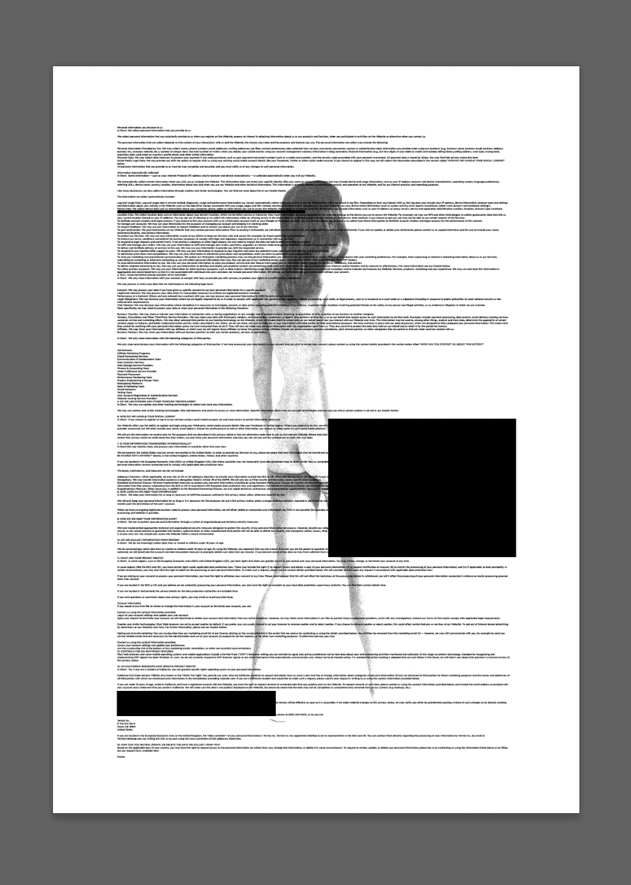
Inspired by the quote from ‘The Bell Jar’: “I felt my lungs inflate with the onrush of scenery air, mountains, trees, people. I thought, "This is what it is to be happy”. I wanted to produce a response to this and the future of books.
KT Kobel’s ‘Evidence Paintings’ and other work
I liked the use of black areas to cover up areas in Kobel’s ‘Evidence Paintings’ and thought that this was a good metaphor for not noticing or caring for books anymore in a digitised world.
The quote from the book shows how being in nature is how we as humans are meant to be, and in a modern day context the digital world isn’t helpful for our health/ mental health. I chose an image from Farber’s photography book again, of a naked woman walking (in nature.) I layered copy of terms and conditions from a random website to represent the digital/modern world, and included black boxes placed ‘randomly’ over the top alluding to distraction or a detached feeling.
Again with this final design I wanted it to feel ‘cut and paste’ and random, therefore didn’t change the composition much from my original idea.
“How could the nature of man ever reach it’s full potential without challenge and danger” is a quote from Jordan Peterson’s ‘12 Rules for life.’ I wanted to pair this quote with imagery that fitted the context across the 2 pages.
I chose an image from a 70s movie magazine of a boy walking, and then running towards a ‘car'. I ripped the end of the 2nd image apart to add ‘danger’ and show a barrier between ‘reaching full potential.’
I included the word ‘run’ to show moving quickly into challenge or danger.
I took an image of a scalpel to represent ‘danger’ and also relate to the cutting of the image, and the ‘cut and paste’ tactile narrative of the zine. I am unsure whether to include the quote itself or just the imagery in the final zine, it will be dependant on the layouts of the other pages and what works best together.
I went along the same lines of showing ‘evil’ and ‘temptations’ as I did with the ‘Cain and Abel’ design. I wanted it to follow the quite dark/ tactile feel of the zine. I took some images of 7 beer bottles (7 sins) and was planning to screen print them (which I did eventually) but I ended up using an inverted edited version of the image. This was to show 2 sides ‘Dr Jekyll and Mr Hyde’.
I arranged the images into a layout that presented the narrative of the zine, and the individual narratives in a way I was happy with. Finally I needed to create the front cover. I left this until last because I was unsure with how the final outcome would look and wanted the title to be representative of what’s inside.
“All human beings, as we meet them, are committed out of good and evil: And Edward Hyde, aline in the ranks of mankind was pure evil” This quote is from “Strange Case of Dr Jekyll and Mr Hyde” I wanted to produce a design that would include a lot of negative space to be next to the ‘Cain and Abel’ design (which was in response to ‘oldest trick in the book’).
Final Zine:
I am relatively happy with my outcome. After working out how to align the images in Indesign with a border that allows the images to fit centralised away from the fold line, I printed my zine. Viewing it finally physically was interesting, it allowed me to notice flaws and elements that I would change.
The paper used was standard printing paper, which I thought was best after my initial tests. Something I didn’t originally notice was the fact that in bright light the large black spots on the designs are visible through the back on the paper. This makes the zine look unprofessional and unfinished. If I were to print it again, I would test with a wider range of paper, or perhaps get it printed on photographic paper.
The 2 collages on photo 9, haven’t printed as well as I had hoped. The contrast isn’t as smooth as presented in Photoshop, and is more dramatic once printed. The sizing of the designs are the same and it makes it less visually interesting/dynamic.
Some of the more intricate/small elements of the designs are less obvious and haven’t printed very well. This is presented in photo 4, the textures of the background in the design on the left page aren’t visible, and the writing on the right design is almost illegible.
I have learnt a lot about book making/designing a magazine throughout this Assignment. The functionality/composition must be addressed initially before beginning designing. The context and style of the designs also must be decided prior to creating the content, this is something I realised especially once I had viewed the work I had completed so far in exercise 7. I have enjoyed producing this zine and am looking forward to continuing with the next section.


