Core Concepts- Assignment 5: Your Choice
Brief 2: Promotional design:
A youth theatre club is performing a production of Abigail’s Party. Mike Leigh’s tale of suburban taste is set in the 1970s and explores middle class aspirations and preoccupations.
You will need to acquaint yourself with the play if you don’t know it already, as they are particularly keen for it to have a 70s feel. The play will be touring local theatres for a month, performing every Friday night and Saturday matinee.
Produce a poster (A3 portrait), a flyer (A5 landscape, double-sided) and newspaper advert (A6) to promote this event. In addition they would like their A5 programme cover to continue the design theme.
For the purposes of this brief you need to invent dates, times, places, names and any other information you think will be required. Use Lorun ipsum text for areas of body text.
I looked forward to researching and testing various designs for a poster, flyer, newspaper advert and programme cover. I began by researching ‘Abigail’s Party’ as I wasn’t familiar with it.
My initial research consisted of looking through various images of 70s film posters and adverts to gain some inspiration. I also looked through some magazines/books I had from the 70s-80s to be inspired by some typography, imagery and layouts.
I looked through my growing collection of old magazines. I specifically looked through ones from the late 60’s and 70’s. I collected any interesting imagery, typography and colours with the brief in mind.
I began to test with fonts, scanning in and using the font finder ‘What the font’ to identify some collected typefaces from old magazines. I compared these to some fonts I thought could work that I was aware of already such as Georgia and Didot. I continued with a font called ‘ITC Cheltenham Standard’ this is a serif font and gave a 70’s feel. The font is easily legible and bold, which is great to be eye catching across the various design formats.
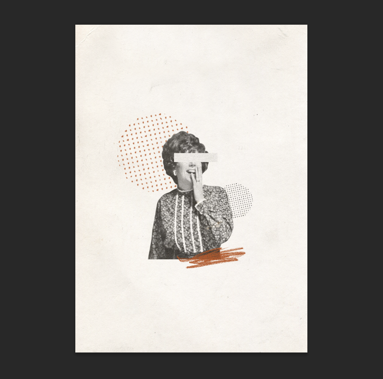
This style of illustration is something I wanted to work with. It is a good chance to try something experimental, especially as the brief says it’s for a youth club (hence the youth- like markings.) I wanted to present the more abstract themes of the play and hint at things changing for the worst (using an energetic colour like orange.) The expression on the woman’s face is perfect, it shows the comedy side, and also looks inquisitive, which I would hop the viewer of the poster would be.
‘The terrain is "the London side of Essex", "theoretical Romford" according to Leigh.[6] Beverly Moss invites her new neighbours, Angela and Tony, who moved into the road just two weeks ago, over for drinks. She has also invited her neighbour Susan (Sue), divorced for three years, whose fifteen-year-old daughter Abigail is holding a party at home. Beverly's husband Laurence comes home late from work, just before the guests arrive. The gathering starts off in a stiff, insensitive, British middle-class way as the virtual strangers tentatively gather, until Beverly and Laurence start sniping at each other. As Beverly serves more drinks and the alcohol takes effect, Beverly flirts more and more overtly with Tony, as Laurence sits impotently by. After a tirade when Beverly insists on showing off her kitsch print Wings of Love, Laurence suffers a fatal heart attack.’-Wikipedia
As I was working I watched/listened to a theatre performance of Abigail’s Party to gain some more inspiration. The colouring used was interesting, very 70’s with a lot of brown and beige, and an orange dress which stands out.
I jotted rough ideas and any important notes from the brief to refer back too, I then continued with the information and listed a hierarchy of information I could refer to for consistency across my designs. For more visual inspiration I referred constantly to my digital collection of works by artists, designers, fashion designers and random images.
I wanted to create an illustration that I could use and manipulate across the designs. The main colours I wanted to use were beige, brown, greyscale and orange. The orange was inspired by the theatre video I saw and encapsulates the 70’s style. I came across a local theatre group to me called Rabble Youth, I decided to use this as the main theatre group. I continued to test with the illustration pairing it with some text and different handmade and digital markings.
Poster A3 Final:
I am quite pleased with the outcome of the poster, I feel that it could be affective for the youth theatre club. The information chosen to be included on here was inspired by Occam’s razor, being simple as possible, but still affective. Looking back I could have included ‘more information here’ or a phrase such as this near the website to push people towards visiting it to find out more.
For the double sided flyer I was unsure of what information to provide, and where. Should I separate the information evenly? Should I have a front and back illustration?
I created some handmade elements for the front of the flyer. I wanted to incorporate a bit of fun as ‘Abigail’s Party’ is and to show the fact it is a youth club.
Double Sided Flyer A5 Final:
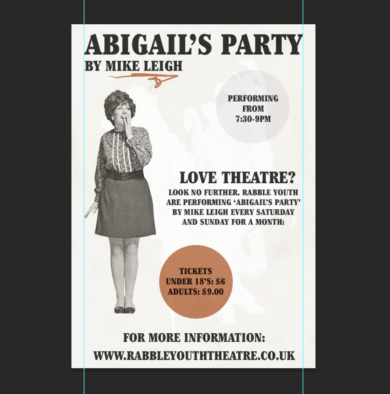
I decided to keep the main information on the back and have the front as the main visual. The visual I feel is interesting enough so a viewer would turn over and read the back or at least glance at it, which depending on how the flyers were distributed is important.
The hierarchy of information here was important. I wanted the viewer to read the information top to bottom, so made the title font larger and broke up the information with 2 circles including the price and start times, this also helps be consistent with the front of the design. Looking back I feel as if I could have done more with the typography used. Perhaps rather than just a paper texture I could have distressed is slightly or made it feel more of a part of the background. I am also now unsure how affective the handmade typography of the front is, and whether depending on the audience it may be confusing or off putting.
For the newspaper advert, the information had to be simpler and draw in the audience, preventing them from skipping through quickly. I started with a different composed illustration from the other designs, but overall composition similar to the flyer. I decided to include less handmade elements as these may be hard to reproduce as quickly as a newspaper is, which could result in loss of detail. The website and information on this advert is a larger point size, so it is easily legible and to allow for readers who have visual impairments.
Newspaper Advert A6 Final:
Looking at the mock up I am unsure of how affective my final design would be as a newspaper advert. It is designed to look 70’s style, but I am unsure whether this would attract viewers or if it’s more abstract appearance would cause them to be uninterested.
The larger font size is to make legibility as easy as possible, and there are less handmade elements so it is easier to print in mass.
Programme Cover A5 Final:
The programme is my favourite of the designs. I wanted to keep it simple as the people who will receive the programme already know what they are there to see, and it is a sort of memento. The quote is from the play and applies to the person in the context of the theatre, and the broader context it is said in.
Overall I am quite pleased with this task, it was enjoyable and good to try something different. I hope to continue to improve my design skills and be more affective at applying certain techniques for certain clients. Looking back there is a lot that I would change, I would definitely test more with illustrations, but my time limit was important to stick to for this task.
I feel as if I should of tested with some distressing or textures on the text as it feels less a part of the design, it stands out in an unprofessional way and makes the design look less ‘clean.’


