Creative Book Design- Assignment 3: My Little Book of...
Book 1: My Little Book of…Good Typography
Using the reference material that you’ve gathered throughout the exercises and research tasks in Part Three, design a book which explores traditional ‘good practice’ in typography. What is readability and, as a designer, how can you aid it? Visually explain the typographic principles that we’ve touched on in Part Three, such as type size, leading and line length. For example, you could demonstrate kerning by creating a page which looks at letter combinations applying this principle. Equally, explore good layouts and use of grids to help support and frame your typography. This is an opportunity to develop carefully considered design layouts that feel easy and engaging to read, and look at. Be creative in how you do this, developing a range of options and possibilities. Show off your good typography skills as well as talking about what makes good typography in your text. To support this, find quotes and type rules by other typographers and designers - perhaps revisit your research into book designers from part two. Find examples of good typography within book design you can present and talk about. Your booklet should be a celebration of good typography, whatever you think that is.
Book 2: My Little Book of…Bad Typography
The rules surrounding what constitutes ‘good’ typography are entrenched in tradition and convention, as you demonstrated in Book 1. Having looked at ‘the rules’ surrounding readability and legibility, now is your opportunity to break them! Be inventive and experimental in how you explore what might constitute ‘bad’ typography. For example, negative leading, too-long line length and ‘inappropriate’ application of typographic principles may produce visually jarring and uncomfortable results. What does ‘bad typography’ mean to you and how might it manifest itself? Express your ideas in a visually imaginative way within your second book. This is an opportunity to be playful and push your design layouts, typography and ideas to the limits - celebrate bad typography through your designs and content. Again, find quotations you can work with or examples of bad typography to draw on.
I aim to design these 2 books separately, but not in silo, creating them side by side in hope to create informative and interesting visuals within both contexts.
I began this task by researching various ‘grid’ or ‘good’ typography methods/rules, which lead onto the research into designers mentioned within videos I came across, the OCA tasks information and my own interests.
I looked further into the Fibonacci sequence within design and referred back to Chris Do’s explanation on the application of the Fibbonacci sequence within page compositions.
I watched a series of videos by ‘Satori Graphics’ on Youtube describing the use of different types of ‘grid’ and how you don’t have to conform exactly to them.
I screen-shotted some minimal yet interesting designs that follow the modern grid method.
The use of colour here is very interesting and something I need to consider when designing my books to have consistency between pages etc.
I came across a very interesting video called ‘The Swiss Grid Presented by Angelina Lippert’ where the 3 speakers went through the history of ‘The Swiss grid’ by presenting various designers work and showing the application of the grid within them. One of my favourite ‘posters’ shown is on the last image by Emil Ruder. I looked into Ruder’s work further.
I found across an interesting blog post about Ruder’s life which gave some great examples of his work.
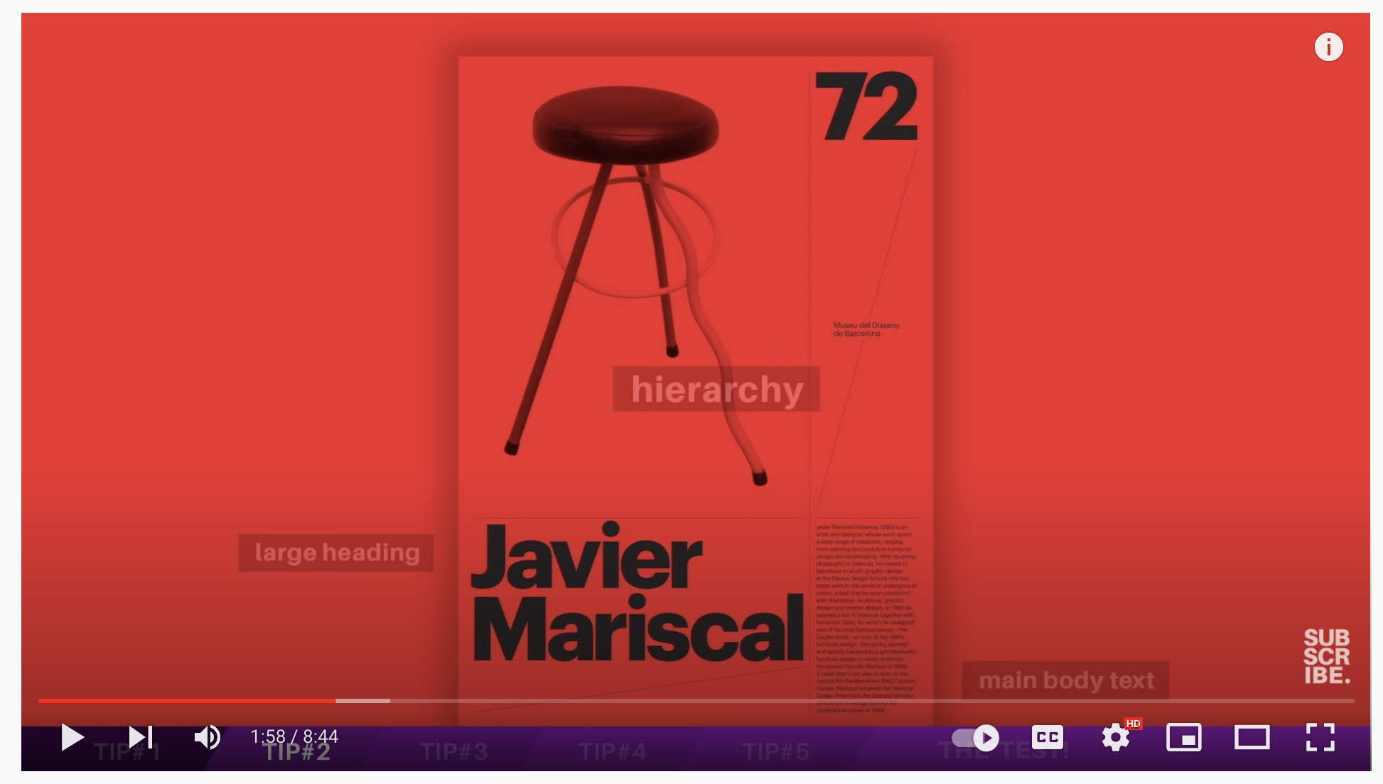
Ruder focused on the use of Sans Serif typefaces and in creating contrast within his work, between the blacks, whites and colour. The black red and white colour scheme is a personal preference from my interest in Bauhaus and Tschichold, perhaps this is something I can incorporate within my book designs.
An important factor here Ruder mentions is legibility “A printed work, which cannot be read, becomes a product without purpose.” This is very interesting as he focuses on aesthetic and function. I personally enjoy an abstract design, but really love the clean appearance of the ‘Swiss’ style. Perhaps the ‘good’ type book can be of a Swiss grid inspiration, and the ‘bad’ more abstract.
With the ‘bad typography’ book in mind I created a couple of mood boards including work from Dieter Roth’s ‘diaries’ and Cy Twombly’s drawings. The use of imagery and hand drawn typography is very emotive and inspiring. I feel that a more tactile approach to the ‘bad typography’ book could be an interesting way to begin with this book.
Josef Muller Brockmann was a Swiss designer born 1914. He studied graphic design and architecture at the Zurich School of Arts and Crafts and later went onto opening a design studio in Zurich.
“These rules can be summarized by the use of very strict composition grids, objective photographs to avoid emotions, the importance of rhythm, harmony, mathematical and geometric compositions. For example, at that time Brockmann saw music as an abstract art, so he considered his concert posters in an abstract way. The publisher Lars Müller described Beethoven's poster (1955) as the ultimate example of "musicality in design".-Grapheine
The ‘Ikon gallery’ local to me hosted an exhibition of Bill Woodrow and Richard Deacon’s recent collaborative work. The pieces were created partially by each other, and then handed to the other person to be completed. This meant that each mark/image was in response to the other person’s previous work.
I found this very interesting not only visually but conceptually. This inspired ideas for my ‘bad typography’ book, in being a celebration of ‘breaking the rules’.
I particularly like these 2 posters by Brockmann. His approach to design is impressive. The visuals chosen are dynamic, and the red/black/white sans serif typeface works well. The small black type on it’s side balances the blacks and again is dynamic, following the imagery. This ‘musicality in design’ thought process is something I would like to carry forwards.
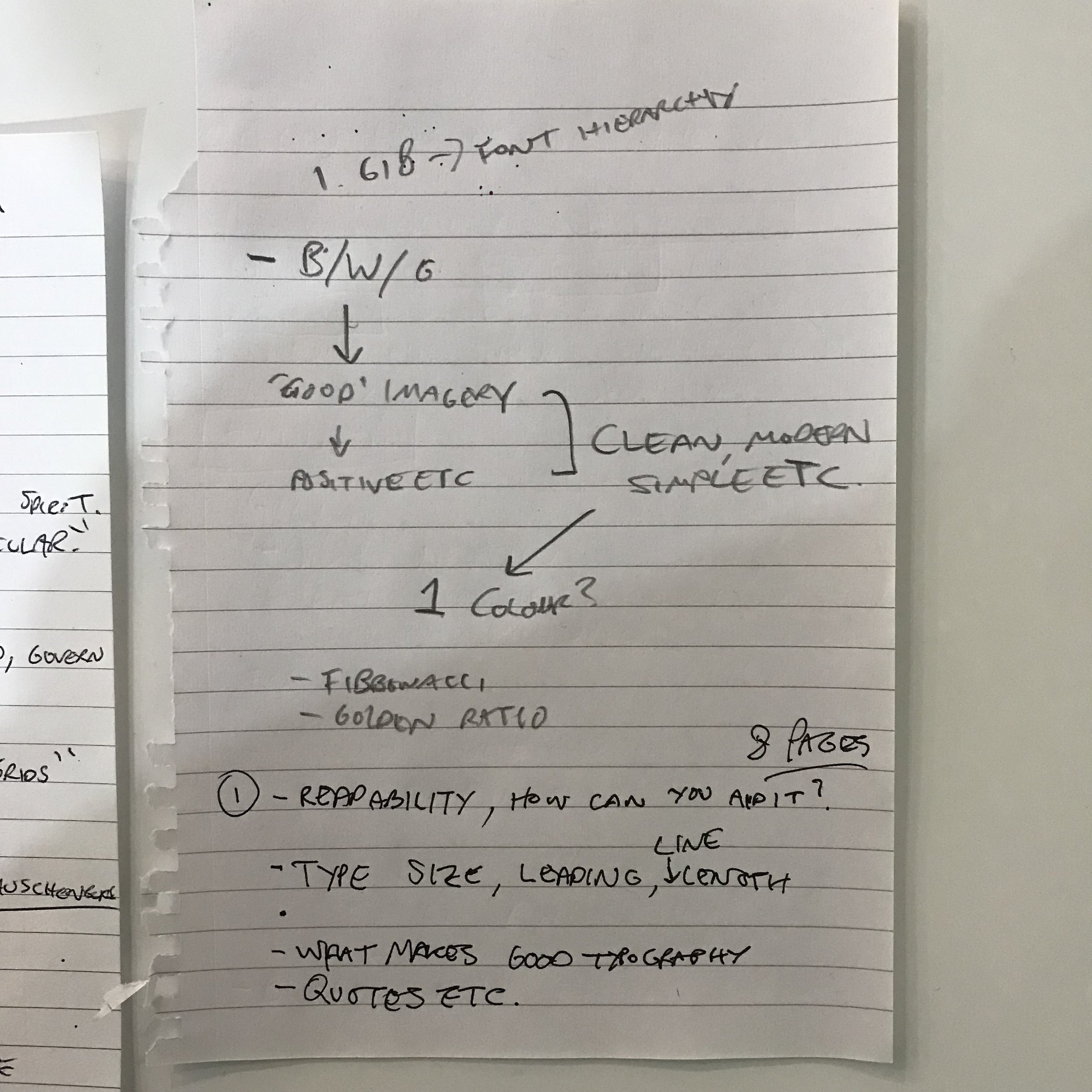
I made some notes/a rough guide to what information would go on each page, and in which order. I noted some quotes I had come across to refer to when designing, doing this brought forwards ideas of the ‘themes’ of each book.
I felt quite overwhelmed with how to begin this task, not due to lack of ideas or thoughts but ‘over ideas’ feeling as if there could be 100’s of versions of each good and bad typography books. I decided to create some restrictions for myself, for the ‘Good’ book I would only be able to use digital software to produce is, including only shapes (no imagery). I feel like this is a good restriction for me as I am inclined to produce responses to tasks in a more tactile way including imagery etc. For the ‘Bad’ book I wanted to experiment and hopefully move towards my goal of creating work with a synergy between tactile and digital techniques.
I initially decided to only use one colour within the books. I chose the colour red, because red was energetic and recurring within many of designers work that inspire me from the Dada to constructivist movements, which was intended to be a ‘nod’ to these designers.
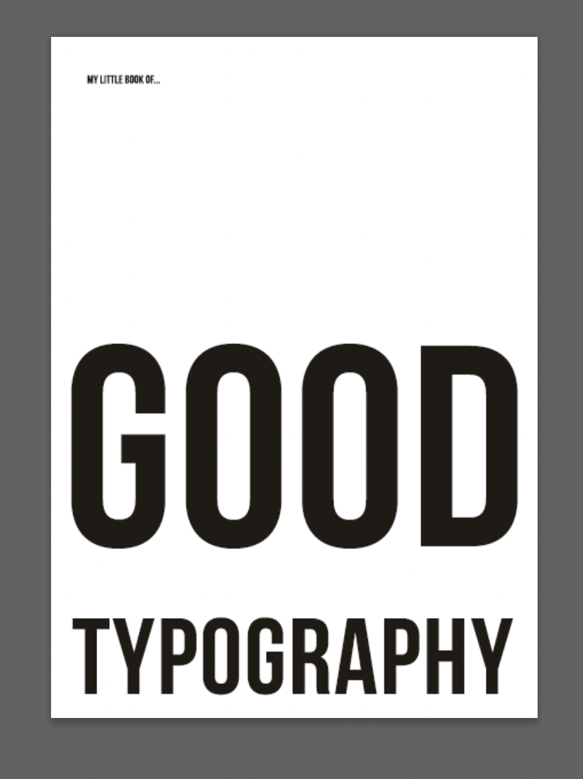
I tested with Sans Serif typefaces, Gotham Black and Bebas Neue were my favourites. The are both modern and easily legible. Gotham has been a favourite since being recommended to research Tobias Frere-Jones by a tutor.
I wanted the opening page to be ‘aligned’ with the rules within the book and wanted to physically represent this alignment. When laying out the letters like this, my intention was to have an anagram of ‘My Little Book of good…” on the front, with it being completed and aligned correctly on the back. This was to show how once you have worked through the book you will know the ‘rules’ therefore have the ‘skill’ to align the letters correctly in a ‘good’ way.
Seeing the letters aligned gave me another idea, which meant already breaking my rule of ‘tactile’ but I had to follow up with it. I created a ‘word search’ style cover, with an almost ‘web’ of confusing lines leading to each letter. The front will be confusing, but the back cover will be complete and aligned.
I did a few iterations of the arrows and then decided which was most aesthetically pleasing. I decided to circle the ‘M’ to represent the beginning point, both literally and in the context of the anagram/word search style cover.
The next 2 pages I had planned to be based on ‘context.’ I feel that context is where you need to start when deciding upon a typeface, asking the question ‘who is this for?’ I had quickly sketched my idea of having the 2 pages represent a film poster and a newspaper. One page would be in each style, presenting the ‘correct’ context to use different typefaces.
I looked through a series of ‘Soviet Weekly’ newspapers I had from the 50s-90s and chose an interesting layout. I find these newspapers very interesting and they are a part of Soviet/war newspapers I have collected. By incorporating the layout from the Soviet newspaper I wanted the implicit meaning to be taking something ‘bad’ and make it ‘good.’ Within the newspaper layout I wrote about ‘context.’
The next 2 pages I had planned to be about ‘layout’ the composition of typography combined with imagery is the next element of ‘good typography’ to consider. I wanted to create a minimal graphic that presented an aesthetically pleasing ‘layout’ in the simplest way. Inspired by Brockmann’s use of circles/motion within his design I moved forwards with using circles.
I found a helpful plug-in for Photoshop which creates a grid for the ‘golden section’ and the rule of thirds. I applied this to a mock up of the double page spread and adjusted where elements aligned with its intersections. I had decided to use a simple A5 sizing for the book, in order for it to be ‘pocket sized’ and not detract from any of the content of the book by keeping within ‘the rules’.
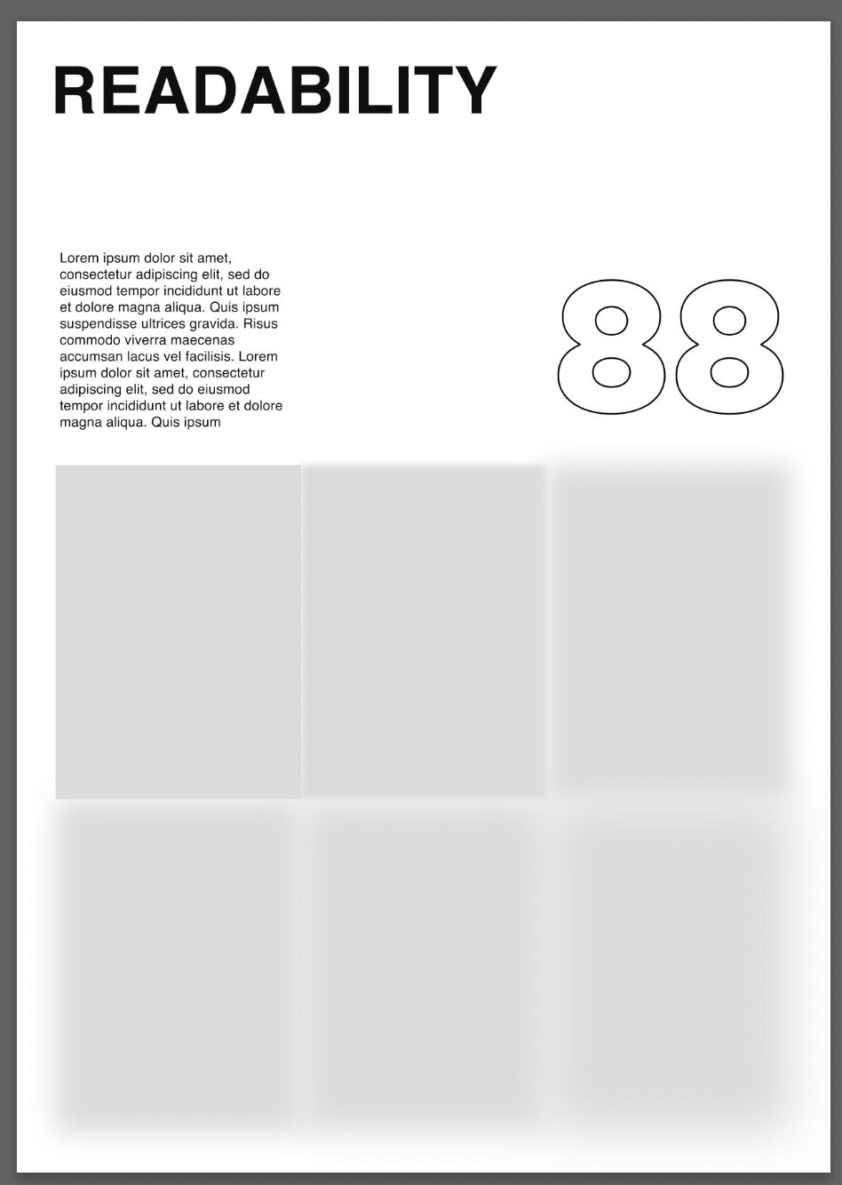
The final page spread was planned to be about legibility/readability. This feeds on from context, but I felt could be a good section to create hopefully interesting visuals for. I began with an idea to blur numbers, and after referring back to my mood boards I was again inspired by Brockmann’s use of shape. I created (again with an aim of simplicity in mind) a visual representation of illegibility. The squares slowly becoming more blurred. I chose the numbers ‘88’ as there are 8 pages of this book. I made the numbers an outline only in an attempt to create balance between the heading and graphic.
For the ‘Bad typography’ book I had in mind to use my new typeface designed using a lino cut in the exact same layout as the ‘Good’ book to show similar themes relating them both, but went onto creating this more tactile style cover. The final outcome looked interesting in black and white, but I continued to move forwards with hope to return to the cover when I had more of an idea of the direction of this book.
I wanted to visually represent ‘bad’ typography with a few quotes in mind:
“Words have meaning. Type has spirit. The combination is spectacular”. -Paula Scher
“Invite the reader to participate by deciphering. Chaos can attract and engage.”. -David Carson
“Sound as form”
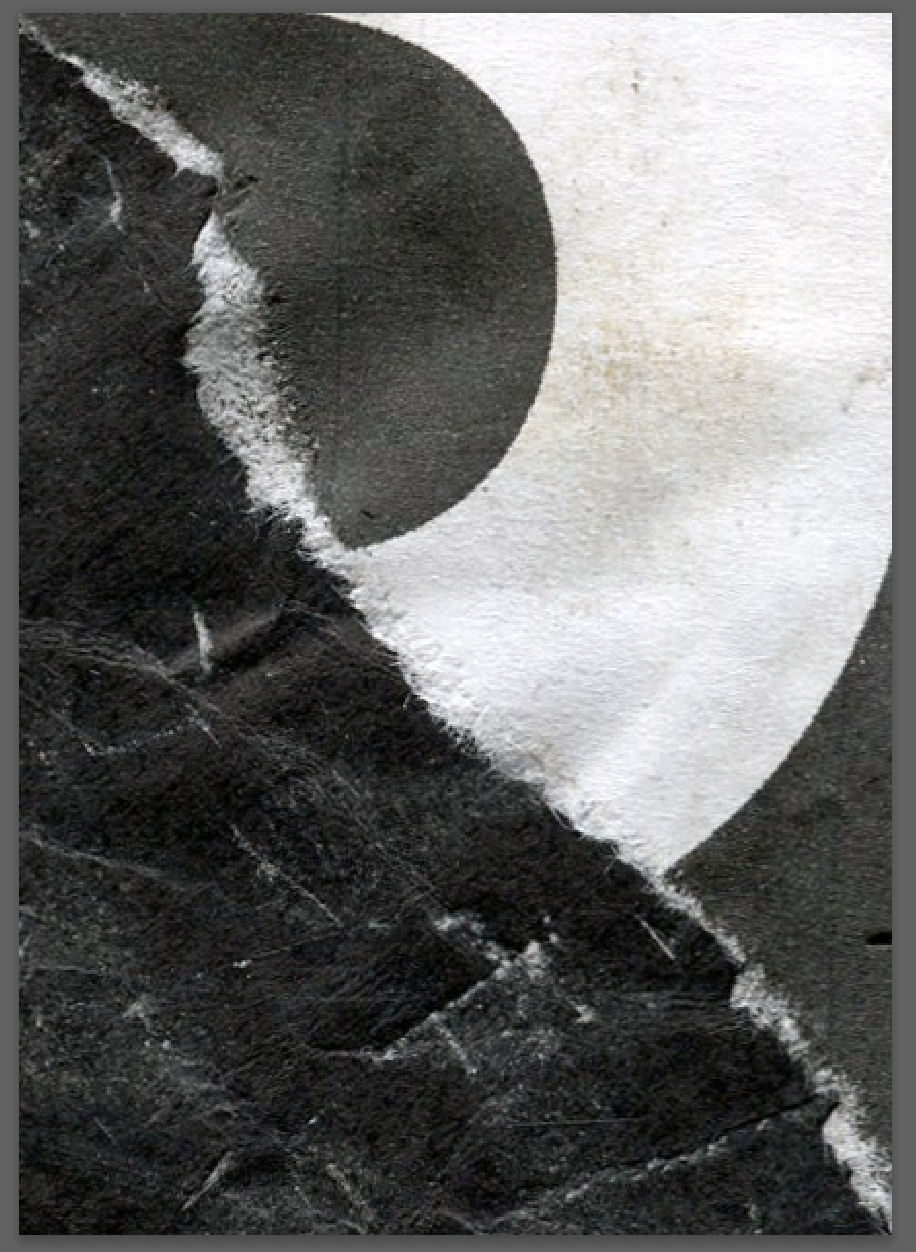
I ripped up the inkjet prints, took them outside and stood on them in order to get them dirty/more interesting texture. I zoomed in on certain sections in Photoshop in order to test with different visuals, some of the outcomes were interesting.
I began with the cliche ‘break the rules’. I feel that it’s almost conforming to a rule in itself by using the phrase, but continued to see if I can create an interesting outcome. I feel as if this would be a good way to being the book. With Carson’s work in mind I began to collage using an inkjet printout and some textured rips off of posters I had come across and collected. I aimed to create a something ‘rough’ that literally looked broken.
I wanted to create more physical collages. I printed off various letters that made up ‘bad typography’ using a xerox printer with intentions to use them with an acetone solution to transfer them into paper. I looked through various old magazines for inspiration for imagery. I was after ‘bad’ or ‘disturbing’ and decided on an image of maggots and flowers. the idea behind flowers was to cover it in ‘bad’ type to imply an oxymoronic hidden beauty.
The image with the upside down ‘T’ was a more abstract response to certain rules in general as well as aesthetically. There is ‘organised chaos’ in the bottom right corner with an arrow reading ‘discipline’ towards a box with red pencil inside it. This was to show conforming/being put into a box or considered as one thing. Many people like to label others as having certain ideas, skills or defined by a job. The red pencil represents this as a bad thing.
The 4th image is various layers of texture produced using a lino roller, paintbrushes and paper. The handwriting was done through carbon paper using the end of a sharp piece of paper and reads “can you hear me?”. This refers to ‘sound as form’ but also again to being ‘heard’ when put into a box so often. I continued to edit these images, creating high threshold black and white versions, which were still relatively effective.
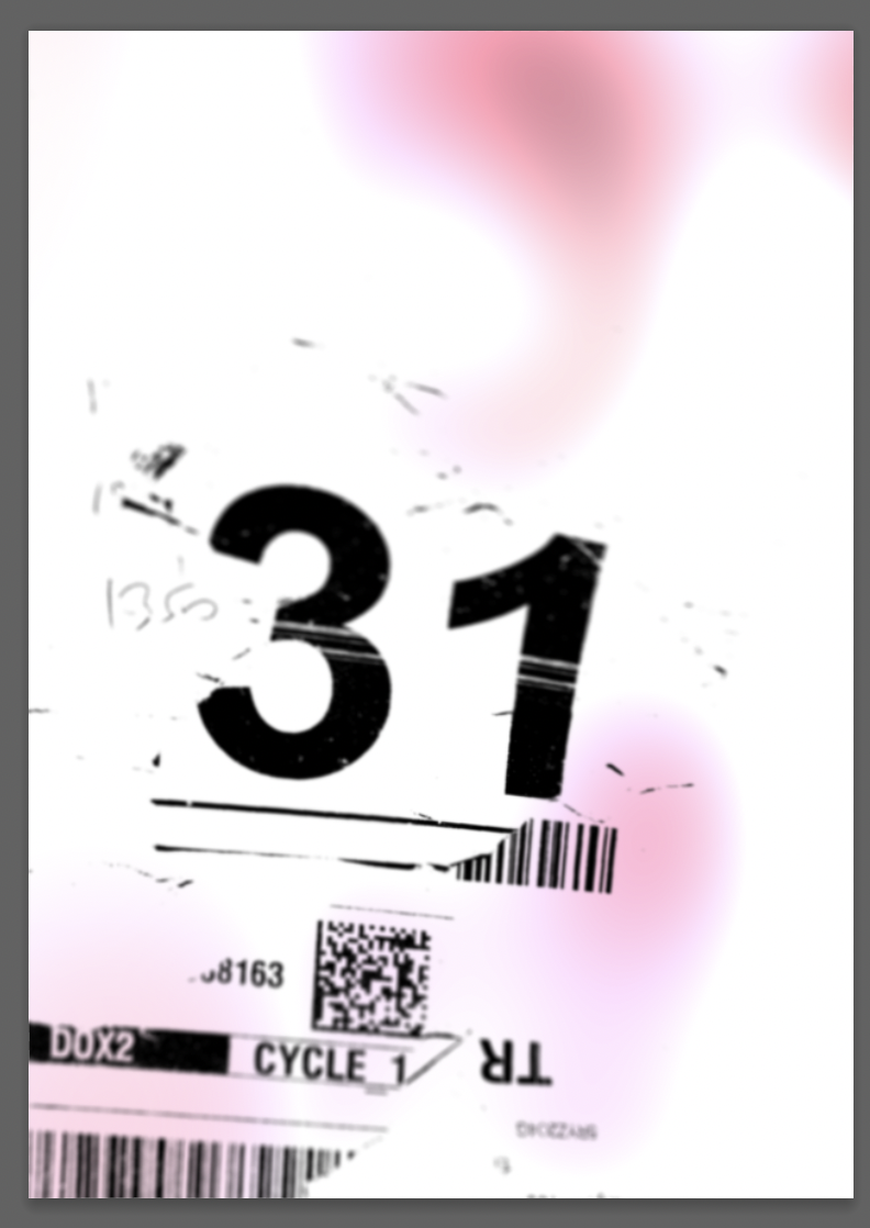
I went further with collaging and pulled out some elements that were off cuts from previous work, that I had kept stuck to acetate to be used in the future. I chose elements with interesting typography, the ‘31’ was particularly good to me, with the misprint lines going across it. When looking for imagery I saw a portrait in an old Vogue magazine, I imagined it faceless as if to represent ‘blindness’ or thinking typography is ‘bad’ if it doesn’t conform to rules. I printed this onto acetate on the wrong side so the ink stays on top, I then printed it onto paper which gave it in interesting texture. I went onto testing with layering/ scanning elements using images on acetate and printed textures.
I edited the collage within Photoshop and began to experiment. I created a distorted version which I used for texture within the background and continued to test using various tools with manipulating the type. I was again thinking about ‘sound as form’ in attempting to create something dynamic with a ‘voice’.
Distorting the collage gave me an idea for the front cover of the book. I used Gotham Black to write ‘Bad Typography’. I didn’t include ‘My little book of’ to deliberately be ‘bad’ and may include it on the back cover or spine, in the same style. I scanned and reprinted the sheet 4 times to exaggerate the misprints/bumps on the edges of the letters. I distressed the type using a scalpel and my dragging the type across the floor. I then scanned in the final version and made a high threshold version. I then printed this out and experimented using the scanner until I cam across a distorted version I liked. I feel like this was beginning to hone in on ‘sound as form’ and “Chaos can attract and engage”.
I continued with distorting type, but this time all digitally. I chose the letters ‘B A D’ and began to apply various filters/maps.
This process was very interesting. I layered the letters on top of each other and changed their opacity/blur to try and create depth. I then added elements from found packaging stickers, choosing a fragile label. The label ‘this way up’ references being put into a box again and the perception of what is good or bad. I added the definition of perception in a small size in the bottom left corner.
Although I wasn’t particularly pleased with the end outcome, it has potential for future designs and I look forward to exploring this method further.
I moved onto arranging the layout of my books within Indesign, and creating their spines. The planned order for my ‘Bad Typography’ book changed, with the more tactile pages in the middle breaking up the more digital designs.
Final: My Little Book of Good Typography
Final: My Little Book of Bad Typography
I am relatively pleased with my outcomes. I decided to produce ‘My Little Book of Bad Typography’ in black and white to place the concentration on the typography itself as much as possible. Some of the final outcomes were stronger than others, I prefer the more tactile looking collages and feel that they convey ‘bad typography’ and it’s associated messages more affectively.
Looking back over both books, in particular ‘My Little Book of Good Typography’ I feel as if more experimentation was needed. I should’ve produced more versions of each page rather than moving forwards with my initial ideas/ only experimenting with composition. I feel as if the designs are ‘incomplete’ and lack a sophistication in conveying the elements that make up ‘good typography’.
I have come across/explored some interesting methods of working during this assignment such as using the scanner to distort text, and using only Photoshop to to create layers of text in a more abstract way. I look forward to exploring these methods further and trying to create a balance between tactile and digital methods of designing with future projects.
