Graphic Design 2.1: Professional Practice, Project 9: ‘Your Choice/Your Voice’ Exercise 1
Self-checkouts (SCOs) and self-service kiosks are machines that provide a mechanism for customers to complete a transaction from a retailer without the need for a trained cashier. These machines are ubiquitous in supermarkets, fast food restaurants and travel hubs. The quick rise in these machines over a relatively short period of time means that many of the touchscreen interfaces used at these terminals have not been designed with usability and accessibility in mind.
For this exercise you will design the interactive touchscreen interface for a self-serve store or restaurant checkout.
Identify any local shops and restaurants that have SCOs, visit these shops and see what you can find out about the terminals used. Explore the visual design as well as the function. What does each screen look like? How easy is it to navigate? What happens when there is an error or store personnel needs to be called to help?
Based on the research, identify the problems that you might be able to solve with better design. Then explore a number of possible solutions.
FIGURE 4:
Figures 5-8 are videos of various self checkout systems being used, including a touch-less interface (figure 8). The most simple and direct was Mcdonald’s, having a clear UI system, despite this, it still looked dated.
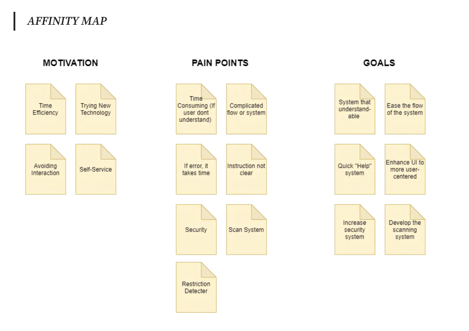
FIGURE 10: affinity map:
FIGURE 14:
Figured 13-15 are further case studies, these ones included further research, listing issues people have with SCO systems. I made notes as I researched of the pros and cons people mention- this will be important to consider when designing my SCO interface.
FIGURE 23:
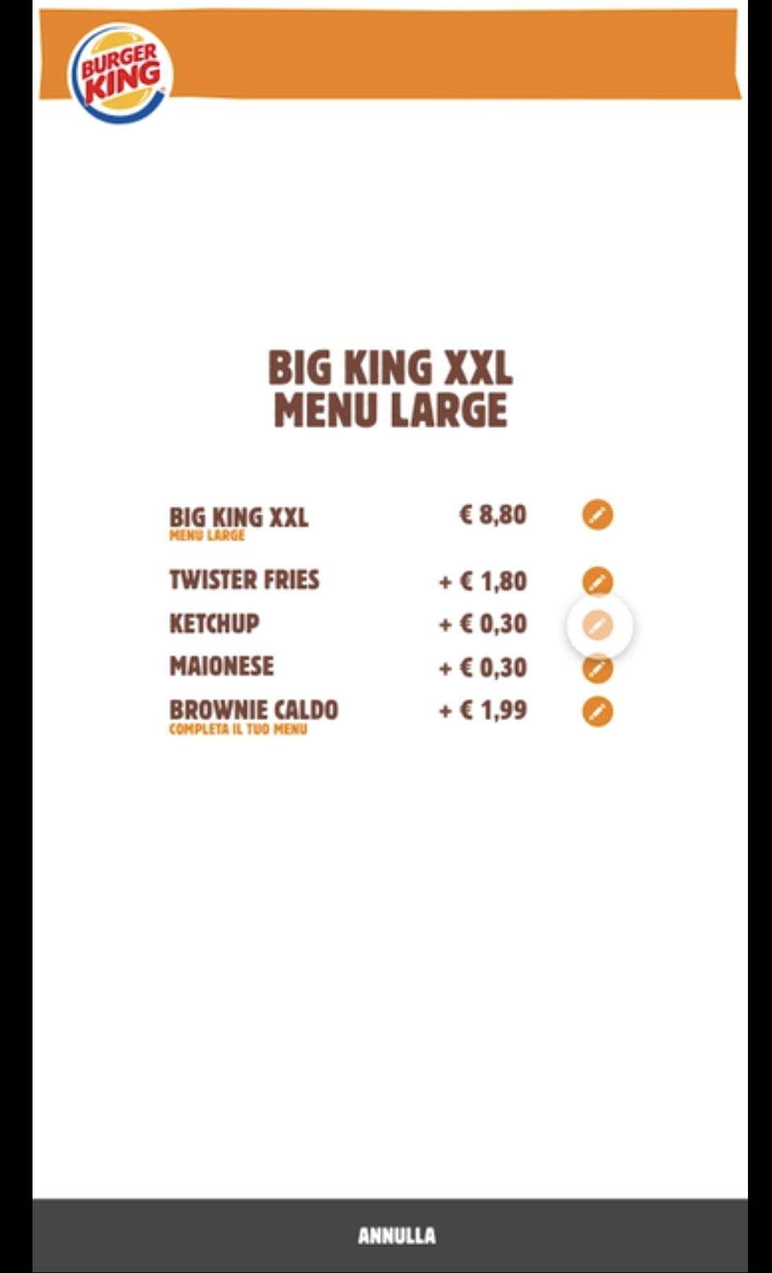
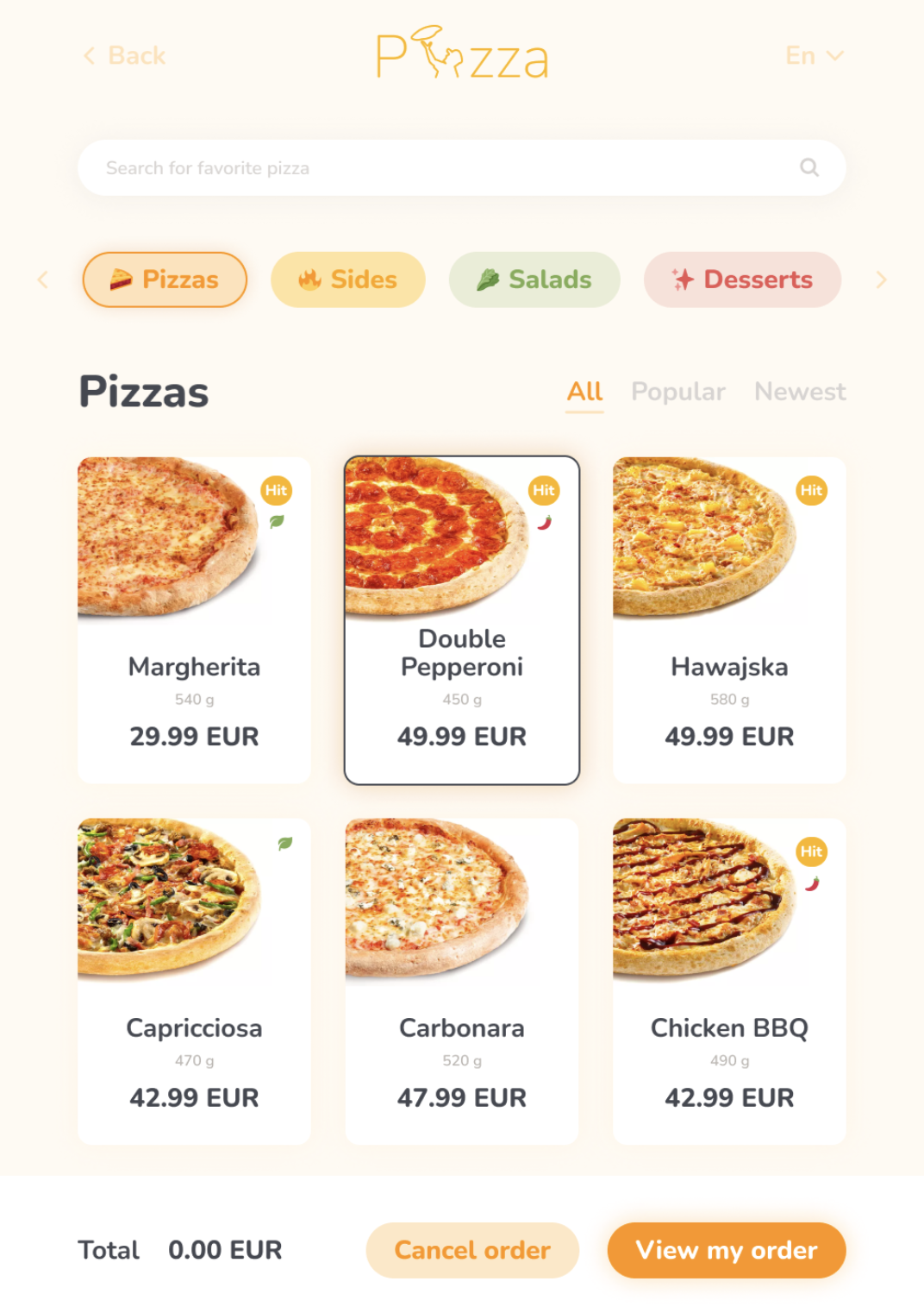
Figures 21-24 are more UX/UI projects. I found these extremely informative, they present data points, research and show the final design. This helps massively with planning my SCO interface. A key element that they all utilise is clear, concise information with icons- using icons with minimal backgrounds seems to be the most effective design choice.
Figure 25 shows Aldi’s system, which is virtually all on one screen. Is this the most clear and user friendly way to present the information? Should there be multiple, clear/minimal screens? Or would that be inefficient and cause more issues?
Each website had some interesting designs, resulting in a fun user experience. Their information was clear, concise and paired with imagery in an interesting way, the colour palettes were also easily legible. When considering my SCO design, I feel that minimalism is the most important element to being clear and accessible for everyone, also the use of colour, to be clear and legible.
FIGURE 28:
I wanted to create a design for a supermarket SCO system (Aldi) as these seem to be way less efficient than fast-food/other SCO interfaces. Notes 2 shows some general notes, including issues of SCO’s as shown or described via my research. I noted key points such as:
ID verification (can this be automated, or is this an extra step that is inefficient?)
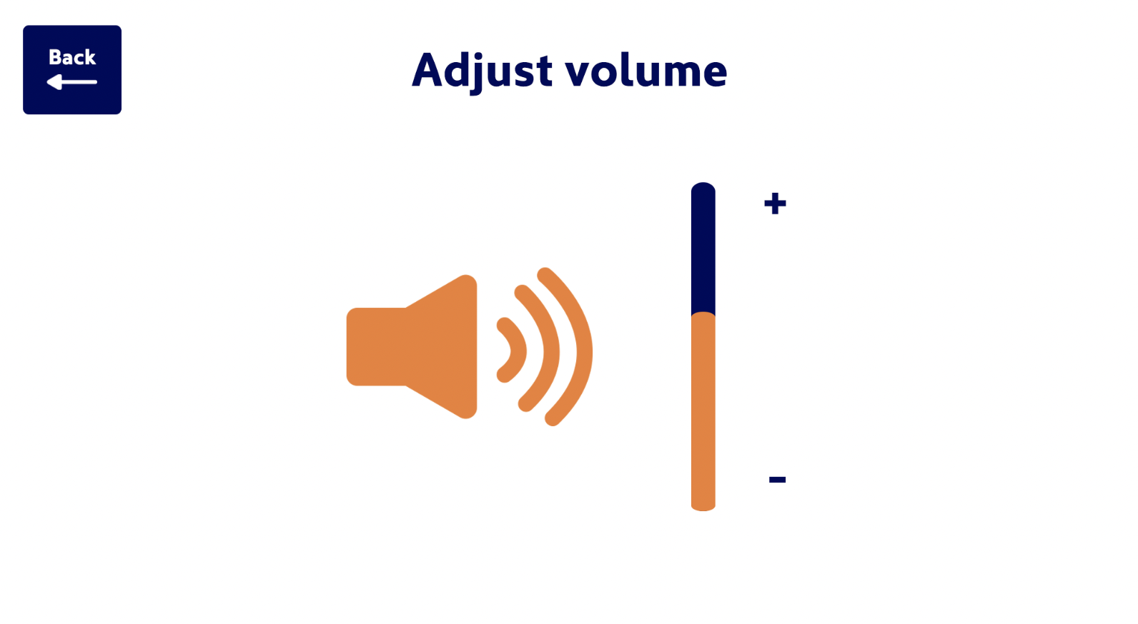
Clear options to change language, type size, colours of background, audio levels/description (accessibility.)
Add bag option (should this be at the start, at the end, or a continuous option to add or remove bags?)
Clear options to cancel items/an area to put them.
Easy access to call assistance.
When considering accessibility, checkout systems need clear, useable icons, followed by clear, legible text. I began by designing the icons I will use to identify different elements within the SCO system. I wanted the icons to be as simple and as clear as possible.
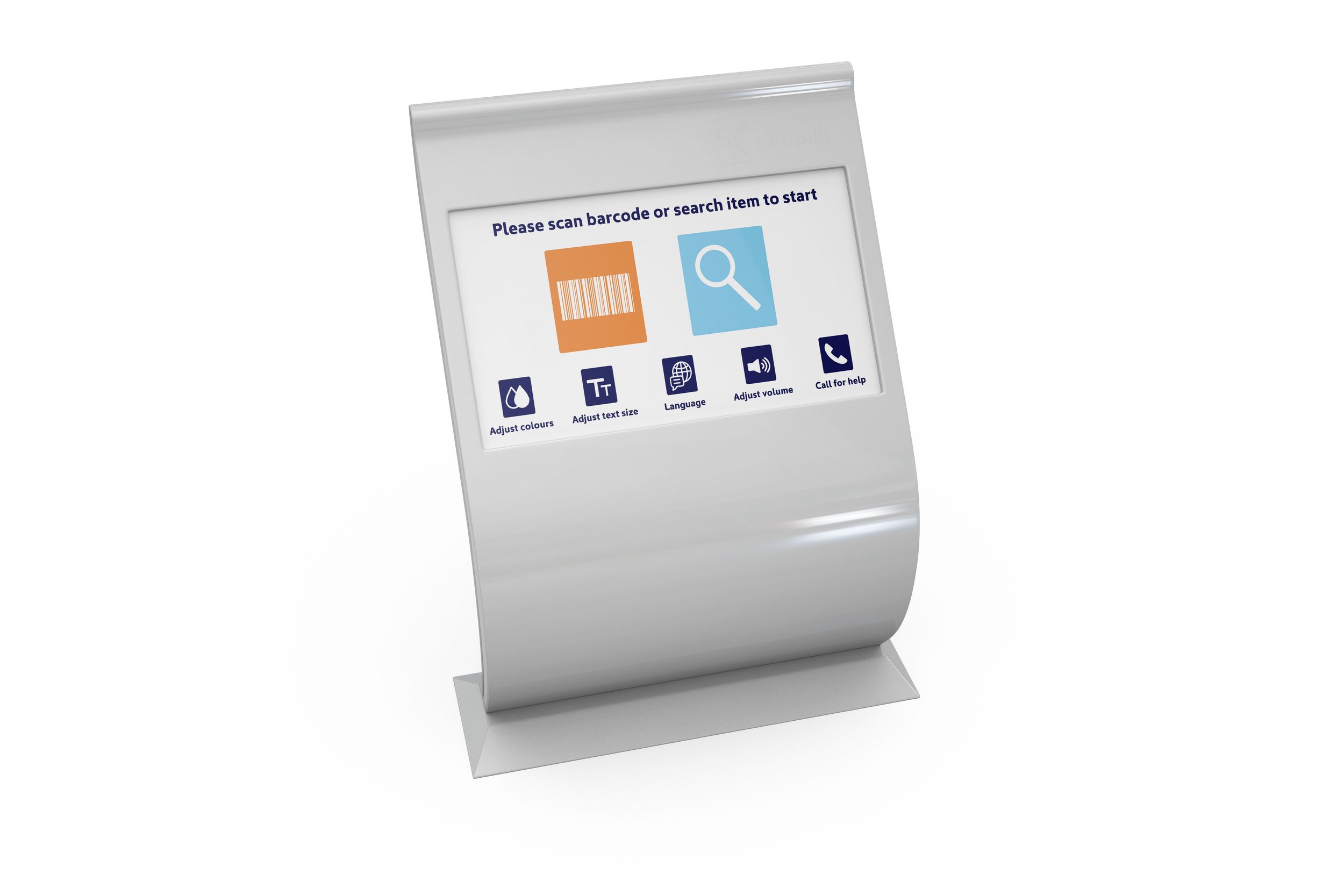
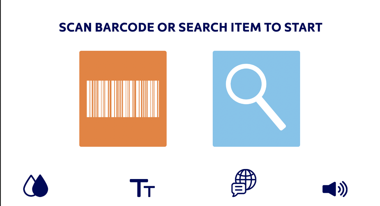
Referring to my plan, I designed the opening screen. I experimented with various configurations of colours, testing for legibility and functionality. I wanted different elements to be distinguishable from one another to promote ease of use, without being overwhelming or causing any confusion.
The shapes of the buttons were inspired by Aldi’s logo, and sized to be legible and easily used. My thought process behind this was to include elements of Aldi’s branding, whilst not including their logo on each screen as all systems seem to do as I felt that this was unnecessary and took up space that could be utilised better- such as for making elements larger and easily legible.
Minimalism and simplicity was key with my screen designs, inspired by fast food/restaurant SCO’s. I aimed to keep instructions succinct and try to be as easy to understand as possible.
I debated between having a clear search bar and a search button with an extra screen, and opted for the extra search screen in hopes that this will be easier to access, with no external distractions from typing in or searching categories for items.
I arranged my final designs into an order that makes sense to view, working through the screens in my head, clicking onto each, imagining the whole checkout system.
Final Mock ups:
I began this task by making some general notes, making a rough plan moving forwards (notes 1). I then started to research SCO’s, collating various images of different types/designs.
Figures 1-3 are examples of different types of restaurants use of SCO including Mcdonalds, KFC and Tossed.
Figure 4 shows some excerpts from a great blog post describing the UX/UI design process for re-designing Itsu’s SCO interface.
The designer breaks down the pros and cons of other brands, and lays out the design problems they had to tackle! This was very informative information and noted for my design.
Figure 10-12 show various case studies of UX/UI design I have found, they included some great information. Seeing the design process of creating a SCO system, including the affinity map/flow diagram helped me consider how I will plan for my SCO design.
FIGURE 12:
FIGURE 13:
FIGURE 15:
Figures 16-20 are further videos of various supermarket self checkout systems. Each system is very similar and all appear dated. It seems that Tesco and Aldi have the most efficient systems, but they could still be improved upon.
FIGURE 21:
I moved onto collating some different research for inspiration. Here, I looked at website which features on awwwards.com for their UX/UI designs (figures 26-29).
FIGURE 27:
FIGURE 29:
I began to sketch a rough flow diagram to use as a guide for my design, considering the main points to improve on with SCO’s. For my design, I was debating between using a smaller amount of screens with more information (similar to Aldi, Tesco) but decided that perhaps more screens with concise, simple and minimal design could be more accessible, despite it being long/slightly more clicking.
I aimed to create a supermarket checkout design inspired by the simplicity and aesthetics of fast food/restaurant style SCO systems. Supermarket systems appear dated design-wise and inefficient with either crowded interfaces, or information that is just not clear enough.
After sketching my rough outline of each screen of the SCO system, I moved onto finding a suitable typeface, inspired by the Aldi logo. I found that Kyrial Sans Pro looks most similar, particularly the curved elements of the letters such an with the letter ‘L’.
The 2 key issues I found with SCO’s were clarity and accessibility. Many of the systems seemed to have irrelevant or extra information on screen, which may add to their branding as a shop of the aesthetics of the checkout screen, but are functionally not working and may cause more issues that not.
Considering legibility, alongside Aldi’s branding, I wanted to choose colours that both reflected the Aldi brand, as well as being the most legible configuration of colours.
I designed each screen, following my flow chart, working my way through each button and it’s function from the opening screen. For accessibility buttons, instead of combining them into one option, or a drop down menu, I designed icons, aiming to be clear and easily clickable. For the language section, I included the most popular languages globally onto the first page, with more options being on the next.
The composition of the main basket screen was hard to ‘get right’. With each element I tried to consider the simplest and clearest way of displaying it.
Despite thinking through the flow chart diagram, there were still elements that I had missed, such as the weighing/scales section and deleting items.
Final Designs:
My SCO design is functional and I feel as if it is simple enough to use, with legibility being at the forefront of the overall design. I think that the colour palette is clearly for Aldi, but that colour may be overused. I intended for the colours to distinguish different elements on the screen to make legibility and understanding as simple as possible, but this may’ve had the opposite affect.
In order to test for this if this were a real design scenario, I could run a research group, having people, varying in ages, from different countries speaking languages other than English to test run using the SCO system. I could then collect feedback not only from them clicking the screen, but verbally too of which areas they understand and which do not work as well.
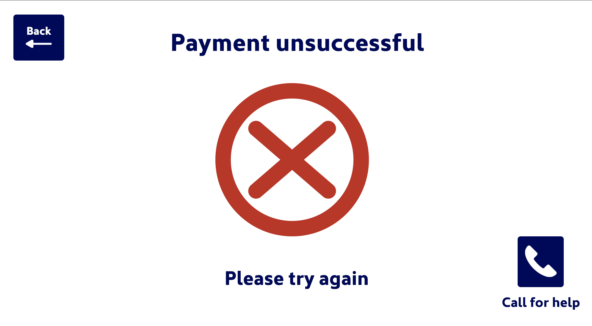
Another area I am unsure about whether it would work if this were a real design scenario is the lack of supermarket branding/use of the Aldi logo. I stated my reasoning being for keeping the design as minimal as possible with only relevant information on screen (the customer knows which shop they are in) but the supermarket chain may want each area of the screen to be branded. I tried to counteract this by including the logo on the end screen after ‘Payment successful’ as a subtle ‘reminder’ to the customer to where they have shopped.
Overall this was a challenging task, something completely different that I hadn’t considered before. The UX/UI area of graphic design is interesting and requires a different sort of analysis to other areas- it is very practical and utility focused.
Resources:
Figure 1: Itsu self-checkout UI/UX case study (2020) JANINE SHROFF. Available at: https://janineshroff.co.uk/portfolio/itsu-self-checkout-ui-ux-case-study/ (Accessed: 8 August 2024).
Figure 2: Itsu self-checkout UI/UX case study (2020) JANINE SHROFF. Available at: https://janineshroff.co.uk/portfolio/itsu-self-checkout-ui-ux-case-study/ (Accessed: 8 August 2024).
Figure 3: Itsu self-checkout UI/UX case study (2020) JANINE SHROFF. Available at: https://janineshroff.co.uk/portfolio/itsu-self-checkout-ui-ux-case-study/ (Accessed: 8 August 2024).
Figure 4: Itsu self-checkout UI/UX case study (2020) JANINE SHROFF. Available at: https://janineshroff.co.uk/portfolio/itsu-self-checkout-ui-ux-case-study/ (Accessed: 8 August 2024).
Figure 5: von Panda, P. (no date) Using the self-service kiosk at McDonald’s. Youtube. Available at: https://www.youtube.com/watch?v=xYLNVZTgEnM (Accessed: 8 August 2024).
Figure 6: Clear, C. (no date) Self check out machine | easy self pay at booragon Kmart. Youtube. Available at: https://www.youtube.com/watch?v=QmXX-F3z54U (Accessed: 8 August 2024).
Figure 7: Vinneltech Home Appliances (no date) That’s asda self checkout | how does it work? Youtube. Available at: https://www.youtube.com/watch?v=CG6ytaUCyhY (Accessed: 8 August 2024).
Figure 8: Reddy, P. (no date) UST Vision Checkout - IKEA demo: Water & Fillet plate self-checkout use case. Youtube. Available at: https://www.youtube.com/watch?v=_8SXXQ3jzV0 (Accessed: 8 August 2024).
Figure 9: Rocky the Self-Checkout Fan (no date) Walmart self checkout. Youtube. Available at: https://www.youtube.com/watch?v=vdc_dZgSubk (Accessed: 8 August 2024).
Figure 10: Habibullah, A. (2020) Self-checkout System UX Study Case - almajid habibullah, Medium. Available at: https://medium.com/@brojid12/self-checkout-system-ux-study-case-d77663778d8d (Accessed: 8 August 2024).
Figure 11: Faza, S. (2020) UI/UX case study — self service technology market - UsabilityGeek - medium, UsabilityGeek. Available at: https://medium.com/usabilitygeek/ui-ux-case-study-future-market-d9820e6a301a (Accessed: 8 August 2024).
Figure 12: Behance (no date) Behance.net. Available at: https://www.behance.net/gallery/194314135/Self-checkout-Kiosk?tracking_source=search_projects|self+checkout&l=3 (Accessed: 9 August 2024).
Figure 13: Walmart self checkout (no date) Matchstick Studio. Available at: https://matchstickstudio.co/portfolio/walmart-self-checkout/ (Accessed: 9 August 2024).
Figure 14: Navadheer (2023) Efficiency and convenience: Improving the user experience of self-checkout kiosks, Bootcamp. Available at: https://bootcamp.uxdesign.cc/efficiency-and-convenience-improving-the-user-experience-of-self-checkout-kiosks-5c120bee0d92 (Accessed: 9 August 2024).
Figure 15: mega project Ui design (no date) Figma. Available at: https://www.figma.com/proto/RkFGqNO3w9p1rgyAAVN9Md/mega-project-Ui-design?page-id=58%3A7096&node-id=58-13504&viewport=241%2C48%2C0.29&scaling=scale-down&starting-point-node-id=58%3A13504 (Accessed: 9 August 2024).
Figure 16: Videos, M. H. R. (no date) NCR self checkout machine @ morrisons - Brentford - west London. Youtube. Available at: https://www.youtube.com/watch?v=jcIopyU006c (Accessed: 9 August 2024).
Figure 17: Vinneltech Home Appliances (no date) Tesco self-checkout full demonstration. Youtube. Available at: https://www.youtube.com/watch?v=gP8AoGYnzq0 (Accessed: 9 August 2024).
Figure 18: Vlogger, U. T. (no date) Using a Morrison’s Self Service checkout at Loughborough. ( AGAIN ). Youtube. Available at: https://www.youtube.com/shorts/I9N8-GQthpA (Accessed: 9 August 2024).
Figure 19: Scøtt, I. (no date) WELCOME - asda scan & go | self service. Youtube. Available at: https://www.youtube.com/shorts/HxasCRNGJpw (Accessed: 9 August 2024).
Figure 20: Adventures, T. (no date) DN self checkout machine lidl wensfield. Youtube. Available at: https://www.youtube.com/shorts/5StrhVudXJc (Accessed: 9 August 2024).
Figure 21: Behance (no date) Behance.net. Available at: https://www.behance.net/gallery/148232835/Self-Ordering-Pizza-Kiosk-App?tracking_source=search_projects|self+ordering+kiosk&l=1 (Accessed: 9 August 2024).
Figure 22: Behance (no date) Behance.net. Available at: https://www.behance.net/gallery/145981935/MB-User-Interface-Self-Ordering-Kiosk-(Service-Design)?tracking_source=search_projects|self+ordering+kiosk&l=3 (Accessed: 9 August 2024).
Figure 23: Behance (no date) Behance.net. Available at: https://www.behance.net/gallery/78688095/Burger-King-Self-Ordering-Kiosk-UXUI?tracking_source=search_projects|self+ordering+kiosk&l=21 (Accessed: 9 August 2024).
Figure 24: Behance (no date) Behance.net. Available at: https://www.behance.net/gallery/184702189/Dominos-Self-Ordering-Machine?tracking_source=search_projects|self+ordering+kiosk&l=22 (Accessed: 9 August 2024).
Figure 25: Vlogs, N. R. (no date) Aldi self-checkout service! #aldi #groceryshopping #selfcheckout #aldishopping #ukstudents #uklife. Youtube. Available at: https://www.youtube.com/shorts/wvmmKSI0u7A?app=desktop (Accessed: 9 August 2024).
Figure 26: Best UX/UI design inspiration sites (no date) Awwwards.com. Available at: https://www.awwwards.com/websites/ui-design/ (Accessed: 9 August 2024).
Figure 27: About (no date) Und-ny.com. Available at: https://und-ny.com/about/ (Accessed: 9 August 2024).
Figure 28: Mercredi studio (no date) Mercredistudio.com. Available at: https://www.mercredistudio.com/ (Accessed: 9 August 2024).
Figure 29: Pranav Suresh (no date) Pranavsuresh.com. Available at: https://www.pranavsuresh.com/ (Accessed: 9 August 2024).
Figure 30: ‘25 most spoken languages in the world in 2024’ (2024) Berlitz, 26 July. Available at: https://www.berlitz.com/blog/most-spoken-languages-world (Accessed: 10 August 2024).


