Graphic Design 2.1: Professional Practice, Project 8: ‘Branching Out’ Exercise 2
Exercise 2: Welcome to my Studio
When you invite a new client into your future studio space what is the first thing you would like them to know about you? What message would you like to put in front of them before they decide to work with you? For the purpose of this exercise, imagine that this hypothetical client has not heard of you and they have not seen your work online. They are passing by your studio or office space in the real physical world.
Design the welcome mat at the entrance to your studio or office space. You might communicate your personal brand with a simple logo, you might explore hand lettering a word or meaningful phrase, you might include colours, symbols and illustrations. Research ‘custom welcome mat printing ‘ to explore the possibilities of colours, textures, and substrates available.
In your learning log provide the rationale for your design choices and reflect how accurately it captures the values and vision of your design practice.
One of the first people that always comes to mind when considering who inspires me is Chris Ashworth. Figure 1 is an example of some of his more recent branding/advertisement work, showcasing his typography design- perhaps a quote/word/meaningful phrase could be a fun way to communicate my personal brand.
I began this task by making some brief notes, including listing some of my favourite designers/artists to reference for my design. I aim for my welcome mat to represent the types of work that interest and inspire me.
This style of collage including paint, print and all kinds of materials is the most visually inspiring types of work to me. I aim to emulate and bring this style into my graphic design when I can- this could be a fun style to emulate, which would represent my love for tactile elements within design.
Figure 4 shows a more corporate style of custom mat company called ‘Ideal Mats’. They offer a more simple print e.g a logo onto various materials, the Coir style really interested me and could look really good with a simple logo.
Figure 6 shows various textures of mat by ‘Specialist Logo Mats UK’. This company seemed to offer all options for mats including fabric, a plastic type, multiple dyed textures and photos onto fabric.
FIGURE 7:
Figure 8 is some work by Scott Cottrell’s Instagram page. I really like his abstract collage style which mixes physical and digital methods. The physical/digital style is something I try to emulate in my work.
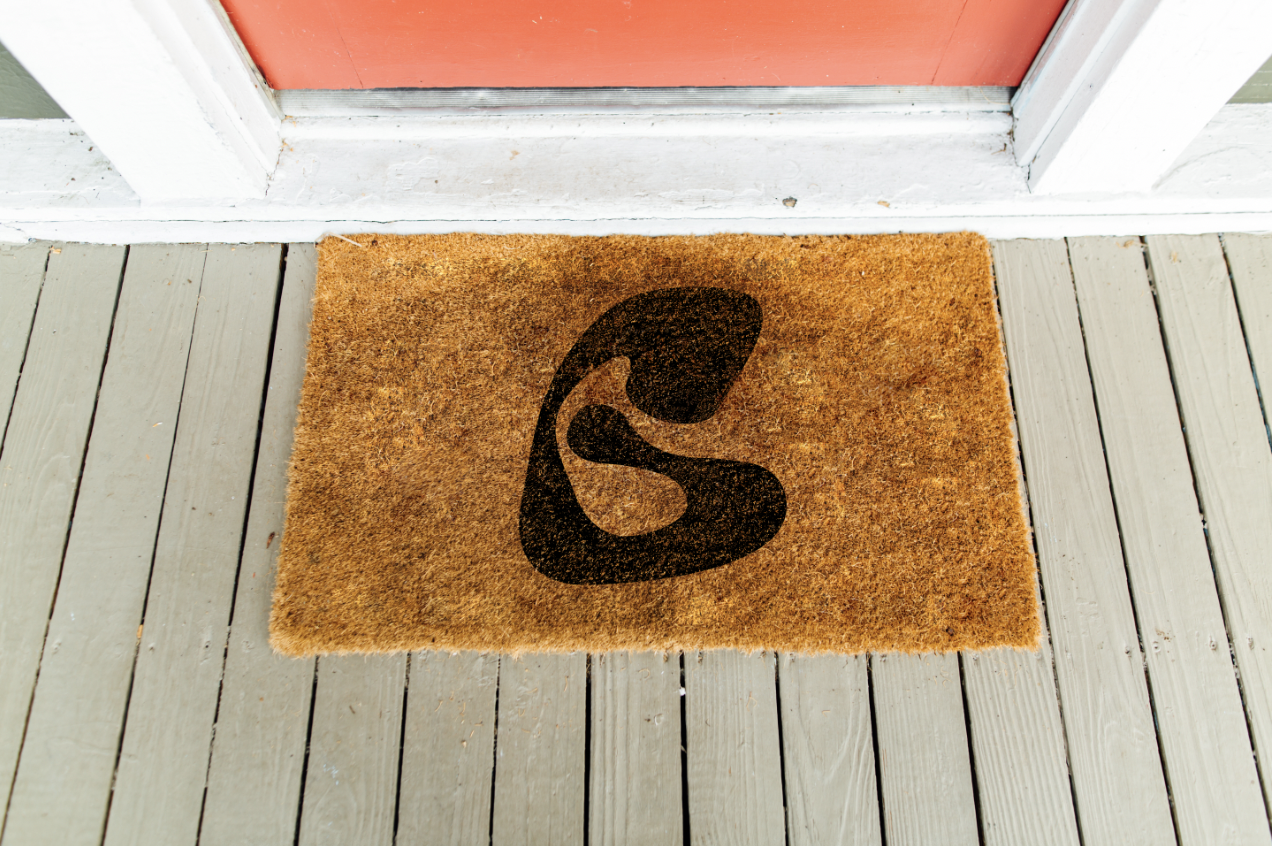
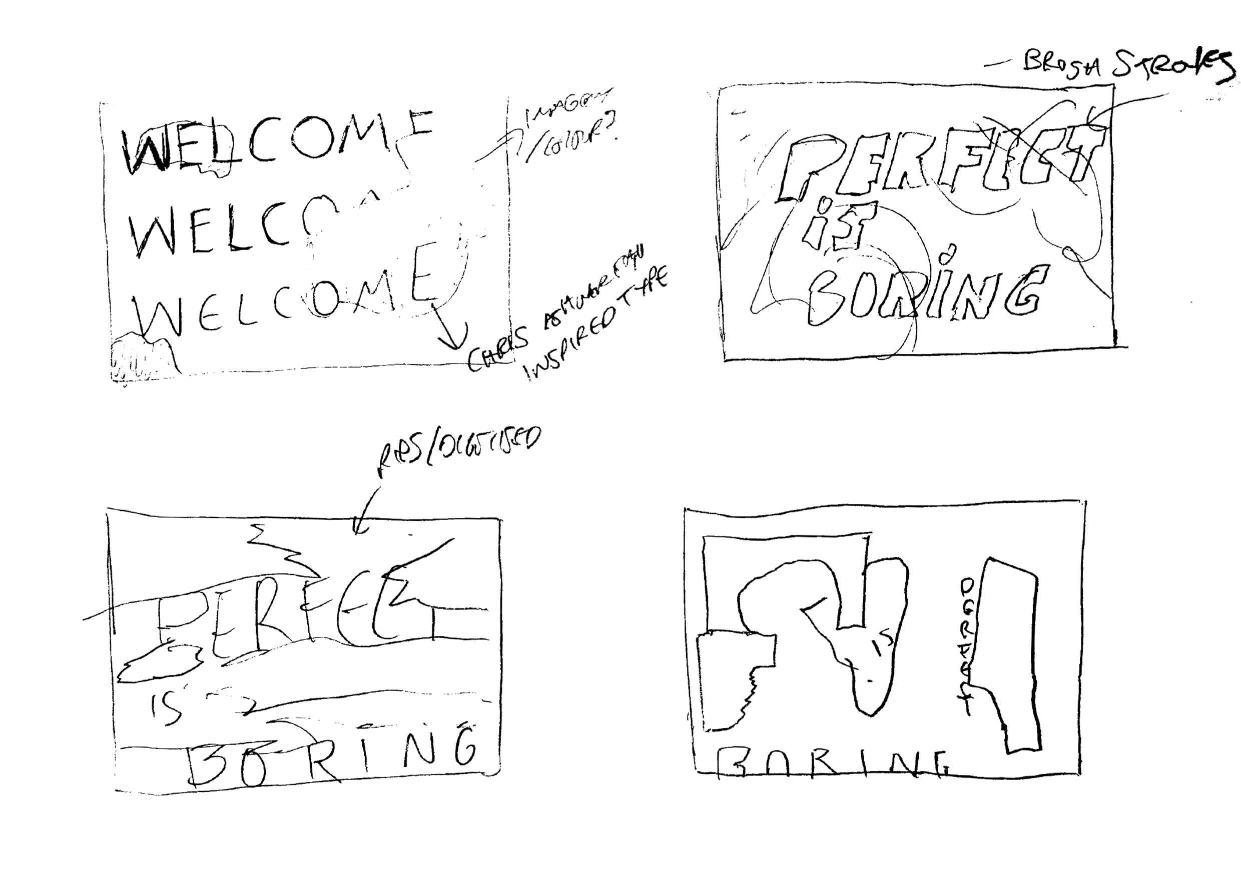
After collating some visuals to refer to, I sketched some brief design ideas, showing compositions/style. I then moved onto finding a suitable mock up, I found 2 different styles (figures 10, 11).
I wanted to convey my interest in typography with tactile elements and decided to first try and produce a type only design. I chose one of my favourite type faces called ‘Frick’ designed by Dennis Grauel and then filled the canvas with ‘welcome’. I then tested with layering the type on top of eachother and printed it out onto acetate using a ink jet printer. I love this printing method, the ink lays on top of the acetate and is able to be printed- it emulates a more experimental/random version of screen printing. Using the print left over on the acetate, I re-printed and dragged it across some plain untextured paper, creating a fun texture.
I scanned in all of my results and began editing it digitally, experimenting with colour and layering. I chose the quote ‘Perfect is boring’ to write above the grunge style ‘welcome’ type, which I feel is quite fitted to the type of work I want/like to create and would show a potential client that I would aim to create original and visually interesting works.
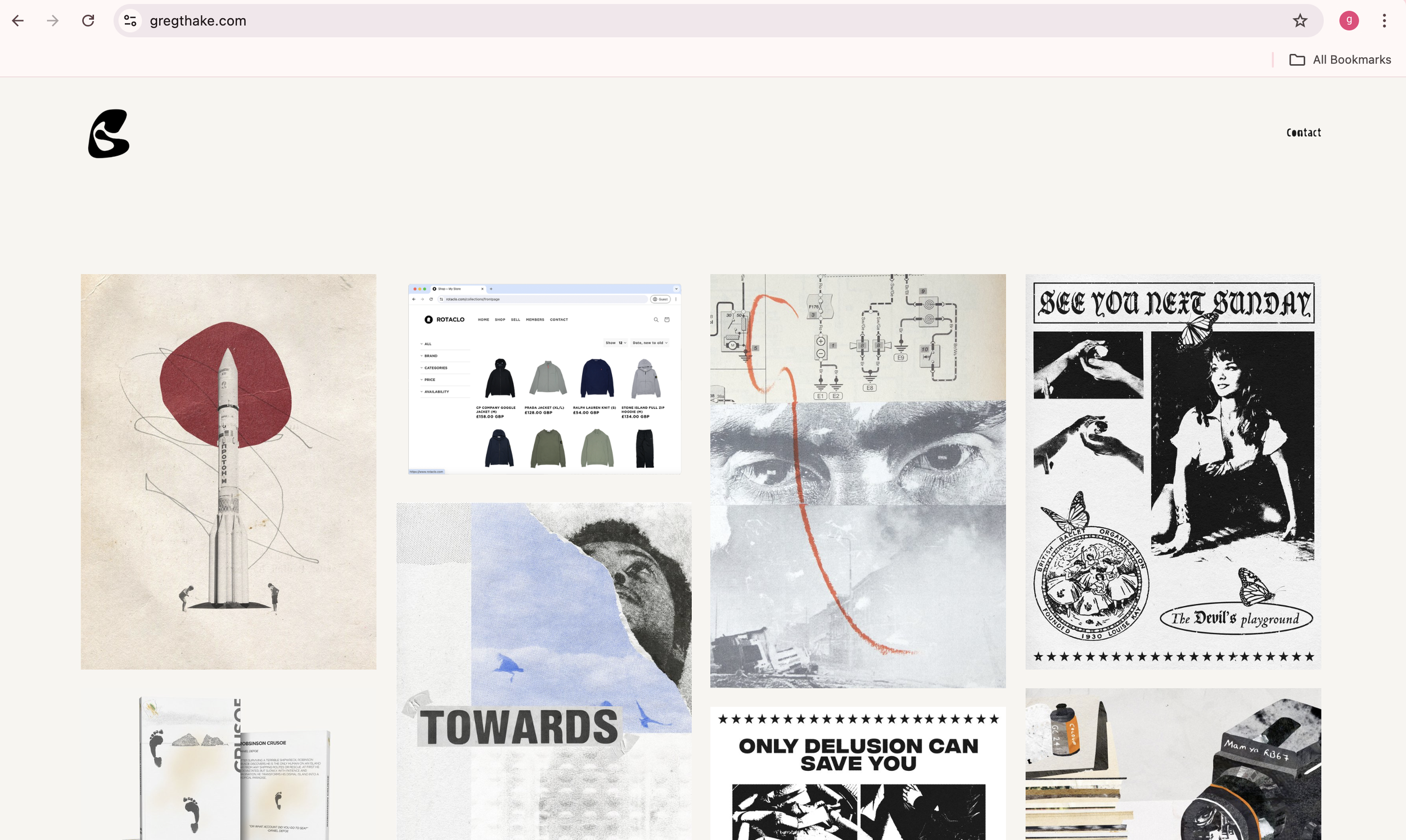
Using my logo I had designed for a previous exercise and for my website www.gregthake.com I created a pattern and experimented with the design on the Brown Cord rug mock up.
Moving forwards, I wanted to design a more illustrative rug to display my interest for collage style illustration and include my interests in art/typography.
I began by using scans of vintage magazines for textures, cutting abstract shapes into them. I then made some pen marks, scanned them in and added them to the composition. Using a photo of the back of a board I use for screen printing I made a texture to layer over the paper to make it look more old/worn out and go with the overall vintage illustrative look.
Using Midjourney, I developed an image of a sculpture, inspired by Giacometti and Lionel Le Jeune’s figure sculptures. I prompted for a close up face image to represent myself. I then used the same phrase ‘perfect is boring’ and printed it out, re-printed it using inkjet ink onto acetate, pressing the back with a roller to create a worn texture to it, inspired by Chris Ashworth’s typography.
Figures 2 and 3 are examples of work from Micosch Holland, a contemporary artist, heavily inspired by Dadaism.
I then came across ‘Contrado’ (figure 5) who offer prints onto fabric, which opens up the design to being anything, if I designed a mat for this style I wouldn’t really have any constraints.
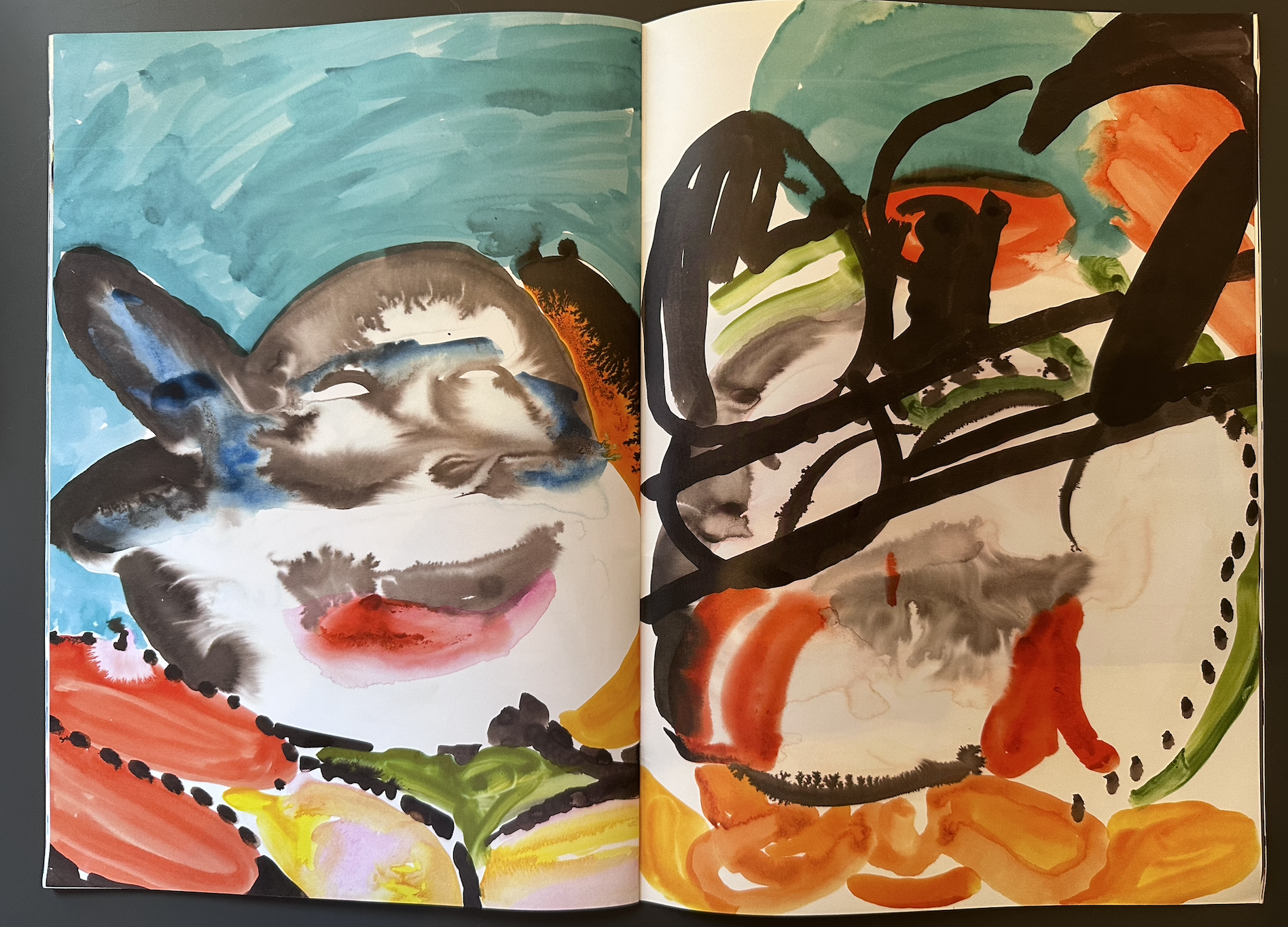
Figure 7 is a magazine/book by Mario Picardo a French Artist from his time in London, Shephard’s Bush. I have owned this book for a few years now and love Picardo’s use of colour/lines. When considering the styles of work that really inspire me, his work and this magazine in particular came to mind.
Lionel Le Jeune (figure 9) is a multidiscipline artist from France, whos sculptures particularly inspire me. I love his use of form and texture, something which abstractly inspired me/my design work.
This was an interesting and enjoyable task. I feel like I represented my passions within design with my 2 final welcome mats, which would work at showing a client what styles and areas of design I was interested in. There were other avenues/designs that I could explore and further designs to experiment with, which could have yielded better results- perhaps more experimentation was needed. I feel like the phrase ‘perfect is boring’ encapsulates my love for a more tactile style of design, something that has character and doesn’t look like it was a ‘cookie cutter’ style of design.
Resources:
Figure 1: Chris Ashworth (no date) Chris Ashworth. Available at: https://www.ashworth.work/ (Accessed: 30 July 2024).
Figure 2: Micosch Holland artworks (no date) Saatchi Art. Available at: https://www.saatchiart.com/en-gb/account/artworks/57091 (Accessed: 30 July 2024).
Figure 3: Micosch Holland artworks (no date) Saatchi Art. Available at: https://www.saatchiart.com/en-gb/account/artworks/57091 (Accessed: 30 July 2024).
Figure 4: Printed Logo Mats (no date) Idealmats.co.uk. Available at: https://www.idealmats.co.uk/logo-mats-colourscope?utm_source=google&utm_medium=cpc&utm_campaign=14208646471&utm_content=130022155340&utm_term=printed%20mats%20with%20logo&gadid=558430459436&gad_source=1&gclid=Cj0KCQjwwae1BhC_ARIsAK4Jfryi4zG8fNF9CDmOYUDEbpeottJEqeJHlj2OydIjAKy5sYuV7VbtKHIaAj2HEALw_wcB (Accessed: 31 July 2024).
Figure 5: Custom door mats UK: Bespoke door mats in 4 sizes (no date) Contrado UK. Available at: https://www.contrado.co.uk/custom-door-mats?srsltid=AfmBOorEntbOpiBUh5zDnSztS1i1wBTZusS48_ouP822WnudyaKazHTjjv4 (Accessed: 31 July 2024).
Figure 6: Design your own custom Logo Mats with specialist Logo Mats UK (no date) Specialistlogomats.co.uk. Available at: https://specialistlogomats.co.uk/design (Accessed: 31 July 2024).
Figure 7: Mario Picardo (2019). Shephard’s Bush. Topsafe.
Figure 8: Instagram (no date) Instagram. Available at: https://www.instagram.com/swi_rl_design/ (Accessed: 31 July 2024).
Figure 9: Lionel Le Jeune artworks (no date) Saatchi Art. Available at: https://www.saatchiart.com/en-gb/account/artworks/691094?page=2 (Accessed: 31 July 2024).
Figure 10: Unblast (2020) Free doormat mockup (PSD), Unblast. Available at: https://unblast.com/free-doormat-mockup-psd/ (Accessed: 31 July 2024).
Figure 11: Door Mat Mockup PSD (no date) Freepik. Available at: https://www.freepik.com/psd/door-mat-mockup (Accessed: 31 July 2024).


