Graphic Design 2.1: Professional Practice, Project 8: ‘Branching Out’ Exercise 1
Exercise 1: Taking Creative Risks
Revisit any of the work you have completed at level 1. This might be a book cover design, a brochure or some of your first experiments with typography. Try to select an exercise where you have a complete learning log entry and access to your working files and process work. You may select an exercise you really enjoyed, one that you didn’t understand at the time, or you may decide to select an exercise that you would like to improve for your portfolio.
Critique your work. Be honest with yourself and also be kind, your early work is not a reflection of your current skills and abilities. The perspective you have gained since you completed the first version of the project will inform how you proceed with this exercise. The goal is to push boundaries, take your work further, and demonstrate how your creative process has matured.
Based on your critique, select the option that will best enable you to take creative risks with the work and evolve it beyond what you initially thought possible.
Option 1: Scrap it and start over. With this option you go back to the brief and start with a completely new set of ideas, developing the work from the beginning.
Option 2: Salvage and refine it. With this option you work with the existing files and continue towards the concept you had initially set out to achieve. You might make adjustments to layouts, colours, or typography but the core idea will remain.
Option 3: Pick and choose. With this option you might keep some elements and completely replace others. You may return to a thumbnail sketch that was unfinished or you may dismantle the final layout and keep some elements.
Once you have critiqued your work and designed the new, updated, or revised version, compare the exercises side by side. Reflect on how your process has changed and what you have learned since your first attempt at the exercise. Include this reflection in your learning log.
I began this exercise by looking back through previous tasks from level 1. I went through each exercise and assignment noting ones that could be good to improve upon, some of which I had completely forgotten about. When I saw ‘Core Concepts Exercise 19: Judging a book by its cover’ with the brief being:
‘Choose a book by an author you are familiar with. You are going to design two different covers for it, one using illustrations or photography and the other using just type.
Design the whole cover including the spine and back page. Include the title of the book, the author’s name, a brief description of the story and any other information you think is necessary.
As you are working remember that your design is intended to help a reader know what the experience of reading the book will be. Is it a serious text book or an off-beat funny novel? Are the readers expected to be young women or older men and does this matter? Is it an ‘easy read’ or ‘literary’? Does the publisher have a house style you need to be part of?’
I remembered that this was a task that I felt proud of when completing and felt that this could be an interesting/challenging task to look back at, analyse and improve upon.
The lack of idea generation/brainstorming resulted in a less interesting and engaging final result for both the typography only cover and the illustrative cover.
I like the use of the textured axe imagery but feel that it overall looks bare, with a lot of unused or meaningless negative space on the final outcome. The colour choices work well and give the book a dark feeling, but perhaps other colour palettes could also be explored.
I like the hand made type, resembling the scene where the caretakers son is writing ‘redrum’ on the bedroom door and Jack scribbling ‘all work and no play makes jack a dull boy’ over his writing. I feel like this could be re-used and improved upon/be more effective if used differently.
The choice of typeface for the book title and back cover works well, but there was little/no experimentation with other typefaces, sizes or composition.
I decided to begin this task again as if it was completely new, perhaps referencing or taking some elements from my previous designs as I go forwards. I started with gathering visual research (including referring to the old mood boards) and beginning the brainstorm process with word association and spider diagrams.
FIGURE 1:
I am particularly inspired by their use of typography and how the type feels a part of the design, as opposed to their being separate elements to the design (e.g. illustration, type, other illustration).
Figures 10 and 11 are examples of work by designer Alvin Lustig. I came across his work within the first part of this course and have been inspired ever since. The use of simple visuals is particularly interesting as he was able to encapsulate a lot of depth and meaning in a simple and tactile way.
Lustig’s work came to mind when I was doing the word association page/considering what imagery best represents ‘The Shining’.
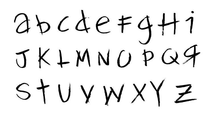
After some experimenting I ended up using a different typeface of a similar style that I had recently created for a previous task, this was inspired by Robert Rauschenberg’s handwriting, titled ‘Rauschenberg’. I felt that in this context, it referenced the ‘Redrum’ writing well and paired with certain imagery/colours looks quite ominous and thriller-like.
I began by reviewing my design process. I didn’t really have a design process at all at this stage, with each task I treated them completely differently without a structure or lens to view them through to help begin to generate design ideas etc. This is shown here with screenshots of my previous process including 2 mood boards and just a couple of sketched design ideas.
I continued to look at the designs and made some notes over them to solidify areas that I would change/improve upon.
Figures 8 and 9 are examples of some book covers designed by ‘Faceout’ studio. The designs by this studio are great examples of covers that look cohesive and appeal to the correct audience, whilst still being original/distinctive.
I began to make some general notes/beginning idea geeneration (notes 1) and then moved onto creating a word association page to help stir up some ideas for visuals.
Using my mood boards and word association as reference, I jotted some quick thumbnail ideas. I aimed to choose one main visual/concept for each thumbnail, inspired by Lustig’s designs. Ideas that stood out to me as working best conceptually were, the maze, a silhouette of a man holding an axe and the room key. I wanted to steer clear of more obvious options such as my original design (the axe), visuals of the hotel corridor, twins, trike etc.
I began by developing images of inside hotels/ballrooms/figures using Midjourney. I took 2 of these images and layered the silhouette on top of the ballroom, printed this and then cut it out using a scalpel. I initially wanted it to have a more tactile and for the edges to be uneven/have character to them.
I experimented with various layers in Photoshop, leaning into the more tactile feel of it, as if it was a collage. I included a typewriter typeface inspired by the ‘All work and no play makes Jack a dull boy’ from figure 1. I experimented with the original type I had developed for this and actually turned it into a useable typeface as opposed to drag/dropping the type previously from JPG files in Photoshop.
Using a cover from an old book, I scanned it in and created a nice old/vintage book texture from it. This added to the ominous/old feel I wanted to convey through the design. Despite the fact that Stephen King and ‘The Shining’ are extremely well known, I was keeping in mind to not go too far with the ‘horror’ aspect of the design as this may be off putting to some potential readers. I wanted the cover to convey a psychological thriller/horror as opposed to a slasher-horror, which I began it felt looking like. I took a break from this design and began to work on an alternative version, inspired by the Overlook hotel maze, which I felt could be more appropriate/better to convey the theme of the book whilst being appealing to a more diverse range of readers.
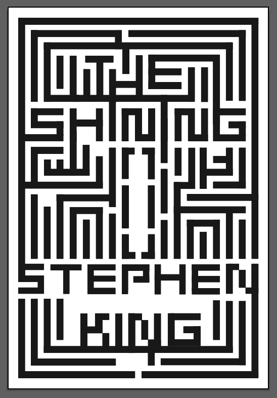
My idea was to intertwine the book title and author’s name into the Overlook hotel maze. I felt that the maze shape was the best visual metaphor for the book, representing the characters struggles, their isolation, psychological struggles etc as well as being an event that actually happens within the narrative (going into the maze).
I began by vectorising the shape of the maze and then working the type into it, editing it where necessary. I continued to work on the style of it, with the idea for the white writing to be raised above the rest of the book when printed. I tried to convey this by adding some depth to the design. The colour palette was inspired by the colours of the carpet within the Shining film and as described on the book as shown in figure 6.
I still felt that it looked quite flat and wanted to add a more horror/mystery feel to it so I experimented with adding lines and then footprints. I initially thought that the footprints walking around the maze could work well and make the title and authors name more legible but finally decided to change the colours around and add white.
Coming back to this design and viewing it with fresh eyes, it did not work as well as I had hoped and didn’t really convey the ominous feeling I wanted. The composition/type appeared like a video game and the type wasn’t very legible. From a distance the red footprints sort of looked like lipstick marks and were less obvious/bold than what I had aimed for. I continued to design, going back to my first design and working on it further.
I scanned in the silhouette over the text and began to experiment. This design was particularly inspired by a post I saw on Instagram by Elisha Zepeda a book cover designer for Faceout studios (figure 12).
Final mock up 1 (illustration) and mock up 2 (type only front cover) work well as a series. I liked my maze concept but felt that the execution of the design did not work as well as the other designs.
My first design brought forwards some ideas for the ‘typography only’ cover. I continued to experiment with this again using colours inspired by the carpet in figure 6 and also the colours I had used in my original design from core concepts exercise 19.
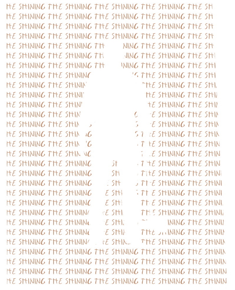
Inspired by Lustig’s ‘simple’ shapes I used the visual of the man holding the axe to create a silhouette which I applied to the text and experimented with inverting. The type repeated and in a row was again referencing the ‘All work and no play makes Jack a dull boy’ typed on a typewriter shown in figure 1.
After experimenting digitally, I printed the design and added some distressing using tape to remove elements from the design with hopes to ‘age’ the design and add a more ominous/mystery feel to it as well as more visual interest/depth. This gave me the idea to layer the silhouette I had previously cut out over the type I had printed out (which I experiment with within a further design below). I liked this visual as the ripped/blank area contrasted well with the area repeating the book title and represented the 2 sides to the character well.
I quite liked both the white and black version, but felt that the black background with white text was more mysterious and referenced the darkness of the hotel and the scenes at night.
FIGURE 12:
The posts described and presented some really intriguing designs which felt like posters as opposed to book covers. They are both so visually interesting and used simple colours to make the book titles and author name become a part of the book cover and work cohesively together.
I then used my visual and edited it so the contrast between light and dark was high (referring to the character’s and families psychological states within the book), colouring it using a dark brown and orange. Later I added some white areas to highlight the author’s name and book title, referencing the ‘Redrum’ writing style on the door (figure 2).
The typeface I chose for the author’s name was ‘Rama Gothic’ which had a modern, yet ‘gothic’ feel to it and I felt it worked well at highlighting the author’s name, which would draw in viewers as he is so well known, then hopefully the book title would be easily depicted from the illustration.
Again, I added the book cover texture I had scanned in of a very old cotton/linen book cover, making the cover feel old and adding to the horror/mystery feel.
For my final mock ups, I brought in elements from my original design, using the back cover’s information and the axe icon across both books.
I feel that finals 1 and 2 both convey the sense of The Shining, with the first feeling more ominous and the 2nd more horror due to it’s colour palette. I like the concept of final 1 with the character’s design having negative space separate from ‘The Shining’ title across the characters head/shoulder to represent the 2 sides of the main character Jack’s personality. I like the contrast of the light and dark areas in the background, emulating both the concept of the book and literally the dark hotel/bright snowy outside. I am still unsure whether the design choice of having a less obvious title (as the author is so well known, so is what the man/axe imagery represents) works, is legible and is a good design idea or takes away from the functionality of the cover.
I like the choice of typography, perhaps an experiment with the bold type being used within the silhouette could’ve been explored, this is the same for final 2 as the title is still less legible from further away. the spines and backs for both covers are less interesting and engaging than the front cover designs, perhaps more exploration was needed here too.
I like the choice of colours for final 1, referencing the colours of the carpet (figure 6) but looking back at final 2, I am unsure if the black/white/red colour palette is too ‘slasher horror-like’ and conveys less of a psychological thriller sense than alternative colours.
Overall this was a very fun and helpful task, looking back at old work and analysing where I can improve has been helpful in seeing both how my design process has changed, as well as help my critical analysis skills when reviewing my own work.
Resources:
Figure 1: Movieclips (2011) The Shining (1980) - all work and no play scene (3/7) | movieclips. Youtube. Available at: https://www.youtube.com/watch?v=4lQ_MjU4QHw (Accessed: 20 July 2024).
Figure 2: (No date) Etsy.com. Available at: https://www.etsy.com/uk/listing/1493553302/the-shining-realistic-redrum-door?dd_referrer=https%3A%2F%2Fwww.google.com%2F (Accessed: 20 July 2024).
Figure 3: the shining maze - Google Search (no date) Google.com. Available at: https://www.google.com/search?sca_esv=321dac8c89e154ad&sca_upv=1&q=the+shining+maze&udm=2&fbs=AEQNm0B2yzHMOEf_Yi0v5EYEWbKOCio4_914wq6ufX8pGLlmAryrUrheWY_IoupTN8gakBp5DNxj4sqXIaMhouUHzuVQIgRbMbqxCy5DoeSWDWut_LTSkCgaVy9YcGlWjRv3O8IOzunqjYgaACzphzEGv7iAsJWQZejZ0YvFfzXowXhV7KDTkcCPuLkG32Y3mYB48x5DqujdLentBaoRqoTTsHV8OfuYhg&sa=X&ved=2ahUKEwiR0NO03LWHAxWoZ0EAHRbYAzwQtKgLegQIFhAB (Accessed: 20 July 2024).
Figure 4: the shining maze - Google Search (no date) Google.com. Available at: https://www.google.com/search?sca_esv=321dac8c89e154ad&sca_upv=1&q=the+shining+maze&udm=2&fbs=AEQNm0B2yzHMOEf_Yi0v5EYEWbKOCio4_914wq6ufX8pGLlmAryrUrheWY_IoupTN8gakBp5DNxj4sqXIaMhouUHzuVQIgRbMbqxCy5DoeSWDWut_LTSkCgaVy9YcGlWjRv3O8IOzunqjYgaACzphzEGv7iAsJWQZejZ0YvFfzXowXhV7KDTkcCPuLkG32Y3mYB48x5DqujdLentBaoRqoTTsHV8OfuYhg&sa=X&ved=2ahUKEwiR0NO03LWHAxWoZ0EAHRbYAzwQtKgLegQIFhAB (Accessed: 20 July 2024).
Figure 5: Paur, J. (2023) The climactic maze scene in Stanley kubrick’s THE SHINING was terrifying to shoot because of fire —, GeekTyrant. Available at: https://geektyrant.com/news/the-climactic-maze-scene-in-stanley-kubricks-the-shining-was-terrifying-to-shoot-because-of-fire (Accessed: 20 July 2024).
Figure 6: Tamara Walker (tamarawalkerx98) (no date) Pinterest. Available at: https://www.pinterest.co.uk/pin/64809682133133073/ (Accessed: 20 July 2024).
Figure 7: The shining / 1980 (no date) Pinterest. Available at: https://www.pinterest.co.uk/pin/296182112994707258/ (Accessed: 20 July 2024).
Figure 8: Faceout Studio (no date) Faceout Studio. Available at: https://www.faceoutstudio.com/?itemId=ohpi0kuvgnv1s7unvfatsd1mzfa8qx (Accessed: 23 July 2024).
Figure 9: Faceout Studio (no date) Faceout Studio. Available at: https://www.faceoutstudio.com/?itemId=ohpi0kuvgnv1s7unvfatsd1mzfa8qx (Accessed: 23 July 2024).
Figure 10: (DESIGN BOOK JACKETS ALVIN LUSTIG) new directions new (no date) Swanngalleries.com. Available at: https://catalogue.swanngalleries.com/Lots/LotDetails?salename=%28DESIGN--BOOK-JACKETS--ALVIN-LUSTIG.%29-New-Directions%2C-New-&saleno=2497&lotNo=95&refNo=755535 (Accessed: 23 July 2024).
Figure 11: Alvin Lustig (no date) Pinterest. Available at: https://www.pinterest.co.uk/pin/329114685266240797/ (Accessed: 23 July 2024).
Figure 12: Instagram (no date) Instagram. Available at: https://www.instagram.com/ez.bookdesign/?hl=en (Accessed: 30 July 2024).


