Graphic Design 2.1: Professional Practice, Project 10: ‘Refining Your Professional Practice’ Exercise 1
Exercise 1: Reviewing your Own Work
Most of the coursework you’ve created so far has been a result of specific tasks with clear objectives defining the outcome. However every design or image you produce has a potential value or use beyond the completion of an exercise or assignment. At the end of Unit 1.1: Elements of Design, we asked you to go through the artwork / designs you’ve created throughout the course, and we would like you to repeat this task for this unit.
Review your sketchbooks, working drawings and thumbnails as well as the more ‘resolved’ or finished design work. Try to step back from each task’s original context, and its success as measured against your original intentions and aims, and make your selection purely on whether you enjoy the outcome aesthetically or conceptually.
Photocopy or scan a selection from your exercises and assignments to make a sample ‘portfolio’of sketchbook work, images or designs as a showcase for your different visual approaches and styles.Make noteson your choice, it will be a valuable step towards making your selection of creative work and learning log entries when you submit for assessment.
Project 1:
Exercise 1:
When considering Project 1 Exercise 1 aesthetically, I personally like both final pieces’ colour palettes. They appeal to me, are neutral with pops of colour. Final 1’s design lacks depth and is very flat, it needs something else ‘going on’. Final 2 is slightly more visually interesting but previous iterations could’ve been explored further.
Exercise 2:
I like the colour palettes for both final results. The browns and neutrals work well together in final 1, as does the dark blue/grey for final 2. I like the typography used on each and the tactile feel to it- although this could be more subtle and perhaps more effective.
Both compositions are interesting, but both seem too crowded. I feel that alternative layouts could’ve been explored and perhaps be more successful.
Project 2:
Exercise 1:
Again, I like the colour palette here, the colours relate to the concept (Leicester city) but the darker colours could be slightly more bold. The digital assets made ‘work’ but are very flat/lack visual depth. The final logo (as stated in feedback) is very generic for a play and not specific to Leicester- any city name could be replaced and still ‘work’.
Assignment 2:
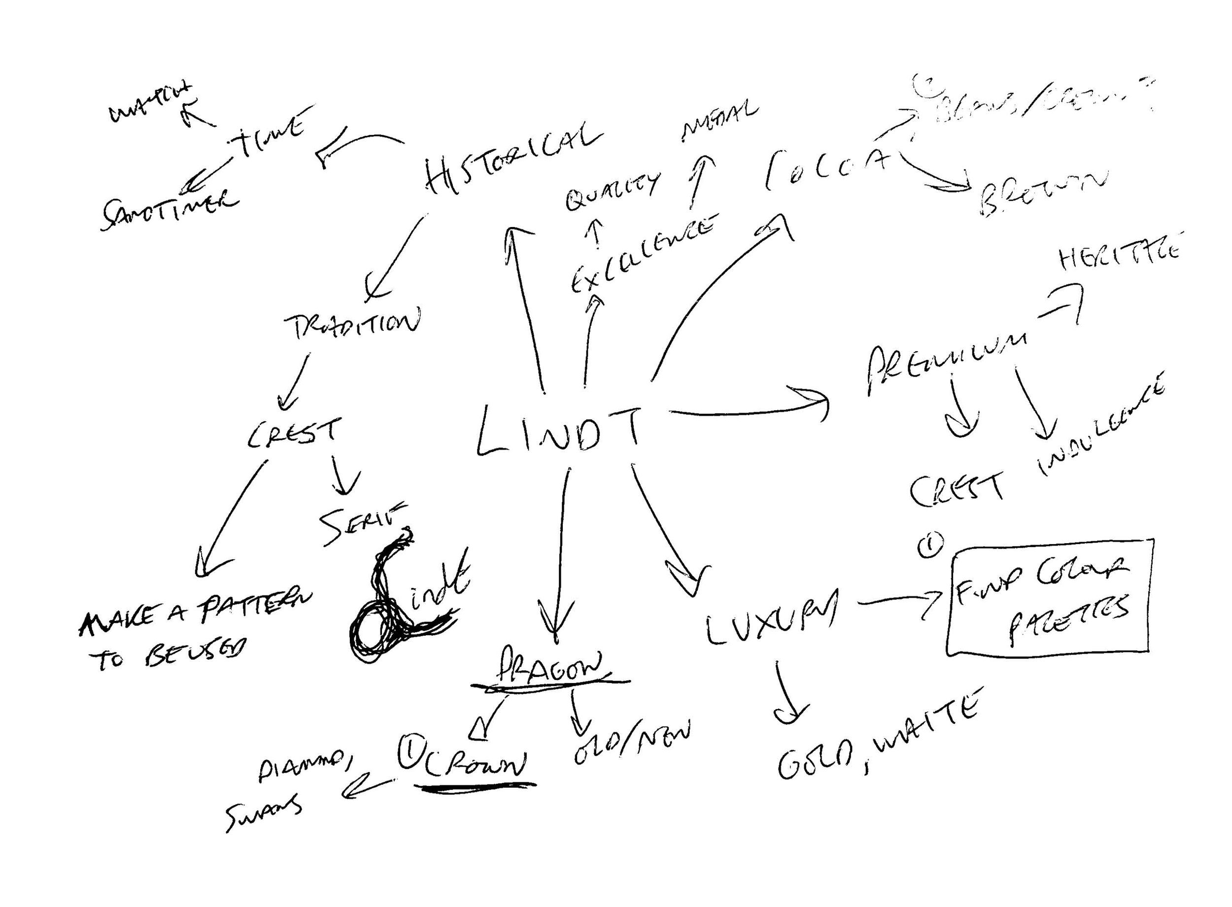
I like the colour palettes of the final designs but looking back I feel that the ‘gold on gold’ design does not work very well and the logo is not well defined, especially from a distance. I also like the aesthetics of a previous logo iteration (the swiss type version) and I feel this could’ve been explored further.
The mock ups look interested, but perhaps more could be added to them, they are quite bland images- mock ups and final presentation is something I would like to improve upon.
Project 3:
Exercise 1:
Project 3 Exercise 1, the logo taxonomy booklet. I like the aesthetics and concept of the front cover- each circle representing an individual logo, with the worse being on the left and the best on the right, standing out from the crowd.
Assignment 3:
I was originally pleased with the outcome for Assignment 3 as it was a massive improvement from previous branding tasks. Looking back I am not so sure on the aesthetics of the logo. The concept works well, blending each element together, but does the logo convey all of these elements effectively?
I like the final colour palette but feel as if these are ‘easy’ colour, although it was justified as the logo is more abstract.
I like the overall aesthetic of the final look book, being on a singular page, but feel as if there is massive room for improvement for layout and mock ups.
Project 4:
Exercise 1:
Project 4 Exercise 1’s layout is simple, but looking back it is too crowded. There needs to be more negative space between the type and images. The colour palette paired with the typography works, the type is clear and legible. I like the hand drawn elements and the imagery in the background to add some depth.
Assignment 4:
The personal branding task was a challenge. I like the final aesthetics of the logo, but I am still unsure if it represents my favourite style of design. I like the texture of the other printed G and perhaps the G I have chosen could be printed and re-edited to add some more texture. I like the abstract shapes used for the background of the business cards and the chosen colour palette.
Project 5:
Exercise 1:
Project 5 Exercise 1 was one of my favourite project results. I liked the end logo conceptually but was still unsure if it was suitable for a drinks brand and if it conveyed the right message. I liked the end colour palette but feel that the ‘Goodrays’ typography needs improvement and could be more stylised. I liked the end mock ups, but again feel like there could be more added, especially for the stand alone can mock up- such as ice, fruit etc.
Assignment 5:
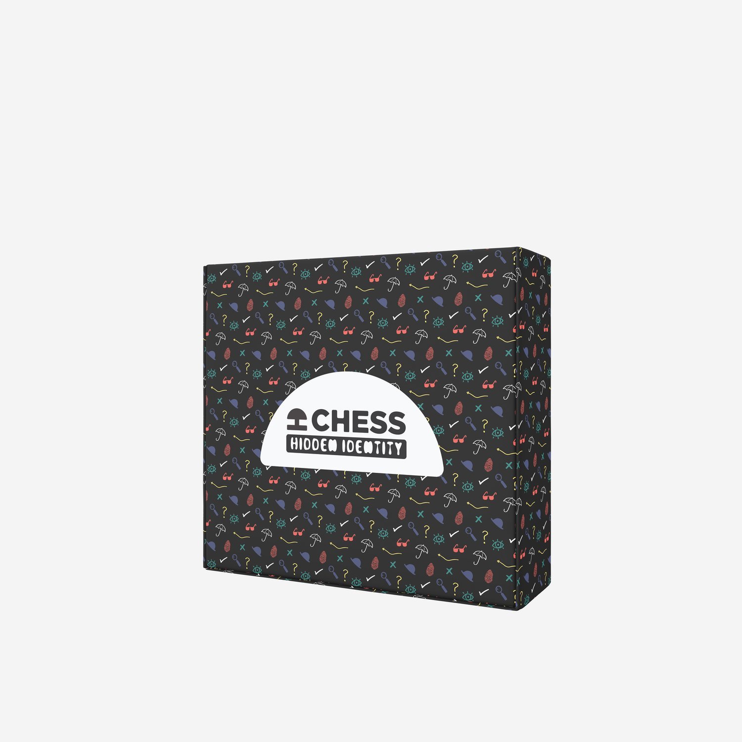
Assignment 5’s result was interesting. I really liked the concept, but the execution not so much. The final colour palette was too dark and the brand pattern was hard to discern from a distance/was too close together and could’ve had more visual interest by adding different sized elements. The final shape of the chess pieces worked conceptually and I quite liked the illustrations on them.
Project 6:
Assignment 6:
Assignment 6 was a challenging task but a fun opportunity to try out different concepts for the book design. I like the final conceptually and it’s colour palette. The silhouettes work and the title is legible, but the overall execution of the design I am unsure of. I feel that other avenues could’ve been explored further.
Project 7:
Exercise 1:
Project 7, Exercise 1 was a very challenging task. I like the end result conceptually, the logo relates to the heritage of Beijing while being culturally sensitive. I like the final colour, but perhaps it was too much of an obvious choice? I like the hand painted typography, referencing the calligraphy done in Beijing/Chinese culture.
Assignment 7:
The result for assignment 7 was interesting and referenced Rasuchenberg’s printed works well. The colour palette worked conceptually but was too obvious and resulted in a more bland result. The colours were muted to reference specific Raushcenberg works as shown in my research for the task, but relating to the restaurant, perhaps this could’ve been more vibrant. I like the print work and the textures of the imagery used as well as the hand drawn typeface.
Project 8:
Exercise 1:
I enjoyed this task and had interesting results to it. I like both covers conceptually but am still unsure whether final design 2 has a more ‘slasher horror’ feel to it as opposed to a psychological horror and whether this works conceptually or not.
I prefer the typography/negative space design of final 2 but maybe the colour palette of final 1 works better?
Concept 1 conceptually works, but the final execution was too busy and over crowded.
Assignment 8:
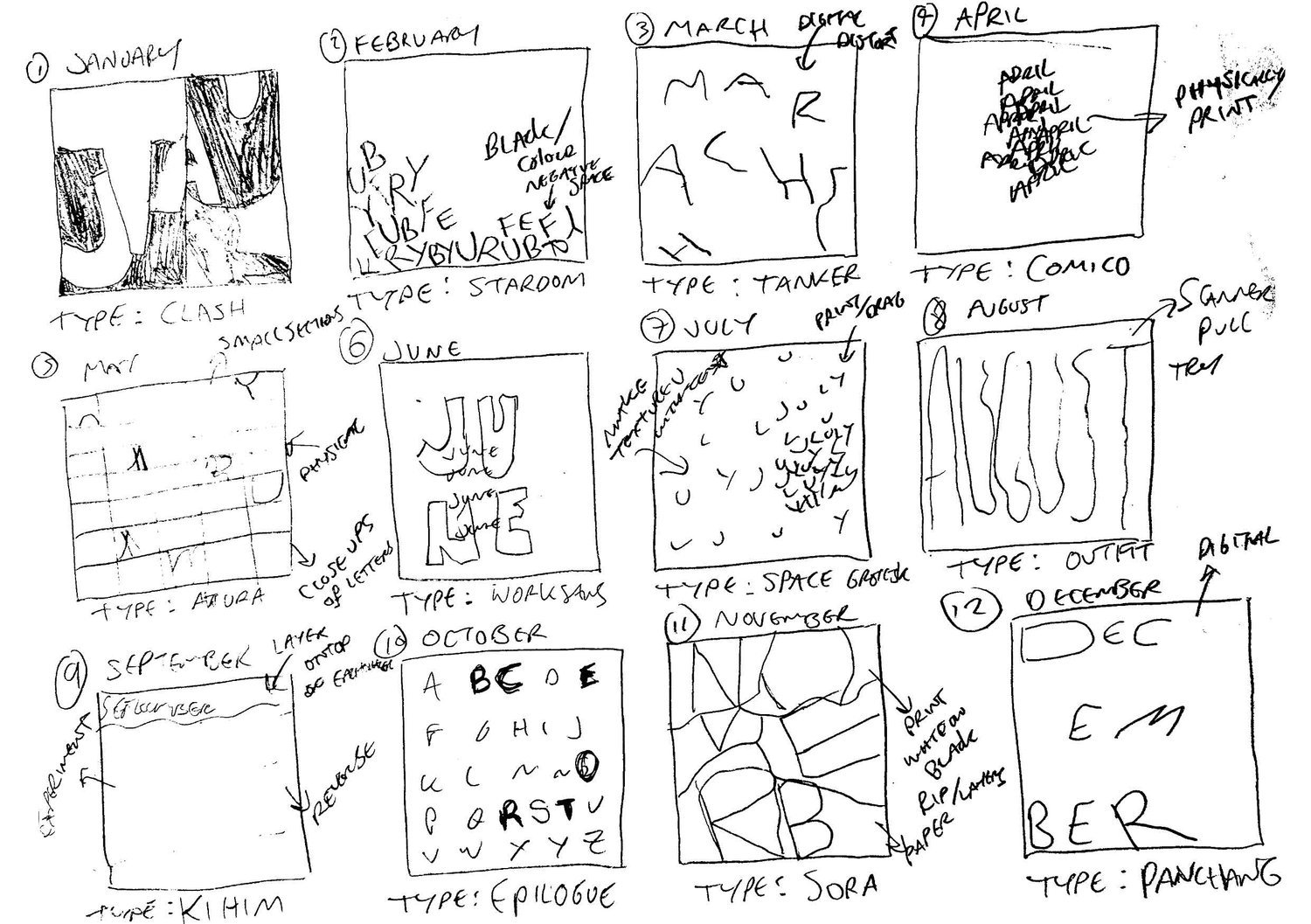
My final result for Assignment 8 worked conceptually- particularly in colour. The colours related to each season and were legible enoguh to promote the typography for the type foundry.
The black and white version still worked as the design was created with 2 colours, one lighter and one darker. I like the typography experiments on some of the designs, but others need more work.


