Illustration 1: Key steps in illustration- Part 4: Style-Exercise 5: A tattoo
A friend has asked you to design a tattoo for them based on the word Mum. He would also like you to make it into a greeting card that he can send his mother. (What a good idea for Mother’s Day).
Research the history and conventions of tattoos and body art – as well as the modern ranges look at the designs from the past and other cultures.
Decide on how complex your design will be and whether you will be using colour.
Draw up your design on a large scale, mindful that it will be smaller both on a body and the card.
Write up your decision making process in your learning log.
I began this task by researching various styles of tatoos. I went over to Instagram and looked at ‘Tatoo Snob’’s page who collates various styles of tatoos, some cartoon like, some realistic and some more traditional.
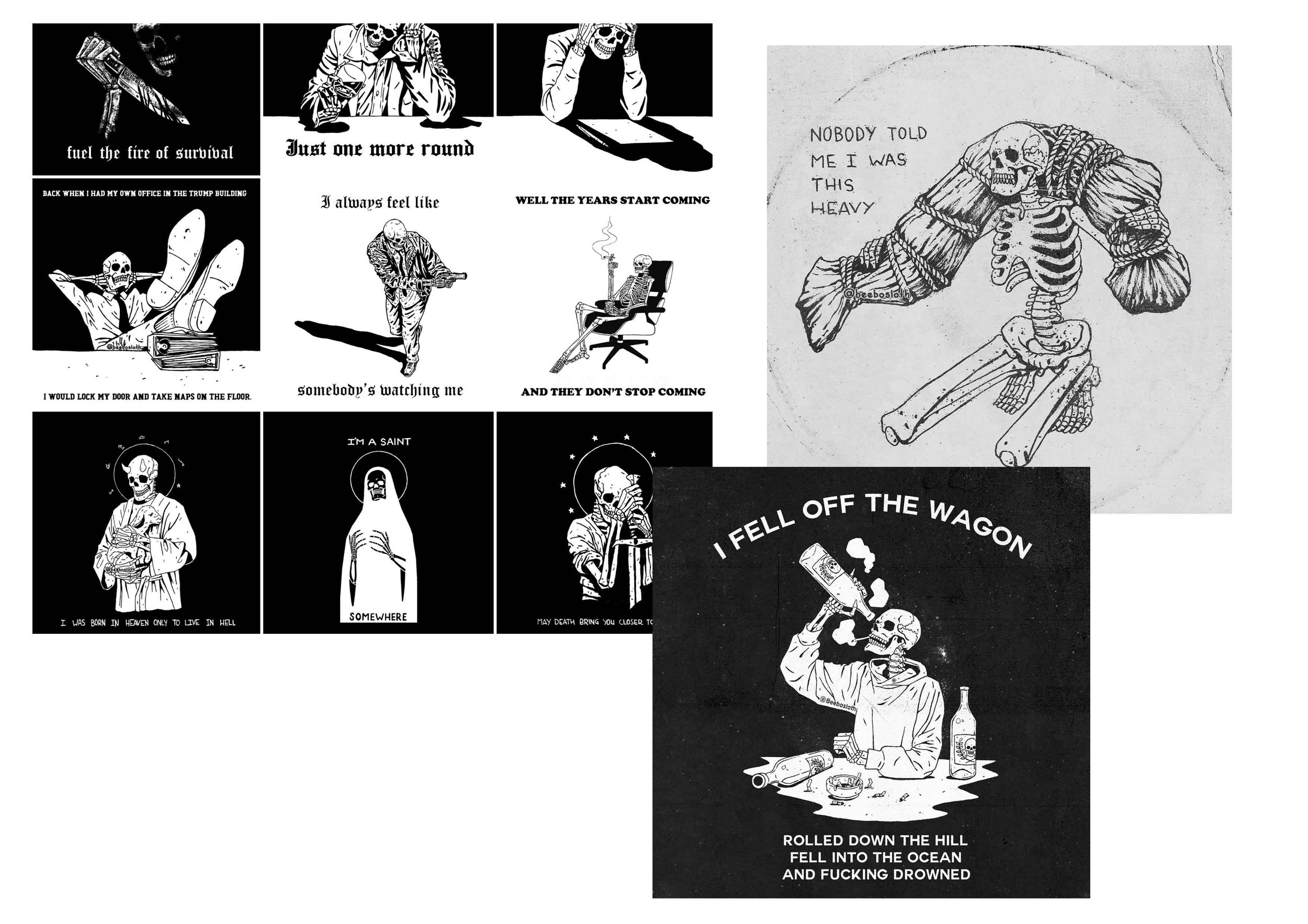
The above couple of mood boards are from Stanislav Osipov an artist whose work is often used for tattoos. I really like the bold line/mono colour look.
I looked into the recorded history of tattooing and came across an article here. Tattooing seems to of been throughout all history, all around the globe. The meanings of tattoo’s in the part I need to focus on for this task, to have an interesting tattoo that conveys meaning and is aesthetically pleasing.
I really like the aesthetics of tribal and classic tattoos. The simple colours with bold black lines looks great, this is the route that I feel I will take for my design.
I think that there is no way in avoiding cliches with this task and will fully lean into it!
I collated some prison stick and poke tattoos. I find these really interesting, they are images of actual tattoos on skin, preserved! The stick and poke method of using anything sharp, a needle, pen etc and ink, stabbing it into the skin and filling in areas slowly. This was ‘common’ in prisons. I really like the messy style with minimal colours, the tactile aesthetic is unique.
I wanted to include classic tattoo style iconography (hearts, banners, stars) within my design, including more interesting ideas. I jotted down related words/imagery that came to mind when considering a meaningful tattoo/card within this style.
I sketched some broad ideas which converged into something including a tea cup and classic flowers/banner, which I felt could work well as a cliche ‘mum’ tattoo style.
I took elements from my initial ideas and sketched out a ‘final’ to refer to. I then drew the parts of it individually, going over it in a broad pen, trying to emulate the classic tattoo style. I scanned this is and digitised it in Illustrator. Instead of using shapes to build up the patterns/colours in the design, I used Photoshop to give it a more hand-made style.
The final result looks less like the classic style than I wanted. I feel as if I probably should of used shapes to smoothen the line work, this would’ve looked cleaner and more like that style of tattoo. The ideas behind the imagery work- the cup of tea and the banner/stars refer to the style of tattoo. The composition is interesting and I intended to stick to the classic palette of colours but I am unsure that this combination of colours works well.


