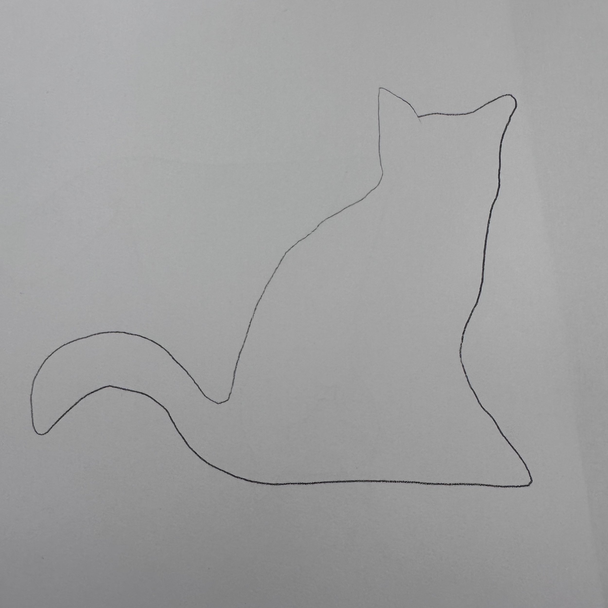
Illustration 1: Key steps in illustration- Part 4: Style-Exercise 6: Visual distortion
This exercise is designed to push you through a deliberate process of stylisation. Tackle it with an open mind and be prepared to adapt or adopt some of the approaches you discover.
Begin by drawing a cat or dog. Use reference from any source – life, photos or images from the internet. Draw the animal in a way that makes it ‘real’. Remember to describe some aspect of its appearance or personality.
Do a second drawing using no more than five lines. These lines can join up with each other and overlap or can be less connected; they can be straight or fluid.
Now make a collage from bits cut from a magazines and printouts. Let the texture of a tree be the fur for example. Have fun introducing surreal elements. Deliberately distort. How far can you bend reality?
Produce a drawn version (not a tracing) of your collage. When drawing, edit and select from the collage being aware of the properties you want to create a strong character. Review the distorted version and decide how you can refine the image.
This image can now be incorporated into a bigger image. Use your imagination and introduce at least one other element that introduces a narrative. Be creative but consistent in the development and rendering of this additional content.
To create my collage I used found materials such as parts from posters and re-scanned images from vintage magazines. I aimed to create an image with interesting textures.
I sketched my idea and then worked into it further, later adding water colours, inspired by Richard Haines’ work. I then scanned/reprinted the coloured version, making the colours more vibrant and added black line detail using a fine line pen, again inspired by Haines’ work.
The final image style is interesting but I am unsure if the cat imagery is very obvious. Though the final result isn’t very sophisticated, this style is something I would like to experiment further with, especially the incorporation of collage and paint/digital methods.
Reading through this task it made me think of Richard Haines to use as a reference. His style is very fluid and loose, using colour and lines in a more representational way.
I began this task by drawing from a photo of one of my cats. I liked the shadow/highlights on the photo and tried to make it look as ‘real’ as I could. I then went onto trying the 5 line drawing.
My 5 line drawing attempts were interesting to say the least. Try to keep the silhouette of the image was very hard. The image is obviously a cat, but there is no sense of detail/the composition is off, with more practise I feel like this could be better/more fluid.
I printed an image of the sketch I did and cut out the shape of my cat then continued to layer various images/colours over each other. The final result is interesting and could be developed further for future exercises. This could potentially be used with more targeted images within the collage to convey certain emotions or a to represent a certain subject.
Moving onto the next section of the task I wanted to create a surreal image, expanding on my collage. I used imagery of nature, trees, sky and clouds within my collage and wanted to include these elements as a part of the cat as opposed to separate.


