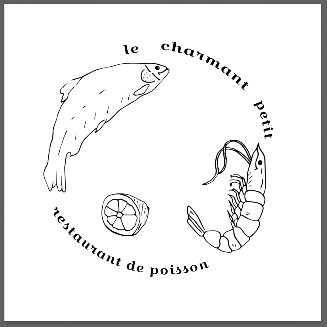
Illustration 1: Key steps in illustration- Part 4: Style-Exercise 4: A menu card
For this exercise you are asked to provide an illustration for use on the menu of a sophisticated, quality fish restaurant – one in a chain sited in major European cities. The menu uses fresh ingredients and the ambience of the restaurant is modern, bright and contemporary in design. Any food depicted needs to be visually appetising.
Although the image will be used at a small size on the actual menu, if it is successful the restaurant would be interested in also using the image as a logo on their stationery and vans. As such the image will need to be reasonable simple and clear.
You will probably want to work on the artwork at a large scale but you need to provide an example reduced to 40mm x 40mm as it will initially be used.
Angelo Dolojan is an illustrator who uses a looser style. I was interested in this style with a combination of a more sleek illustration for this task to represent a modern, sophisticated restaurant.
I continued to jot initial ideas and looked into names of restaurants. I decided to move forwards with 'La Petit restaurant de poisson’ after seeing the name of a fish market in London ‘La Petit Poissoneirie’. The French sounded sophisticated and could work well as an interesting type face.
I took elements from some of my thumbnails and began to sketch them. I wanted the logo to appear hand made/artisan but remain sophisticated. I chose a shrimp/prawn, a fish and a lemon to represent freshness. I took this to Illustrator and made the line work digitised, touching up certain lines and making elements thicker.
I began this task by looking at menus of high end seafood restaurants and then looking at various logos, some from fish and chip shops and some from restaurants. I wanted to research both so I avoid creating an illustration that doesn’t look like it should be used on a sophisticated seafood restaurants menu.
I went onto experimenting with typefaces. Initially I was going to make a hand drawn type but then felt this could come across as unsophisticated. I went with a stylistic typeface that I felt looked sophisticated but still legible. I experimented with the composition in Photoshop.
I added some more illustrations, one of a herb leaf branching through the illustration with the idea of it drawing it together/leading your eyes from the top of the restaurant name to the bottom. I looked at the colours of the illustration and aimed for it to look fresh/appealing and sophisticated. The blue colours I felt worked and still allowed the inner parts of the logo to be legible.
I continued to experiment with composition, referring back to my thumbnail sketches.
I feel that the 2nd illustration would work better on a menu/as a logo as it is more dynamic, the elements look like they are moving outwards towards the name of the restaurant. The lemon/wine bottle maybe could be mirrored as they look unintentional and I am unsure if they have a sophisticated look to them. When zoomed out the logo is less obvious than final 1, which could be an issue if printed small onto a menu. The sense freshness I feel is conveyed through the shrimp/fish illustrations alongside the lemon and wine but I am unsure how they come together at the end in regards to composition.
When directly comparing to other logos I collated at the beginning of this task, I probably should have focused less on the hand drawn style and gone with a more digitised ‘clean’ look having the illustration be all encompassing into a certain shape, such as a fish, or focused on the type being a certain shape. The incorporation of type and illustration/ creating a synergy between the two is something I will continue to work on moving forwards.


