Illustration 1: Key steps in illustration- Part 3: Working it out-Exercise 5: Giving instructions
Using the internet, magazines, reference books leaflets, brochures and flyers make a collection of examples and reference materials that can help you with an illustration to fit one of the categories below.
Making a cup of tea
Getting to my house
Playing a tune on an instrument
Start by working out the information you need to impart and the steps involved. What are the main points? How many stages are there? Working at a fairly large scale, work out the space needed for each step. You may decide to have one picture that encompasses the whole process or you might want to break it down into a strip with clearly demarcated steps. Try as many possibilities as you can.
Be mindful of the hierarchy of the elements in the composition and the dynamics needed to draw the viewer’s eye from one stage to the other. Try to use as few words as possible. Best of all use none.
Before you start the final artwork take a critical look at your roughs and compare one element to another and be especially aware of what is happening in the immediate background of the image.
Decide on the tools and materials you will use for your illustration. If you use colour be aware of how it adds focus and can help your communication process.
When you have finished show it to other people to check that it works both as an attractive illustration and in its main function – to give instructions.
Saul Steinberg is an illustrator/designer recommended to me by my tutor. His style of illustration is great, the bold black lines work really well with a specifically chosen amount of colour- making it more impactful. The use of photo/collage within the illustrations is the element I am particularly interested in and definitely a style which could be experimented with throughout this task.
Jeffers illustration style reminded me of the art by Lewis Rossignol. I really like Rossignol’s use of mixed media including collaged elements. The textures are really interesting and the more abstract is appealing to me.
I created various textures/marks using tea stains and printing/reprinting them onto different pieces of paper. I also collected some household ephemera- something you could potentially leave a cup of tea on top of.
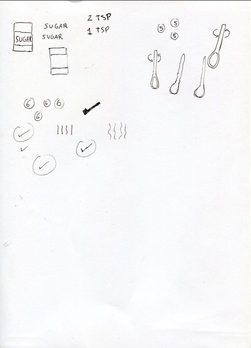
I decided to go with ‘making a cup of tea’. I created a spider diagram and tested with different ways of bullet-pointing how to make a cup of tea. I tried to create a list which was as simple as possible. I jotted some initial ideas of simple and to the point diagrams including as little steps as possible- 6. I quickly drew ideas that came to mind before researching further and collecting materials/images/artist research.
When researching Steinberg I came across some illustrations by Oliver Jeffers which caught my eye. The styles have some distinct similarities, their use of colour and textured/aged paper. Both their works have a very tactile feel which I like. I collated some of his map like illustrations to reference for this task as I feel they could be relevant for brainstorming and drawing.
I looked into more informational/instructional/technical illustrations for inspiration regarding layout and how to simplify instructions. I came across Ikea style designs which only used imagery to describe how to perform certain tasks or make certain things. The simple black lines work really well and the layouts are simple to follow. I found the more technical instructions in mood board ‘info illustrations 2’ helpful for ideas regarding potential compositions of my illustration.
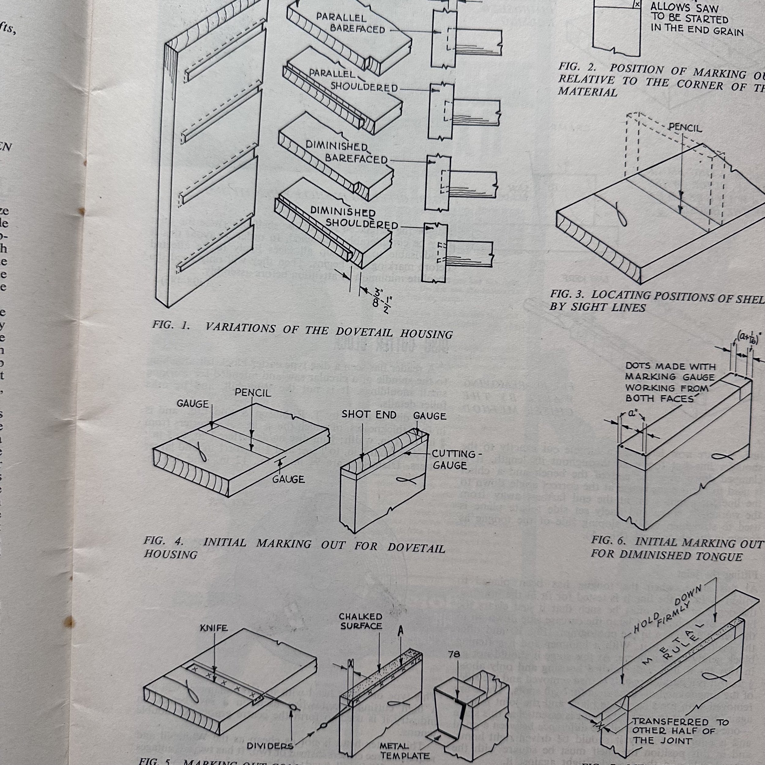
I looked through various ephemera I have such as old magazines and had a few in mind which could have good examples of technical illustrations/images. The ‘woodworker’ magazines are from the 60s and provoked a few ideas for compositions and uses of typefaces. Various pages of the older magazines included nice textures including ring marks from cups, splash marks and hand jottings previous owners of them have made. These findings are all great to have when designing.
I went onto creating some messy style illustrations inspired by Steinberg and Jeffers, also with the idea of using ‘found materials’ or material that would be lying around a house, office, somewhere you would drink a cup of tea etc. I experimented with the illustrations and some images from the internet, combining them with the textures I had created just to play/see how things looked.
I took multiple photos from different angles of making a cup of tea in order to have my own images for this illustration.
I used all of my own images apart from the sand timer. I decided that a sand timer may’ve been better than a clock/watch as the timing on the face of it may be more confusing- a sand timer is universally known as meaning ‘time’.
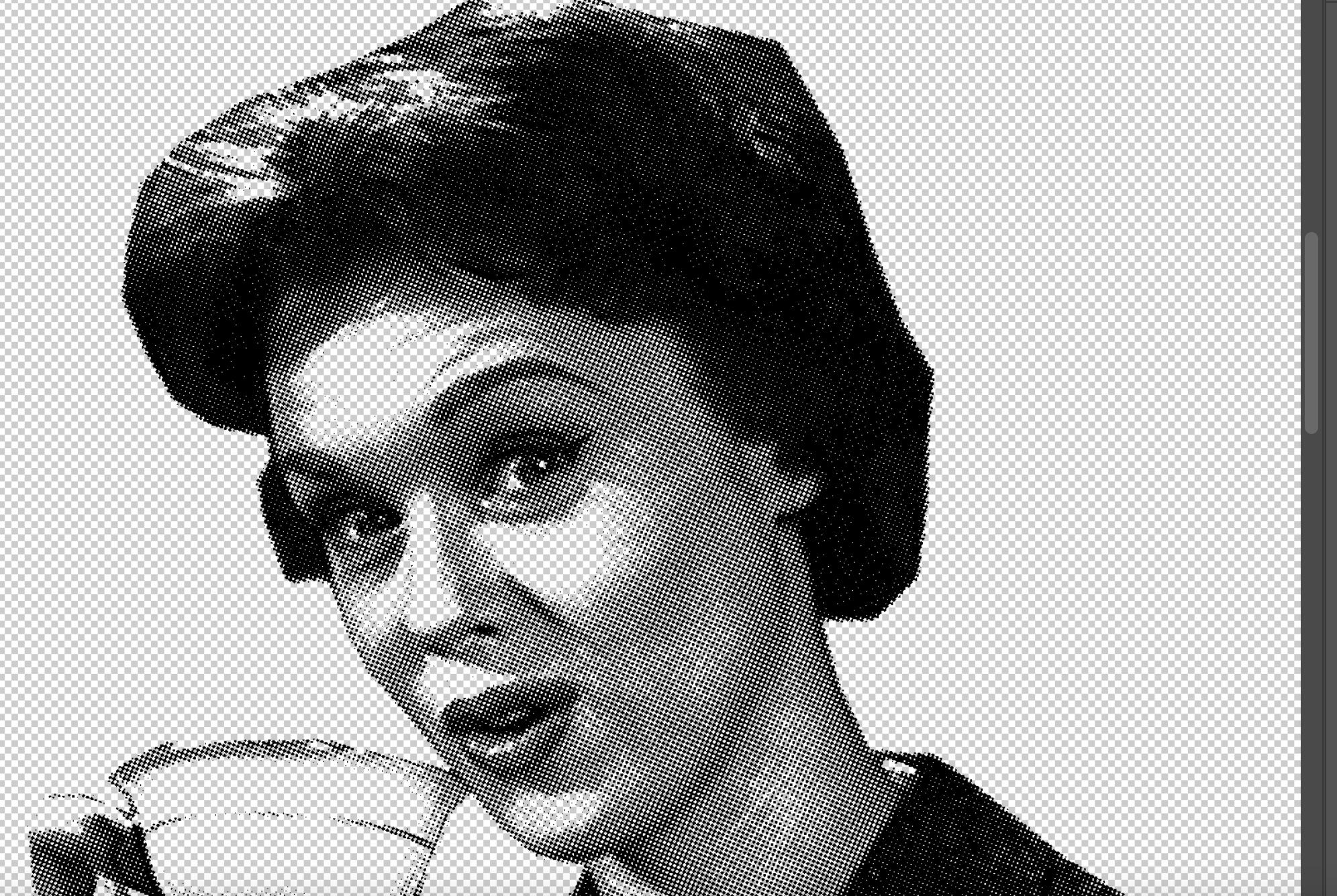
I experimented with various filters, layers and with using the textures I had created. I went through each of the images and adjusted their threshold, painting/taking away certain elements to try and create an image that is obvious but interesting aesthetically. I wanted the texture to be like tea granules. I achieved something close to this through multiple layers and printing/rescanning the images.
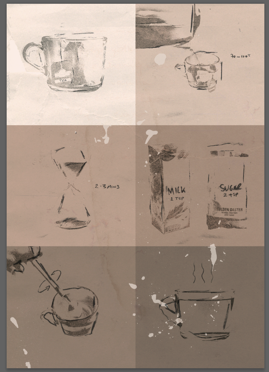
I referred back to my initial mind maps and continued to experiment with different images and try a more stylistic artwork. The end result still needed to be functional as information on how to make a cup of tea and I am unsure if this was fully achieved or if this was clear enough. I compared the final results:
The first result (image on the left) was initially inspired by the Ikea style instructions, aiming to be produced in the style of the other illustrators (Steinberg, Rossignol, Jeffers). I feel as if this is functional as an informational artwork but the use of more colour could of been more beneficial. Perhaps if I had introduced red for heat, white for the milk/sugar- less text/explanation would of been needed, making the artwork more simple and easy to follow. I wanted the colours to be representative of making a cup of tea so wanted to stick to the palette of browns but on reflection these colours could’ve been used more sparingly along with others in order to present the information as well as being aesthetically interesting.
The second final (on the right) included elements from the previous illustration presented as circles. I initially wanted to show the informational images as tea droplets, as if spilt over the image but this felt too tactile/made the hierarchy of images more obscure. I wanted to keep the order of importance as obvious as possible, having the images go from top to bottom but I think that this was lost in the image and by the use of other shapes/lines. The use of a numbering system could’ve been beneficial, having each step numbered and perhaps each of the individual illustrations being larger and clearer.
After tutor feedback I re-looked at my first final design and implemented some colour.
I chose red and blue, red to represent heat, blue to represent time. I chose red as it is commonly associated with heat and blue to contrast. The blue mid way through the illustration in a way balances or breaks up the 2 red elements.
I quite liked how these small changes made a lot of difference not just to the functionality of the illustration, but the aesthetics of it too.


