Illustration 1: Key steps in illustration- Part 3: Working it out-Exercise 4: Abstract illustration
Listen to a piece of instrumental music by a musician such as:
George Gershwin
The Gypsy Kings
Beethoven
Miles Davis
As you listen to the music create marks which convey your interpretation of the essence or mood of the piece. Work quickly and intuitively to bring a degree of self-expression to the exercise. Be selective in your use of materials, colours, marks and textures.
Stand back from your worksheet and choose an adjective or word that you feel describes the tone of the piece. This is your interpretation and not a definition of it. Go through your drawings and choose a square area that you feel communicates the meaning of your chosen word and has visually interesting qualities.
Using a square format and working at any size, reproduce your selected area. Starting with your chosen adjective, introduce colours, textures and shapes. Choose any media you like for this exercise and experiment by mixing them. Try not to over complicate the image.
Be conscious of the mood you are trying to convey – keep listening to the music as you work to help you focus more clearly. You can add forms or create the shape of an element with some representational value. Any additional shapes should enhance or extend the design and fit together visually within the structure you have created.
Constantly reappraise your image to ensure the composition suits what you are trying to say. You may find that you are editing and removing elements from the original and replacing them with others.
Do you think your image would work as an illustration for a cover of a CD for the music you listened to?
I have loved art that leans towards the abstract expressionist style for as long as I can remember and was very interested by this task. I enjoy to produce art in response to music quite regularly but over time have developed a ‘method’ or workflow for doing so. I was interested to break out of my usual ‘style’ and experiment with different approaches for this task. I began by collating work by various artists to reference and gather inspiration from.
Robert Rauschenberg is an artist I constantly reference and mention throughout my design course but again for this task his work serves as a great reference. Rauschenberg’s use of mark making combined with imagery is very expressive and his use of colour helps convey emotion. I really enjoy his work with smaller amounts of colour, used seemingly perfectly.
shapes. I like the colour brown as I feel it represents the contrast between sombre and energetic parts of the music and it’s sad over all feeling.
Frank bowling’s work is full of textures, colour and found materials. I find Bowling particularly inspiring as he is one of the few living artists who have produced art for so long and still continue to do so. His Instagram page ran by I believe his studio assistant is a great source of inspiration. Bowling’s more recent style of mixing colours using water and found materials is really interesting and something I could experiment with.
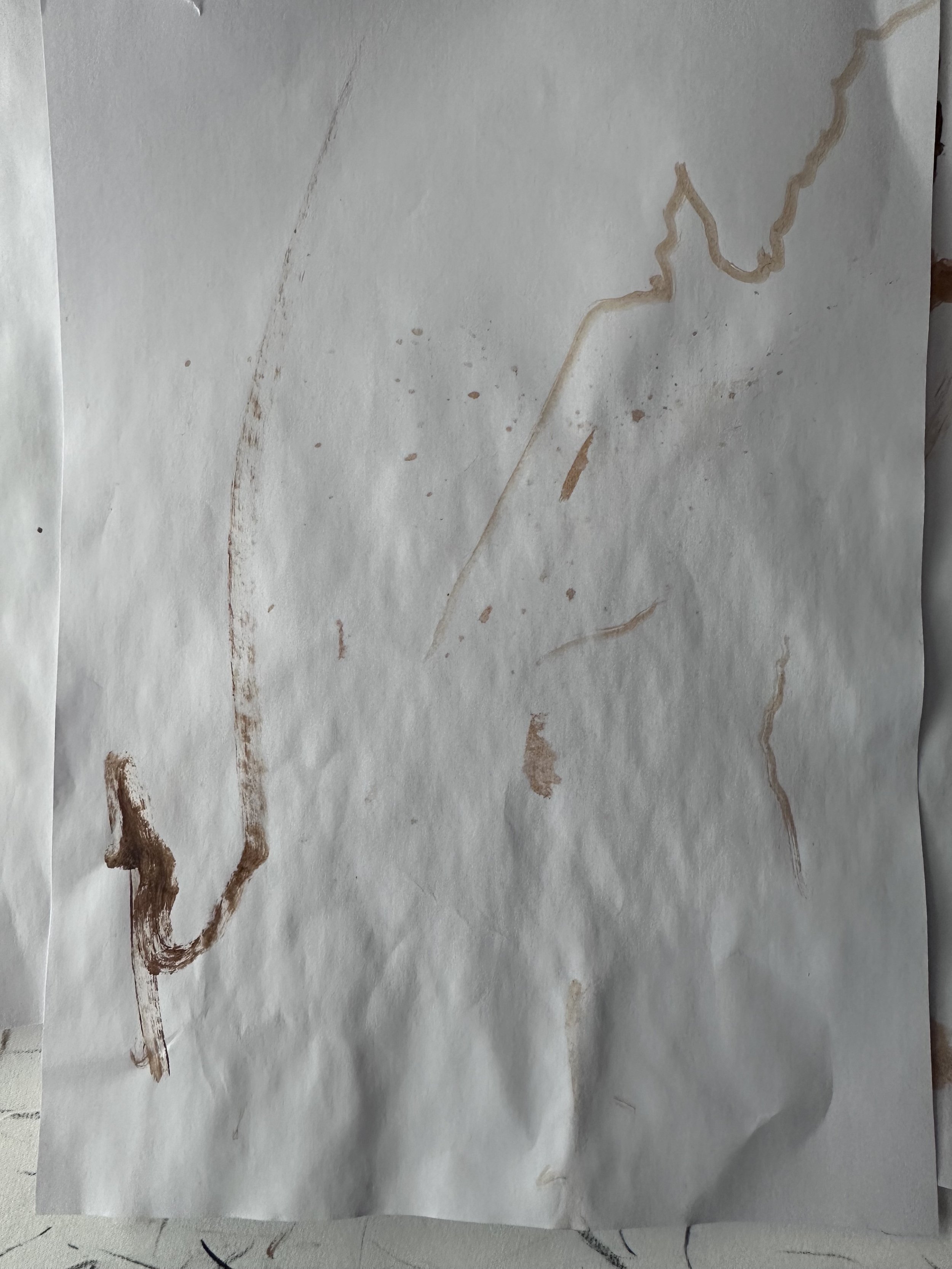
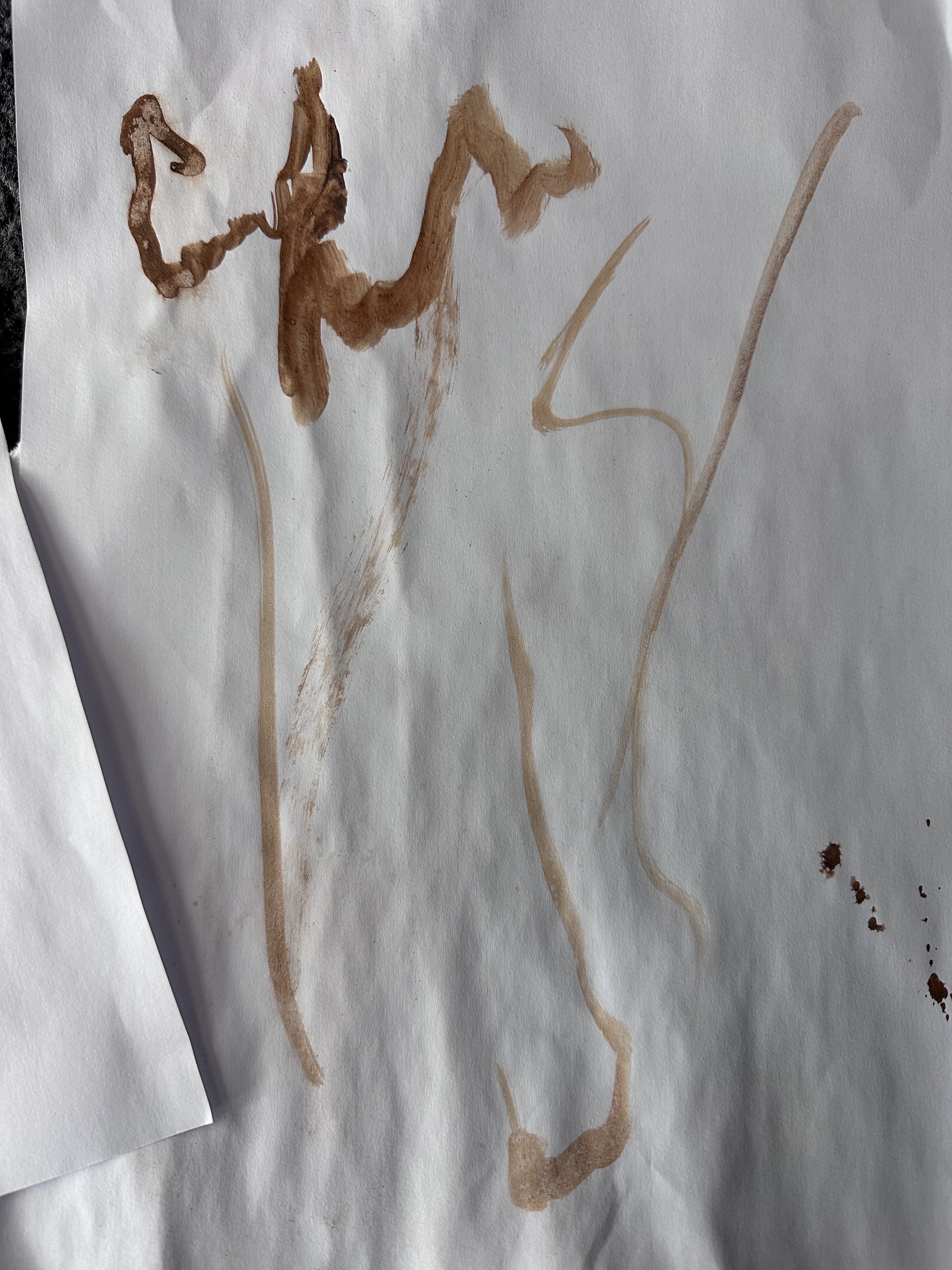
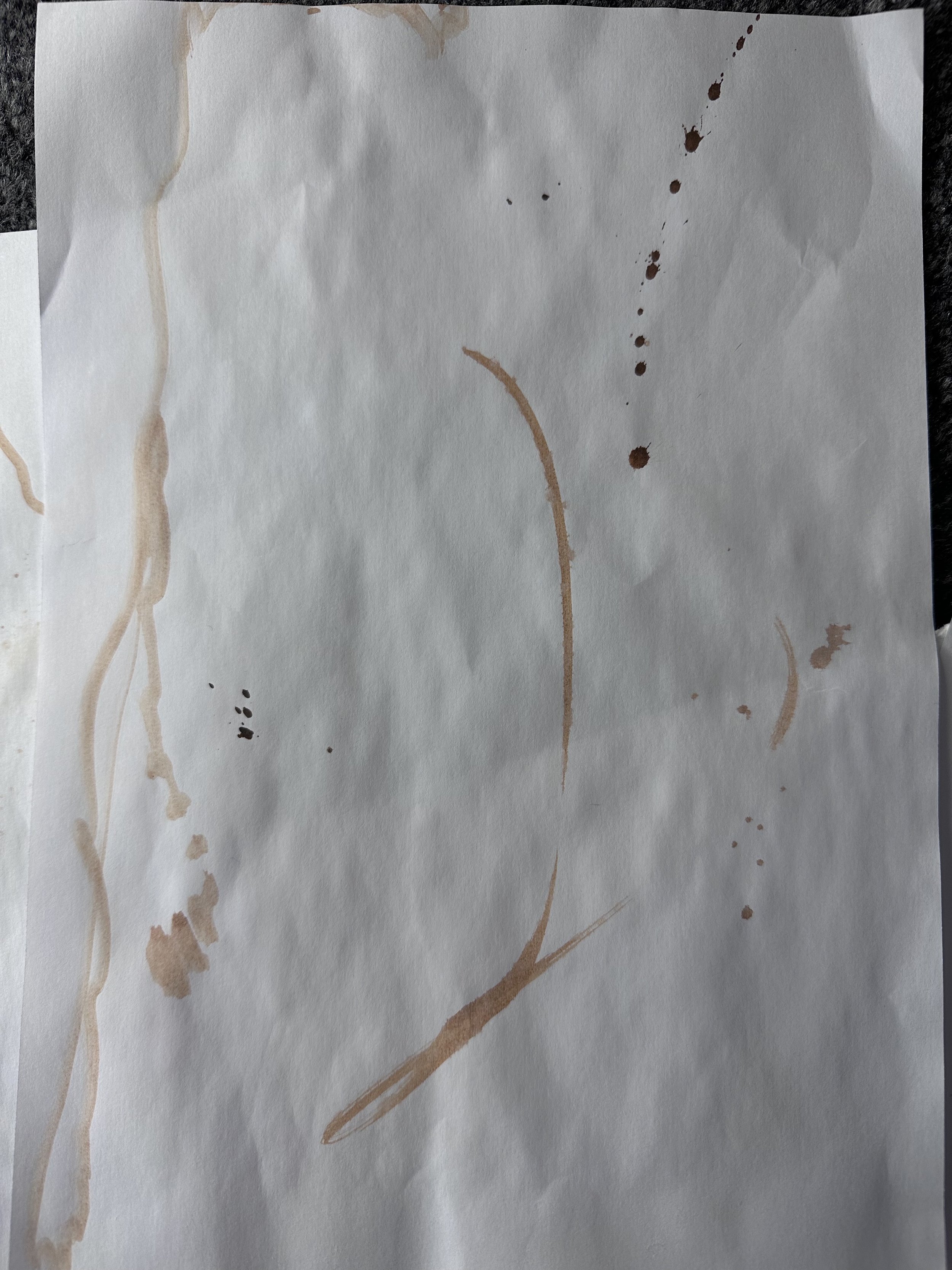
I decided to listen to Beethoven and create marks to capture the mood of the music. I listened to one my favourite compositions known as ‘Razumovsky Quartets’ the music comissioned by Russian Prince Razumovsky. The music was produced whilst Razumovsky lived a more secluded life following a fire that happened after a New Years Eve party, that burnt his palace to the ground, including his many artworks, sculptures and instruments, the incident also left him partially sighted. The part I particularly love is the 3rd movement at around the 30 minute minute mark.
I began by using brown ink and a small wooden stick to produce marks, and then using a paint brush and a spray bottle to make other
I used various layers of paint to produce the marks made, inspired by Bowling’s artwork and tried to re-create the marks in the style of the others I had first made on paper in brown ink. I didn’t like the feeling of the darker colours so covered it in white and used tape/various tools to retract from the paint revealing the darker underneath. I added the colour blue underneath and above as I felt this represented the word ‘sorrow’. The music and story behind the music to me is represented by the word ‘sorrow’. You can feel the loss and sadness felt through the music and can almost romanticise it.
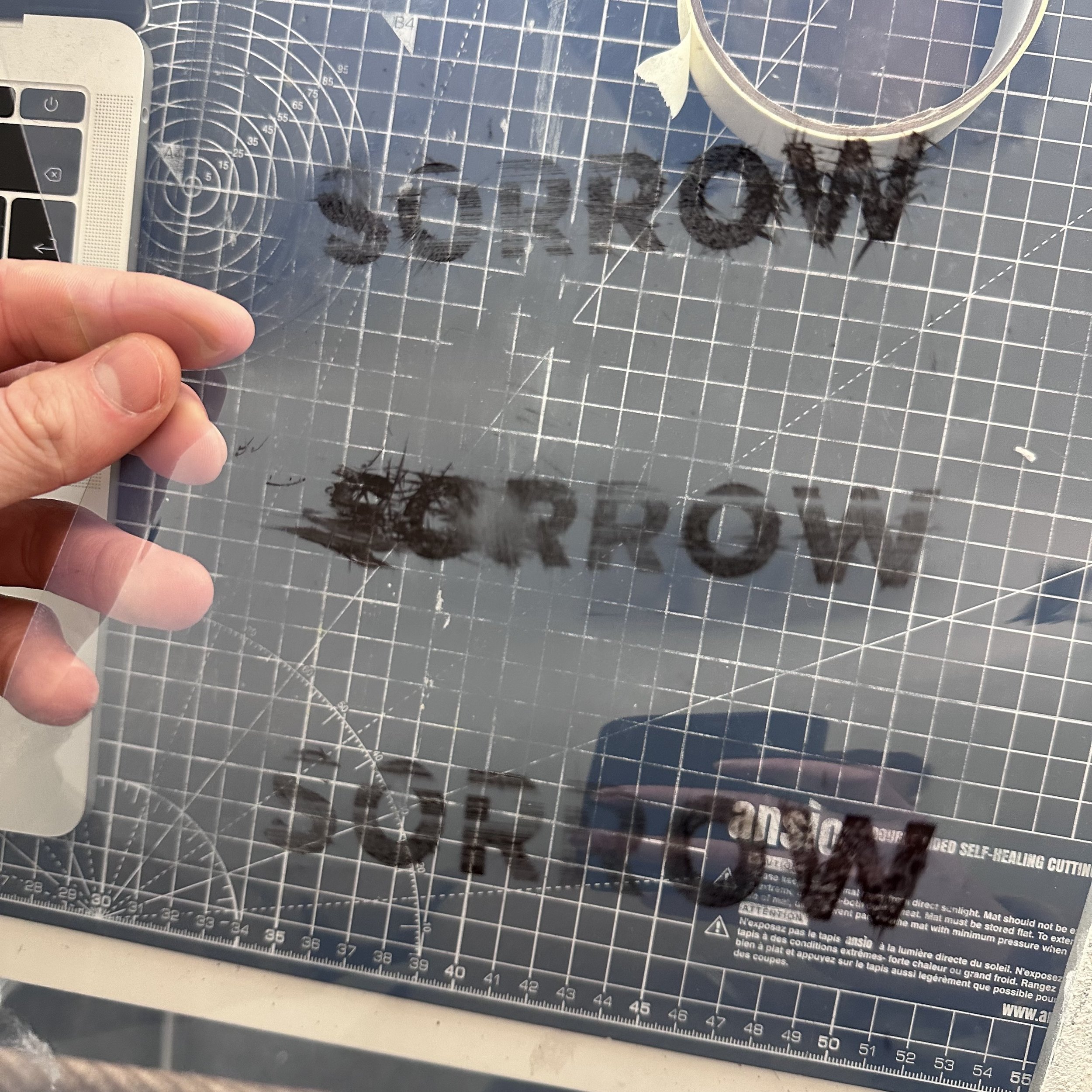
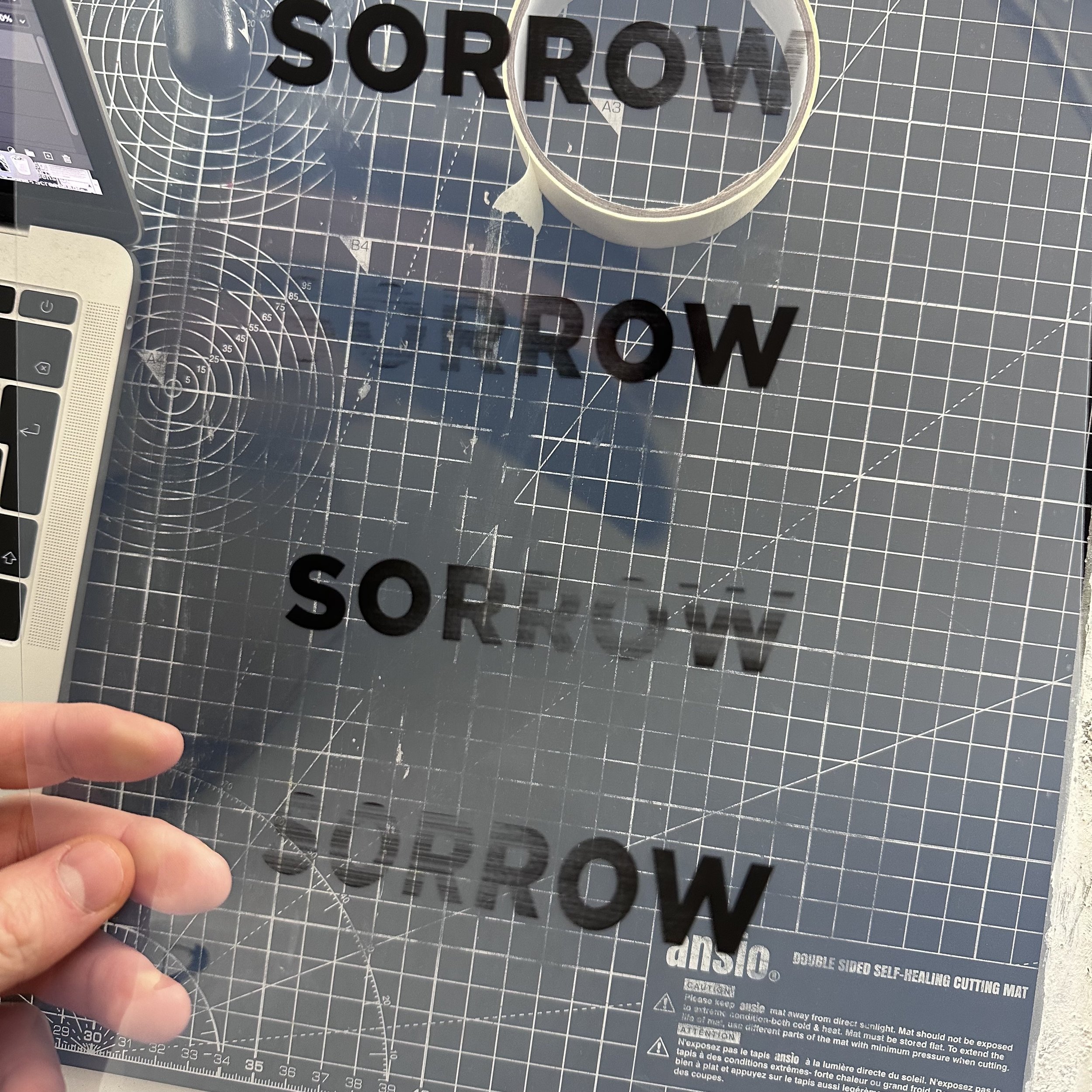
I used Xerox acetate through a inkjet printer which leaves the ink sitting on top of the acetate allowing it to be printable onto other surfaces. This is a technique I came across by accident a long time ago when using the wrong acetate in the wrong printer.
I am unsure whether my final outcome would be suitable as a CD/album cover as it is quite abstract. To me it is representational of the music but this is obviously a more personal response to it and may not be seen as a good representation by others. This would probably work better is all of it was digitised and perhaps included some imagery. I enjoyed this task, particularly with deciding on a single word to represent the music. This could be an interesting Occam’s Razor esc method to use on future design tasks- could the brief be boiled down to a single word? What is the most important element the audience should see?
I quite liked this digitised version of the artwork and am glad that my tutor guided me to return to this task. I like how the typography looks in blue and how the texture of it translates digitally.
The combinations of physical and digital work is something that really interests me and that I try to combine within my illustrations, this was a great help in experimenting further and shows that when you think you are done, to take a step back and return at a later date to see if you can improve.
After receiving tutor feedback I went back and experimented further with combining my mark making and digitising them.
I used my 2 favourite outcomes and in Photoshop used various layers and filters to combine the works. I quite liked the black and brown outcome but continued with the blue and white.
