Illustration 1: Key steps in illustration- Part 3: Working it out-Exercise 6: Viewpoint
Make a small collection of objects around a theme – choose from:
Festival
The morning after
Summertime
Workshop
Using a digital camera move around your set of objects. Look at them from above and from underneath. Zoom in and out. Look for interesting combinations of shapes and textures, and document them using photographs. Be unusual with the positioning of the frame. Experiment with diagonals within the structure and deliberately position some elements close to the frame.
Do the same thing with drawing but work in a format that is different from your viewfinder, such as a square format, or long and thin, or an irregular rectangle. If it helps you can make a viewfinder using two ‘L’ shaped pieces of stiff card or paper in your chosen format. Repeat the exercise of exploring viewpoints but this time document your visual journey around the set in your sketchbook. Draw shapes to work with that are the same format as your viewfinder. You may find it helpful to draw around your viewfinder to create a set of thumbnail shapes.
Choose your favourite design. Remember that you are trying to communicate an idea about your chosen theme – your favoured design should be one which is most successful in this regard.
Using a pencil, draw this design on a larger scale. Either draw from the photographs that you took or from the still life directly. Draw your final design to a format and scale which is proportionate to your thumbnail. This line drawing should be descriptive and readable as a visual and not a final artwork in its own right
Which viewpoint best fitted the word your objects illustrated? Why was this?
Which format best illustrated your words?
Did changing viewpoints make you think differently about your choice of objects and arrangement of them?
Before beginning with my photos/illustrations I researched illustrators/photographers who use ‘unseen’ or obscure angles to create narrative and display emotion. I began with someone who I follow on Instagram @carnetbruns (brown notebooks) whose work as far as I know is only on Instagram. I really like their illustration style, inclusion of photography and interesting angles/crops.
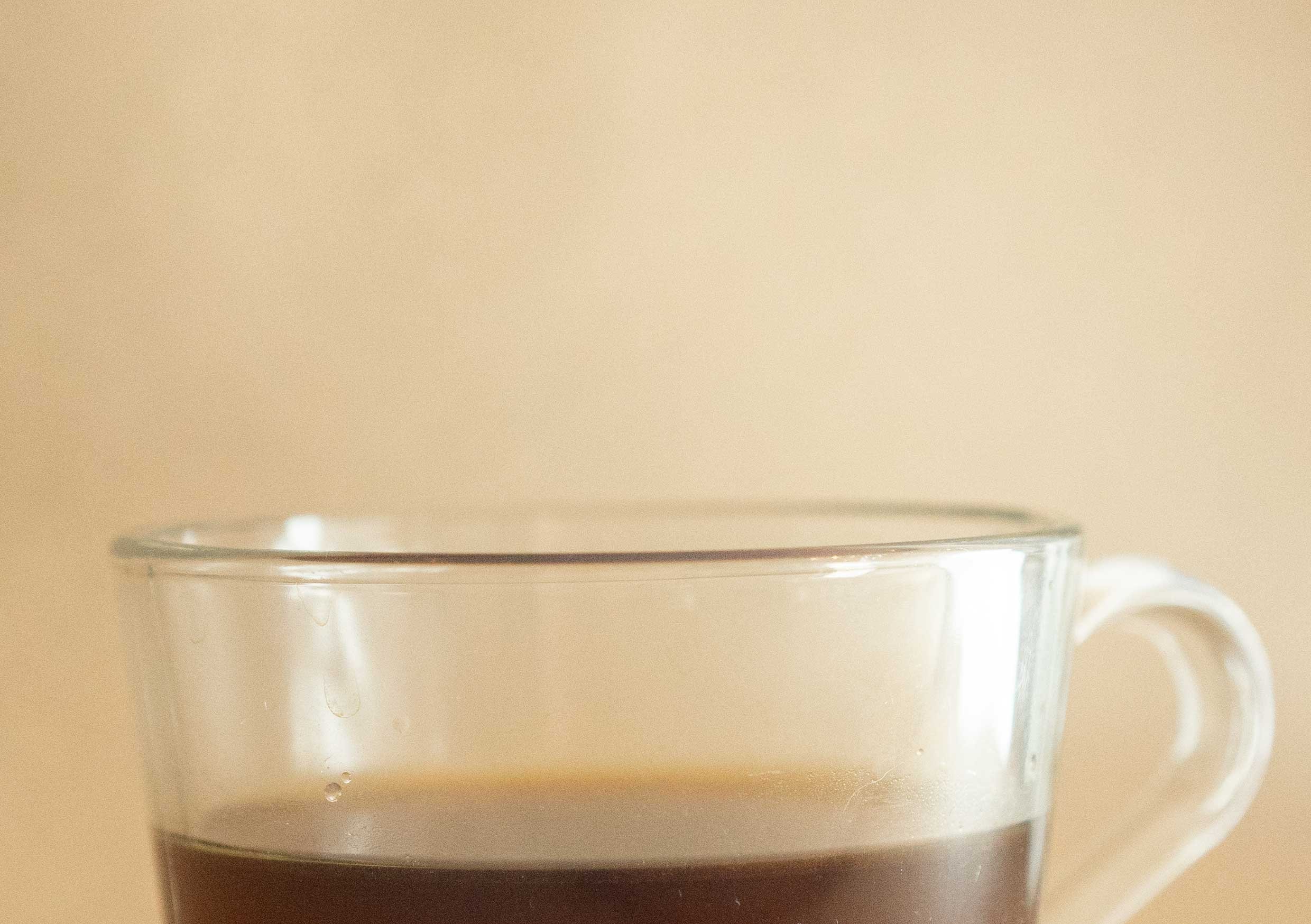
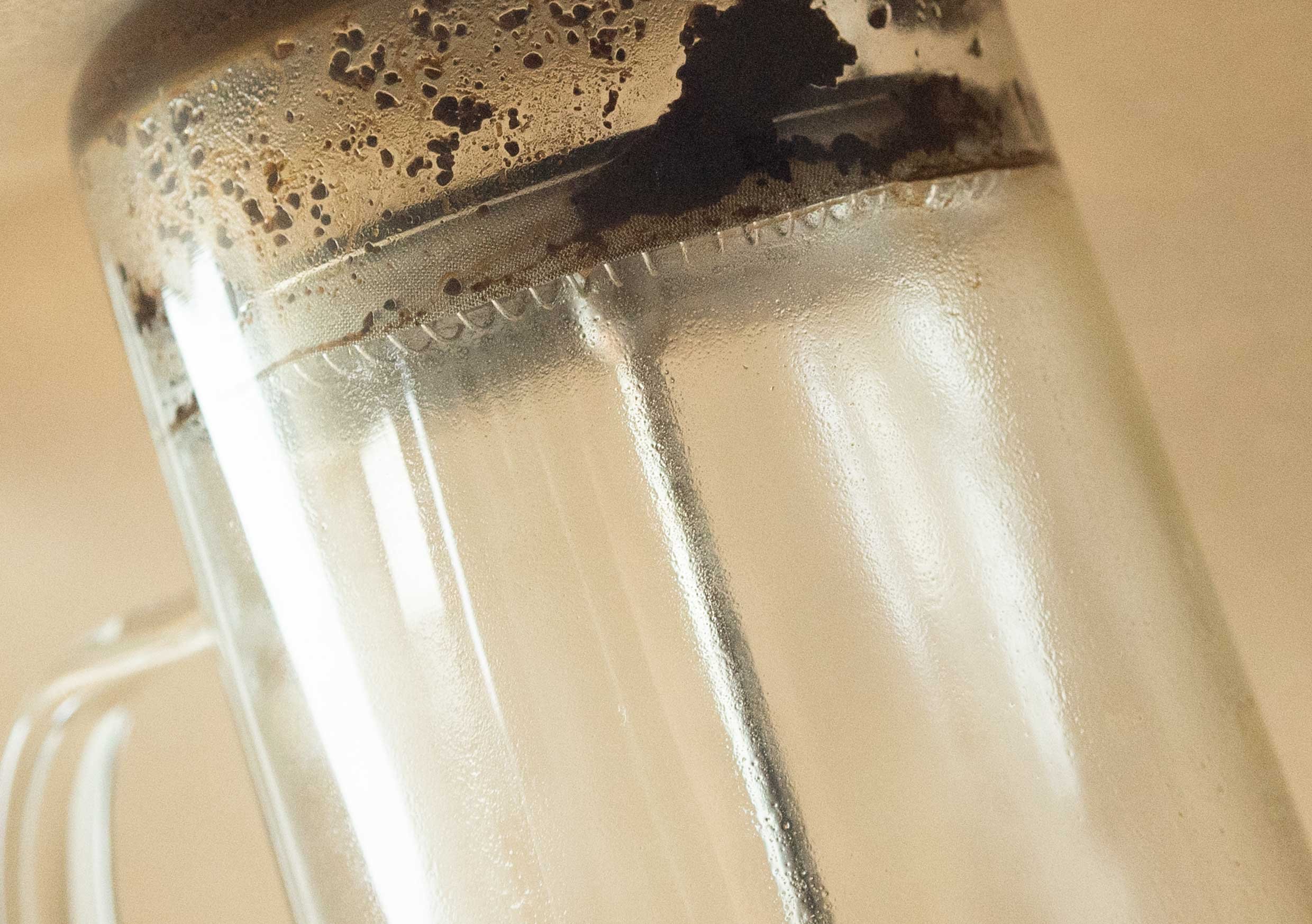
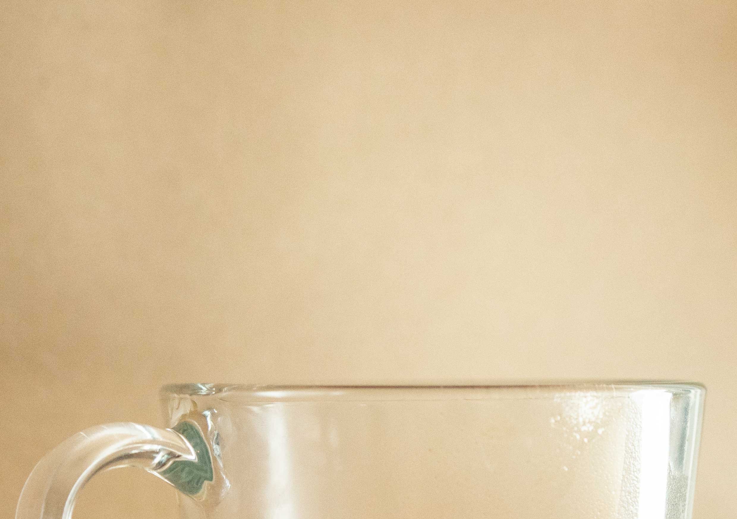
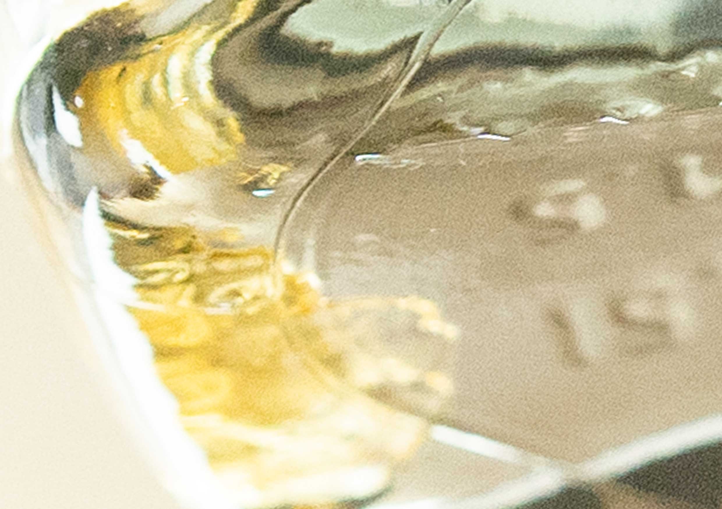
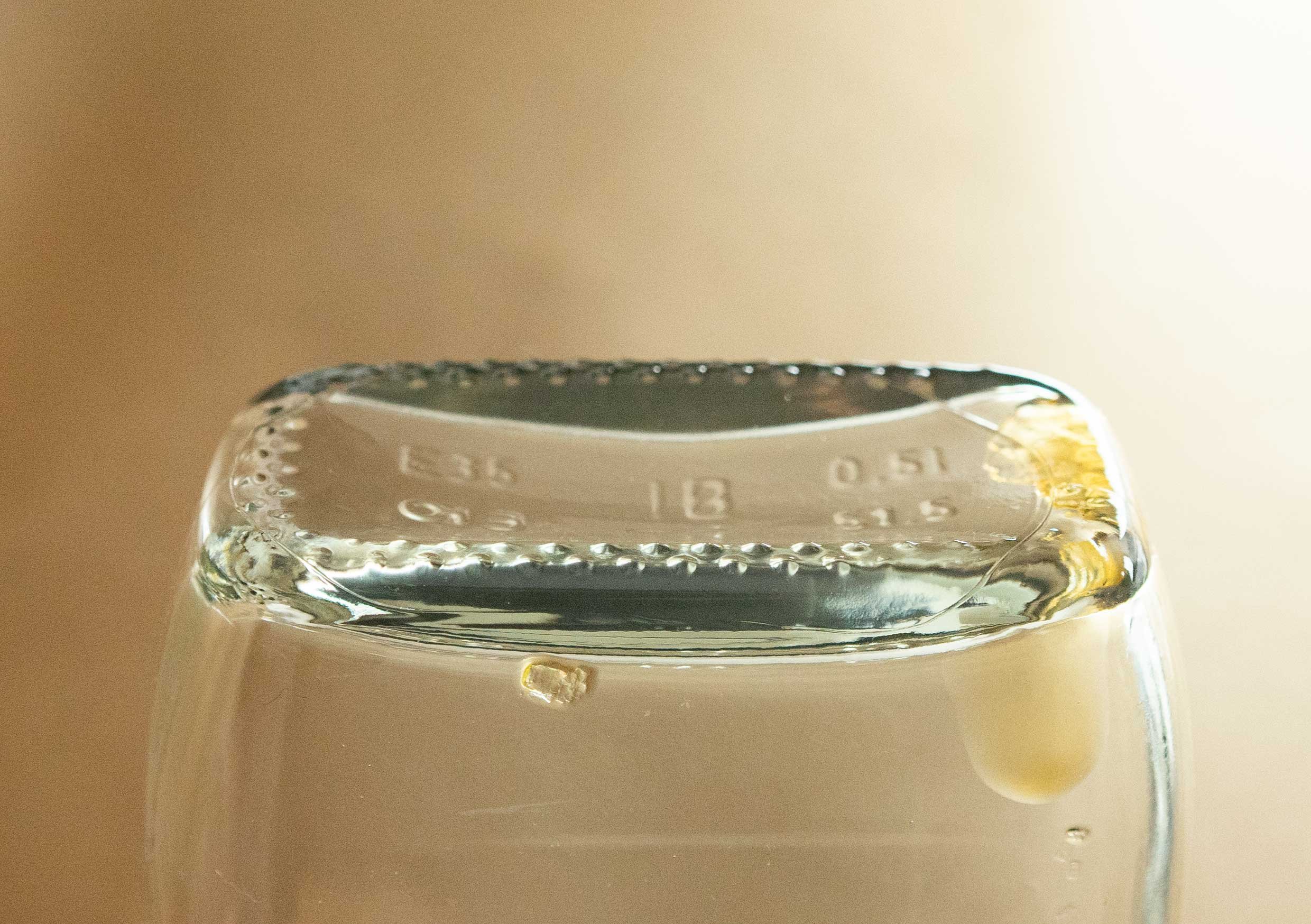
I took multiple photos from varied angles, some close up and some further away and cropped a few of them within Photoshop afterwards. Some of the angles were more affective than others in creating a sense of ‘the morning after’. I then sketched out some of the objects from observation and some from different crops of the images.
I continued to experiment using Indian ink before using pencil to draw my final illustration.
I created a spider diagram noting items and ideas related to ‘the morning after’. I felt this theme has potential for an interesting narrative.
Jonti Wild is a photographer based in LA. I came across his work recently and was reminded of it when reading this task. Again his portraits are more obscure and show more interesting angles/close ups from varied angles.
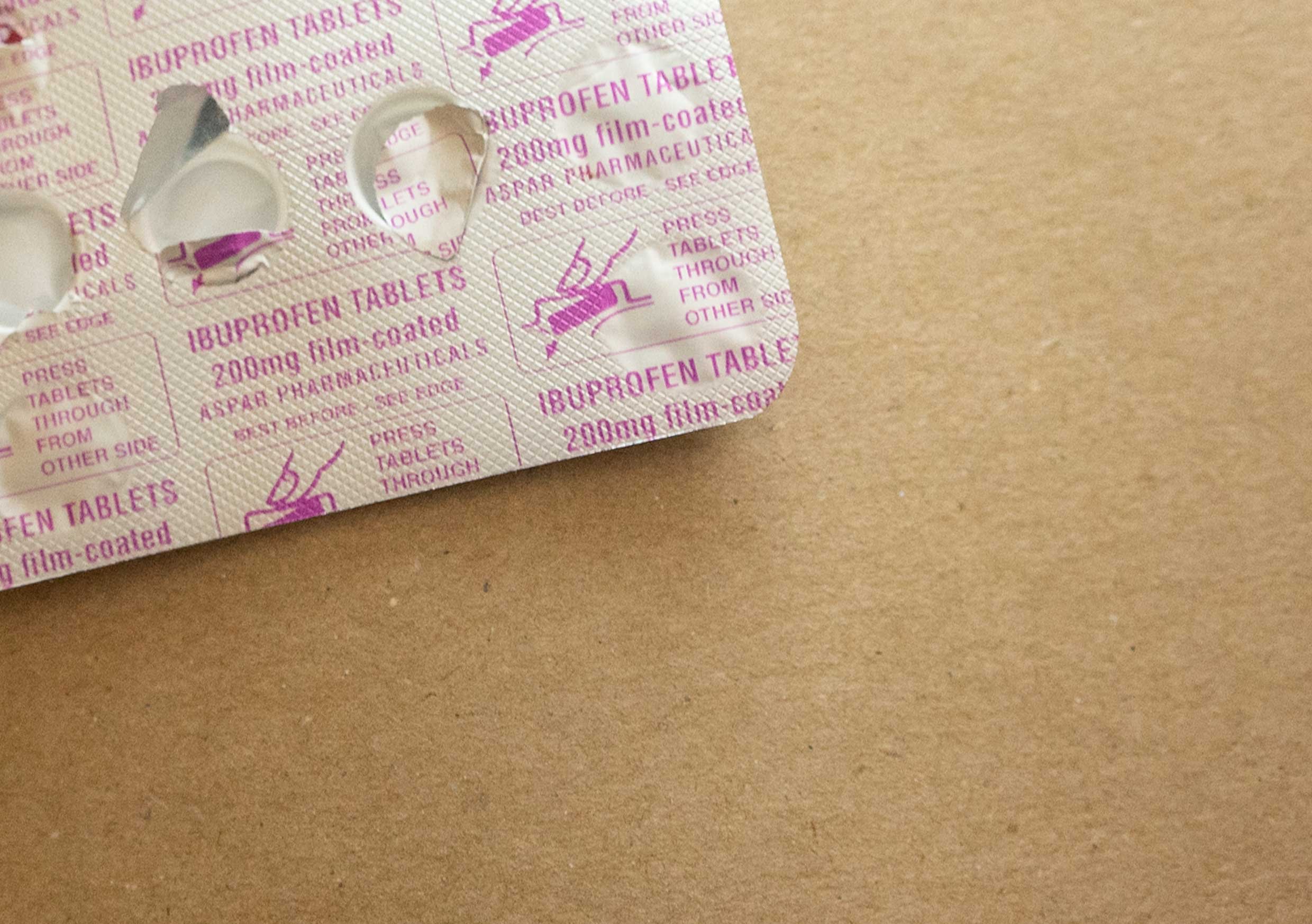
I collated some objects that I felt represented ‘the morning after’ best. I referred to my mind map and used coffee, an empty alcohol bottle and ibuprofen. All of these objects seem quite difficult to create something interesting of them, and also to represent the narrative- this could be a good challenge.
I felt like the more obscure angles, of the items upside down were more affective in representing the ‘upside down’ feeling of ‘the morning after’ and representing a hangover/headache and struggle. I continued with these angles and adjusted some of the images to reference when illustrating them further.
Referring back to my final image I am unsure if it best represents my chosen phrase. I felt that the more obscure angle of the cafetiere could show a struggle of a hangover, the ‘need’ for energy and the sense of feeling upside down/headache.
I don’t think that this was achieved with my final drawing, the angle chosen isn’t obscure enough and the drawing itself isn’t sophisticated enough to show the angle/shadows/details etc which could add to the over all sense of the image/mood.
When looking back at inspiration e.g photographer Jonti Wild, his work uses more extreme angles to create mood and also the use of movement with the camera itself which could’ve been interesting to try- moving the lens and using a zoom lens etc.
Looking at an image close up, particularly of the Ibuprofen tablets allows a mundane object to look way more interesting and has potential there for it to create a different mood and have a more abstract meaning. I don’t feel that this was well represented with my images but it was a start. I feel as if I should’ve been more experimental with angles and movement, but at the time didn’t consider these elements.


