Illustration 1: Key steps in illustration- Part 2: Ideas -Exercise 5: Using reference
Collect as much reference as you can find for the1950s period. Catalogue the information you find according to these categories:
People and costume
Architecture and interiors
Art – painting, drawing sculpture
Graphic design – posters, books, typography
Advertising
Transport
Film and TV
Surface pattern and decoration.
Be eclectic in your sources. Identify the visual qualities that are universal within the categories – shapes, textures, colours, style and other features.
In your learning log write a short review of the 1950s from a visual perspective.
Describe the characteristics that typify the decade and the ideas and visual trends that were prevalent at this time.
Are there reflections of the 1950s in any areas of contemporary art, design or culture? If so what– give examples? It may be useful to look both at what preceded and followed the 1950s to gain a sense of the broader context of this era.
Now make an illustration of someone sitting in a chair surrounded by typical artefacts to give a teenager an idea of the 1950s.
I then delved into each of the specific categories further and created visual mood boards of imagery/noting any words/colours/feelings that I came across. I made notes and kept visuals in folders of artists/designers/musicians/directors I found particularly interesting.
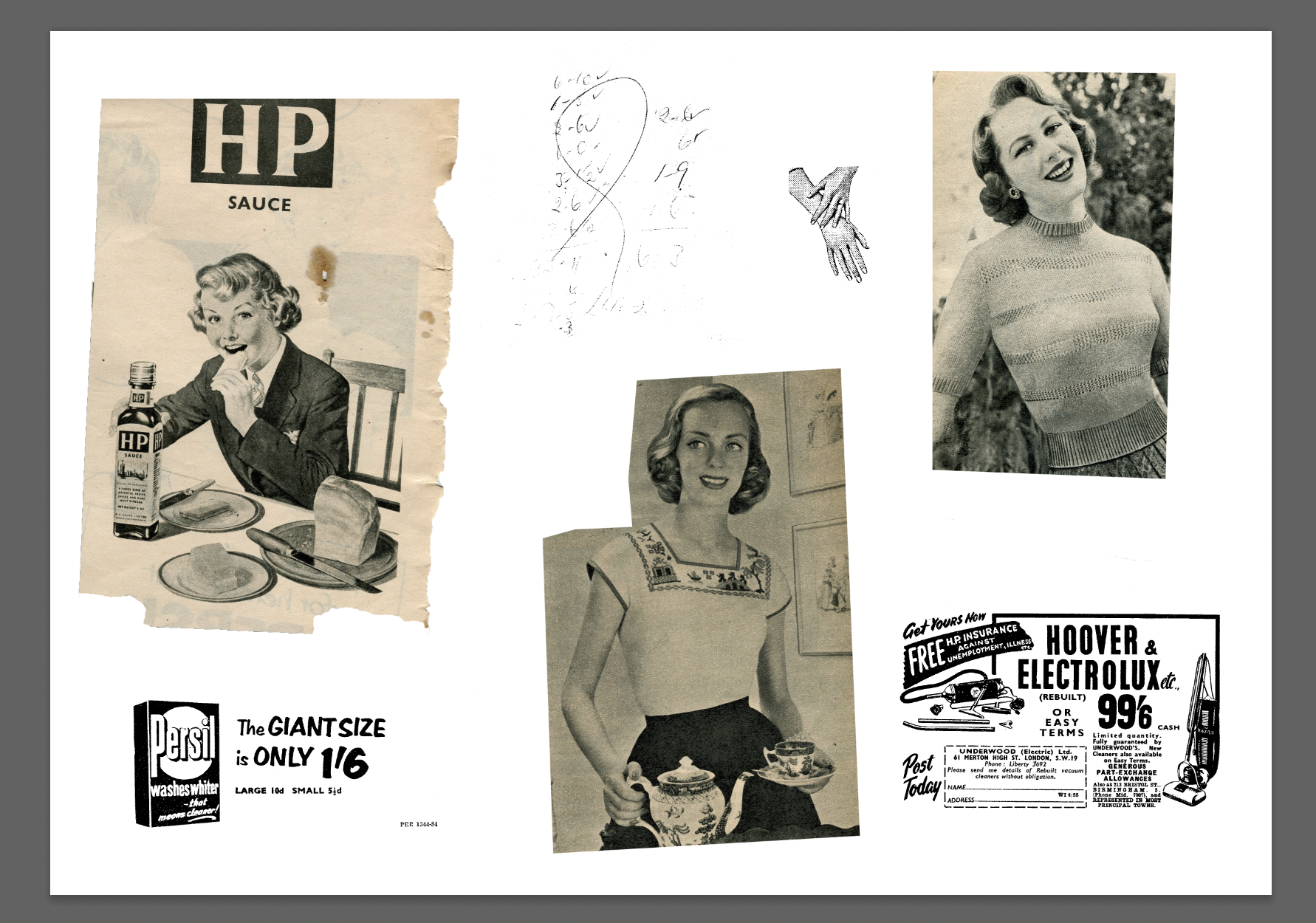
I came across some postcards I had from the 1950’s purchased on ebay a long time ago. I scanned in multiple images/textures from these and added them to my mood boards.
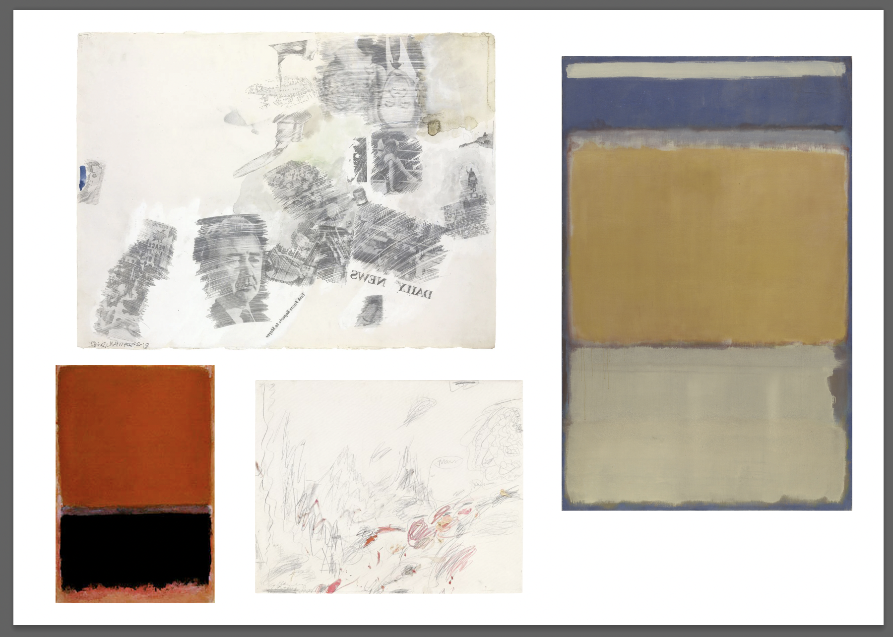
I found/collated some very interesting visual references, in particular under the; advertising, architecture and interiors and painting section. I focused on work from designers; Noguchi, Eames, Bertoia, Bellini. Designers; Huber, Brockmann, Matter. Artists: Rauschenberg, Kilne, Twombly, Rothko, Giacometti.
I created some separate mood boards of my favourite work by; Architect Frank Lloyd Wright, Architect/Furniture designer Marcel Breuer, Artist Robert Rauschenberg, Musician Chuck Berry- these 4 peoples work I am particularly drawn to and feel capture the overall ‘feeling’ of the 1950’s.
1950’s from a visual perspective:
The 1950’s was a period of growth and experiment, the post world war II era was full of interesting shapes and colours of which emerged pop art and the brutalist aesthetic- intertwining beauty and utility (a combination of characteristics I feel is no longer at the forefront in our more modern era).
The 50’s to me not only has a specific aesthetic, but a sound too. The likes of; Chuck Berry, Nina simone, Frank Sinatra all encapsulate the excitement and experimental rouse of the era. To me, their sounds emulate the mark makings of Rauschenberg, the dynamic lines within the architecture designed by Breuer and the ‘gull wings’ of a Mercedes 300 SL- they are the 50’s.
I began this task by researching the 1950’s broadly through wikipedia and various history websites/blogs. I noted any information relevant to the list given for the task from memory and added to it during researching. I wanted to keep my notes very succinct with the final part of this task in mind (creating a visual using my research).
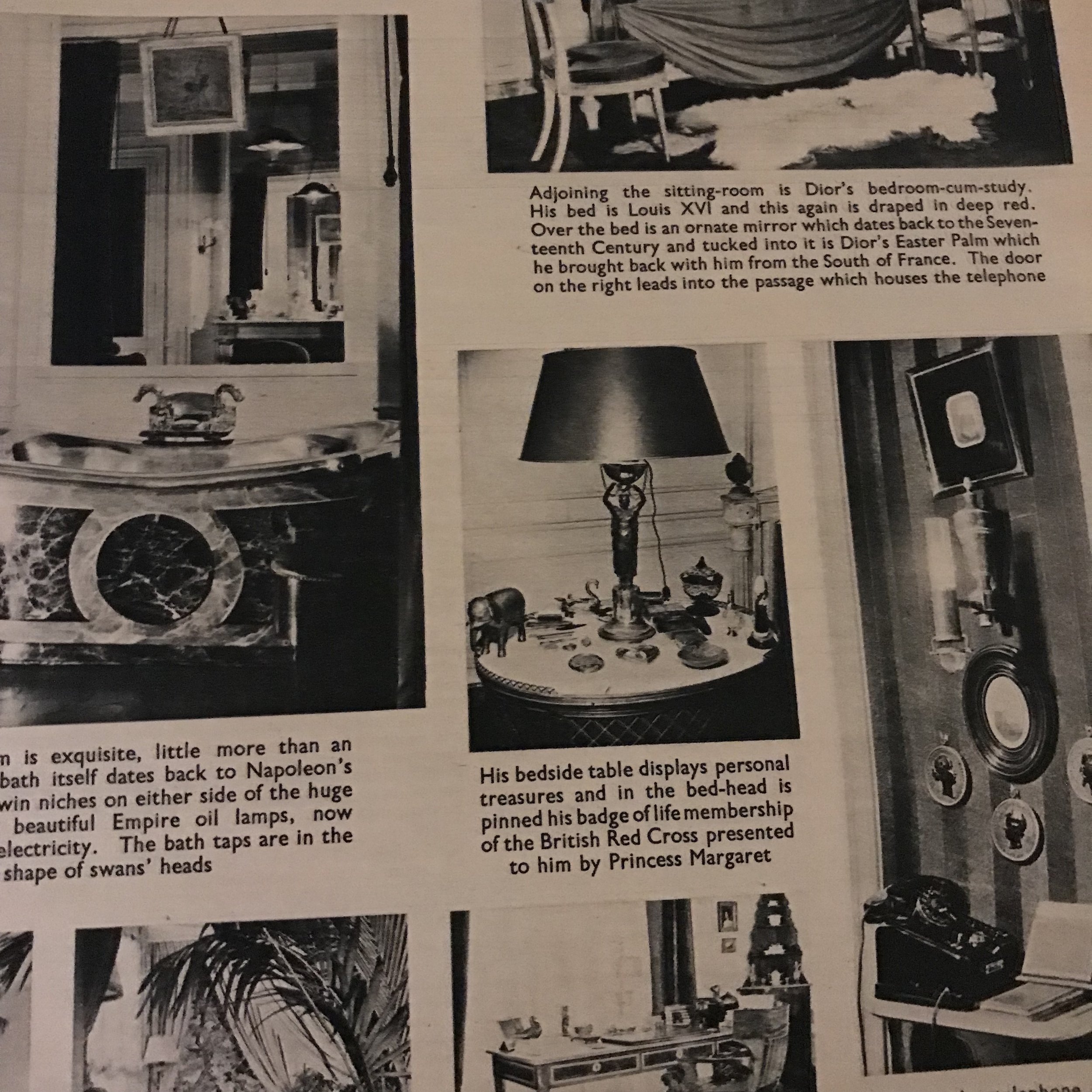
I looked through my collection of old magazines/books to find any from the 1950’s. It appears that most of my collection is from 1900-1940’s and then more form the 70s/80s. To the left are the few magazines I had from the 50’s- ‘Woman’s Illustrated’ and a film magazine. These included many great visuals/writing/adverts to draw inspiration from for my short summary and design task.
The clothing of ‘every day’ people was still smart, formal and well put together. The colours were pastel, brown and natural tones with pops of colour, which again only reflect the culture and art around them. From Hitchcock’s ‘Vertigo’ to Bunuel’s ‘The Brute’ the characters style, fits of clothing and their colours have an elegant, purposefully designed feel that the 50’s culture feels to me.
The 1950’s are reflected upon throughout modern art, a few of my favourites that have been inspired by the 1950’s; Rauschenberg’s ‘Retroactive 1’, Warhol’s ‘Eight Elvises’, Lichtenstein’s ‘Whaam’.
Despite Rauschenberg’s ‘Retroactive 1’ being produced in the 60’s with a large focus on ex-president JFK- it emulates elements of the 50’s. JFK contributed towards the civil rights movement which began mid 1950 and Rauschenberg’s work places emphasis on this using colour/ repeating imagery of JFK’s hand.
Warhol’s ‘Eight Elvises’ is one of my favourites from his series of Elvis works. Elvis represents the 1950’s and helped change peoples views and culture through performance. The image used of Elvis is from the film ‘flaming star’ a film Elvis starred in 1960- which is inspired by 50’s westerns.
Lichtenstein’s ‘Whaam’ doesn’t exactly emulate the 50’s but it does war and this era. The imagery Lichtenstein used is from magazine which began in the mid 50’s ‘All American Men of War’. To me it draws attention to the cold war/Korean war.
I looked through my gathered imagery and identified images that could create a narrative with each other representative of the 50’s (‘someone sitting in a chair surrounded by typical artefacts’). I didn’t want to consider the question too literally and create an image that one initially imagines when considering the question- a person sat on a chair with items around them; T.V, Chair, Instruments, Cars etc but also didn’t want to get too abstract. I referred to my mood boards of colours that I had sampled from images of the 50’s that I felt represented the era and continued with a pale orange/pink hue.
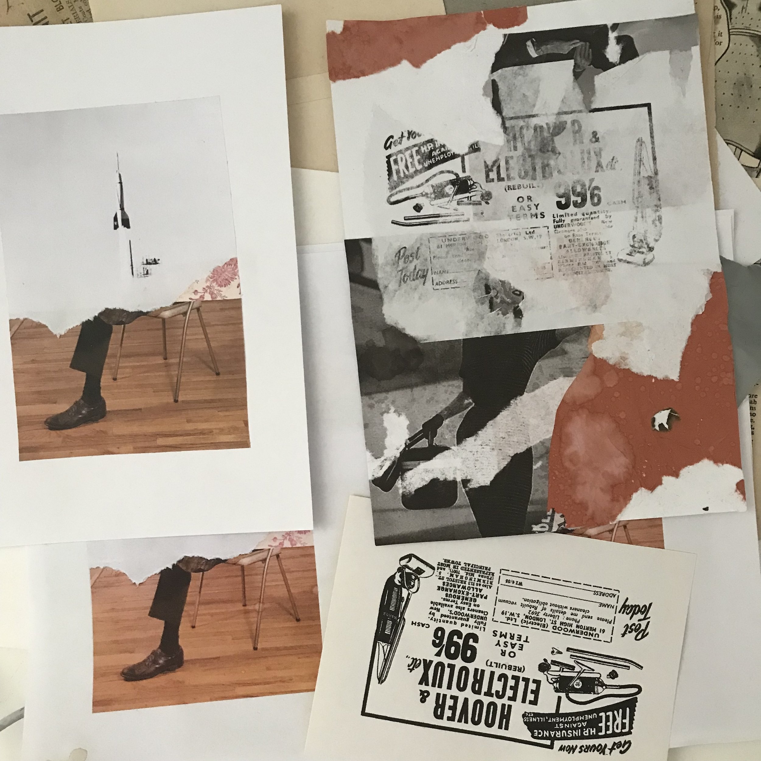
I created a few physical collages and then used elements of each to create a different version in Photoshop (image above on the right). I used printed imagery and reproduced some adverts I found within a 50’s magazine that I liked the typography/style of that represented the 50’s. I layered and distressed the images and printed the advert onto stickers which I peeled off with tape and layered over the collage. I aimed to integrate inspirations from artists Rauschenberg, Twombly (mark making) and architect Frank Lloyd Wright (lines/light and dark contrast). I included some handwriting (numbers in a list) found from the inside of one of the magazines from the 50’s, it appeared to be some workings out of a math problem or maybe a score for a game jotted in the corner of the magazine. These numbers/handwriting reminded me of Twomblys work and I felt I had to include.
I went onto producing another design using elements of previous collages/designs. I wanted to include/represent the fashion and music of the 50’s within this as well and the inspirations mentioned previously.
I really liked the image of the man sat at a table outside dressed in a suit, to me he looked like a Hitchcock character. The colours used were inspired by 1950’s wallpaper and taken from a colour swatch I had made when researching for this task- inspired by Brockmann’s use of limited colours and pops of brighter/more colourful hues.
I really enjoyed the entirety of this task and like the idea of writing about- then producing work on a topic/era. The brief overview of the 50’s aesthetics/style/visuals/art/feel helped me consider what were the most important elements to include to signify the 50’s.
The writing section worked as an Occam’s razor allowing me to really consider colour/imagery in relationship with music, architecture, culture and design work from the era- breaking it down to the simplest/most important elements to include within my design. I am constantly trying to improve my planning method/workflow and to step back when working to re-evaluate the primary question/task. I feel as if I could’ve again slowed down after producing the initial collages and tried other ways of responding to the task, or when I felt it was ‘complete’ to try further compositions or designs completely. I also aim to incorporate more typography within future work such as the handwriting found within the magazine.


