Illustration 1: Key steps in illustration- Part 2: Ideas -Exercise 4: Making a moodboard
Choose one of the words from the previous exercise and on a large sheet begin expanding on the themes and ideas that you identified.
Collect swatches of colour and texture to or create your own to establish a palette of colours and repertoire of marks. Google some of the words and from the Images link, either print off or draw from some of the images that emerge. Go through other books and magazines and take snippets of images, which have associations with your words and theme. Assemble these elements on your large sheet.
You are not creating a piece that is a designed artefact in its own right. You don’t have to include words but may want to selectively incorporate some words into your moodboards as an aide-memoire. If you organise your content according to visual connections you may find that links and some nice surprises emerge This should lead to you being able to recognise or establish a hierarchy within your content. There is more on this concept in Part three.
I continued to expand on the word ‘fashion’. I began by researching ‘direct’ influences such as actual clothing/design and created some brief mood boards of imagery to use/refer to when creating my physical mood board.
I then spent some time looking through some old magazines, ranging from the 40’s-70’s focusing on typography and collated some of my favourite typefaces from there. I also looked through my growing collection of ripped posters/receipts/found imagery and put to the side anything that I felt related to ‘fashion’ as a concept or feeling.
I intuitively chose colours to use that I felt related to the images I had chosen and the feelings the clothing/designs/art evoked. I layered imagery with type, including some typography onto acetate. I wasn’t focusing on anything such as composition or designing an ‘artefact in its own right’ (as the exercise guidelines states) but came across a lot of ‘happy’ accidents.
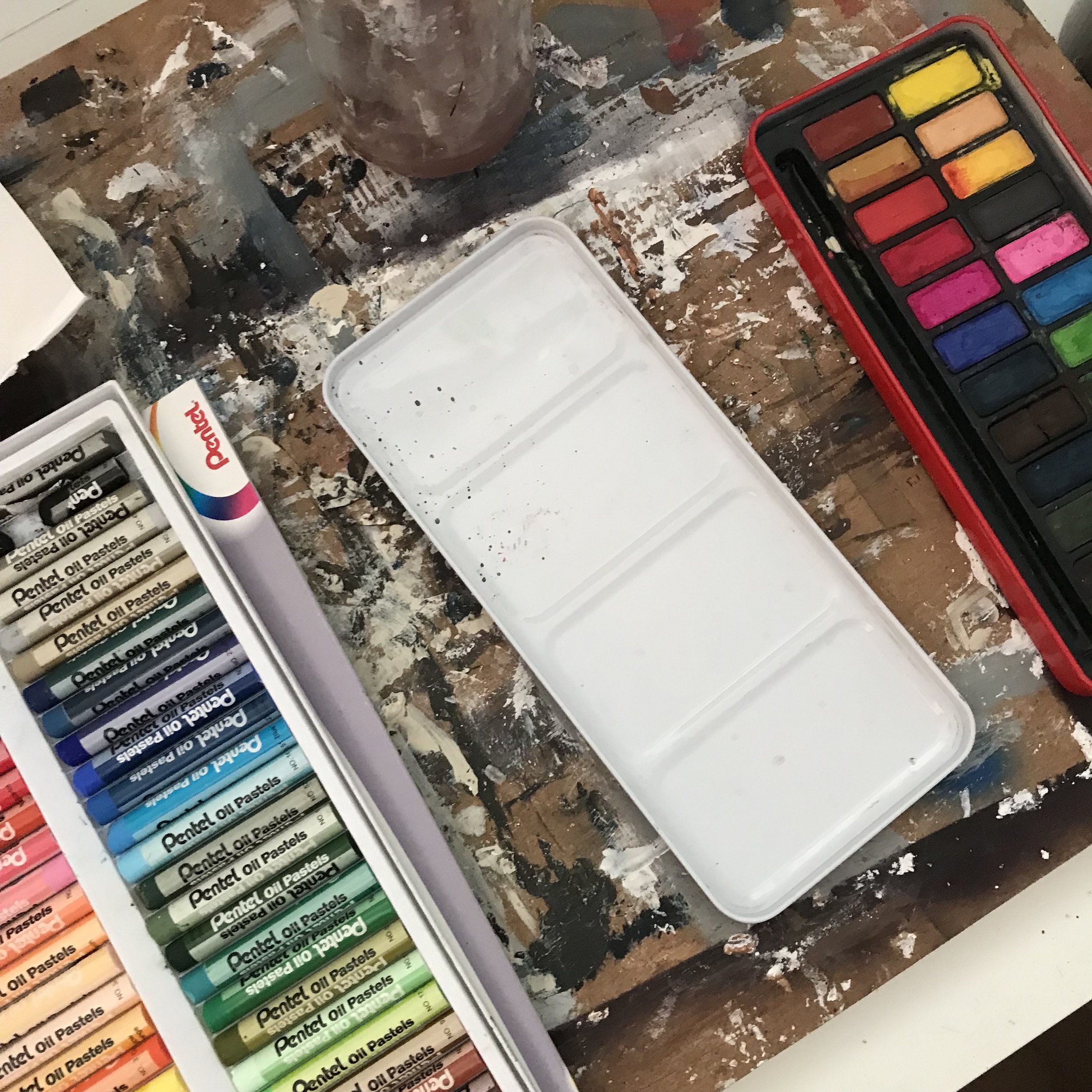
I surrounded myself with varied materials- paints, pastels, sprays, tape, pens, paper to test with different colours and textures.
When pairing different materials with imagery and type it brought forwards lots of ideas for compositions/texture/designs for future work. I made some notes across the mood board to remind myself of them.
I found this task very helpful- it will become a further stage of my own ‘work flow’ when focusing on a design or assignment. The more intuitive ‘less care’ for aesthetic approach allowed me to make marks/manipulate imagery/make layers that I may not of otherwise tried when previously creating an illustration. I would usually make a few mood boards of work by artists that inspire me etc- but collating it in this visual way allows for different connections to be made with colour/texture/concept and is a space to intuit/test initial ideas.


