Illustration 1: Key steps in illustration- Part 2: Ideas -Exercise 6: Exploring drawing and painting
Create a sketchbook with different kinds of coloured and textured papers. Use a variety of surfaces including rough textures such as sugar paper and heavy watercolour paper and smooth, shiny surfaces such as brown paper and cheap typing paper. Collect the sheets together in a binder or with a bulldog clip.
Collect a range of drawing implements. Include the cheap and throwaway such as children’s felt tip pens, food dyes, ballpoints, chalks, oil pastels, pots of sample decorating paints. Force yourself to put familiar materials to one side and to explore unchartered territories.
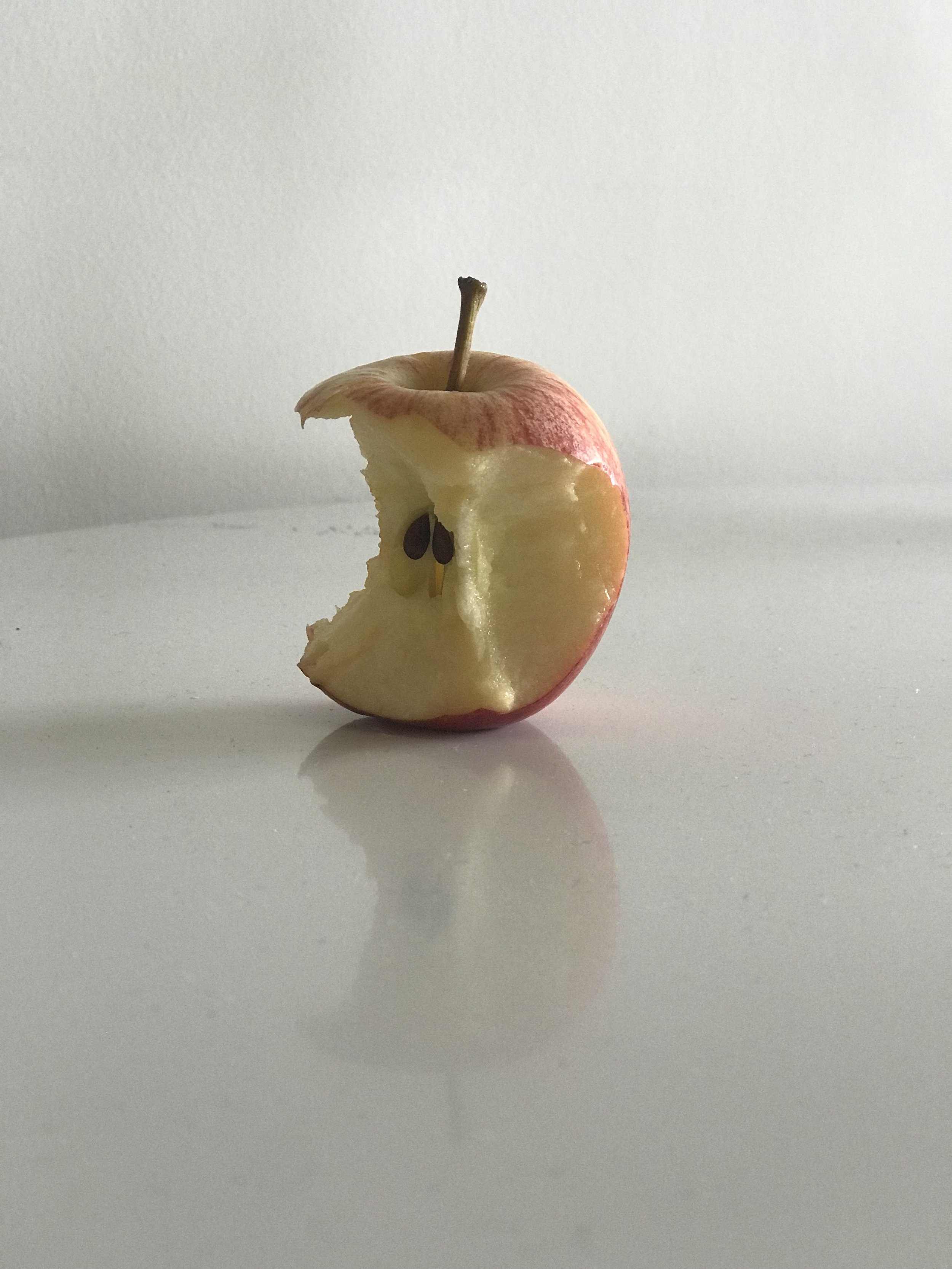
Choose something like: a cake with icing, cherries, hundreds and thousands or other topping; a shoe or trainer; or a piece of fruit with a bite taken out of it.
Draw your object on each of the sheets in your sketchbook using a different drawing material for each one. Practice using the same media in different ways and at different scales. Explore cross-hatching, stippling, splattering, smudging and dry brush work.
Investigate the properties of mixed media; see which marks work together or not, and how you can alter marks with a rubber, and by rubbing and smudging with your finger. Some of the wetter media can be modified by adding water or dilute bleach. Some of the fine line pens or felt tip pens may also be water soluble.
After seeing the example of Paul Bower’s work on the brief I took a look at his website and really enjoyed some of his work. The texture of the what appears to be prints was great. I also liked his use of primary bright colours mixed with bold black lines.
I decided to use an apple with a bite taken out of it as my subject. I began by using a pen and trying a stipple method directly onto the paper without and preliminary sketching. I found it hard as to know when to ‘stop’ or how close to have the dots together to create a sense of light/dark/depth. I then tried using normal colouring pencils (limiting myself to 3 colours). I followed this with a black and white pencil version but onto an old magazine page. The colour of the beige paper and grayscale to me was appealing. I then tried a similar method but using a dry paintbrush onto a background of posting tape. I really liked the sections of tape that overlapped/the rips and this gave me some ideas for future collaging.
I used a black section of a ripped poster to create the first collage. I took off the black layer from the poster which made the white texture underneath used for the inner of the apple. The black and white rips added some texture to the skin, I quite liked this style and had an idea for the next which was to use an image to create the collage. I chose a random printed out image left over from a previous task which had a lot of contrast within it. The darker parts I used for the skin and tried to use different shades of grey to create shadows within the core of the apple.
For the next collage I initially cut out the apple free hand from red paper and then remembered the brief mentioning bleach. I used some diluted bleach on the paper which turned a yellowy/brown colour which I felt was the perfect colour for the apple core. I then used a brown pastel to fill in the seeds and stalk.
I quickly drew a sketch of the apple using a berol pen which had almost ran out. Inspired by Paul Bower’s work I scanned it and reprinted using an ink jet printer using acetate meant for a laser printer (a method I had come across accidentally during an earlier Graphic Design section). The ink sits ontop of the acetate and allows you to print onto any surface. I printed the sketch onto various papers/surfaces and went onto printing over some scribbled colours in the rough shape of the apple.
The printing inspired me to try a linocut. I sketched out the apple onto some lino and began to carve it away. I have never used lino before to print an image (only my own typeface). This was a challenge, it took many re-prints back and forth with re-carving elements of the lino. I quite liked the end result as it had an interesting texture.
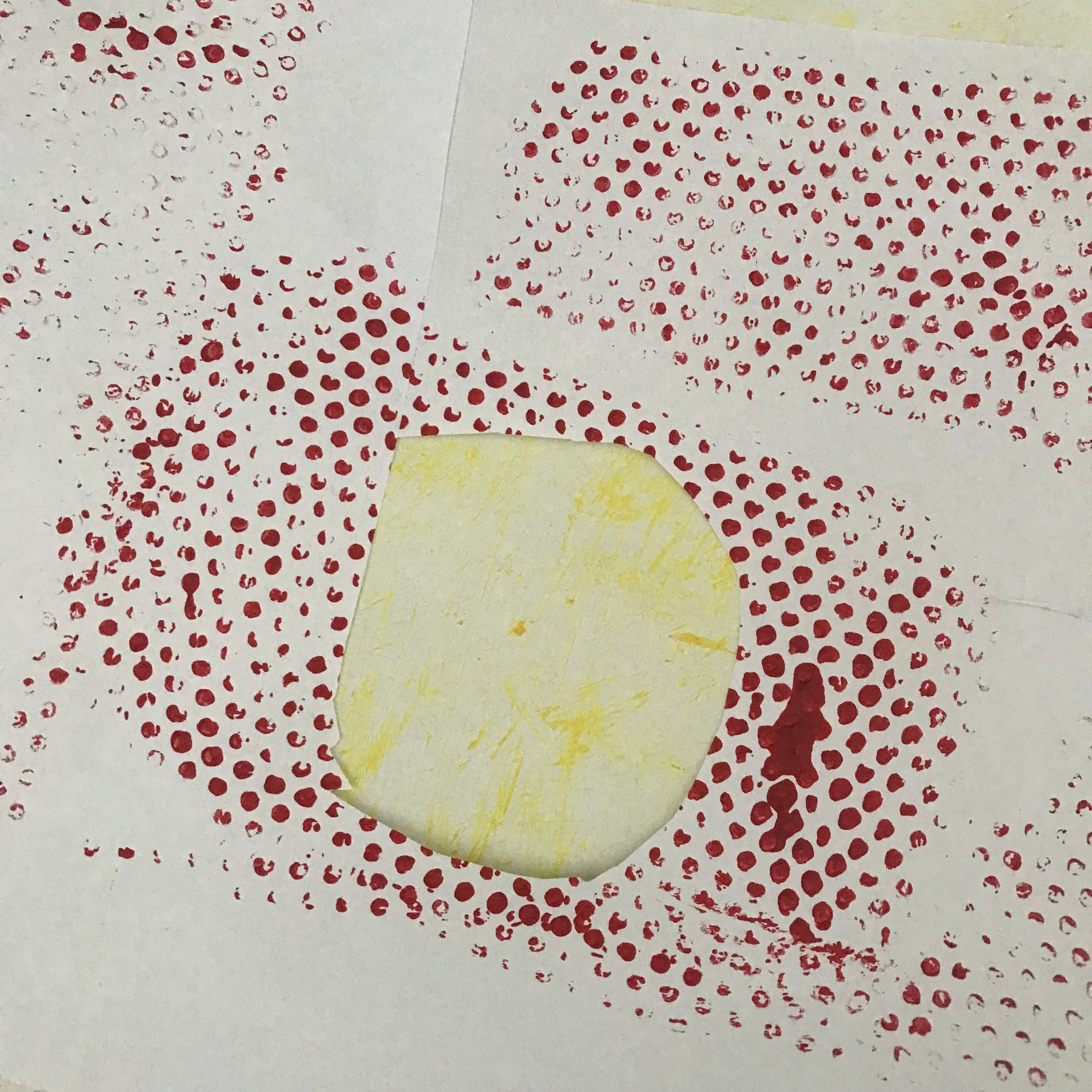
I continued testing with different papers and textures. I printed using some plastic I had found which had circular notches onto it. I then used a dry brush with yellow paint to create the core.
I had many outcomes within this task that I wasn’t happy with but really enjoyed testing and trying out different methods of printing, drawing and collage. I found this a very useful task to take a ‘simple’ object and try to convey it in different and less obvious ways. I feel like this should be something I can implement into my workflow to occasionally try and draw/represent an object/figure using varied material solely with the goal of playing/testing.
I would definitely like to explore the use of bleach to create texture and distort imagery moving forwards. I like the unpredictability of the material and the varied results it creates when used sparingly/a lot.


