Core Concepts- Exercise 18: Magazine Pages
Choose a magazine, newspaper or journal and work out the grid or grids they have used. You will probably need to look at least four pages to get a feel of the layout. Measure the size of the pages, the margins, the text columns and the gaps in between them.
How many columns do they use?
Is it the same on every page?
Can you identify the fonts they use?
Do you have it or one with similar properties?
How do they use photographs and illustrations?
How much ‘white space’ on the pages is there?
Draw up a two page spread using the same grid as the magazine. Indicate text using Lorum Ipsum and indicate images by either filling a picture box with a 10% tint or using a picture from your collection. When you have done this see if you can develop the grid further. Select a title and images and see how many variations you can come up with.
What happens when you alter the body font or headline font?
Do different kinds of images change the ‘feel’ of the publication?
Do you think the readership for each of your variations would be the same?
Does the image you choose suggest a different design?
Which ones work best and why?
A few pages stood out to me in particular, they are documented on the right. The layout of each page varies, but large imagery seems to be constant. I really like the use of text over the top of images, it could create some interesting and dynamic outcomes.
The first page was very simple, but effective. I found a ‘handwritten’ style font that suited the style of the advert. The main font I found using My Font’s ‘what the font section.’ The font is called ‘Elaaha’ and is very similar to the font used here so I decided to include it. The kerning used is very interesting. It is very wide, I used over 200 points in Photoshop. I quite like the aesthetic of the ‘block’ of text aligned by kerning. The use of white space on this page is great, I like the black and white imagery which is centralised, surrounded by white, this puts focus onto the main image and then the text below.
I randomly selected a magazine from my ever growing collection! This one is a Vogue magazine from 2004. I love the aesthetic of Vogue magazines, despite them being filled with a lot of adverts.


I decided to recreate the layout of these 2 pages. Even though they are very different (one being an advert, the other being the beginnings of an article) I feel like they work well together, especially when the the images are of a similar theme etc.
The second page is my favourite out of the 2, after recreating it. The text laid over a large image, which almost fills the page looks bold well balanced. The text all being in the bottom left corner I think creates an interesting layout. The text I found for ‘Spy’ was called ‘Monotype Modern Std’ which is an almost perfect fit. The main text I felt looked like Times New Roman, which works well. The text was aligned to the right, along with the title, which balances it with the clean cut line of the image. I like the use of serif fonts, and sans serif for smaller subtitles or information. The Bold sub title font I decided worked as a condensed bold Helvetica Neue. The other above the ‘Y’ in ‘Spy I thought looked similar to a medium Futura. I am interested to see how the 2 layouts work together as a 2 page spread.
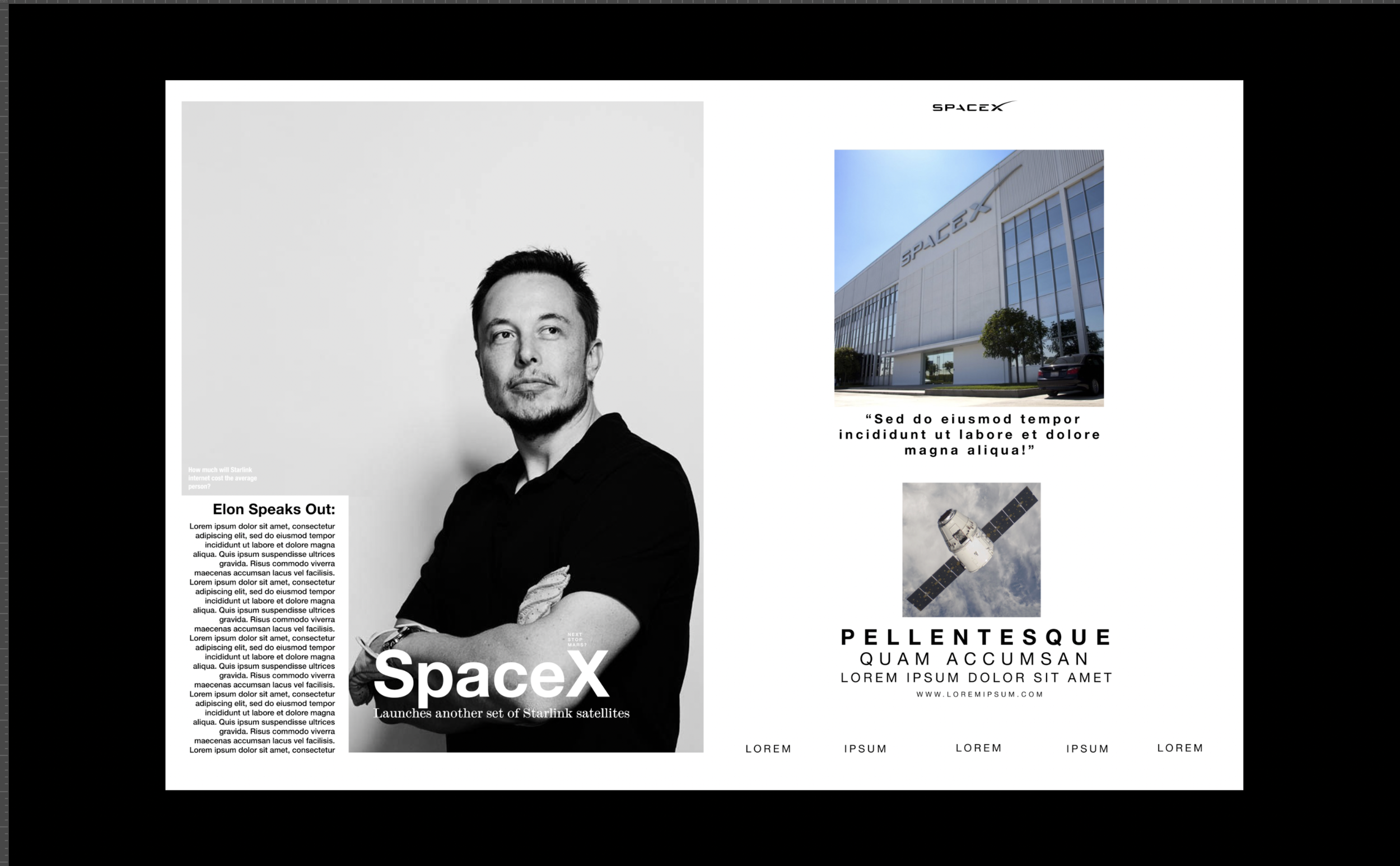
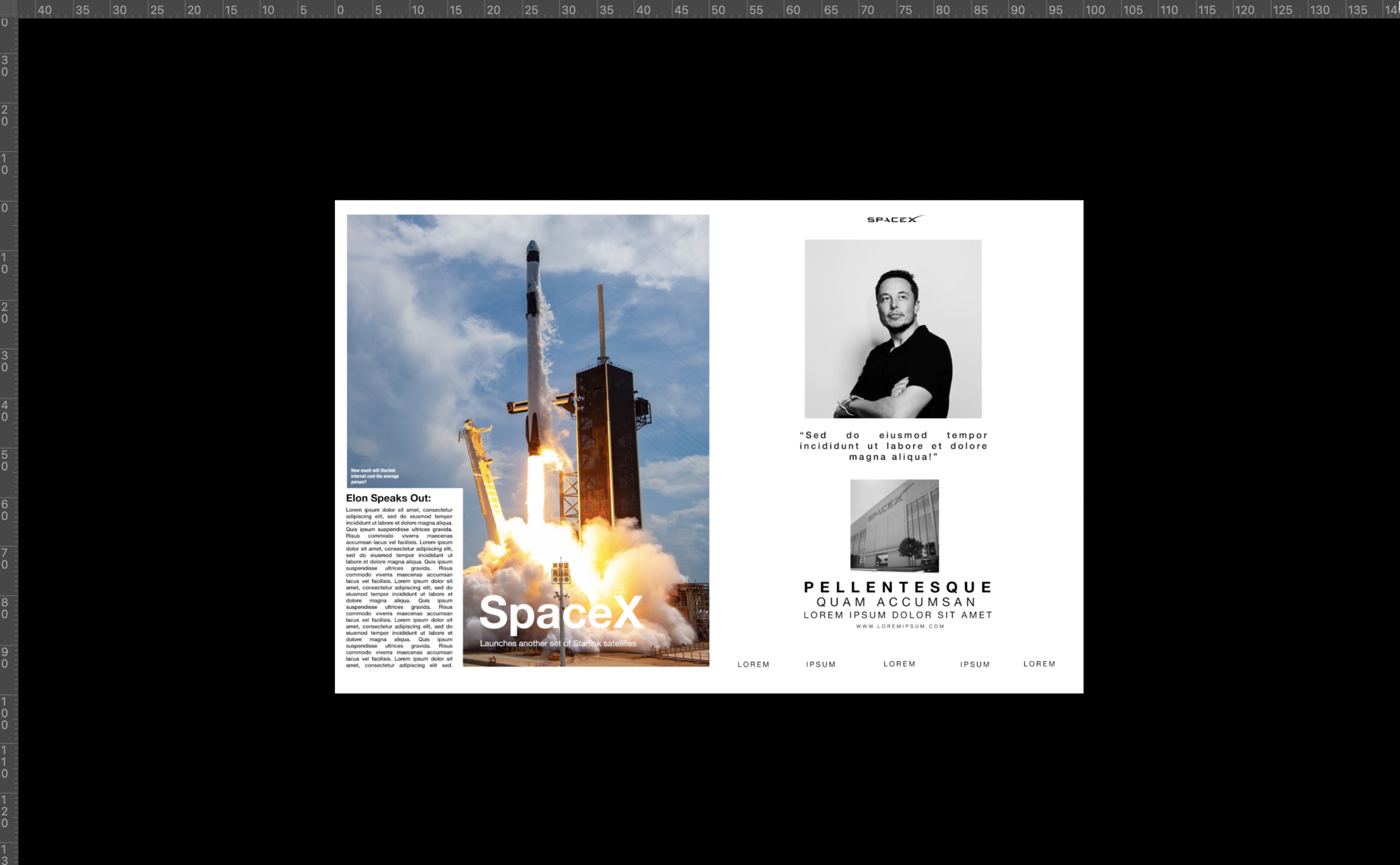
For my 2 page spread version I decided to choose a subject not really fitting to a magazine to see if I can make it ‘work.’ I went with a Spacex Elon Musk interview. When initially designing and deciding on where/what images to include it was clear that the handwritten style font on the second page would not work well with the subject, it looked very out of place. To begin with I changed the font to match the main text I had chosen, which was an improvement.
Final 1:
I feel like the imagery doesn’t work well with the more dated font. I feel like the use of a sans serif font may appear more modern and suited to the subject of the magazine spread. I think I will try a version with a sans serif heading, and a serif main text, then both sans serif and compare. Changing the imagery may also have an affect on the feel of the fonts.
For the next version I found a few new images, and wanted overall a less colourful palette. I feel like the large black and white portrait instead of the rocket launch creates a calmer beginning to the double page and works well with the other images. I tried different versions using sans serif fonts, and settled with a hierarchy of Helvetica Neue, using a bold, regular and light font. I feel like this works well with the subject of the magazine and imagery. The more modern typeface is easily legible and professional. I decided to test with changing the alignment on the left main text. I tested with it aligned to the left, right and then justified. It is a personal preference but I quite like the justified version, despite that being quite a dated way of aligning text and may not be consistent with the modern feel of the magazine spread. Another change I made was the layout of the logo on right page, and the text at the bottom of this page. I made them align with the end of the photo of the left, leaving the page feeling more complete.
Final 2:
So far, neither design felt ‘right’ or worked coherently. I aimed to use a combination of my previous versions to design a double page spread that looks coherent with the subject and could work within a magazine. I tested various layouts of the images and felt that having the majority in black and white, with a colour image contrasting worked well. I decided to stick with the justified text, but changed the heading fonts to Neue Grotesk Bold, and the main text to Neue Grotesk Roman 55, a thinner version. The other sub headings are a combination of Neue Grotesk and Helvetica Neue. These fonts combined with the large photo give the magazine spread a professional and quite serious feel. I think that this works well for the subject. The use of white space from the left side of the left page, balances with the right nicely. I am not very sure on the appearance of the quote underneath the rocket image on the right page, but this was the layout of the original advertisement in the Vogue magazine.
Final 3:
Overall this was a very interesting task, and working within the limitations was a good help to see how imagery and font/the combination of affects the appearance and feel of a design. I quite like the final outcome, although I may not design it like that from scratch myself, I am definitely inspired by the ‘cutting’ out of an image and replacing it with text.


