Core Concepts- Exercise 19: Judging a book by its cover
Choose a book by an author you are familiar with. You are going to design two different covers for it, one using illustrations or photography and the other using just type.
Design the whole cover including the spine and back page. Include the title of the book, the author’s name, a brief description of the story and any other information you think is necessary.
As you are working remember that your design is intended to help a reader know what the experience of reading the book will be. Is it a serious text book or an off-beat funny novel? Are the readers expected to be young women or older men and does this matter? Is it an ‘easy read’ or ‘literary’? Does the publisher have a house style you need to be part of?
When you have finished critique your work – which of your two designs do you feel works the most successfully and why? Make notes in your learning log.


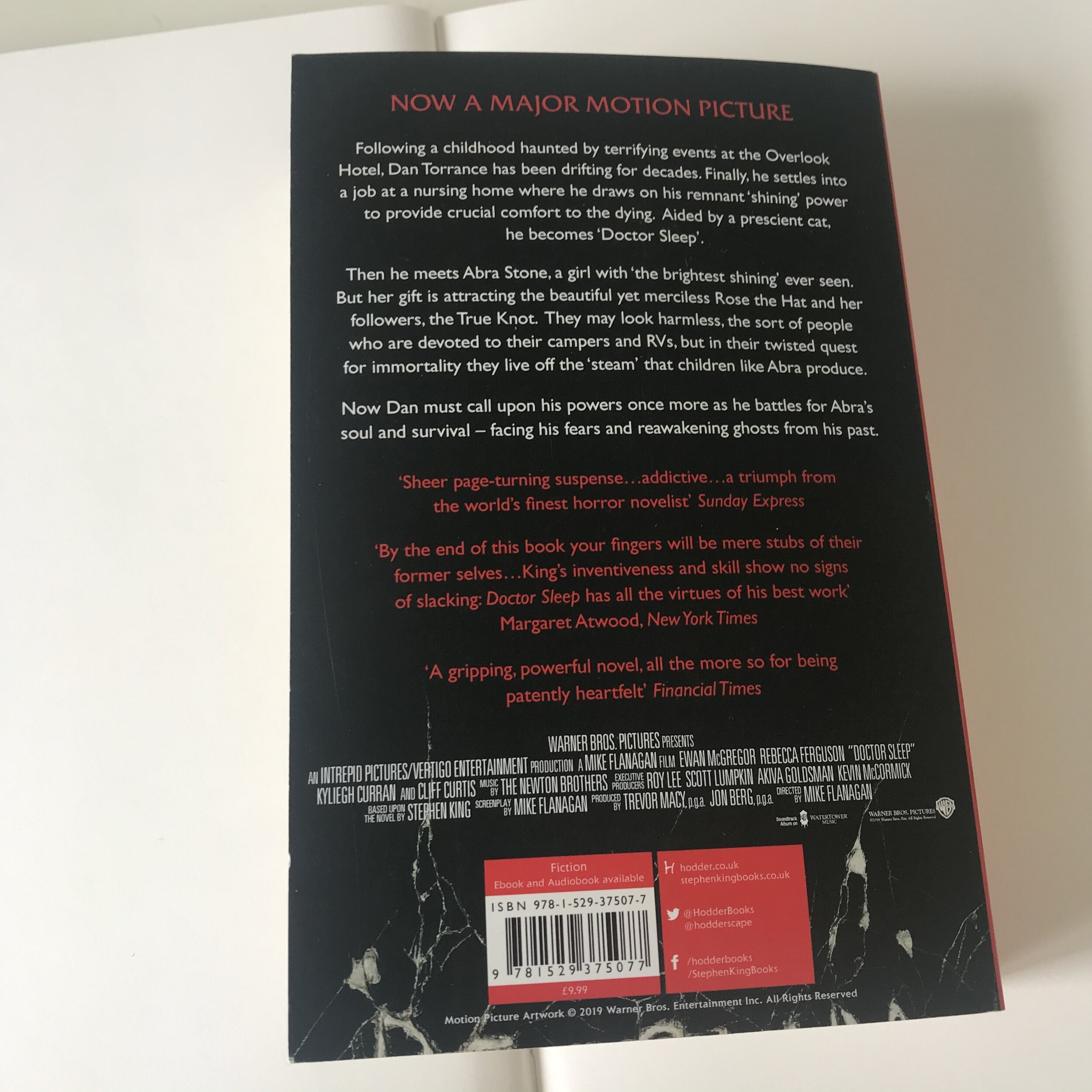
Interested to see whether a newer book I owned by Stephen King was published by the same publishing house, I also looked at ‘Doctor Sleep.’ This book was also published by ‘Hodder.’ Their logo placement on the spine, and at the bottom of the back cover was the same across both books, this is something to keep in mind when designing. The fact that these similarities continued across time shows a style by the publisher, and that it is an element that is affective. The authors name, also appears to be the largest in the typography hierarchy, perhaps because the authors name is known by so many, this draws in potential readers.
When looking at the books side by side, the imagery is very dark and uses a lot of black, red and orange. All these colours work well with the dark horror themes of King’s novels, and convey to the audience the scarier themes of the story.
Stephen King’s audience obviously likes horror, but also a more psychological thriller with abnormal and disturbed characters. I feel like King’s audience may be late teens to young adults, but also other fans of horror. I feel like King’s audience isn’t a ‘cult’ following but generally a fan of one book is a fan of them all.
When presenting ‘The shining’ to this chosen audience I need to keep in mind a dark colour palette, imagery, and decide/create on the typography and how to incorporate it within the design to present these themes effectively.
I decided on Stephen King’s ‘The Shining’ one of my favourite novels. I don’t own or read a lot of fiction, usually non fiction so I thought this could be more of as challenge. I began by inspecting the book, front cover, spine and back. The book itself is quite old, and was purchased a long time ago at a car boot sale. The publisher is ‘Hodder,’ I hadn’t heard of this publisher before so decided to do some research.
I quickly learnt that Hodder, was an imprint of ‘Hodder and Stoughton.’ A company owned by ‘Hachette’ a british publisher founded in 1768.
Imprint is a new term for me. It is interesting how the umbrella companies establish different imprints for different styles or areas of books.


I looked into other Stephen King books, new and old to get more of a feel for the visuals of the books, and to begin to think about what type of font is suitable to use. I also looked into some other novel book covers that were horror related, or of a darker theme.
I feel that the best style of font to use will be a bold serif font, with different or interesting serifs, combined with a handmade or manipulated font. From my research it shows that the authors name is the largest in the typography hierarchy, I will aim to present this in my design. The authors name being the largest, the title being second largest and probably the handmade part, what other information do is necessary to include?
I think that for the front cover, as shown by my research these 2 elements work best, and other information should be shown on the back cover. I need there to be continuity throughout the designs front and back.
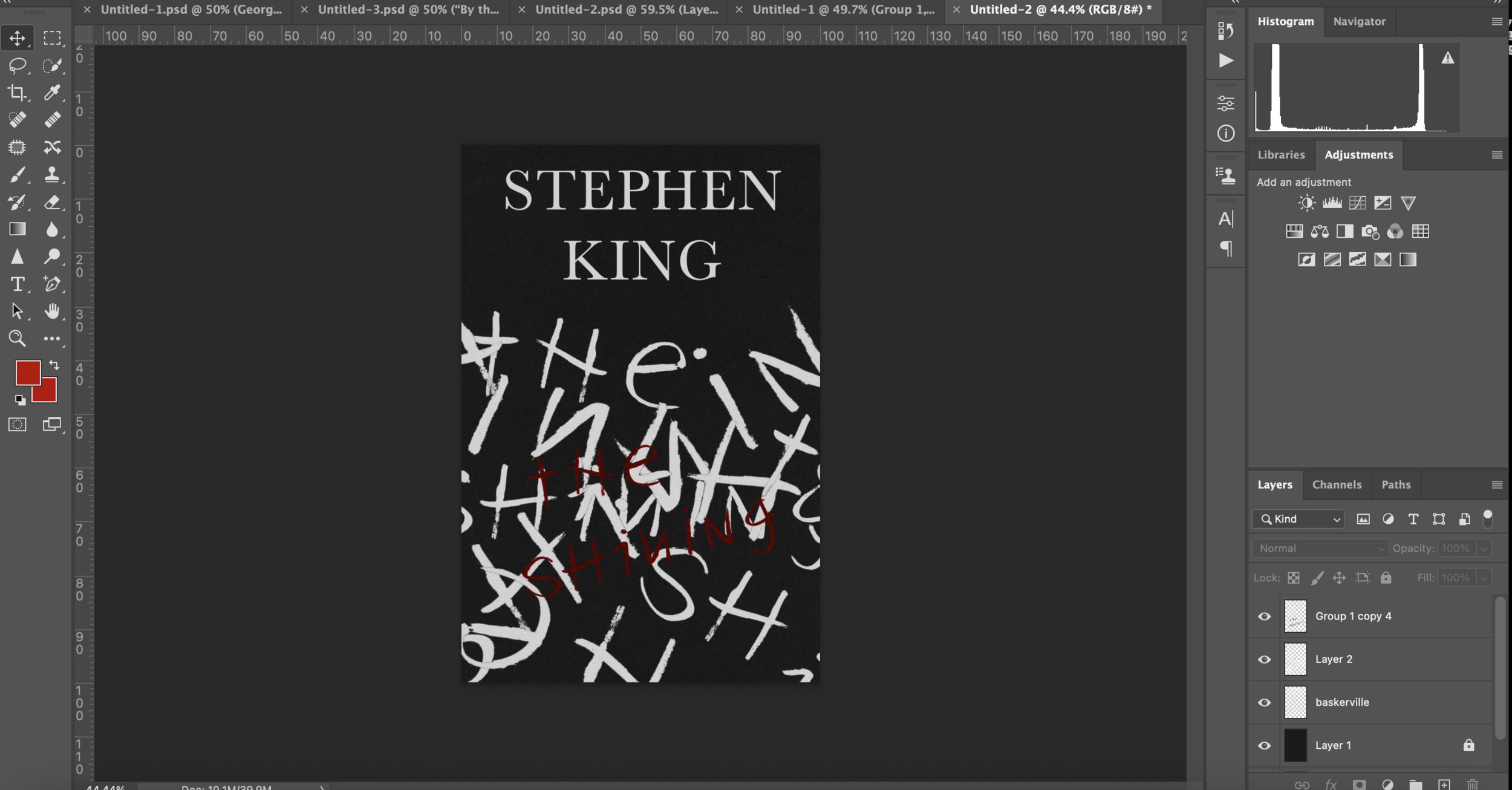
I began to experiment with different serif fonts, including some found from scanning in King’s books and using ‘what the font’ to identify the font. I applied these fonts to a black background as I feel like a darker background best represents the dark themes of the book. Some of the tested fonts included PT Serif, OPTI Danley bold, Baskerville and Georgia, in different font styles; bold, italic, semi-bold. I went onto producing some information for the back cover, using quotes taken from the back of some of King’s books to judge how well the hierarchy of fonts worked and presented the themes of the book to it’s audience. I decided on using ‘Baskerville’ a serif font, in bold, semi-bold and italics. I like the contrast of the more complex serifs in the italic regular version, paired with the more simple but almost sinister looking (especially on a dark background) semi-bold version.
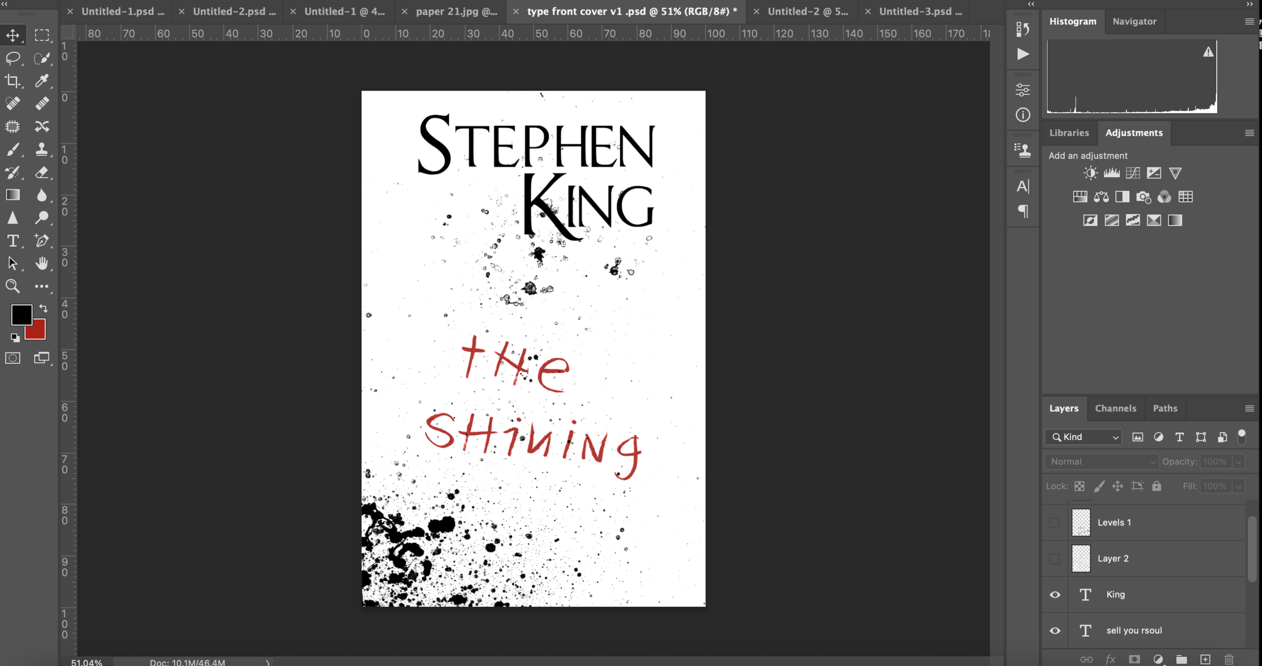
I collected some visuals from the film ‘The Shining’ to help inspire designs/mood. I noted some ideas for designs, and drew up some quick sketches to get an idea of composition. I went onto creating various textures to potentially use, using ink, paint, oil and cooked paper. The idea was to include something resembling blood, or scratching in the background to help the covers to be coherent, and enticing to the audience. When thinking of how to include a scratching element that resembled the ‘REDRUM’ writing Danny draws on the walls in the book (and film, which helped to give more ideas of visuals) it brought to mind a typeface I had designed for a previous task which I could test with.
I tested with my planned sketches composition, and with an idea that came to me when looking back at the font I had designed for a previous task. I then went onto seeing the difference between a dark and light background, and whether the feel of the design changed. I wanted a quite dark and sinister visual, one not to dissimilar from King’s other books so the audience would find it appealing. I needed the front cover to also be easily legible, and be individual enough so a viewer would know it was for ‘The Shining.’
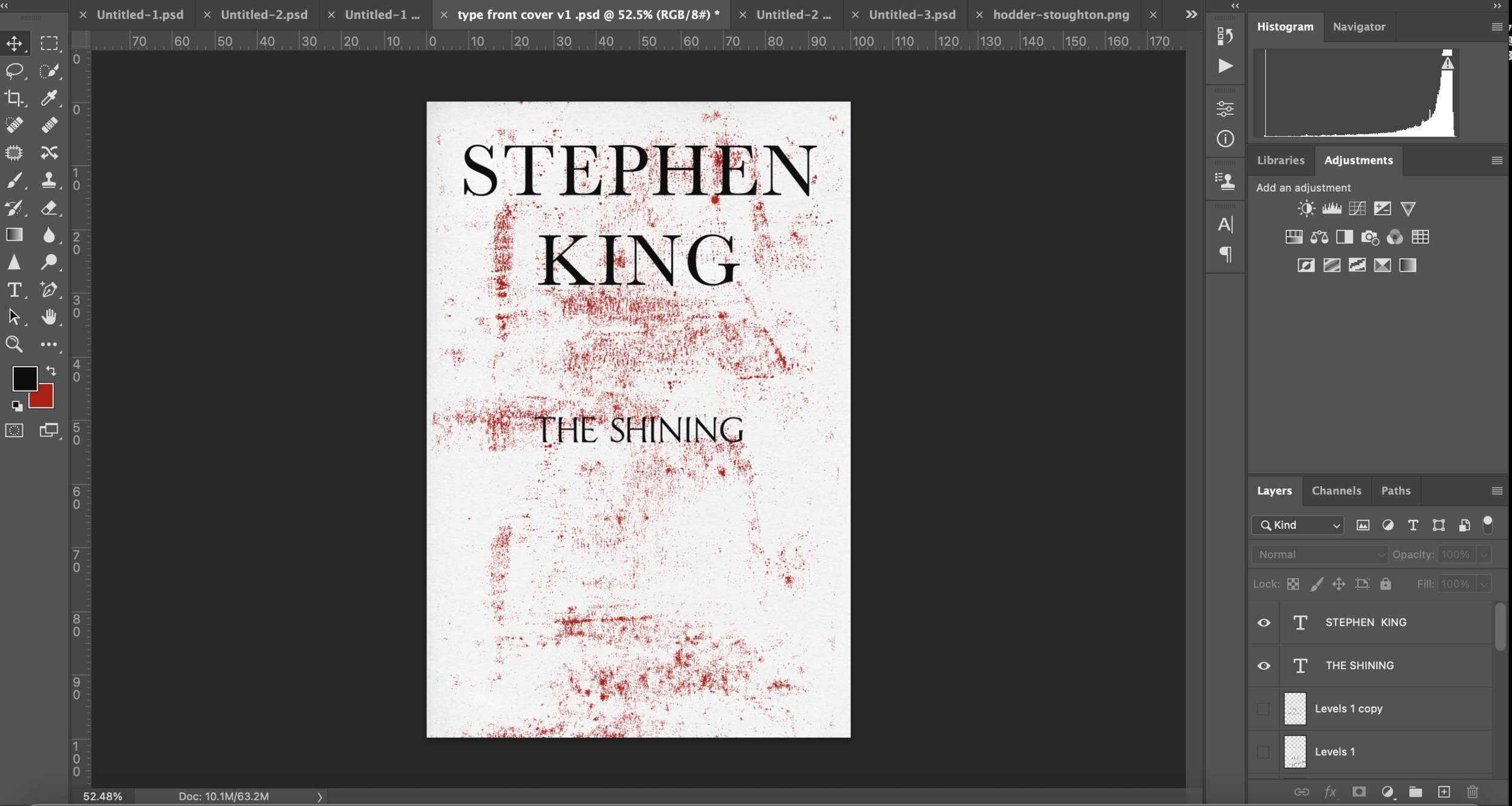
I continued with switching between the darker/lighter colouring, whilst sticking to a minimal colour palette. I feel like the red, black and white aligns with the darker themes of King’s books, and the palette is also similar to the authors other books. The composition works well, and keeping the hierarchy of the fonts this way also seemed to form in alignment with King’s other book styles.
I tried another texture that resembled more of a scratch, but decided that the ‘blood splatter’ was more affective. I then went onto testing with distressing the text digitally. I used other physical textures that I had created previously to do this, including markings from a receipt collected in an earlier vernacular typography task, which worked well. I kept in mind the legibility of the text whilst distressing it, which lead to me creating a more subtle affect.
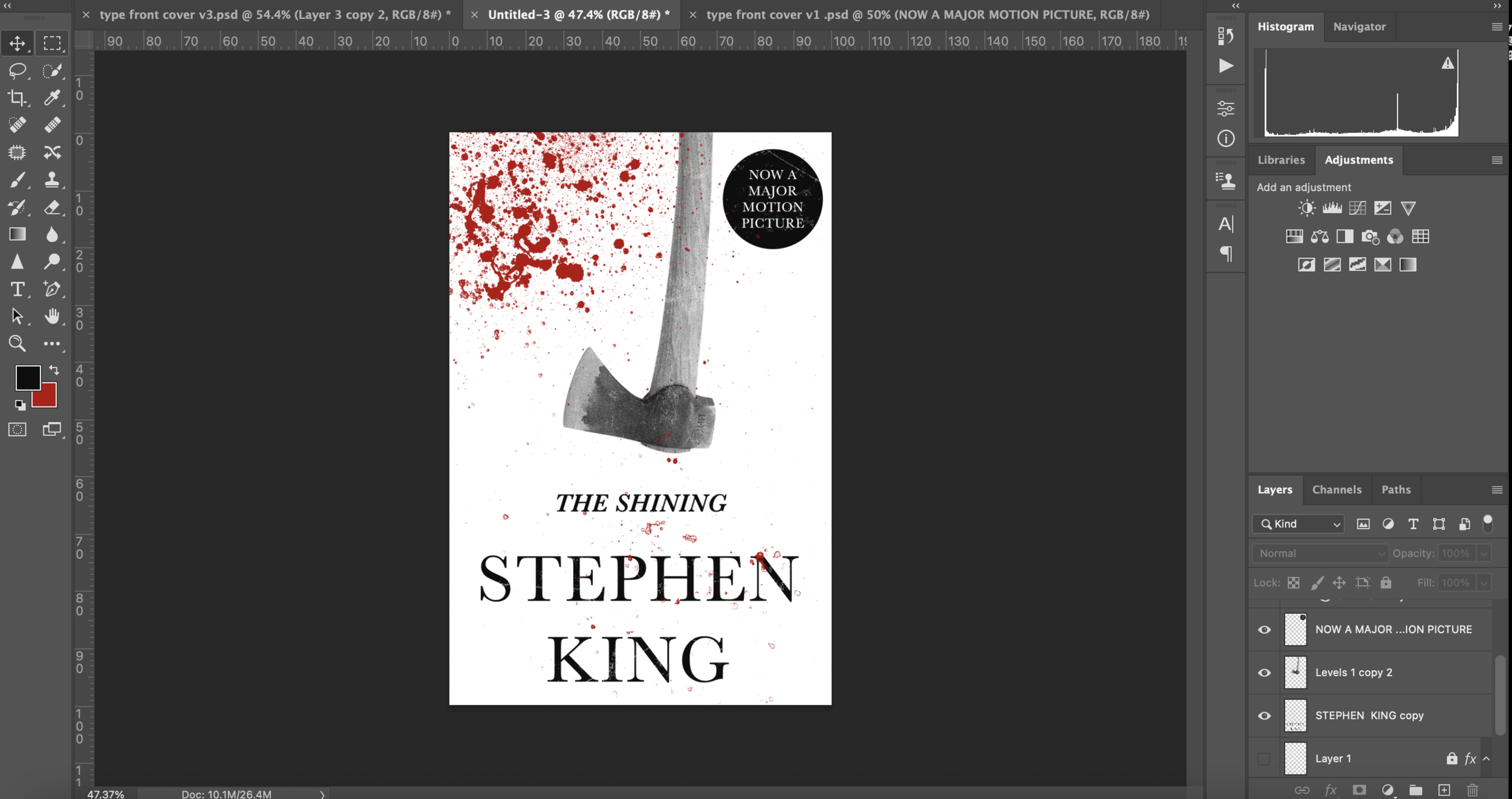
It was at this point where I decided to test with the illustrated front cover. I wanted the 2 covers to work together almost as a series, and look coherent so I intended on working on them simultaneously. I referred back to my sketches and liked the idea of the axe. The axe is an important element to the story, where Jack breaks through the bathroom door trying to get to Wendy. This iconography is strong and I think would resonate well with the audience.
I began the illustrated version by implementing the axe as shown in my sketched plan. The author text in a semi-bold Baskerville worked well so this remained the same, ‘The shining’ is a semi-bold italic Baskerville which is coherent with the authors name. I tested between 2 textured backgrounds, changing their composition on the page. The results were obviously very similar, but almost too similar and included too many elements of the previous design. Playing with the layout and imagery gave me an idea for an illustration that I wanted to continue with.
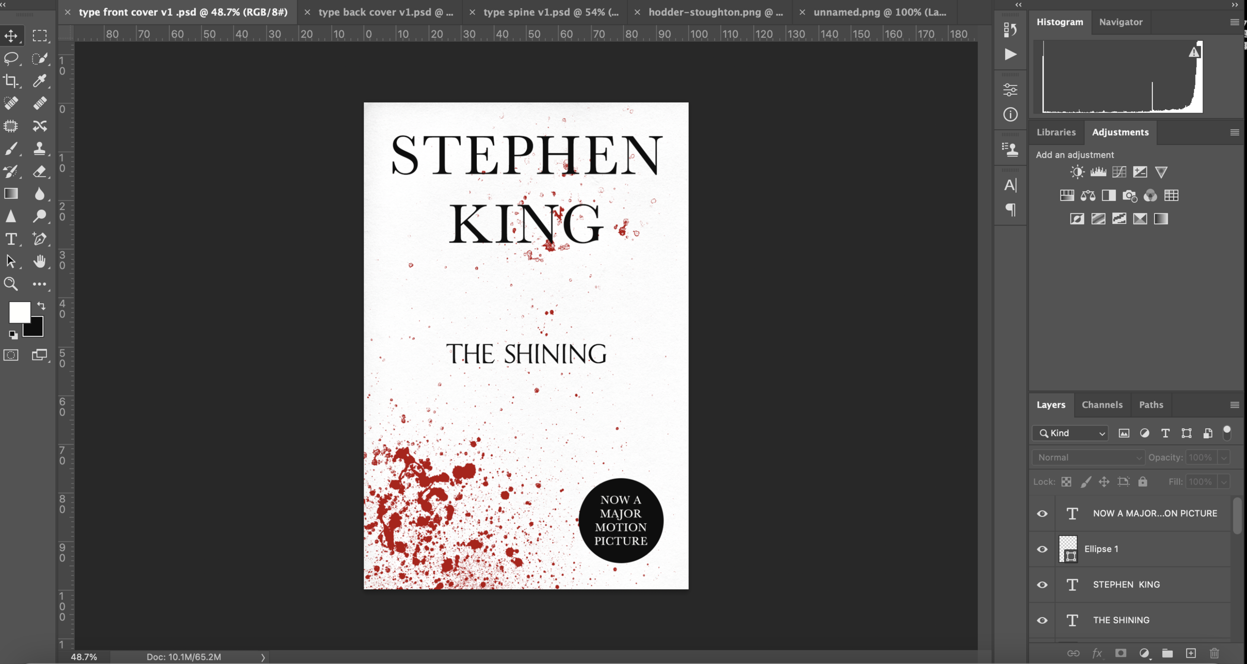
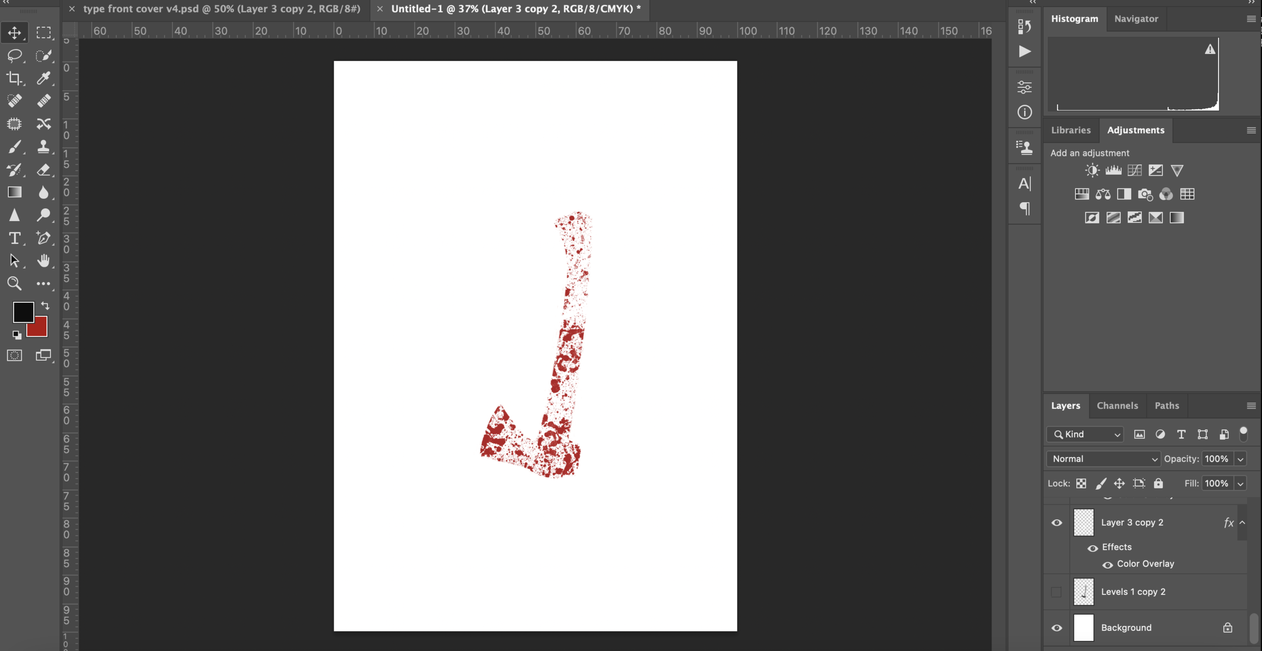
I took the image of the axe and the ‘blood splatter’ texture and combined the both. I feel like the end result works well and puts more focus on the illustration. The white background without a texture looks ‘clean’ and professional, it contrasts well with the more dark/violent imagery of the illustration. Before finalising the front cover I went onto designing the back over and spine for the type only design.
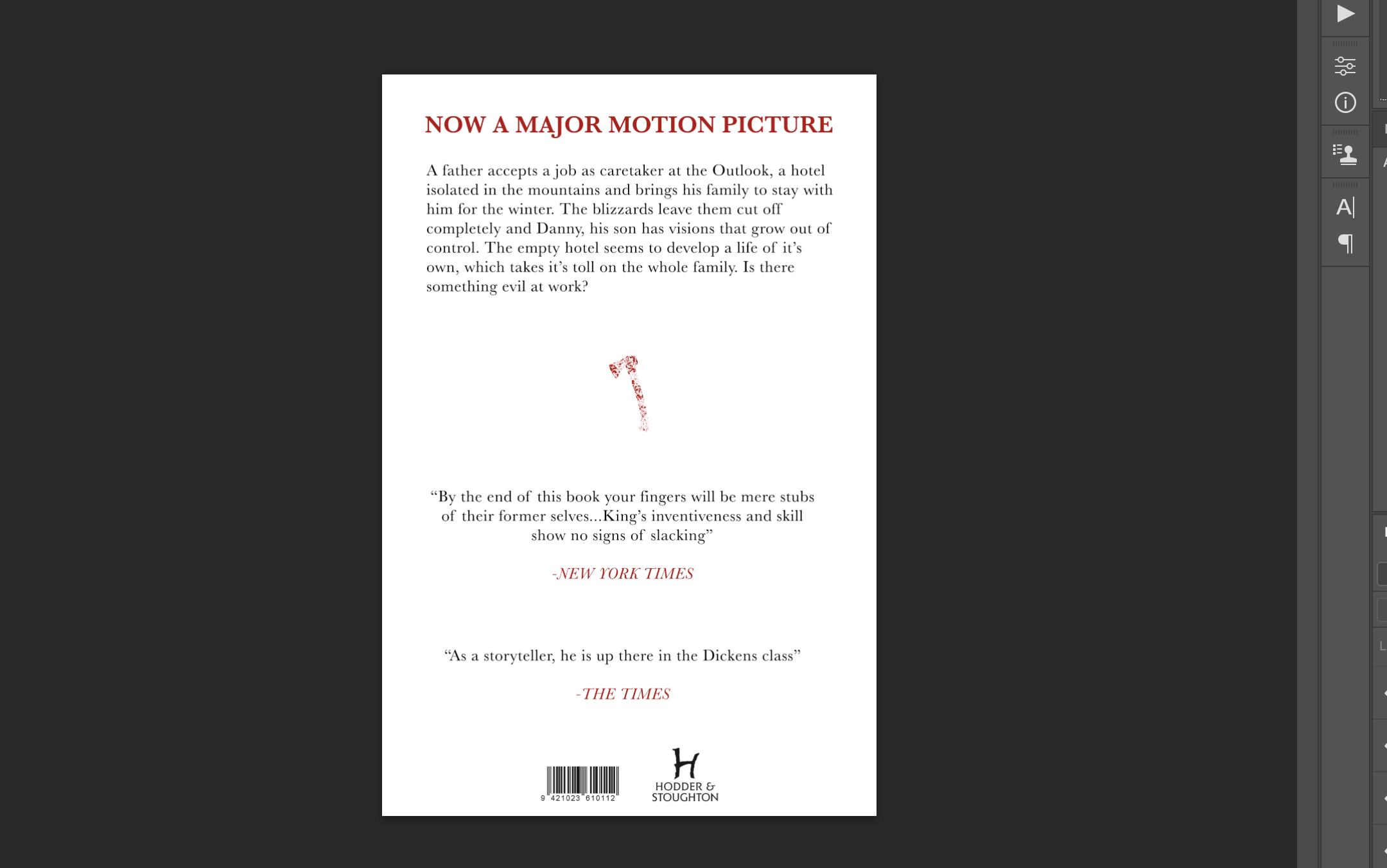
I had a good idea based on my research of what to include for the back cover. I had seen many books use quotes of high brow people/businesses that has reviewed the novel, and took a couple of the quotes from there that I felt worked well. For the layout I initially decided on having the brief description of the story in the middle, with a quote above and below. The font I used for the main text here is Baskerville. I really like the aesthetic of the same typeface in different fonts and this typeface is well suited for conveying the themes of the book. I looked at different ways of aligning the text, left to right, centralised and justified. The more conventional method is having the text central I found from my research, this seemed to work the best and was easily legible, and seemed 'balanced’ on both sides. I moved onto working on the back cover and spine of the illustrated version.
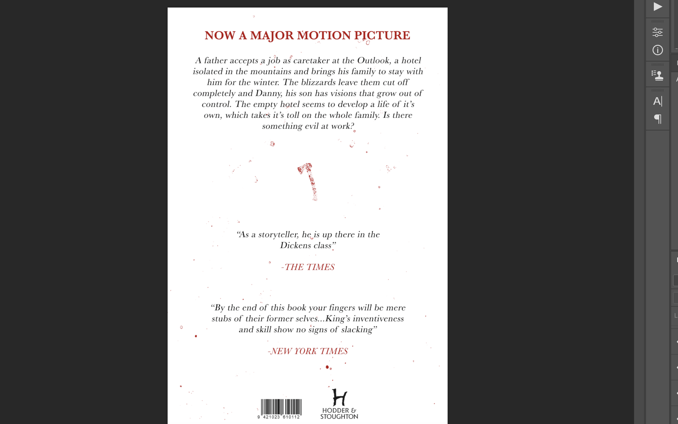
I continued with changing the composition and alignment of the text, and tested with using the blood splatter from the other design. I feel like this was almost too much with the red text and made the design look less professional and ‘clean.’ I looked at colouring the spine in a similar way, the design is a similar layout to other Hodder books, with the authors name large and in the conventional book composition. I decided on using the illustration in the middle to represent ‘the shining.’ I hope that the iconography is strong enough for the audience to know from just viewing the spine as to what it alludes to, but I feel like it would entice a new reader who was interested in a darker themed book anyway.
I looked back on my planning and decided to test with different colouring of the text, using the same red as the illustration. I began by choosing a ‘title’ being ‘Now a major motion picture’ the same writing as on the front to be consistent, this is something I had seen through my research of Hodder and Stoughton books. I tested with different styles of the font, making it italic, bold and semi bold. I also tested with the layouts of the text, and decided on using the front illustration as a ‘break’ between the text and reviews, this is again something I identified in my research.
Final 1: Type
I feel like this design works quite successfully. The contrast between the Baskerville heading and the handmade font of the book title makes the book stand out and the fonts themselves paired together look quite sinister which works for King’s dark themes throughout the book. I included some distressing on the text to exaggerate the ‘darker’ feel, I didn’t want to go too far and for it to appear unprofessional or not be suited as a book cover within the Hodder and Stoughton area. The cover also has elements that other Hodder and Stoughton books do, such as the ‘sticker’ ‘now a major motion picture’ and their use of their logo in the same place on their spine and back cover. Overall looking back at this design I feel like I have designed a useable cover for a Stephen King book, I think it works well for the audience and within the Hodder and Stoughton space. The ‘blood splatter’ texture is too strong on the front and back cover and could’ve been done more subtly and tastefully, I also should’ve tested with more layouts of the text on the back and seen its affects. I feel as if I should’ve tested with more interesting compositions similar to ones in my initial sketches to compare the difference.
Final 2: Illustration
I feel like this is the more successful outcome of the pair. I like the contrast of the distressed text and illustration with the white background. I think that the big difference is the back cover, I prefer the type hierarchy and layout. The red, black then red repeating pattern is an improvement on the type back cover. I decided to use an italic version of the regular Baskerville font throughout the text, I am still unsure whether this works the best but decided to use it for the final. The idea behind it was that it acted as conversation with the reader, but I am unsure whether I should have kept the short story synopsis as regular text and the quotes in italic, with the names of who said the quote in regular text. I decided against using the blood splatter on the back cover and spine and instead went with a ‘cleaner’ version.
Throughout this task I feel as if I have improved on my application of typography and focus on the audience of the design. I feel as if I am beginning to look at design with a different mindset, and hope to improve with creating affective designs as I continue with this section. My focus shifting from just visuals to typography, it’s layout, hierarchy and affect on the design and audience has improved my designs or at least my outlook on them. I look forward to progressing and improving to hopefully create professional and more ‘finessed’ looking work.


