Core Concepts- Exercise 17: Hierarchy
Using about 500 words of Lorum Ipsum (or other dummy text) you are going to design three different pages:
• an interview with a TV actor in a listings magazine entitled: Will Sheila tell the naked truth?
• a review of a new piece of hardware or software in a specialist computer magazine
• a book review in a newspaper’s weekend edition.
Research these types of publications and identify three different combinations of typefaces appropriate for each publication. Now you need to invent headings and subheadings for your articles. Set these combinations so that your header is above 12pt in size, your body text is 12pt or below and subheadings sit in between in your hierarchy. You will need to create some text to allow you to show your combinations in action. Use your text to describe your decision making process, why you think the combination works and what your intentions were.
Interview with a TV actor in a listings magazine entitled: ‘Will Sheila tell the naked truth?’:
I began this task by collecting magazine/newspaper articles from fashion/gossip media. I next went through and used some to identify which typefaces to use/how to compose my article.
I had recently come across some interesting designers when looking for inspiration for future designs, as I really wasn’t happy with previous work from this typography module. I decided to list them below:
Anton Reva:


Anton is a photographer and designer who combines physical techniques with digital editing. I really enjoy this ‘handmade’ more abstract style of work, these techniques are something I would like to test out with future work. They especially have potential with magazine/book design.
Chris Ashworth:
I came across Chris via Instagram and he’s definitely up there with some of the best designers I’ve seen. He is known for being the creative director at ‘Ray Gun’ music magazine in 1997. I love his physical style, and use of typography. It is as if he uses individual letters/words as a medium of their own.


I then went straight into beginning to design the page as I wanted to try different compositions and play with the fonts/composition as much as possible. I measured a 2007 Vogue magazine for it’s page dimensions and used this 22.5 x 30 cm, I feel like this looks nicer than A4 and is more interesting.


I tested with the different fonts, sizing and composition, till I had the skeleton for a layout that; looks visually interesting, was legible and suited for a TV actor article in a magazine. The image I decided on using was one from an old ‘Woman’s Own’ magazine, which I felt suited as it was eye catching and would entice somebody to want to continue to read the article. I wanted the text to be justified, even though it was one block of text, inspired by ‘Soviet Weekly’ newspapers explored in the previous task.
I then went onto printing the text using an acetone transfer method with different items such as a spoon to achieve interesting textures. I also produced a few versions of the image, distressing different parts. I feel like this adds to the enticing title of the article, ‘Will Sheila tell the naked truth’ or will the truth be changed/distorted/distressed.
The additions of the barcode/numbers were taken from receipts and postage packaging, scanned in and edited. This was again to add to the context of the article, making the viewer question what the truth is about etc. I included hand made, Photoshop edited red markings to exaggerate the heading.


Final outcome:
For my final outcome I went with a combination of my initial fonts, using Warownia for the heading and subtitle, with Swift for the main text. The use of a sans serif heading, and a serif main text was inspired from my research on other magazines in my mood boards, and from the ‘Soviet Weekly’ 1980’s newspapers.
I did intend to screen print the text/acetone transfers and then edit them again in Photoshop, but aware of the time spent on this task I decided to stick with the initial acetone transfer version. I tested with layering colour digitally, but I preferred the original. I feel as if this would be a more abstract, but enticing article layout for a magazine. I am quite pleased with the outcome, but looking back there is a lot I could’ve tried and changed. I could have changed the composition entirely a few times and compared, and also the typography a bit more. I look back at my work and think this a lot, and need to incorporate in my method of creating work when I feel ‘comfortable’ with what I have done, to take it apart and see if I can improve or change it. This is time consuming so often testing a bit and continuing is what needs to be done, but this would definitely be beneficial.
I feel that I am slowly improving throughout this ‘Typography’ section in particular, because I am learning how to incorporate type as a part of the final piece and images/illustrations, rather than thinking of it as a separate entity. Chris Ashworth in particular inspired a change in thought of type, and to use it as a medium in itself.
A review of a new piece of hardware or software in a specialist computer magazine:
I continued with researching interesting compositions/layouts of articles and magazines. I found some different looking, more modern layouts that I will draw inspiration from. I searched through various images of computers/ hardware when looking for a topic/ focus for the magazine review and came across an article about a gaming PC. This topic is something I know nothing about, but I was drawn in by the interesting imagery of the hardware.

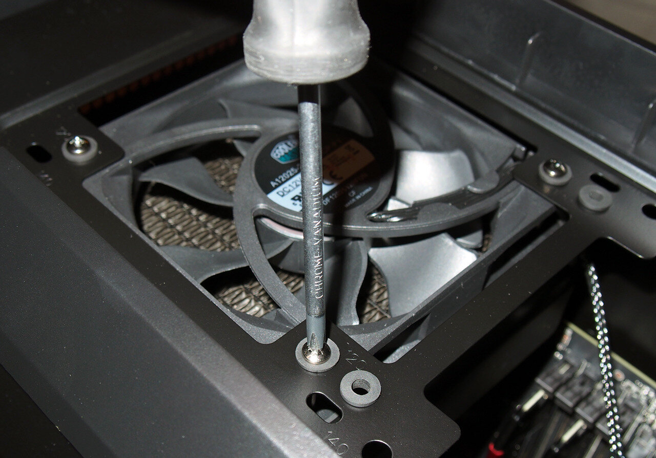
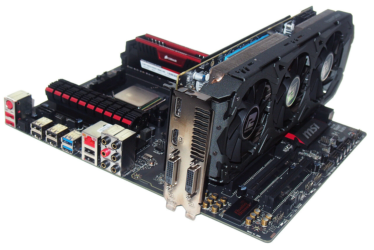
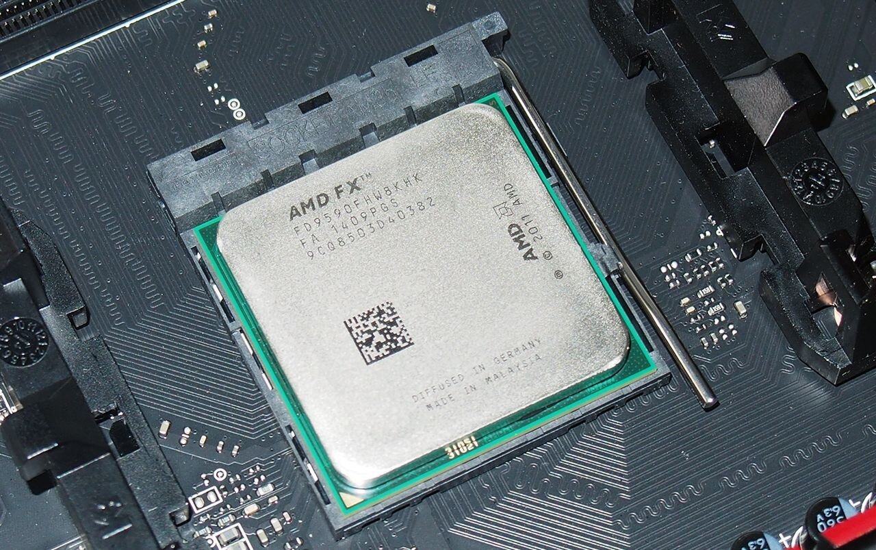
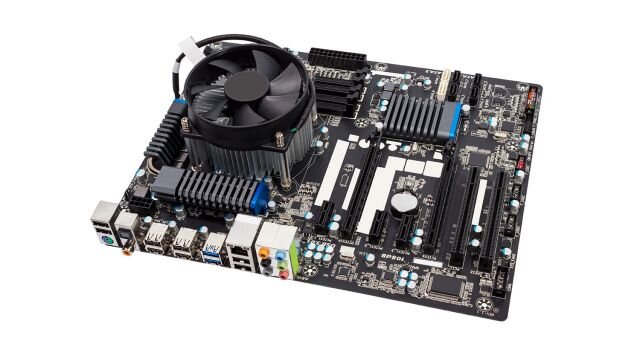
These were some of the images that initially drew me towards the article. I will potentially use some of these in my mock up.
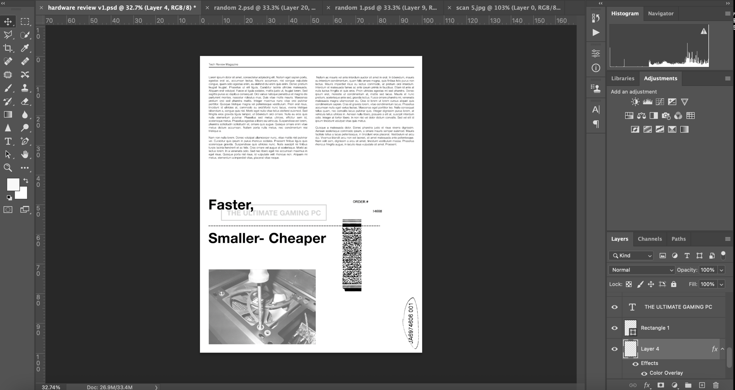
With an idea from my planning in mind, I took to Photoshop to create a mock up, before printing the text and creating the illustration. for this digital focused article, I wanted to keep it ‘plain’ so kept to a greyscale palette.


When washing out my exposed screen I came across a problem. Parts of my screen were underexposed and not washing out, which required more pressure and water to do so, this broke away some of the fragile emulsion. After some research I found that this is because my emulsion’s shelf life is up (well over in fact) and the emulsion starts to behave differently. Despite this being an issue, at least I now know roughly how long it is before I should replace my emulsion to avoid this!
I continued testing with different compositions, and with including some colour. I created new textures on paper to incorporate, which made some interesting results. I wasn’t happy with the way this turned out, and wanted to see if adding some hand drawn/written elements would add something to the design. Aware that this is for a computer magazine, I was apprehensive to add more handmade elements, as I didn’t want to seem ignorant to the designs target audience, but was interested to see where it could go.
Final:
I feel like my final version could work as an interesting design within a computer magazine. Despite the handmade feel, it’s intention to make an otherwise ‘boring’ article more interesting, was I think-achieved. The use of Helvetica fonts in a justified alignment I feel worked well, as they are modern, easily legible, and professional looking, making them well suited for a computer magazine. Again, stylistically I look forward to improving and refining my visuals and design. I also look forward to carrying forward my further found appreciation for typography and printing.
A book review in a newspaper’s weekend edition:
I looked over my own ‘visual diary’ and added some new additions, screenshots/book pages/vernacular typography photos. I was also suggested some great artists and books to view, here are 2 of my favourites:
Edward Fella:
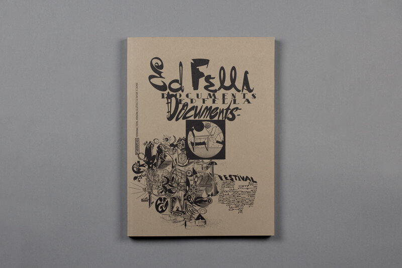
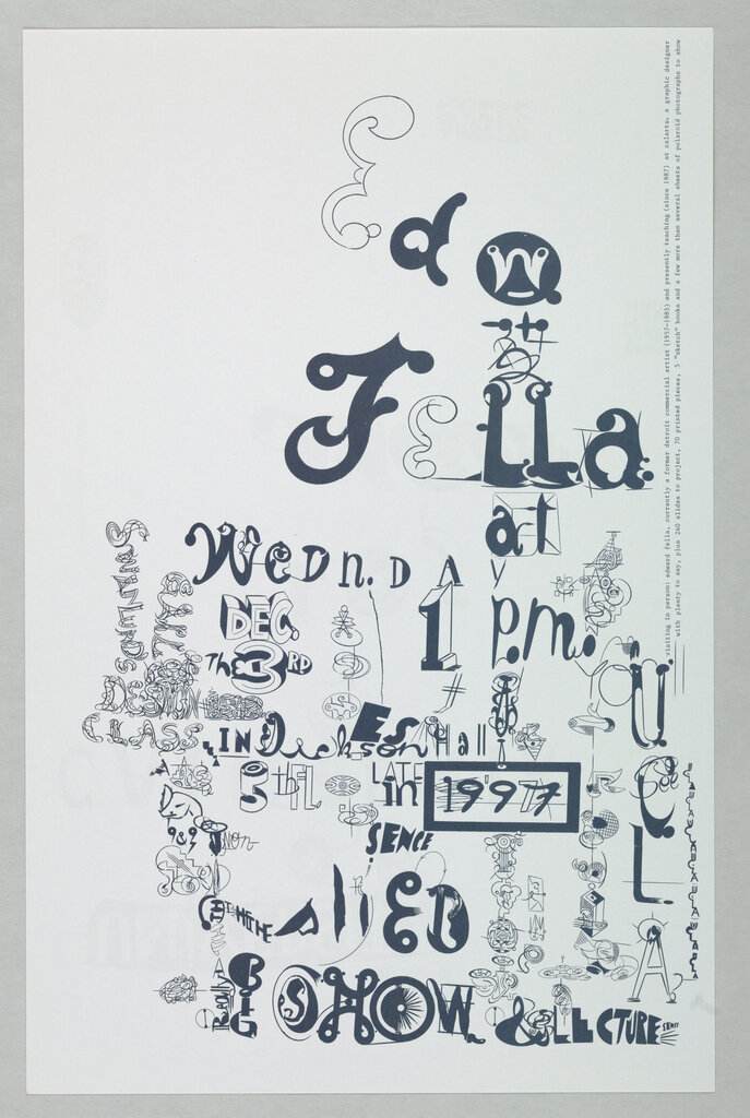


I love Ed’s eye for design and aesthetic, his handmade style is really inspiring. I collected some screenshots of his work Instagram and collected some from other research.
Ed Fella is an American artist/graphic designer. I came across a good short biography about Ed via AIGA: “He simply did not live long enough.” Like the author of Angela's Ashes, who followed a high-school teaching career by winning the Pulitzer Prize and international fame, Ed Fella's second act has been more noteworthy than his first. After three decades as a successful commercial artist, Fella, at age 47, entered the MFA program at Cranbrook Academy of Art in 1985, opening the door for him to be recognized as a pioneer of postmodern graphic design. From his subsequent position as a professor at California Institute of the Arts, where he has profoundly impacted the design program for the past 20 years, Fella has since presided as vanguard master to a new generation of graphic designers.


Hand Job- A catalog of type by Michael Perry


This book is brilliant. It displays some great typography by 55 artists artists. There’s some very interesting concepts, such as the carving into skin!
I look forward to testing some ideas from this book in the future, such as the stencil type, I think this would look great, spray painted, with chalk etc.


A few days had passed since creating my Hierarchy list of fonts, and since then I came across ‘Neue Haas Grotesk’ which I feel is a great, modern style similar to Helvetica. I felt like this could work well, especially in a weekend edition of the newspaper, where more creative work is shown anyway. I tested the font in different styles/ levels of bold similar to how I chose to work with Helvetica in the previous design. This may be almost a ‘cheat’ of seeing which fonts work together, but to me visually it works.
I collected some of the fonts found within newspapers I recently collected that stood out to me, and used ‘what the font’ to find out which they were. Some I decided to test/potentially incorporate in my mock up.
My next choice was which book? I decided to choose the most recent one that I am currently reading being Jordan Peterson’s ‘Beyond Order’- 12 More Rules For Life.
I began to test with compositions, textures and layering of text. My emulsion, for screenprinting still hadn’t arrived, so for this design I had to come up with another method of printing. Instead of an acetone print, I accidentally came across a method involving an inkjet printer, printing onto acetate (where the ink sits on top) and then transferring this onto paper. My laser printer stopped working, so I used another printer (inkjet) where I realised I can’t print onto acetate the same!
I was really pleased with this method’s results, and excited to try it more in the future. Again, another accident that worked, was the smudging of the text, the sheet of acetate fell onto the floor and distorted the print.
I continued with changing composition/textures before applying the newly printed text to the design. The justified text, inspired from the old Soviet Weekly newspapers I mentioned in a previous task, I feel works well for a newspaper, despite it being a quite dated style.
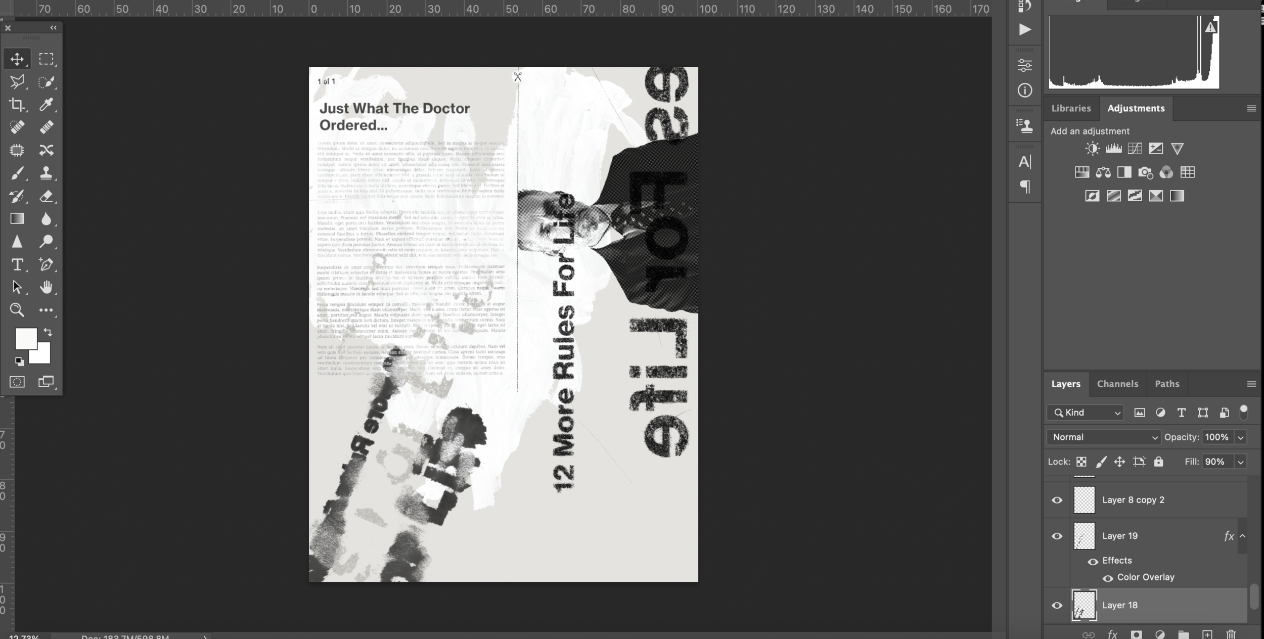
Final:
I think that my final version could be quite an affective book review. I really like the Neue Haas Grotesk font and think it works well for this review. For the illustration I took the scissor cut out from an invoice I had in a package sent to me. I used this to ‘cut open’ Peterson’s head to ‘reveal his knowledge’ which is what his literature does. I enjoyed experimenting on this design, and feel like I have improved from the beginning of this typography section.


