Graphic Design 2.1: Professional Practice, Project 4: ‘Getting to Know You’ Exercise 1
Exercise 1: What’s Your Forte?
What is the skill, talent or ability that provides you with a distinct advantage? This might be something related to design practice (eg. you know all the Photoshop keyboard shortcuts) or it could be a human skill (eg. you are an incredible listener) or it might be something completely unexpected (eg. you practise sustainable foraging). Select one aspect about yourself and explain in graphic form how you go about doing this unique thing.
From the examples listed above, you could create an infographic to summarise all the keyboard shortcuts, you could design a mockup for an app that helps develop listening skills, or create an illustrated map and design the layout for a magazine article about sustainable foraging.
Include a reflection that explores how this skill, talent, or ability might fit into your professional practice and how this unique aspect about you might provide a career advantage.
I always find exercises that need even the slightest amount of introspection, discussing personal traits or skills very difficult. When considering a skill I have that would provide me with a ‘distinct advantage’ I think about photography, the area of art that really got me interested in graphic design.
I have been taking photos/interested in photography for almost 15 years now and is something I can and should be incorporating more within my design work. I practise photography daily for work through taking product photos of clothing, content for social media, or working with clothing brands.
Despite photography being different from design, I consider them adjacent skills, with photography being included within most design, used as inspiration or working symbiotically with graphic design to create interesting visuals. Photography skills such as framing, lighting and colour theory are all transferrable skills. The sense of beginning with an empty canvas and creating something is very similar, especially with film photography as you are unable to immediately see what you have created. Film photography also relies more on your knowledge of photography theory and allows you to achieve certain effects that you can only create organically using film.
I began to make notes considering how I can present photography in graphic form. My ideas ranged from more abstract posters to magazine articles. I decided to move forwards with a magazine article as this is something I have little experience in designing and thought it would be more of a challenge.
I used Behance to research various styles of magazine, collating compositions I found interesting.
I wanted to develop a magazine article that discussed film vs digital photography as I have a massive interest in both.
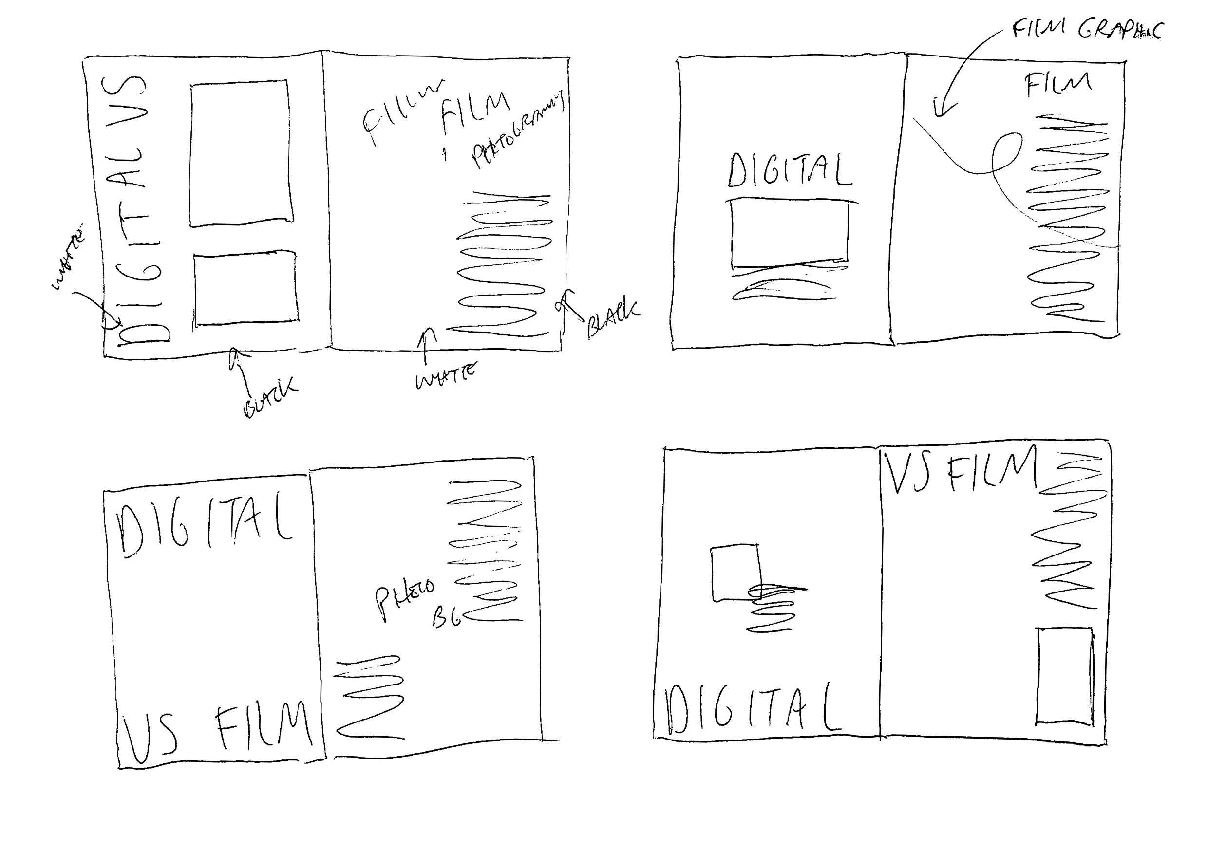
Referencing my research I jotted some composition/concept ideas. The main idea was to have the digital vs film be represented physically by colour, position of information and images. One side would be digital and use digital elements such as type and only include information about the digital side of photography, while the other would have more tactile elements such as hand drawn type to represent the more organic photo style you get when using film.
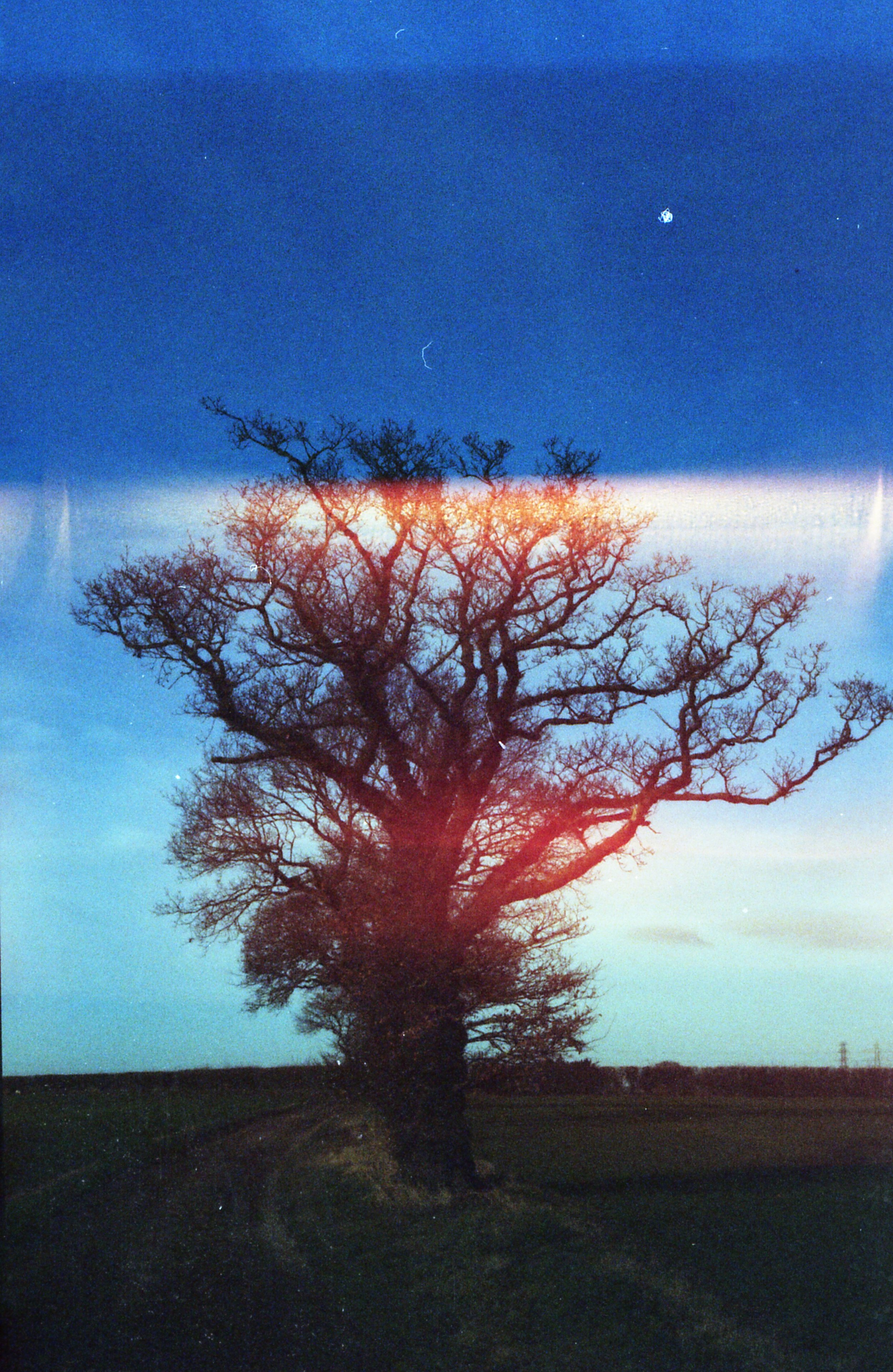
I then went through and collated some of my photography work which could be suitable to be included within the magazine article. I gathered a mixture of digital photography along with experimental film photos which played with expired film (producing orange hues on photos) and poor quality cameras (large amounts of grain).
I personally really like the raw look of film therefore had the idea to have the digital page in black and white or void of major colours and the other page with more colour elements to represent film being more interesting.
I began the process by choosing a typeface that would work well as a title and one that would work well as the body text. The type I chose was ‘Warownia’ which reminds me of the Gotham typeface which is probably why I like it so much. The kerning of this type seemed to be off with certain letter combinations when capitalised such as ‘TAL’ at the end of ‘Digital’. I rasterised the type and edited this manually, achieving a more balanced look.
I then used a marker pen that was running out of ink to quickly hand draw the ‘VS film photography’ type. I scanned this in and manipulated it to achieve a level of grain/tactile feel I felt worked well in contrast with the thicker digital type.
I then experimented with composition, referring back to my sketches, adding a film roll (figure 5) image to the background of both pages with an aim to draw them together visually. I warped the image so it appeared closer ton the viewer on the right hand side of the page to add some depth to the visuals of the magazine spread.
I used Chat GPT to develop various versions of an article instead of using ‘lorem ipsum’ or writing the article myself. This was time effective and despite the fact that I would of enjoyed to of written it myself, this was not a part of the task and it also allows me to integrate the use of AI to improve my workflow.
Using Chat GPT this allowed me to edit the article down to a size which fitted perfectly across the 2 pages with the information regarding digital cameras being on the left page and the film camera information being on the right page.
I was apprehensive to begin this task but really enjoyed the process once I got started. This task was an opportunity to experiment with different styles and techniques to develop a double page magazine spread- a form of design I don’t usually create. The end result is interesting but looking back I feel like it lacks something. Perhaps I could layer the images on top of paper for more visual interest and manipulate the type further, making the digital side appear more ‘clean’ and ‘digital’ compared to the film sides body text.
I decided to go back to my design and make some subtle changes in hopes to improve it. I began by changing the typeface used for the body text to a thinner style, Gotham Medium. I then added a border to the design adding more depth to match the inner film reel colour. I experimented with having the film reel as a different colour, coming off over the border but this did not work as well. Finally I added some hand drawn marks to the edge of the film photo, again exaggerating the tactile element to film photography and balancing the darker colours on the digital side of the article.
Figure 1: Behance (no date d) Behance.net. Available at: https://www.behance.net/gallery/111288475/084-Amtista-Fashion-Book (Accessed: 10 April 2024).
Figure 2: Behance (no date) Behance.net. Available at: https://www.behance.net/gallery/17865701/Re-ISSUE-01-2012-13?utm_medium=email&utm_source=transactional&utm_campaign=project-published (Accessed: 10 April 2024).
Figure 3: Behance (no date f) Behance.net. Available at: https://www.behance.net/gallery/151902461/Reveladas-magazine (Accessed: 10 April 2024).
Figure 4: Behance (no date g) Behance.net. Available at: https://www.behance.net/gallery/30255391/Ginsberg-Zine (Accessed: 10 April 2024).
Figure 5: Film Roll image (no date) Adobe Stock. Available at: https://stock.adobe.com/search?k=film+roll+vector (Accessed 12 April 2024).


