Graphic Design 2.1: Professional Practice, Project 3: ‘Understanding Visual Identity’ Exercise 1
Exercise 1: My Logo Taxonomy
For this exercise you will curate a collection of logos into your own personal reference guide for inspiration and future development.
Although it is impossible to familiarise yourself with every logo, you can get a good sense of the variety and breadth by searching through curated resources available online. To get started you can explore:
the Logobook Archives to find a collection of logos curated by Svizra, a community of international branding designers. The criteria to be included in this collection include that the logo must be strictly black and white and use icons.
UnderConsideration curates the content for Brand New to discuss and chronicle corporate and brand identity work including redesigns and new designs for products, companies, services, and organisations across all industries and locations.
Once you’ve done a little exploration:
Identify a range of logos
Aim for at least 100, although this could easily expand to many more. Aim to include a wide range of styles from diverse industries. Include the full range of historical to contemporary designs, explore diverse cultural backgrounds, national affiliations, and heritage. Seek out controversial logos as well as logo ‘fails’ Limit the familiar and easily recognised designs.
Develop your own taxonomy and criteria for rating successful/unsuccessful logos.
The taxonomy you develop could be based on absolutely anything. It could be chronological or by colour, it could sort logos by characteristics such as typographic, logos with animals, logos with faces, logos with double-meanings etc. For example, one of the categories used by the Logobook archives is called ‘Nature logos’ in which you will find the subcategories of ‘birds’, ‘eyes’, ‘fire’, and ‘planets, globes, and moons’ among numerous others.
Compile your collection into a reference guide.
The format of the reference guide could be a dynamic website that allows you to search and filter through the collection using your own taxonomy or it could be a book with indexes and tabs to navigate through the collection. The final format of your collection is up to you. Try to make it as comprehensive as you can. Consider including further details about the logos - who was the designer? What evolutions has the logo gone through? Include details about the company or products the logo is associated with.
I began this task by looking through the suggested sites, ‘Logobook’ and ‘Brand New’. I spent a lot of time looking through each site, I hadn’t come across either of them before and they are full of inspiration! I will definitely be referring to these sites more often. I particularly like how Brand New breaks down the industries into categories, allowing you to find specific industry logos/brand identities.
Whilst looking through these sites I considered how my reference guide would work and how I could best categorise the logos. I made some notes deciding that collating them initially by colour would work best.
By colour each logo would be ranked least to most effective, subjectively by myself but considering elements such as double meanings and metaphorically relating to the company/brand identity. I would then compile the best logos and research further into them and who designed them etc. Finally I would compile some logo ‘fails’ and explain why I feel they fail, also including details on the designer etc.
I continued to research logos predominantly using ‘LogoBook’, ‘Brand New’ and ‘1000Logos’. I focused mainly on logos that were mainly icons, including a few type based logos.
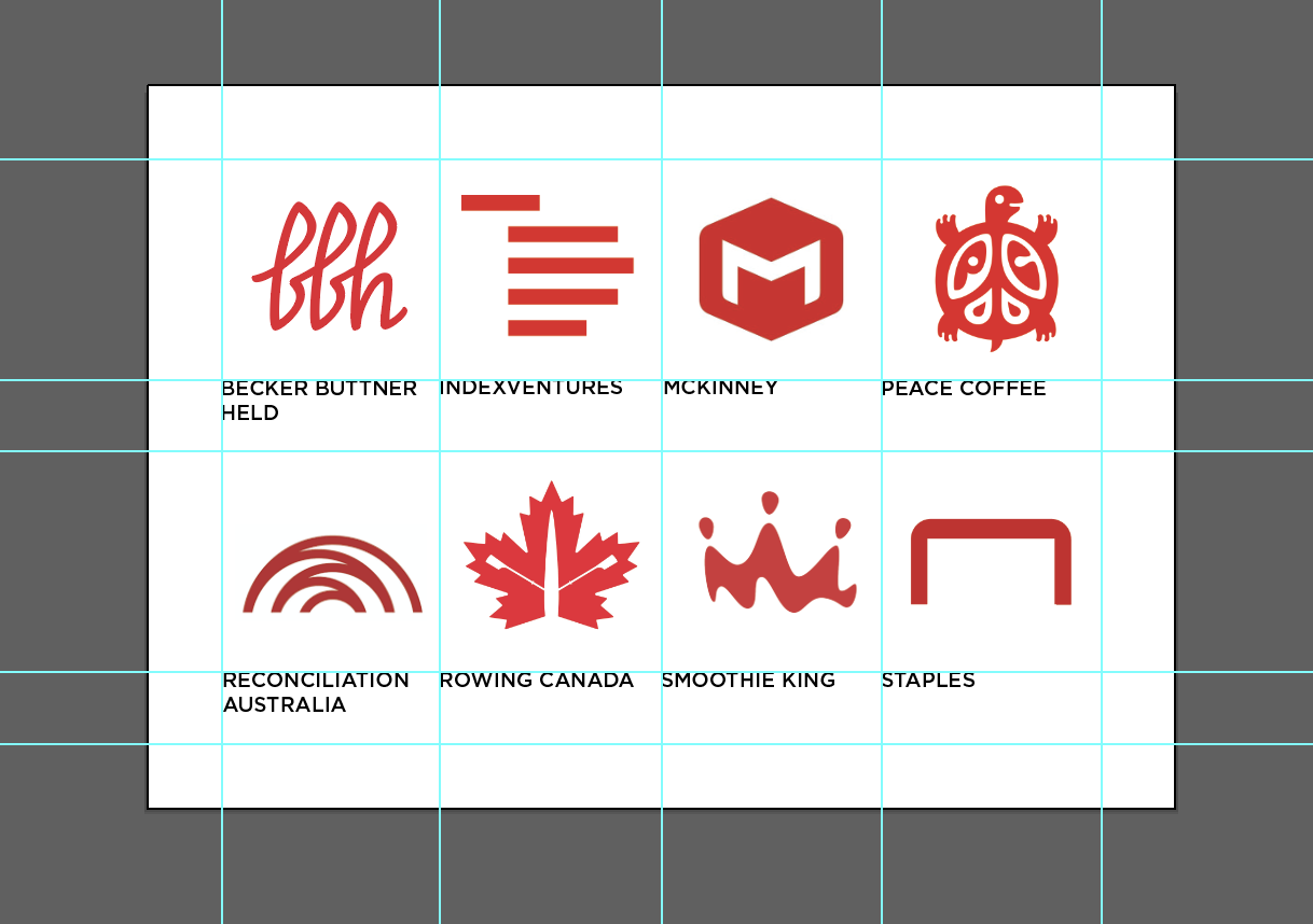
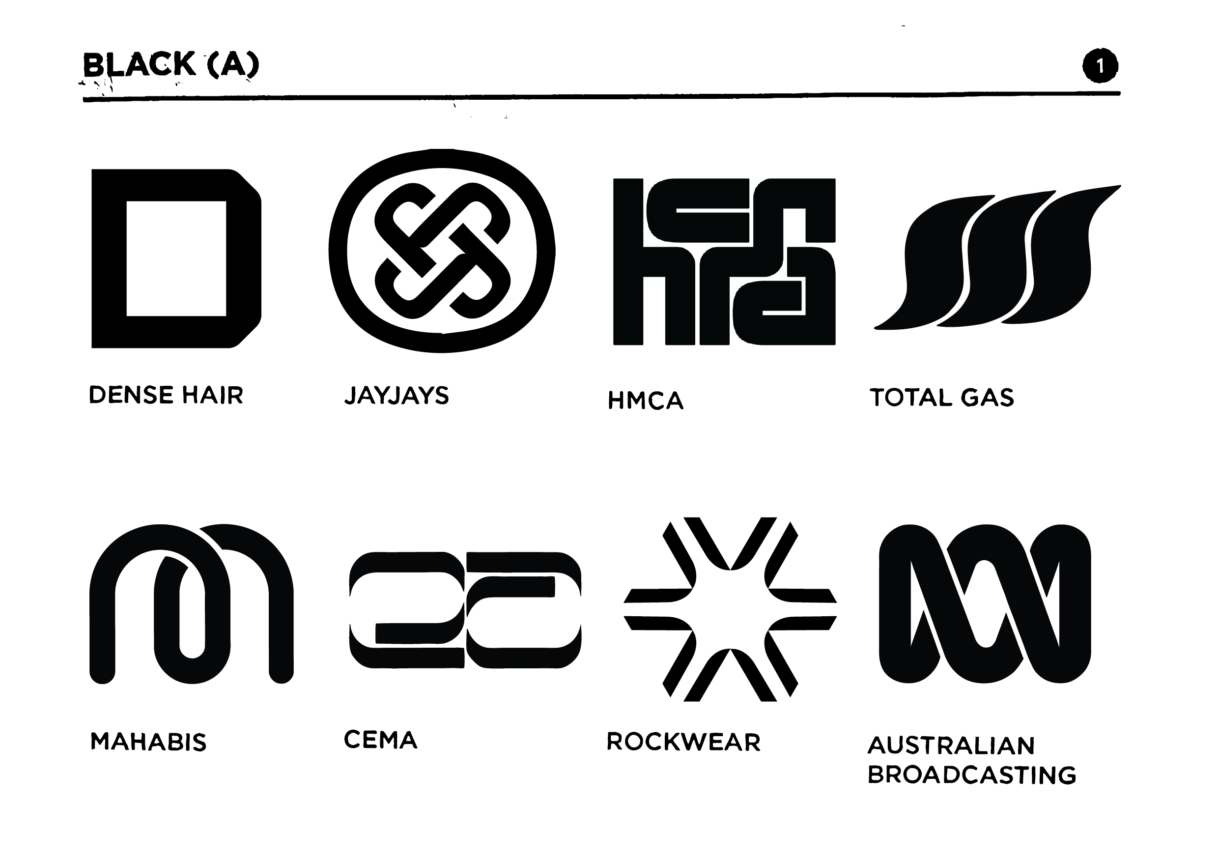
I designed a layout for the logos with 8 logo per page and eventually had 2 pages to display each colour.
Once I had collated roughly 20 logos of each colour I omitted the worst and then went onto ranking the best from 1-16. My ‘taxonomy rules’ are found on the first page of the final digital booklet, which described the process I used to rank the logos. When I had found the best logos I went through and researched them specifically, including searching for the designer/design agency that created their logo. I then wrote a brief analysis on each of the best logos.
For the front cover of my digital booklet I initially planned to design in a collage style, combining elements of some of the most visually interesting logos within the taxonomy.
I collated some of my favourite logos, printed them onto the reverse side of acetate and began to print them. The aims for the prints were to exaggerate the ‘individual’ feel each logo has, relating to how I have ranked them throughout the taxonomy.
When doing this I saw the circle I had printed and then had the idea to use the circle shape for the front cover and have it represent the logos within the taxonomy. I then went onto printing circles, re-scanning and digitally manipulating them so they were all individual. I aligned the circles on the front cover with some being closer to one another and others being further out. This was to represent the outliers of the logos (the ones that worked the best, were more effective and unique). For all of the text throughout the booklet I printed them out onto paper and used tape and scalpel blades to manipulate the typography to relate to the front cover in being more unique.
Final Logo Taxonomy:
Above is my final digital booklet. I enjoyed working through this task and taking the time to analyse logos and consider why some may work better than others. This task also helped me analyse potential reasons why my initial gut feeling towards a certain logo was the way it was. The most effective logos seemed to be representative as opposed to literal. They included abstract shapes or forms that depicted images that represent their company/organisation and sometimes formed the letter shapes. Logos with ‘double entendre imagery’ worked best, appearing visually simple but conceptually complex, for example the Air Bnb logo. The most effective logos had a flow to them and did not feel disjointed, nor did they include too many individual elements or shapes that were not connected to each other. I look forward to taking the knowledge gained from this task and moving forwards to developing more logos and brands myself.
Resources:
Logobook - Discover the worlds finest logos, symbols and trademarks (2016) Logobook. Available at: http://www.logobook.com/ (Accessed: 5 March 2024)
1000 Logos - The Famous logos and Popular company logos in the World (no date) 1000logos.net. Available at: https://1000logos.net/ (Accessed: 5 March 2024)
Branding agency - London (no date) Brandopus.com. Available at: https://www.brandopus.com/ (Accessed: 6 March 2024)
Welcome (no date) Org.uk. Available at: https://www.ramblers.org.uk/ (Accessed: 6 March 2024)
Airbnb.co.uk (no date). Available at: https://www.airbnb.co.uk/ (Accessed: 6 March 2024)
Holistic London (no date) Holistic London Co. Available at: https://thisisholisticlondon.com/ (Accessed: 6 March 2024)
Jdoglobal.com (no date). Available at: https://jdoglobal.com/about/ (Accessed: 6 March 2024)
National Rowing Foundation (2016) National Rowing Foundation. Available at: https://natrowing.org/ (Accessed: 6 March 2024)
Infinia Group (no date) Infiniagroup.com. Available at: https://www.infiniagroup.com/ (Accessed: 6 March 2024)
Nagarro (no date) Nagarro, Nagarro.com. Available at: https://www.nagarro.com/en (Accessed: 7 March 2024)
Official FNATIC gear & apparel shop – worldwide shipping (no date) Fnatic. Available at: https://fnatic.com/shop (Accessed: 7 March 2024)
Smoothie King (2018) Rule the day® at smoothie king, Smoothie King. Available at: https://www.smoothieking.com (Accessed: 7 March 2024)
Us Open (no date) Usopen.org. Available at: https://www.usopen.org/index.html (Accessed: 7 March 2024)
Chermayeff & Geismar & Haviv (no date) Cghnyc.com. Available at: https://www.cghnyc.com/ (Accessed: 7 March 2024)


