Graphic Design 2.1: Professional Practice, Project 1: ‘Graphic Design Now’ Exercise 1
Exercise 1: How the Industry Works
Design a piece of information graphics which shows the workflow from client brief to the final production of a new gaming console. For the purpose of this exercise you may use an existing brand, for example ‘PlayStation’.
This will visually demonstrate the relationship between client, designers, and any other agencies or services that might be involved in the initiation, development and completion, as well as marketing of a designed item for distribution across all media platforms.
Start by researching the gaming sector and the history of gaming consoles. Include earlier examples of the brand and its application. Then, choose an existing brand and chart its development. This could be a simple timeline to include the various models. Next, indicate through simple visual sketches or thumbnails the sequence of contributors to the workflow. Finally, work up your finished infographic to a size of your choice. Consider your use of type and other graphic elements and whether these are in keeping with your chosen brand.
I began this task by researching the history of gaming consoles. I began by watching a video which presented all gaming consoles from 1972-2019, this was very interesting to see the massive changes over such short periods of time within gaming.
I did some further reading into specific consoles via wikipedia and found the info graphic of sales of each over time particularly interesting.
I decided to stick with the example of Playstation and looked into the history of the console further. There are some great Youtube videos that
go very in depth with the changes between Playstation Models, their games and history. There were also some good blogs talking through the evolution of the Playstation.
I created the timeline using the colours of Playstation’s original logo and their new blue/white logo. I also found Playstation’s typeface and continued to use this. I took this as time to begin to explore colours/type for my infographic.
His other work consists of logo design, branding and other infographics. It was great to look at diverse projects which were each trying to present something different and for different reasons. When considering my design, I have to think about it’s purpose, to show the workflow from client-production of a new gaming console.
From my notes I developed a simple timeline of the Playstation and it’s various products released from 1994-present. I used images of each product and intended to create a game-like icon to represent each of them.
I continued to research/make notes on design workflow, especially in relationship to product development and Playstation. I also researched further into infographics and particular designers to reference for inspiration.
I made various notes throughout the research process, documenting any ideas, layouts, information to include, colours etc. I referred back to my workflow diagram designed during the previous task.
When looking for inspiration for my infographic I came across Peter Sather, who runs Sather design co. I was firstly drawn in by the yellow ‘gratitude’ information graphic below.
I created some moodboards for reference of varied found designs, including infographics, posters and other styles.
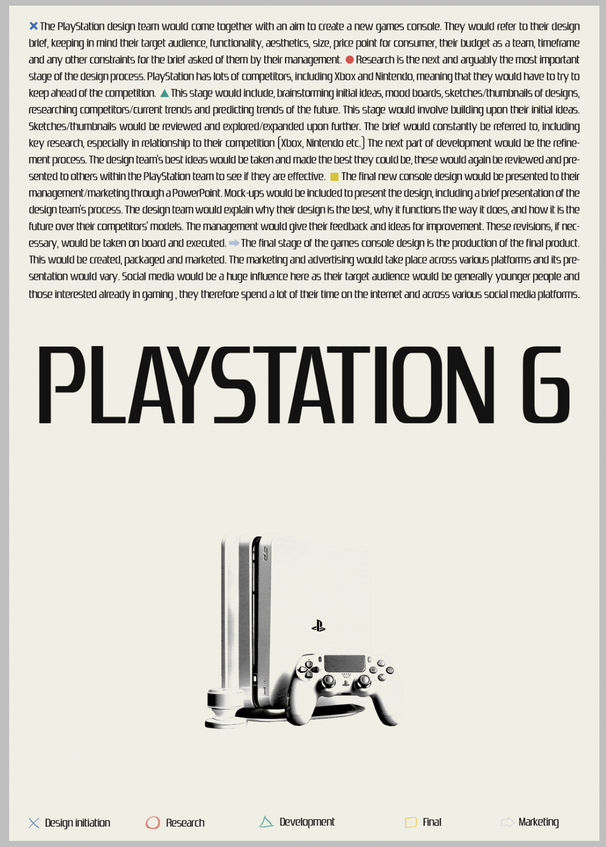
I looked back through my initial thumbnail ideas and quickly re-sketched my favourite 6, numbering them in order of the ones I thought had potential. I then moved onto drafting the information needed to describe the design workflow. I aimed to be as concise as possible, referring back to my workflow diagram from a previous task, breaking down the process into 5/6 key stages (design initiation, research, development, final, marketing).
After noting the stages in a longer form, I confined them to bullet points, the more concise information I feel would work better for an information graphic.
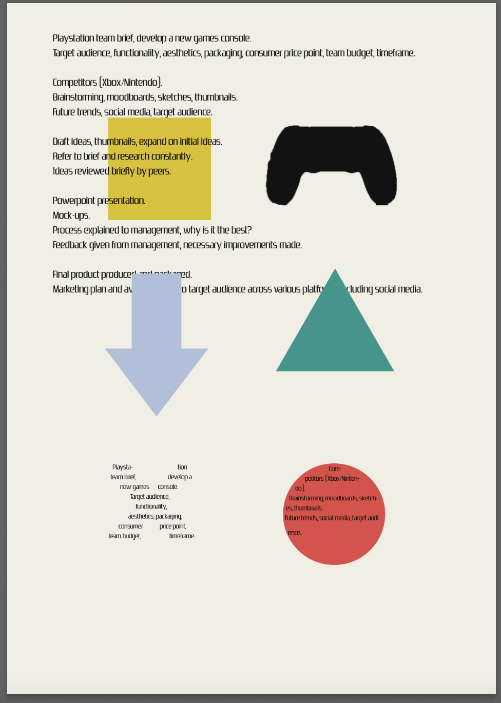
Whilst researching and collating moodboards, I made notes and sketched out thumbnail ideas for compositions and styles of infographics. I had some ideas which were more simple and others more abstract. From researching, I particularly like the infographics that include the information within a shape relevant to it’s information. This gives a feeling of a more complete and cohesive design.
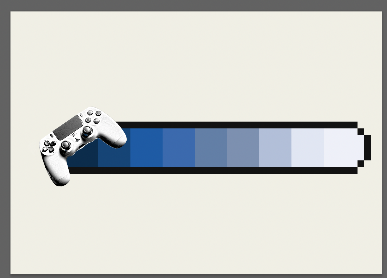
I used Midjourney to develop an image of a near future Playstation console combining past images of the playstation 1 and the newest model playstation 5. After a few very specific prompts and some editing it came up with an image I moved forwards with to develop. I decided to begin with the more retro/pixelated idea for the information graphic. I aimed to represent a game ‘health bar’ or levels within a game using a Playstation blue-white colour gradient. When moving forwards with this design I felt that it did not represent a new games console well, but would be a good, simple way to present the workflow information.
Using the original longer form workflow text I arranged a more simple design using the Playstation typeface and the colours of the original Playstation logo. Again I felt this did not work and the information wasn’t very legible. I like the idea of using the symbols within the design to present the workflow information and moved onto trying to integrate it into another design style. I referred back to my research and thumbnails, coming up with some further design ideas.
I tested with different compositions, including the 3d shape elements. I also tried a more tactile looking approach experimenting with the ‘play’ element of Playstation using paint marks I had created.
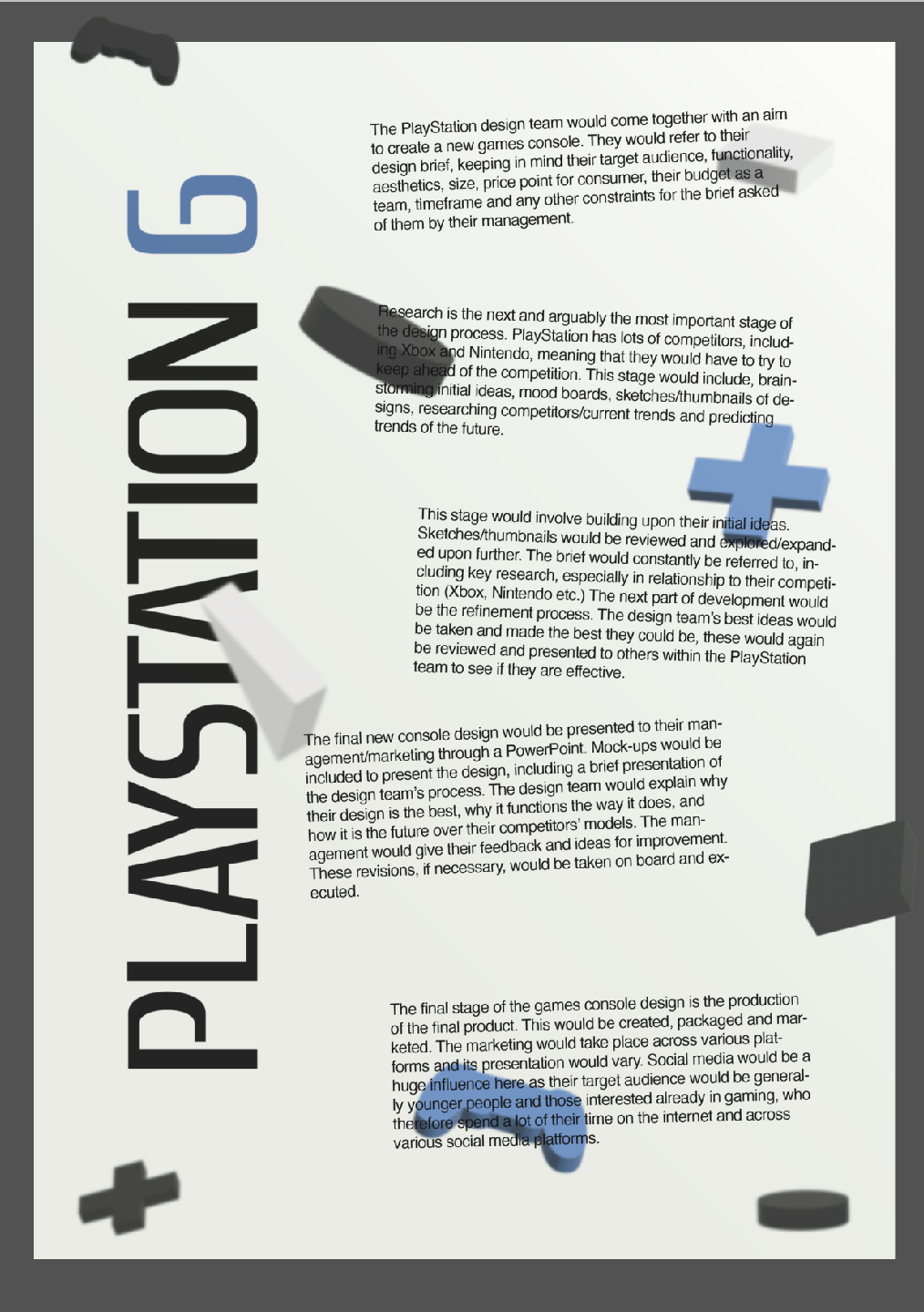
My goals with this design were to represent Playstation as a company but to add a different style to a usual Playstation-like advertisement/infographic. I wanted to include the Playstation blue colour and present the information so it is easily legible but still playful.
Looking back at my design I feel that it is quite flat and perhaps working further with the 3D shapes I had developed would’ve been a better route to take. The paint mark imagery is interesting but has less energy than the shapes, I think a change in composition is also needed with this design.
I continued to experiment with shapes and composition of the information graphic, referring back to my original sketches I worked on a different idea. The information to needed to be easily legible and be in simple sections as opposed to focusing more of the aesthetics of the visuals shown in the previous design idea.
The graphic has to be functional and legible but still look and be in keeping with Playstation as a brand.


