Graphic Design 2.1: Professional Practice, Project 1: ‘Graphic Design Now’ Exercise 2
Exercise 2: Promotional Posters
Through this exercise, begin to extend your knowledge and understanding of professional practice through a series of illustrated case studies.
Create a series of A3 posters, using appropriate type and images, which both reflects and promotes the nature and practice of three specific areas of graphic design.
Try to express the experience of engaging with the creative process, the creative team, and with the special visual dynamics of each area. You may choose to show outcomes of great design projects, working environments, the tools of the trade or a combination of several aspects. Be creative and let your imagination show through.
Make sure that the final outcomes do work as posters, and are not just photographs, collages or other illustrations. Use type thoughtfully, and think about what information you might also need to include.
Typography design:
He creates a mixture of physical and digital typography tests, sometimes using a just a small square as a canvas. The descriptions of the posts are particularly interesting, where he describes the process and previous processes, for example him strapping letraset/paper to his children’s shoes to see the textures it would create after a days wear.
The key elements to this task is to present the information as well as possible, whilst with the poster still being visually interesting. It is important to remember the function of the poster as well as it’s aesthetics.
Chris Ashworth, best known for being the art director for ‘Ray Gun’ magazine does a lot of typography work via Instagram.
I continued to research other typography posters. I am always drawn to the more tactile appearing textures, including hand drawn/printed typography. I really like the black/white or minimal styles with one or two bold colours.
Whilst researching I made some notes and quick thumbnail sketches to document my initial ideas.
I combined 2 of the designs in Photoshop, changing the ‘O’ and then made some of the letters attach to flow better in moving from the top left corner to the bottom.
Inspired by Chris Ashworth’s typography work, I aimed to create a poster representing typography and the creative process. I wanted to demonstrate this physically as well as through the information shown on the poster.
I feel as if the end result works as a poster but feels quite flat. I tried to remedy the flatness by blending together the typography, having some words go behind the ‘typography’ in brown and others layered in front of it.
The information at the bottom of the poster is still legible and the aim was to have to look and flow as a part of the illustrative ‘typography’ part. I am unsure if this was effective, or if the type looks out of place.
I combined textures of the type with the background, including some abstract markings, again inspired by Chris Ashworth’s work. I enjoy the use of these elements but feel that it may be overdone here and could be more subtle.
I aim for this poster to show my interest in tactile design and the process of design itself. I began with one of my favourite typefaces, Gotham, and created a layout digitally which I then printed. I ran the type through the scanner many times and have shown a cross section of the results here. I had an idea of the composition I wanted and wanted to leave the negative space for information or just the aesthetics of the poster. I tried different motions and movements of the type, then went back to digital to choose the one I felt worked best.
I went onto experimenting with layering key words on top of the ‘typography’ type, taken from the previous research task. I then printed the design onto the wrong side of acetate and re-printed this onto paper. I scanned the print and adjusted it in Photoshop. The print gives the type a nice texture, but still remains legible.
Illustration:
This style of illustration really interests me, the inclusion of photos with collage and digital elements creates a distinctive, abstract style.
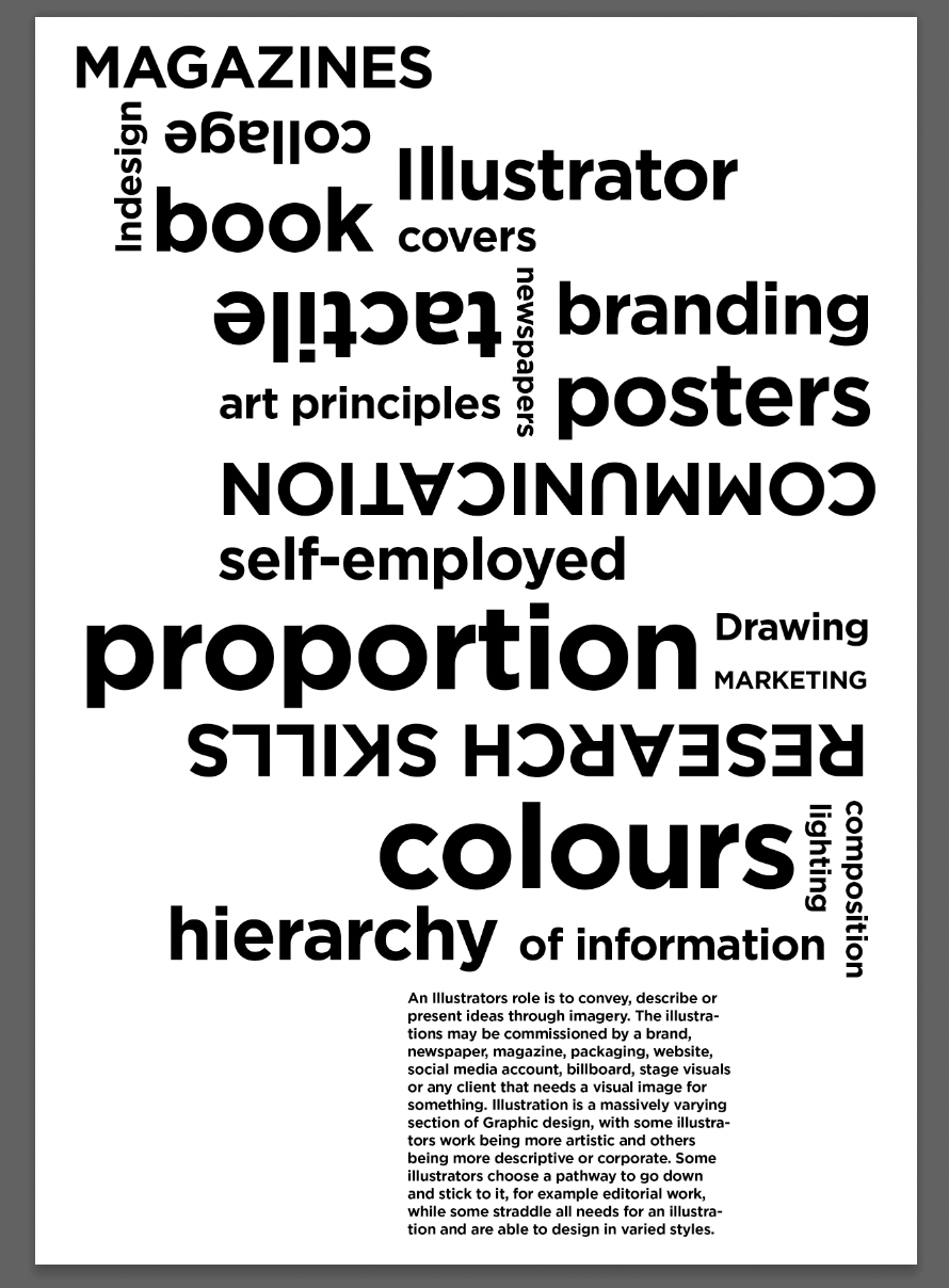
Again with this poster I decided to use my research from the previous task. The information included on this poster would be sourced from my previous description of illustration. I made some notes of imagery I could include which represented ‘illustration’ these included imagery such as hands, eyes, brain, open landscapes and smoke/steam.
Concepcion Studios is a graphic design studio based in California. They produce various illustrations mainly for films and musicians. These 2 mood boards are a collection of some of my favourite, more minimal designs.
I collated some further visual inspiration, focusing on the colour orange, which I felt represents the energy of illustration.
With the goal of creating a more abstract illustration but still referencing Concepcion Studios as inspiration, I began to experiment with imagery, composition and texture.
I experimented with a collage style using various found materials, scanned in and manipulated. I also hand wrote the information in a stylised way to see if this would add to the collage feel.
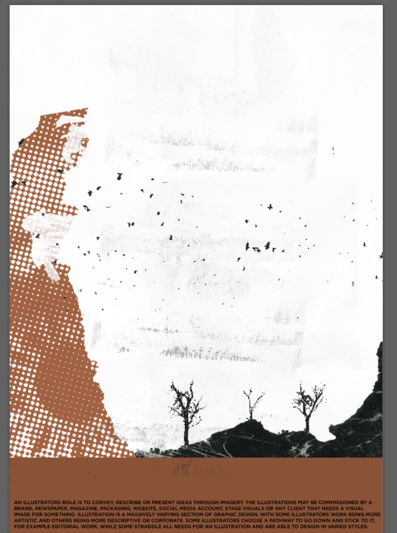
This poster aims to represent illustration more abstractly, showing an abstract landscape including imagery that conveys a feeling of creativity/illustration.
The information I had originally intended to be more of a part of the design itself, being hand drawn and in the background/acting as clouds or the mountain.
The overall layout is inspired by Concepcion Studios but the information I feel could’ve been presented in a more interesting way or be a part of the landscape itself.
Fashion/Apparel design:
I researched various clothing and use of graphics throughout time, beginning with arguably the inventor of streetwear, Basquiat and his ‘man made’ art.
I used Midjourney to develop some ideas for imagery that I had, I wanted to represent streetwear as a concept by having different people stood on a street, wearing different clothes, including their shadows, all in different positions.
To reference Basquiat’s ‘Man made’ collection I wanted to include some abstract elements and hand drawn type. I tested using different pens/crayons, some running out and some darker than others.
I aimed to represent apparel designers by referencing graphics throughout time, particularly being inspired by Basquiat and a grunge aesthetic. The final layout is quite simple, with the information being at the bottom of the poster, I wanted the typography to be interesting, inspired by handmade types but still to remain legible.
I feel that this design does work as a poster, but is perhaps over worked and could be more subtle, the imagery may now appear too abstract. I like the typography of the title the most, but again this may be over worked. I enjoyed experimenting with combining physical and digital design techniques throughout this part of the exercise.
I began by taking some initial notes including ideas for my poster, again I have to remember to focus on presenting the information and not just the idea/aesthetics.
I collated some of my favourites from my research including works by some of the designers I had mentioned in a previous research task. The grunge/ Dada-like styles really interest me and could make for an interesting style poster. I noted some composition ideas whilst researching.
I included imagery such as ‘neurons firing’ representing creativity and a target to show the more marketing side of fashion apparel design, ‘aiming’ at a specific demographic or audience.
I printed out my design a few times to add a grain and then distressed it using tape. I rolled tape up and dragged it across specific sections and continued to pull other parts off.


