Illustration 1: Key steps in illustration- Part 4: Style-Exercise 1: Identifying tools and materials
Find a range of illustrators who use a particular medium. You may focus on the traditional such as pencil, watercolour, paint, gouache, coloured pencils, oil or acrylic paint, coloured pencils, collage, prints or on the more obviously digital processes – including digital collage, photography, digital drawing and painting.
Catalogue the illustrators according to similarities in the way that they use tools and materials. How do they distort or exaggerate the representation of elements in their work? How do they communicate through use of metaphor or symbols?
Choose one image which you most appreciate visually. In your learning log write about the way that the illustrator works. It often helps to begin by describing a picture. Ask yourself questions as you write such as: How is the image composed? How are colour, tone, and texture used to evoke mood or convey an idea? Has the illustrator distorted the content within the imagery and how does this work for the purpose the image fulfils?
Go back to a visual you created for an earlier exercise and now render it using the same tools and materials as your chosen artist.
Now choose a very different artwork and repeat the process.
Lewis Rossignol and Scott Bergey both use various materials to create their collage style drawings. They use muted tones with pops of colour to create a more abstract portrait of their subjects.
David Carson and Scott Cottrell use type and collage in a more grunge style manipulated in interesting ways. The combination of handmade/rough looking type with clean imagery is really interesting.
I began this task by listing various artists that came to mind who used different materials/methods. I then chose pairs who have a similar style and made sure all 6 included one particular method- collage. I really like the aesthetic and synergy of drawing/type/collage.
Katrien De Blauwer and Armand Brac use collage and mark making. They choose one or two images and manipulate them including colours and textures to convey emotion and create narrative within their work.
All of these artists have very distinct styles, despite this they are very similar is many ways. Each uses collage, mark making and texture to create metaphorical work. The images used (even if literal portraits in Carson’s case) are more representative and convey feelings instead of specific information. The manipulation of a characters face/body layered with colours and abstract expressionist style marks produces an individual and personal concept to the viewer which pushes you in a direction of feeling but is ambiguous enough to keep interest and stand out.
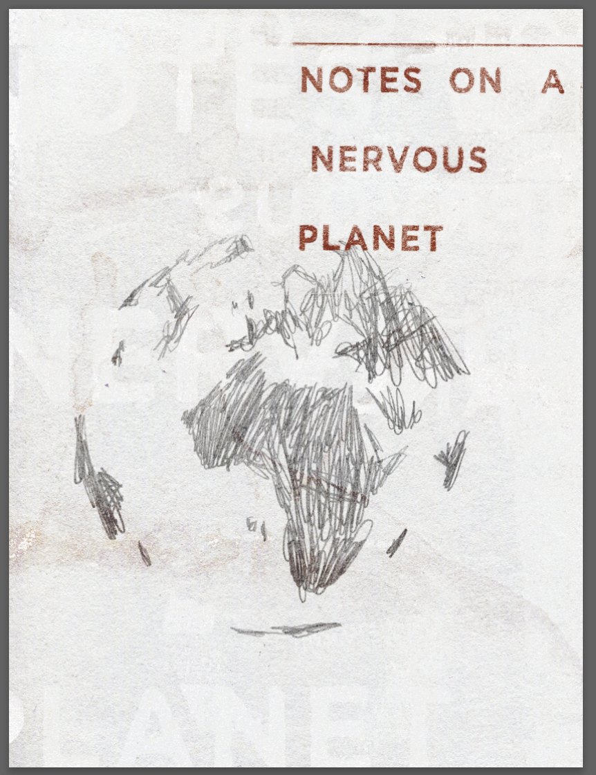
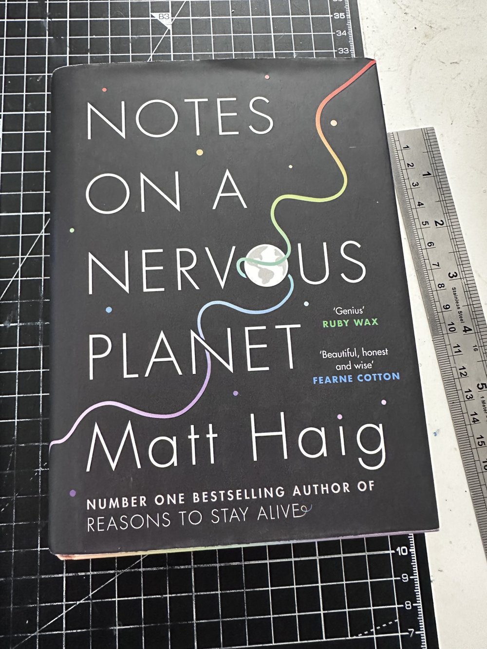
I decided to move forwards with recreating a recent task which asked to design a book cover. Despite the style perhaps not being in-line with the themes of the book/the best way to present the book cover I was interested in emulating Carson/Ray Gun style and felt this cover could be a good challenge to attempt to do so with.
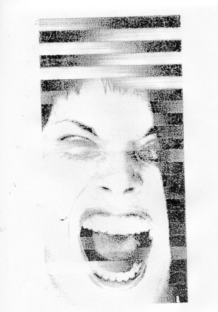
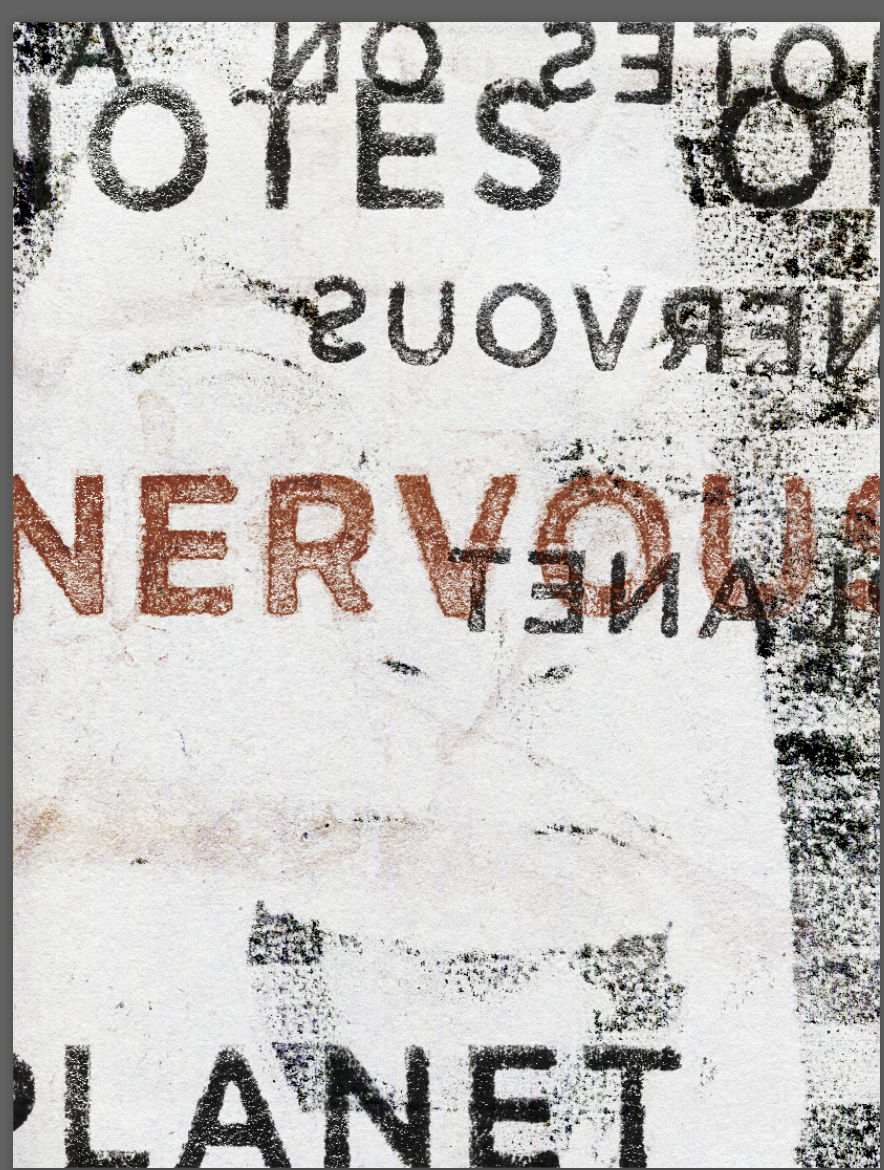
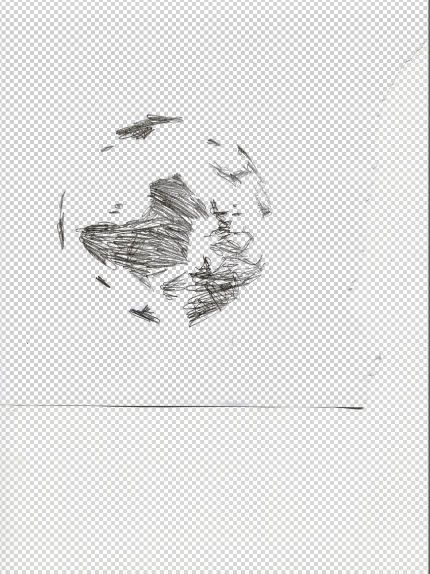
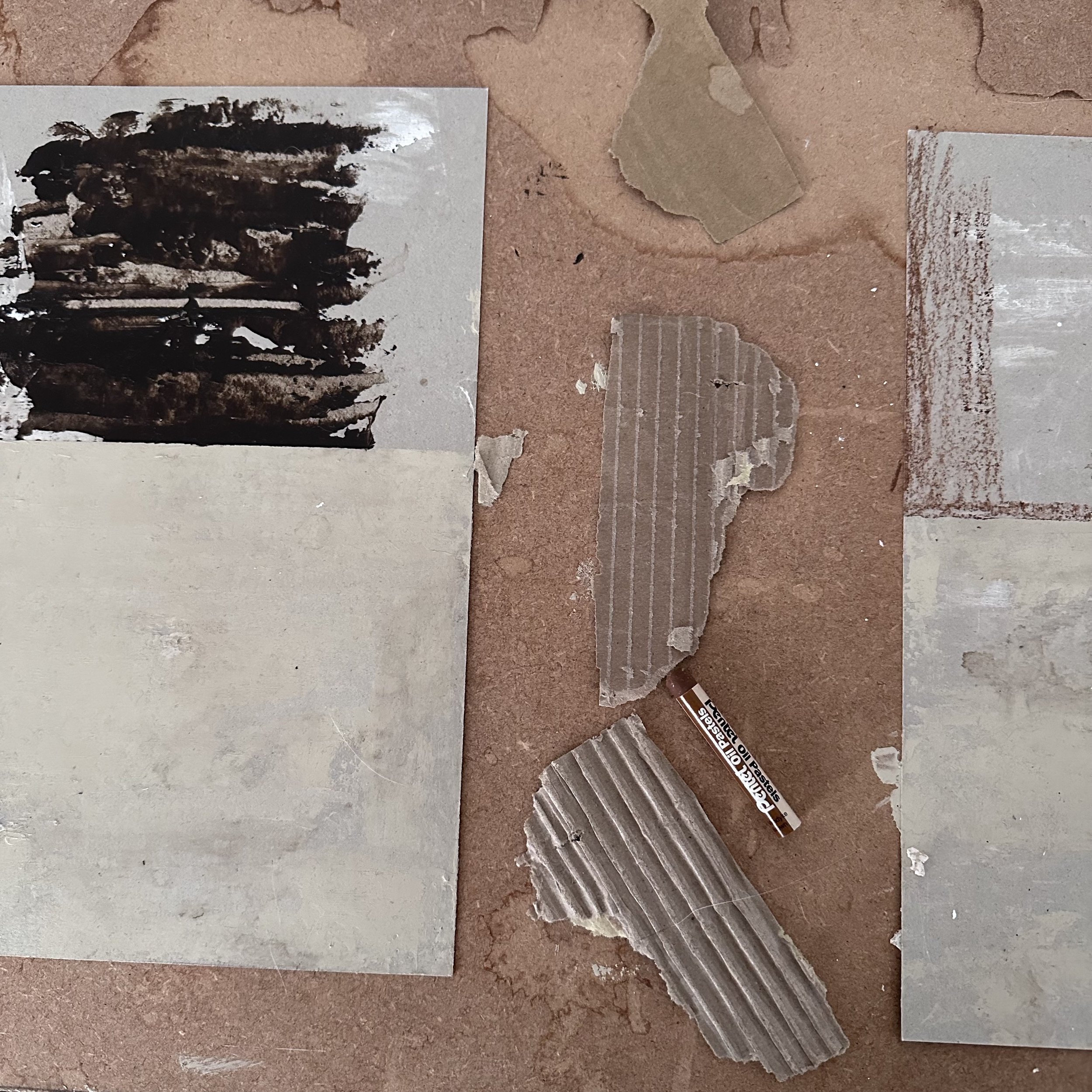
I used elements from this task I had already collected such as the earth sketch and image of the screaming face. I created new type for it by printing onto acetate and reprinting onto paper in different ways. I then scanned this is and used acteone to re-print this from a xerox printer, afterwards scanning this again and manipulating it in Photoshop. I collected various textures from marks on my desk, boards that I paint on etc. I layered these textures and arranged my initial inspired design. I came back to the design a few days later and continued to experiment. I wanted to still keep the cover as functional and true to the content of the book as much as possible.
I love the first cover of Ray Gun magazine by David Carson and possibly Chris Ashworth- I am unsure whether he was involved at this time with the design.
The composition of this is interesting. The page is full of information, different textures and images yet the final result feels complete and ‘clean’ as if it is meant to be produced in this exact way. The title, instead of being at the left reading to the right is instead in the top right corner of the page. The red colour helps it stand out from the pale yellow and white background, drawing the viewers attention to it, as opposed to starting to read from the left as usual. The imagery of the eyes below it then leads you down the page and to follow the eye line of the image towards the list of bands/music the issue includes. This is great and appears as if it is expertly calculated yet comes across as random.
The pale white background and yellow paired with black imagery/information has almost an eerie feel and appears like a fire, particularly with the red ‘Ray Gun’ magazine title. This is representative of Carson and co designing something truly different and unseen in the design world.
I aimed to emulate Carson’s style and use of colours. Focusing on typography and layers of textures I used various materials such as paint, pencil, pastel, printer ink, acetone and more to create the final image. I find my end result interesting, it feels ‘too much’ especially when comparing directly to the Ray Gun magazine cover above, but it was an informative style to experiment with. Subtlety is important and the textures used on my typeface was more dramatic than that of Carson’s, something I should focus on, including the minimal amount of something for the maximal affect.
For my image emulating Scott Bergey’s style I used various materials such as coffee, oil paint, oil pastel, chalk, pencil, pen and found materials/labels. I tried to add layers of interesting colours and textures as Bergey does. His abstract figures were what really interested me and how they seamlessly combine with the background. My final result was interesting but this style would definitely need a lot more work. I tried to make the character a part of the whole image by layering colours of the background over the top, this half worked but appears unfinished/unsophisticated.
Scott Bergey is a Canadian artist who I have come across recently. His work is more abstract, focusing on people, animals and buildings.
The figures Bergey creates are more representative than descriptive, the shapes and distorted sized body parts are ambiguous and allow for the viewer to feel as oppose to see. This paired with his use of texture and colour is great. The muted colours with occasional brighter tones is something that really interests me.
Bergey’s mixed media approach like the example on the left includes newspaper rippings and layers of paint/sand to create a visual that to me comes across as dark. The covering of the figures faces with the dripping also adds to this.

