Illustration 1: Key steps in illustration- Part 3: Working it out-Exercise 8: Making a mock up
For this exercise you are going to mock-up a book cover. From your book shelves or the library choose a book title that appeals to you. Read the blurb on the back of the book (or the whole book if you have time). Examine the design of the cover to identify what the brief would be for the illustration and establish the function you want your image to perform.
You may already have done an illustration you can use or you may be inspired to make a new one. If you are using one you have already done you may need to modify it in some way. You may need to play with the colours, edit or adjust the composition or alter the size or scale. Don’t make changes to the original.
Either copying the design of the cover and adding your illustration or designing the cover from scratch, make sure that you incorporate the title, author and publisher’s details. If possible choose a paper for the mock-up as near as possible to that which would be used for real.
In your learning log note how well your image worked and any technical problems you had to overcome to make a convincing mock-up.
For this task I went with a book I had recently read which could allow for some interesting designs/illustrations- ‘Notes on a nervous planet’ by Matt Haig. I enjoyed ‘Reasons to stay alive’ by Haig which I had read a long time ago but hadn’t got round to reading this book until recently. The book is a short read and I skimmed through it again for this task, adding marks/folding pages which had interesting lines/ provoked imagery.
Mendelsund’s work is diverse yet still has a style. Each design stands alone as very specific to the book and its content. The metaphors he uses are excellent and definitely is something for me to consider during this task.
I made a spider diagram with words/initial ideas and then expanded on them with quick thumbnail sketches after/during researching book covers/illustrators.
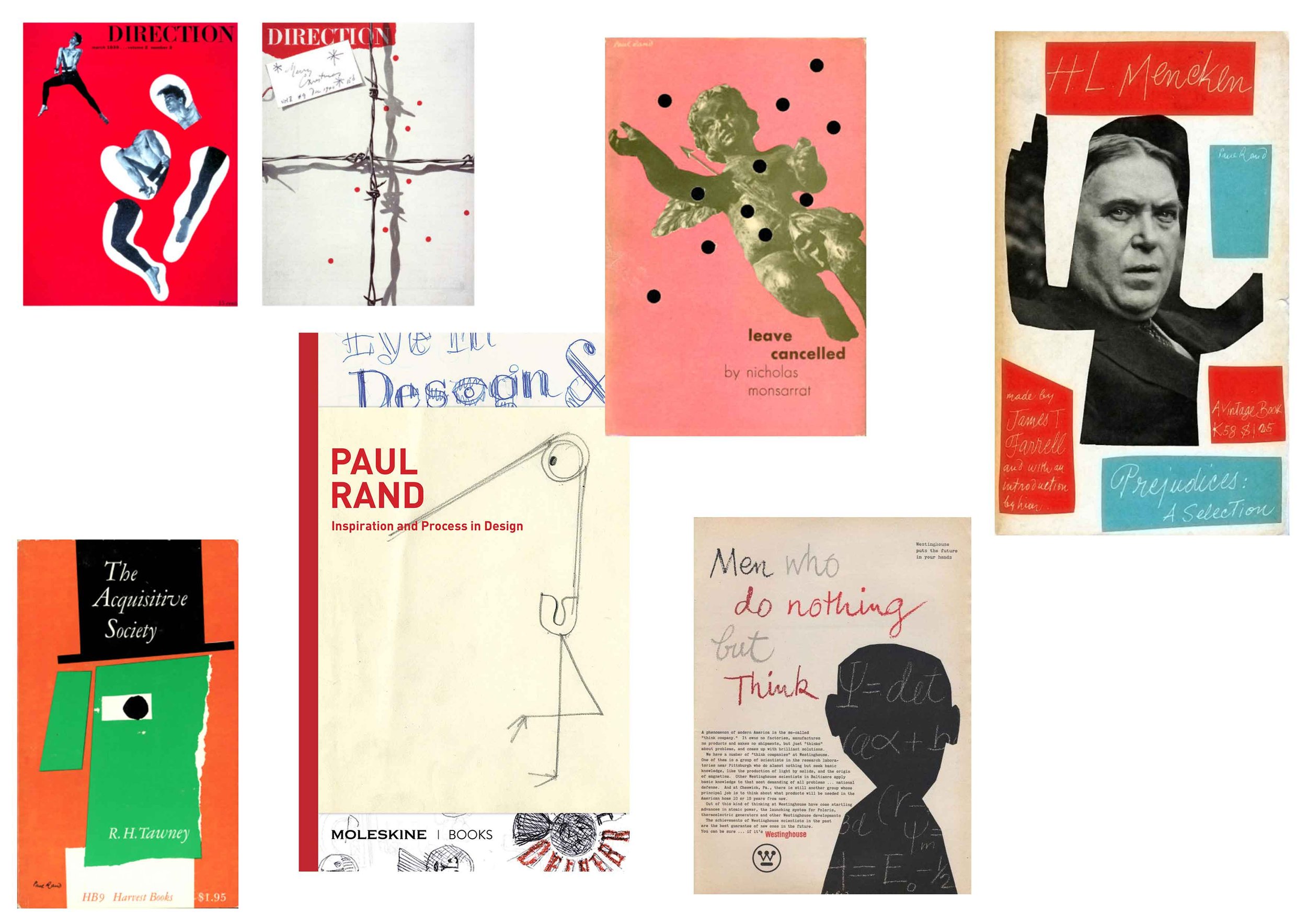
Peter Mendelsund is primarily a book cover illustrator, he also makes abstract art. I came across him from an earlier section along my graphic design course and frequently reference his work.
Other inspiration: Paul Rand, Adalis Martinez, other Matt Haig books, Neue Miller instagram
Whilst referring and adding to my initial thumbnails I collated textures and materials that I found interesting and that were representative of the key elements of the book- technology and it’s affect on mental health, Social media, Anxiety, Suicide.
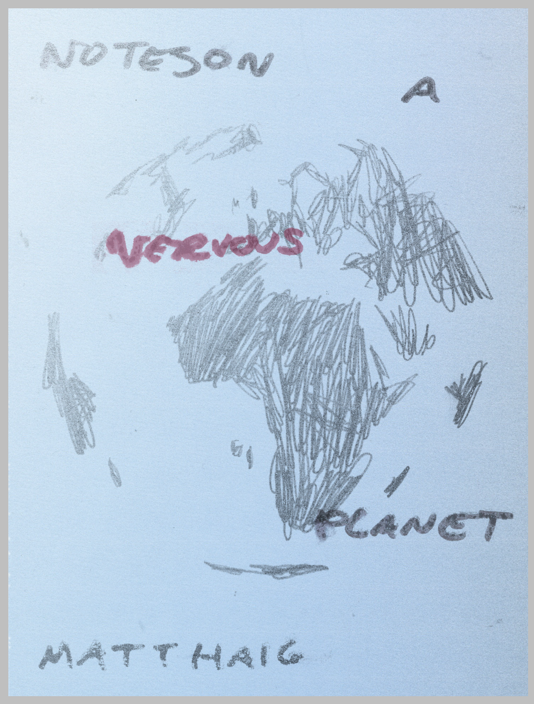
I moved forwards with a more obvious response to the brief, inspired directly by the actual cover of the book and the various sources of reference such as Peter Mendelsund. I began by experimenting with type and how the type would present within a globe. I sketched a loose globe and the land masses, moving to Photoshop to create layers.
The final outcome I feel doesn’t quite show the title of the book as initially intended. The literal sense of the title being noted on a planet in a jittery/wiggly way to represent nervousness doesn’t seem clear or large enough to be seen without closer inspection. I wanted the authors name to be the largest as fans of his writing would be drawn to it, but this also makes the title appear even smaller and is questionable if it is the title of the book.
Despite the concept being more obvious I quite liked the idea but looking back I feel that the execution and final outcome is not as affective as desired. I continued to experiment with a more abstract style to compare.
I continued along the idea of the globe initially and sketched out a different more tactile version and began to experiment with different colours and brightness to represent the negative and positive impacts of a modern world/technology and peoples feelings towards/as a result of it.
I then went onto creating a collage and later printing using a Xerox printer multiple times an edited image from Photoshop of a man standing. I did not like the direction of this cover and referred back to my thumbnails/artist research for inspiration. I was looking for something more abstract- a shape or idea that could capture the book as a visual metaphor.
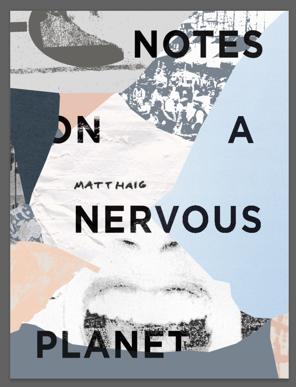
I ended up using a cracked phone screen protector I had kept for a potential texture etc. I scanned in the screen protectors and zoomed in on a section to use as a rough guide to my collage. I then went through my found material and previous experiments so far during this task and cut various parts of them out/mixed with new elements.
I decided to move forwards with a flesh colour and a light blue. The flesh referring to people and a human reaction to the blue (planet). The blue is also a more positive colour than my initial ideas of red/green or red/dark blue which aimed to encapsulate the positivity of the book.
Looking back at my design and comparing it to other book covers I feel that there is too much going on/too many textures and not a singular focal point. I aimed for the title to cover and take you across the book/feel a part of it and be representative of writing notes (the title) on a nervous planet (nervous or stressful imagery) with positive colours interwoven. Some of the individual letters I ‘hid’ behind other elements as if they were nervous. I like the concept but I am unsure of the final outcome, perhaps more time and different compositions was needed in order to create something that felt more cohesive.
For the target audience (Matt Haig fans or general public looking for an overview of a self help style book) I am unsure whether this style is affective. The cover may be too much and the authors name may be too small. My hopes was to have the hand written ‘Matt Haig’ on the note/paper part of the cover to add a more personal feel, but I feel like the name is lost within the design. Moving forwards I will try and focus on a visual metaphor or singular visual for my designs and compare/contrast with more ‘busy’ styles.
The tutor feedback I received for this task mentioned how ‘notes’ in the book title is harder to see as the background is too similar. Looking back this is definitely a problem as it would not be legible. I went back and edited this, also changing some other elements of the design.
I made other elements more digitised, colour matching with the original collage. I decided to use the colour from the bottom of the collage to add to the section below ‘notes’, this made the title way more legible and the contrast worked better. I used this colour to try and draw the top and the bottom of the cover together.


