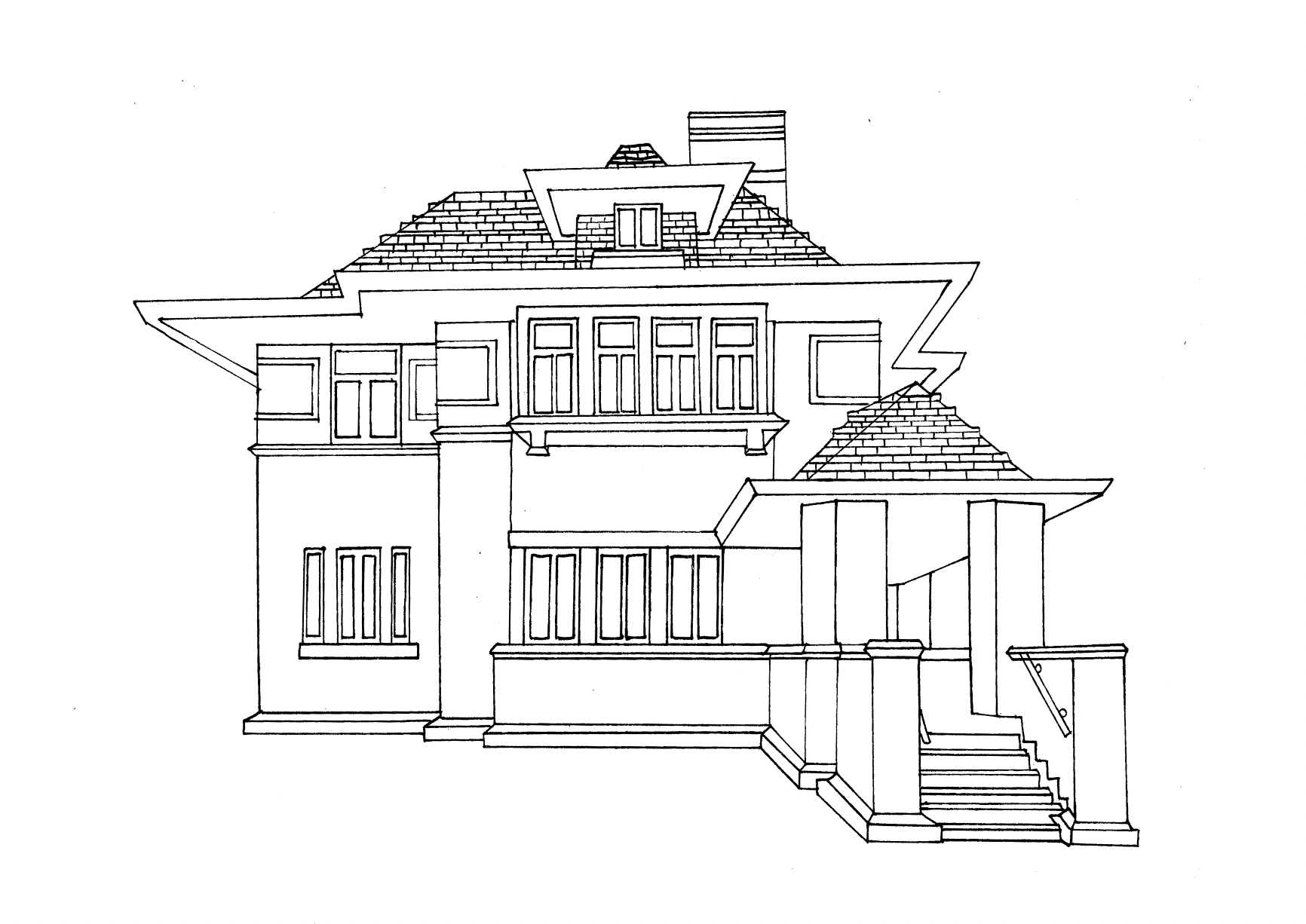
Illustration 1: Key steps in illustration- Part 2: Ideas-Exercise 9: Using black and white
Produce a line visual around one of these words:
Sea
Extraordinary
Building
Journey
Through brainstorming you may decide to draw from an object or selection of objects or work in a more narrative way around a scene or idea. Ensure that the line visual you produce through visual exploration and development is very clear, employing a line which is solid and definite – fine-liners over a pencil visual should give a clean edge.
Using the lines in your image as a guide, cut shapes from the black copy to collage into the white copy. Your ‘filling-in’ should be considered – are you going to suggest that there is light entering from one direction or use white in a decorative way to create a visual pattern? Work with the biggest areas first and maybe Blu-Tack your pieces down until you are confident about their final placing.
I began this task by choosing a word. Initially I was going to create a visual around ‘journey’ but was apprehensive as I hadn’t used this method of drawing/collage before. I decided to move forwards with the word ‘building’ a more literal visual which would hopefully allow me to focus more on the medium of the task.
The use of varied lines, straight and curved are exaggerated by the contrast of black and white. Grandfield manages to communicate so much through many ‘simple’ shapes. I need to keep in mind what parts of the house I would like to draw attention to and why when creating my image.
I looked through photos of various architects buildings which I had saved from a prior task. After further research I came across this house via a related google search. The house had a clear definition between light and dark, a contrast that would be important when only using black and white. The lines in it also interested me and I thought would be more of a challenge to sketch.
I looked into Geoff Grandfield, an artist suggested from a future exercise. His work uses a lot of black and white. Here I have chosen my favourites of his black and white work.
I found it challenging to sketch the building, in particular the perspective of the roof and stairs.
I used a pencil initially, going over it with a fine liner to exaggerate the lines. I then placed the drawing into Photoshop and made it black/white using the ‘threshold’ tool. I inverted the colours, which looked interesting. I then looked over the reference image and the darker parts were initially obvious, but without a greyscale it would be harder to produce an image that resembled the building. This meant that I had to test with which areas the black worked best in order to show the darker materials and shadows.
I found this stage to be a bit of trial and error as to where to add the black elements. The light and dark areas were obvious, but some shadows next to darker parts of the house would result in large black areas which didn’t work well. Finally I decided to focus more on the dark feature sof the house with some shadowing in the parts that I deemed most important.
I enjoyed this task, it has been a challenge getting back into drawing. As well as my sketch book work (daily observational drawings suggested by my tutor) alongside the tasks, drawing a building allowed me to practise perspective and in particular with this task light and shadows. The task made me look at what parts of the image are integral, which are less important and which to exaggerate. This can be expanded out to all elements of my design practise e.g. Which feelings do I want to evoke? Which are most important? What colours should I use/how many? Can I use light and dark to exaggerate particular elements to relate to the theme of the design?


