Illustration 1: Key steps in illustration- Part 2: Ideas-Exercise 10: Choosing content
Make notes on these questions
• If this were to be made into a film what would the main character be like?
• What clothes would the character be wearing?
• What furniture is in the main area in which the action takes place?
Collect visual reference for the items on your list Find a reference book or website for this era. Use the internet and do an image search. Be selective – don’t go for the first image you encounter. Try to remember your own vision of the story and reflect this in your choices. Stick these images onto a large sheet of paper or in a visual notebook.
The next process is about textural and colouristic visual brainstorming and idea generation Chose a word, which you feel captures the mood you would like to convey. Collect and create textures and colours you associate with this word to make a moodboard. Start with a broad vision to describe the overall colour or tone of the image, not specific elements of it. Be minimal and selective and gradually add textures and colours that complement this general impression.
Create a simple portrait (figure, or head and shoulders) of the character, using the reference you have gathered. Use sketchbooks to help you to select and edit from your reference materials and to explore where to position your figure within the frame or format of the picture. Make the shape based on any book you have to hand.
Use the colours, textures and qualities you assembled for your moodboard to render the portrait. You may literally collage these textures into a drawing, or convey the tonal qualities of the moodboard through the way that you use materials and mark making.
Notice the extent to which you have evolved the reference and used it to inform your illustration. If at any point you felt that you had insufficient visual information what steps did you take to address this? Make notes of this evolution in your learning log.
I hadn’t heard of ‘The Daffodil Affair’ by J.I.M Stewart before and was interested to view more. I refrained from researching/reading the book when approaching this task as I wanted my work to be just about the short extract and to not include learnt elements about the novel or author etc. I began by taking notes answering the given questions and including any thoughts/feelings/colours/parts of the scene that the words conveyed to me.
For each exercise I like to keep mood boards full of inspiration from any design/art/texture I have seen recently to refer to. For this mood board I collated some works by Sam Lock an abstract artist. His use of mark making and representation of emotion through colour were the elements that I wanted to draw from when considering creating a portrait/figure for the final part of this task.
I read forwards to the next section of the task which was to choose a word that captures the mood of the ‘image’ I perceive from the text. I thought it was best to choose my word and expand on it prior to searching for visual references incase I came across something that would work for the word chosen (and the final part of the task to create the portrait).
I began to note any words/feelings/thoughts related to ‘rage’ and expanded o this by interconnecting words and thoughts which could help give me more of a narrative/ideas for visuals.
Considering portaits/texture I looked back at work I had saved by Martin O’Neill and Paul Wearing after coming across Martin O’Neill from a previous task and being recommended Paul Wearing by my tutor. Their use of colour and texture again is something I would like to draw inspiration from and to keep in mind when looking for visual references/textures.
The text mentioned ‘war time’ which immediately brings to mind WW1 and 2. The ‘big desk’ also gave the impression it was an older period of time. I began to look through various magazines I have and continue to
collect from the 1930-70’s. The colours, imagery and text all relate more towards the time period than anything an internet search could present. I used the internet, in particular Pinterest to collate some more specific images after looking through these magazines having gained some more insight as to the direction the aesthetics were going etc.
In visual reference 1 there are a few wartime images relating to this era and perhaps a past the character has experienced. The imagery of a mime artist/clown like figure was referring to the ‘year by year the anger burst deeper…’ line implying the character acts calmer socially than he
I looked through various different styles of magazines from different eras and collated images I believed conveyed my perception of the character from the text best.
feels alone- having multiple sides to him. The top left image shows danger and is more of the colours I feel rage is conveyed by (red, yellow, orange) and also relates to the characters past work/upbringing.
The visual references 2 again shows some war time imagery but particularly focuses on peoples emotions and figures. The image in the top left of this is of the Kray twins 2 infamous London gangsters to relate to the crime and danger the character is against/in. The imagery of the heart is to show stress and adrenaline- rage.
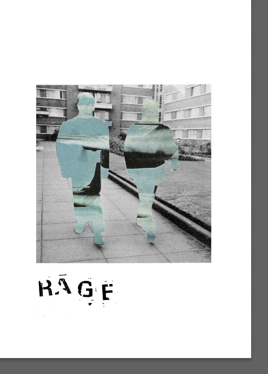
After collating various textures and imagery I began to experiment digitally initially with cutting images and adding them to one another. I used an old Letraset ‘universal’ typeface to spell ‘rage’. I found that if I scribbled the letters onto paper and then heated it the letters begin to flake, leaving an interesting texture.
I liked the way the physical appearance represented the word itself. I continued to test with layering images to see how they worked together and how different textures appeared in relationship to one another. The end result of merging 2 of the images I liked as it showed the various sides of the character from the text and the hidden rage. I continued with experimenting with texture, physically and digitally.
I continued with experimenting physically with collage and texture. I used various materials/methods including printing and burning to experiment how the different materials and images could work together. Focusing on ‘rage’ I used the colour red and brown burnt colours/markings as i feel they embody the word and have negative connotations such as anger, hell, ‘a burning rage’. I tested with collaging and using paint to print over the top and also with running collages through an ink jet printer. I made a mistake arranging my collage the wrong way around in the printer which then printed the image on top of itself. This did not look very good but I did like the black marking it made and later used it as a texture overlay.
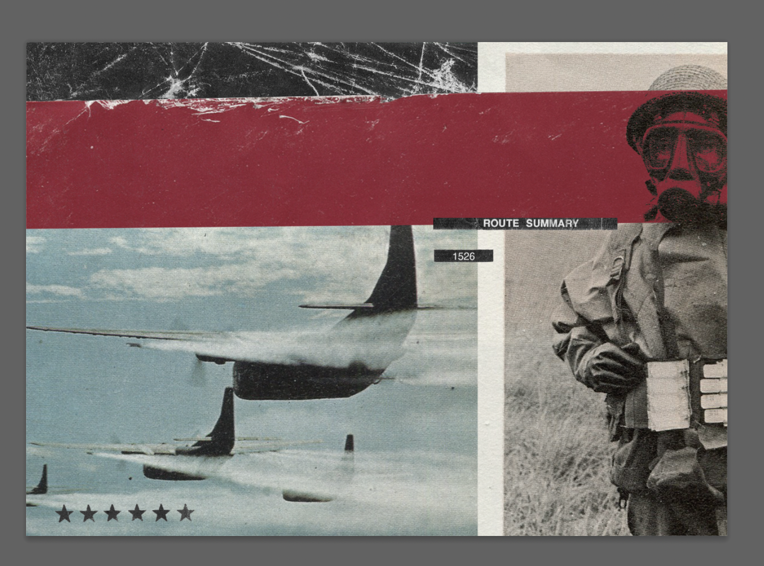
I wanted to focus on the war style imagery as I felt this best represented the characters feelings, rage and the time period the extract was set. I wanted the main focal point of the image to be the portrait of the solider wearing a gas mask. The gas mask represents the character masking his feelings for so long and how it has now become the ‘innermost principle’ of his being (the red line going across his face).
I felt like I needed further visual inspiration for this task in order to create my portrait. I did not want to create a simple portrait of the character with collaged elements as I had done in a previous task (collaged a hat in ‘E8: A subjective drawing’) but wanted to create a more subjective visual- a portrait representing the character from the extract and including the word ‘rage’.
Scott Cottrell is a designer/artist I had come across via Instagram whilst looking for inspiration for this task. I really like his synergy of physical and digital elements- something I strive to improve myself.
My final image uses my reference images but hasn’t changed them drastically, I have collaged them digitally layering them with various textures I had created when experimenting earlier in the task to add depth and to convey a feeling of rage.
I hope that I haven’t strayed to far from what the task has asked of me and have created a more subjective portrait representative of the character.
I enjoyed this task and found it an interesting challenge to begin with reading from the extract and having to extrapolate a visual using key words and feelings conveyed from the text. I feel that previous tasks have helped me be able to respond to this, in particular the subjective drawing and ‘expanding from words’ tasks. I found choosing a word and producing a mind map from it, still with the character/extract in mind helpful and is something I will carry forwards when responding to other exercises. Producing an idea of the whole scene and character was also an interesting element to this task and again I felt that my notes helped inform my choices of reference images massively, and my final image.


