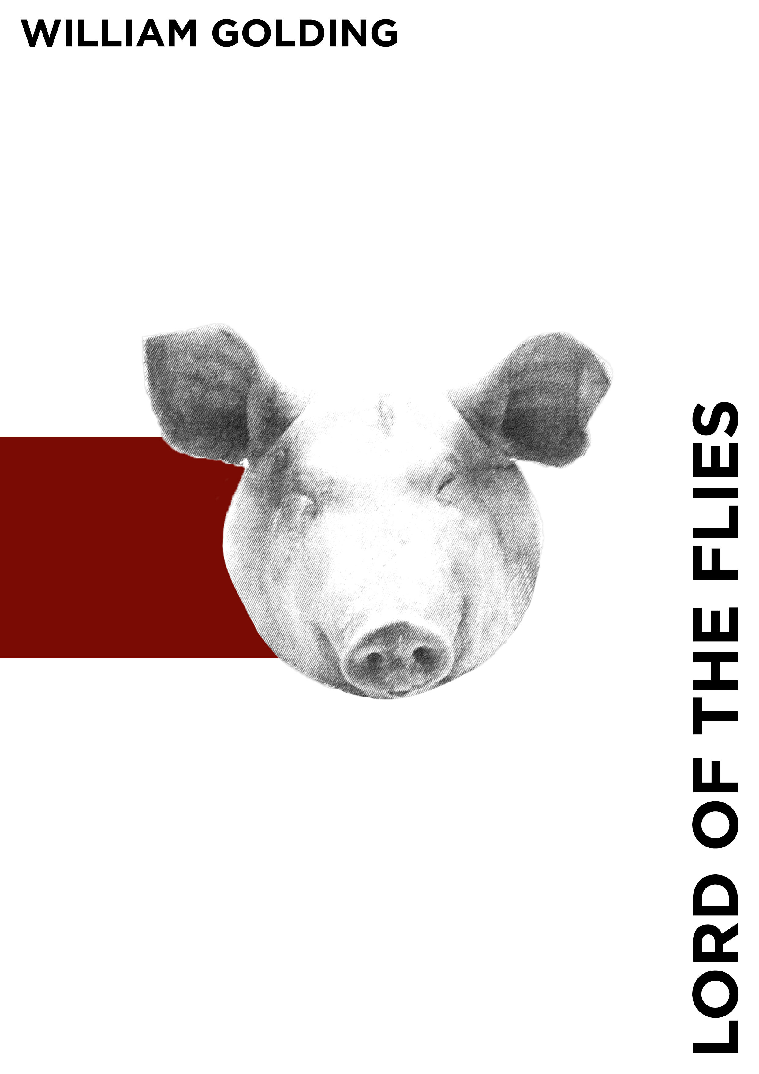
Creative Book Design- Part Two: Form and Function- Exercise 4: Designing a cover
Following on from the discussion of George Orwell’s novel 1984, look at the covers for Margaret Atwood’s equally dystopian novel The Handmaid’s Tale (1985), in which a woman finds herself surviving inside a harsh American fundamentalist society, that sees women’s roles as subservient cooks, matrons, and mothers. Alternatively, you can pick a different book to respond to, but it needs to be one with more than one cover design, so avoid recently published books.
Are there key conceptual motifs being used over and over again within different cover treatments? Can you identify more expressive versions of the covers? Check the date of each version and try to speculate about the historical, political or social context for each one. (Don’t spend long on this but it’s important to realise that creative design doesn’t happen in a vacuum.)
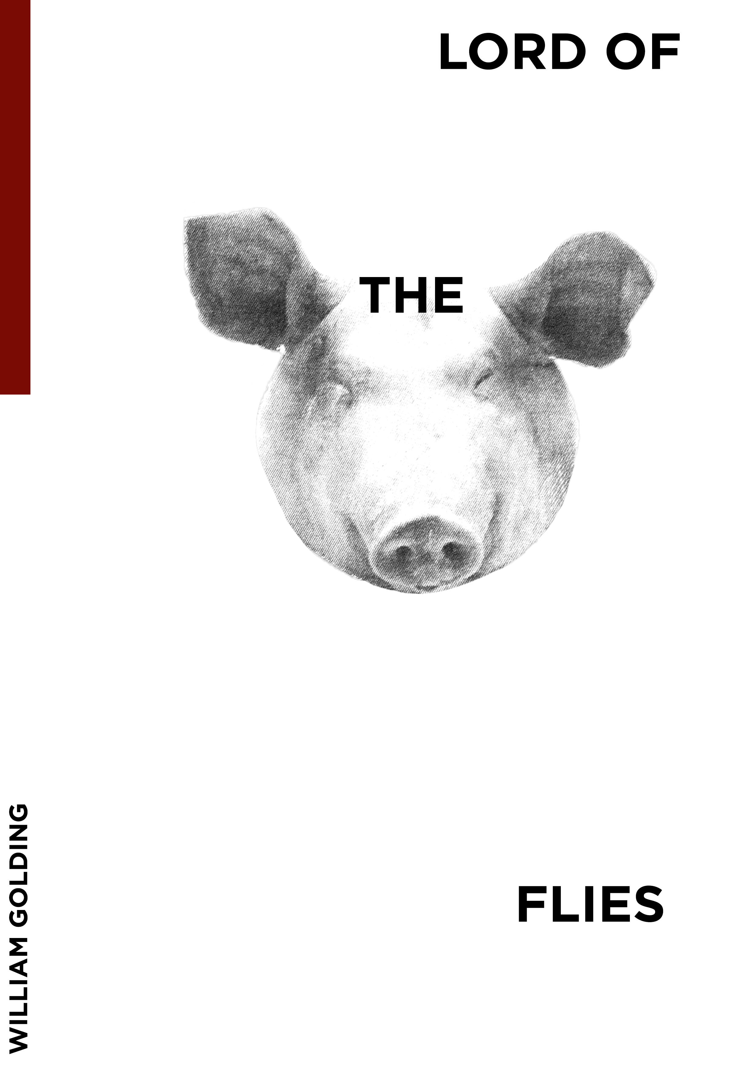
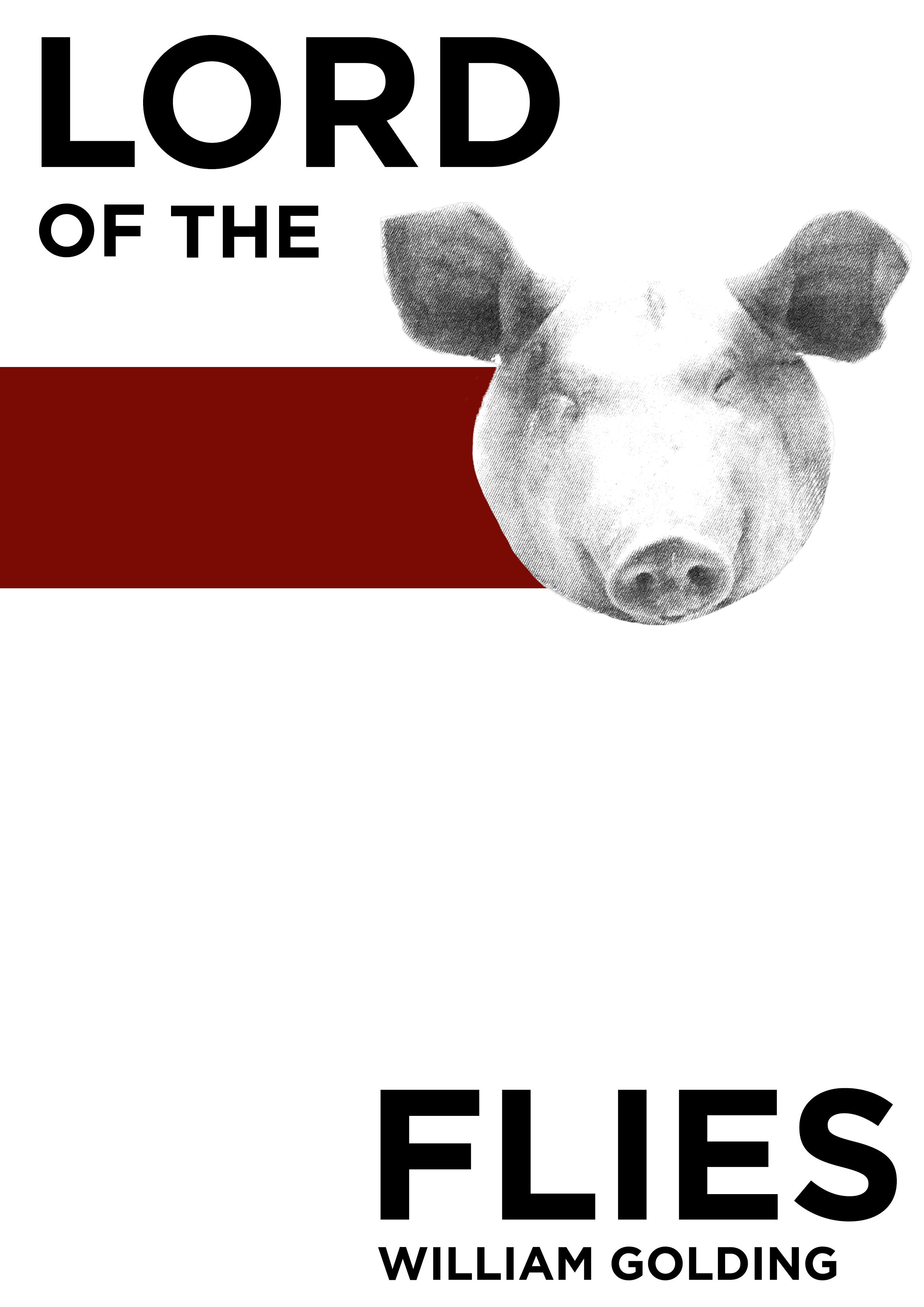
Using one of the main motifs you have identified (such as the uniforms that feature the book), the title of the book, author’s name, and no more than three colours (including black and white), generate as many different layouts of the cover design as you can. Think about how you can dynamically layer, organise, frame, clash, or balance these elements. Work quickly and come up with lots of different visual possibilities.
This is a similar exercise to the Lightbulb Project in Graphic Design 1, which aims to generate quick design possibilities by arranging your typography, motif and colours in as many, and as varied, ways as possible.
I have never read ‘The Handmaid’s Tale’ so I decided to look deeper into the cover designs of another prominent book I have read (so I am aware more of the context) ‘The Lord of the Flies’ which has various styles of covers throughout time.
Above are 6 of the most recognisable ‘Lord of the Flies’ covers from the original (1st image) in 1954 till 2011 (the last image). These front covers vary majorly in styles and imagery, despite this they are all very similar conceptually and express certain emotions.
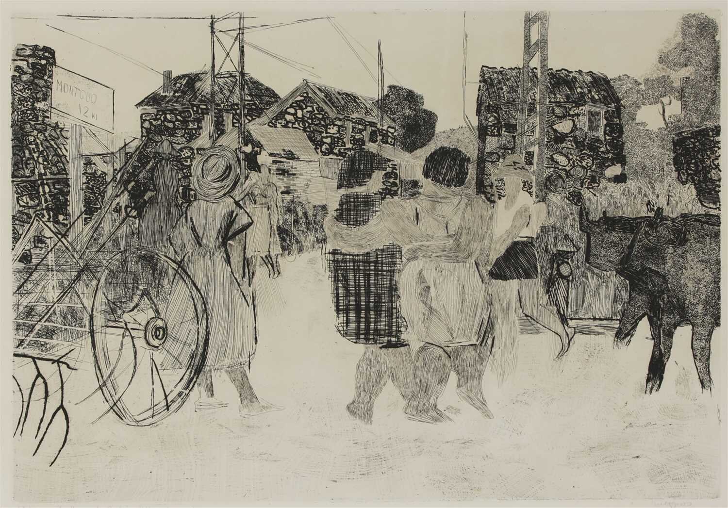
I personally find the original front cover from 1954 very engaging. The artwork was created by Anthony Gross a British painter and printmaker. I hadn’t heard of Anthony Gross before and had to look into some of his other work.
I find Gross’ work very engaging and interesting, the lines and colours used in these chosen images are very emotive. I really understand why he was the designer for the first front cover.
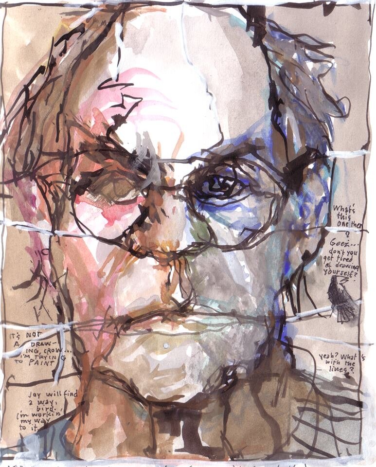
The next front cover is personally my least favourite of the chosen few. This was published in 1980 by Perigee and designed by Barron Storey.
When looking into other work by Barron Storey (which I expected to not like as much) I was really engaged by it. I personally prefer the more impressionist or abstract, and found some of his other work interesting and am slightly confused as to why the cover style was more realistic when the subject matter of the book is predicated on ideology, beliefs and human nature.
The 70s was full of positive cultural change and technological advances. The book was published around the late stages of the Cold war but also at a time of the Central American crisis; the rise of communist regimes and civil wars, perhaps this work by Barron Storey was alluding to the loss of liberty for a lot of people in Southern America. The image is presenting a man who looks very stern, yet in pain, the headdress may represent freedom, and the shield the defence of that freedom.
Similar imagery is used within Gross’ original cover such as leaves, plants, and people that represent freedom or liberty. Similar colours also present nature and liberty such as yellow/green.
Paul Hogarth designed this front cover for the version published by Faber & Faber in 1990. Paul Hogarth was mentioned by my tutor to look into and I really enjoy his illustration style, especially some of his black and white line work. This cover is my personal favourite out of them all, I really enjoy the use of colour and the imagery of the pig, representing Piggy and the ideologies that are encapsulated by his character.
This cover is a darker representation of ‘Lord of the Flies’ but is similar to Storey’s cover in that it presents pain or loss through it’s imagery. The pig is crying with blood, and has a look of despair similar to that conveyed by Storey.
David Hughes designed the front cover for the version in 1993 published by Faber & Faber. Hughes’ illustration style is great. I love the mixed media approach and the colours.
The illustration style is broadly similar to that of Hogarth. The designs were only 3 years apart, which could be of significance. The early 90s was the fall of the soviet union and therefore a more ‘peaceful’ time. Art was and continued to be more contemporary, maybe the illustrative and interesting line work of Hughes and Hogarth is representative of this.
The imagery of Piggy in this cover is similar to the previous by Hogarth. Although this is a portrait of a young boy, the same pain is represented within the expression on Piggy’s face. Overall the cover has a darker feel, which I feel is very affective in alluding to the themes within ‘Lord of the Flies’.
Sam Weber designed the cover in 2009. The silhouette is very strong, leaving 2 holes for Piggy’s glasses which are very suggestive. The lack of a title on the front cover is brilliant, it creates a very empty feel which alludes to the narrative perfectly.
Sam Weber’s work is quite fantastical, I personally don’t enjoy the aesthetic, but the emotion conveyed in his work is very strong, and the colours/shadows are impressive.
The front cover again uses Piggy as the main imagery. I feel like many of the covers have used this due to Piggy representing the fall of structure into anarchy and the vulnerabilities of people.
Neil Gower has illustrated many on William Golding’s books and has done 2 covers for ‘Lord of the Flies’. Although Gower’s style is not my preferred aesthetic, he encapsulates the book well conceptually.
The conch is a great image to use. I feel the conch represents the importance of order and democracy, then moving into a more anarchic state within the book. The black and white illustration could represent the black and white of order and chaos, or function and dysfunction. The illusrative typography appears as if it was ‘carved’ which is a nice element to the design.


