Creative Book Design- Part Three: Text, image and typography-Exercise 1: Type samples
I began this task by looking through some collated typography from my Photoshop typeface collection, organised in a previous task within the typography section in Core concepts. I referred back to these typefaces and their categories when comparing them to ‘found’ typography from a collection of old/new magazines, leaflets, receipts etc.
I chose a random selection of words and type keeping the final assignment in mind in regards to what work/experiments can be produced/what thoughts and imagery is evoked when reading certain words in certain typefaces. When tracing the typefaces instead of enlarging the text digitally to make it easier to trace, I traced directly from the source of the text in a hope to make more ‘mistakes’ which could be visually interesting to include or experiment with later on in the assignment.
I also thought about how the typeface/font used affects the feeling of the text as a whole. I categorised the found typefaces into serif/sans serif and went onto how they can be used for reading in different contexts using the specific examples given (and also why certain typefaces would be ‘wrong’). I chose 5 types to focus on.
Personally I really like sans serif typefaces. ‘The New Typography’ was the first book that came into my head when thinking about sans serif typefaces. The simple and clean typeface could be used within a modern magazine or science book, where as a newspaper tends to use a serif font to appear more formal and ‘conversation like’. I used this sans serif typeface to compare to an older magazine, which used a similar font.
This font is from a Woodwork magazine published in 1964. The sans serif heading is accompanied by a serif font main text. The combination of the sans serif/serif creates a simple and affective hierarchy. Within ‘The New Typography’ a thinner sans serif font is used for the main text, having a similar affect. The typeface used here would have the same application as ‘The New Typography’. It could also be used as a title or headline within a newspaper, which would be particularly affective paired with a newspaper’s usual serif main text.
I went to a Tracey Emin exhibition in the summer and found this small book containing an interview she had done. I was drawn to the use of serif fonts and particularly the embossed element underneath the text which is slightly misaligned. I really like the hierarchy created in the title, ‘The Loneliness of the Soul’ appears as if it is being spoken and conversation-like which is exactly how her work is seen, as a representation/conversation of feelings. I found this very interesting when thinking about the affect typefaces have. If this was a sans serif font, it would have a very different feel, less emotive and almost clinical when paired with the word ‘soul’. I liked the outcome of the trace, I didn’t want to be particular in reproducing the typeface, which gave me an idea for the assignment.
I found a leaflet from 2020 by National Trust and thought that this modern leaflet would be an interesting example of the use of typefaces in different contexts. The information within the leaflet is for people to follow, its aim is to be inviting so people travel and explore areas conserved by the National Trust. The use of a serif font here allows the information to be formal but still conversational. If the text used was a hierarchy of bold/thin sans serif fonts I feel that the leaflet overall would have a different affect on the reader. It could appear less inviting and look more like ‘just information’.
I chose to focus on the word ‘church’ for the imagery and multiple layers of meaning which it evokes are interesting. I liked the outcome of the traced word, especially how the r is misaligned.
The difference in how decorative the typeface here is in comparison to the ‘Tracey Emin’ example is interesting. The Emin typeface is more decorative and has a more varied line weight. If this was used within the context of the National Trust leaflet, it would appear ‘too far’ and ‘wrong’ due to the context of the information within the page. This makes me think that there must be a certain ‘limit’ for how decorative or different a typeface can be within a context such as this leaflet before it becomes unprofessional or not aesthetically pleasing. It is very interesting how naturally we view things this way, it makes me wonder whether this is solely due to the historical use of different typefaces within certain contexts, or whether naturally elements appear a certain way and hold specific emotive values to us, meaning certain typefaces feel ‘right’ or ‘wrong’.
I found a different leaflet from an electricity company providing information on energy. The difference between the 2 leaflets was interesting. The National Trust used serif typefaces, whereas this uses a hierarchy of bold and thin sans serif fonts. The electricity company is looking to convey information and ultimately sell to the reader, therefore the information must be presented professionally and clearly. The use of a serif typeface here may be too decorative and less legible, especially for people who are older or visually impaired.
The bold heading works well with the thinner sans serif main text, particularly on the blue background. I noticed that both the National Trust and the energy company used similar colours here, or perhaps I was subconsciously drawn to them both, which again is interesting. They both appear very similar, but if the typefaces were switched, they would both feel wrong. I am interested if I would have chosen them to look into if the typefaces were switched.
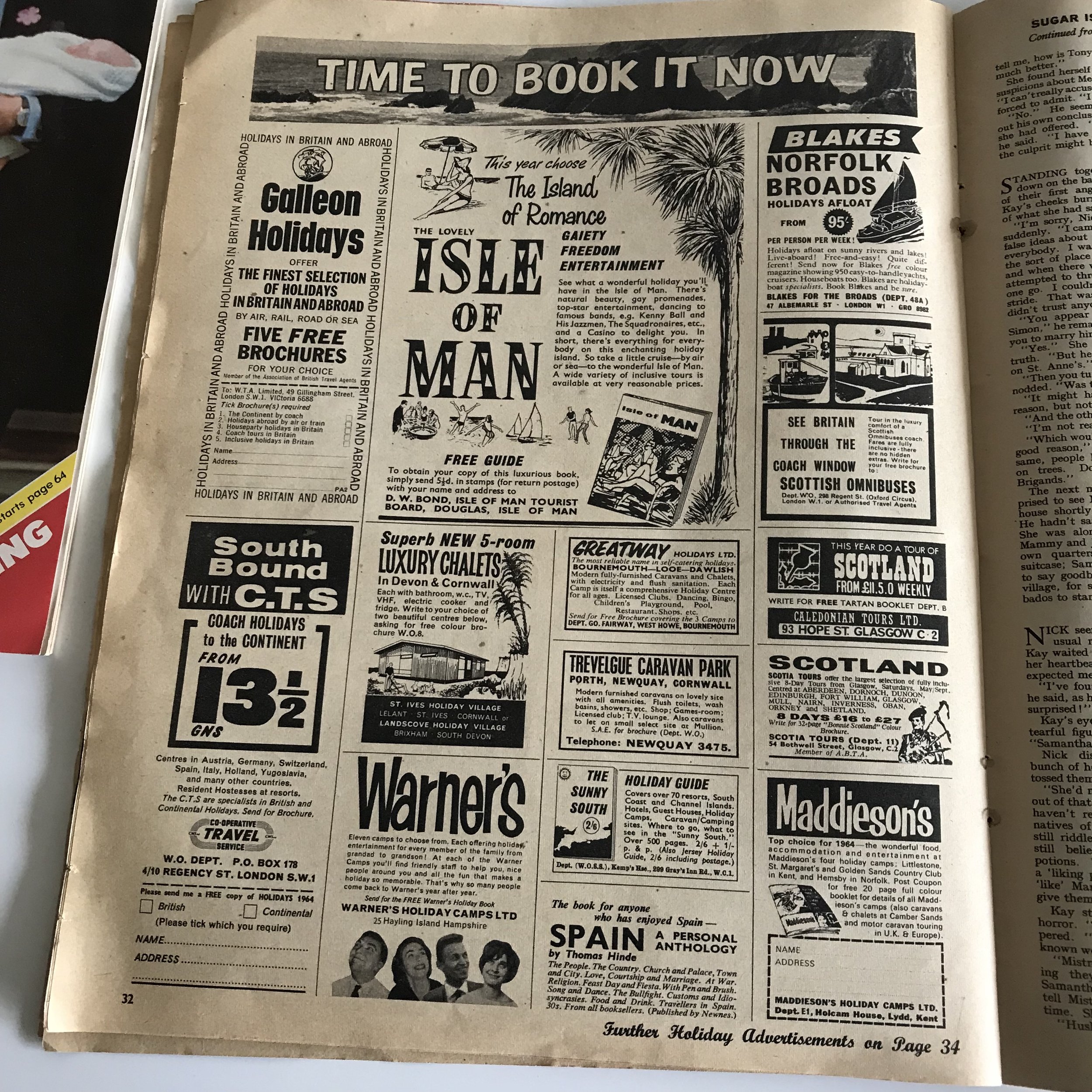
These are a few elements I was drawn towards when looking at different type styles that I think are interesting. The 2 images on the left are advertisements from a 60’s ‘Woman’s Own’ magazine. The varied use of typography size and style looks great, it presents a lot of adverts fighting for attention within a black and white format. They are examples of what can be done in order to catch a readers attention.
The next image is a piece of paper that was stuck underneath a package I had received I particularly like the sans serif typography paired with hand written elements, especially the back list being ticked off. Similarly I was drawn to a list on the reverse side of a clothing tag, the sans serif typeface looks really good in a list format. Perhaps this is something I can explore when creating my books on good/bad typography.
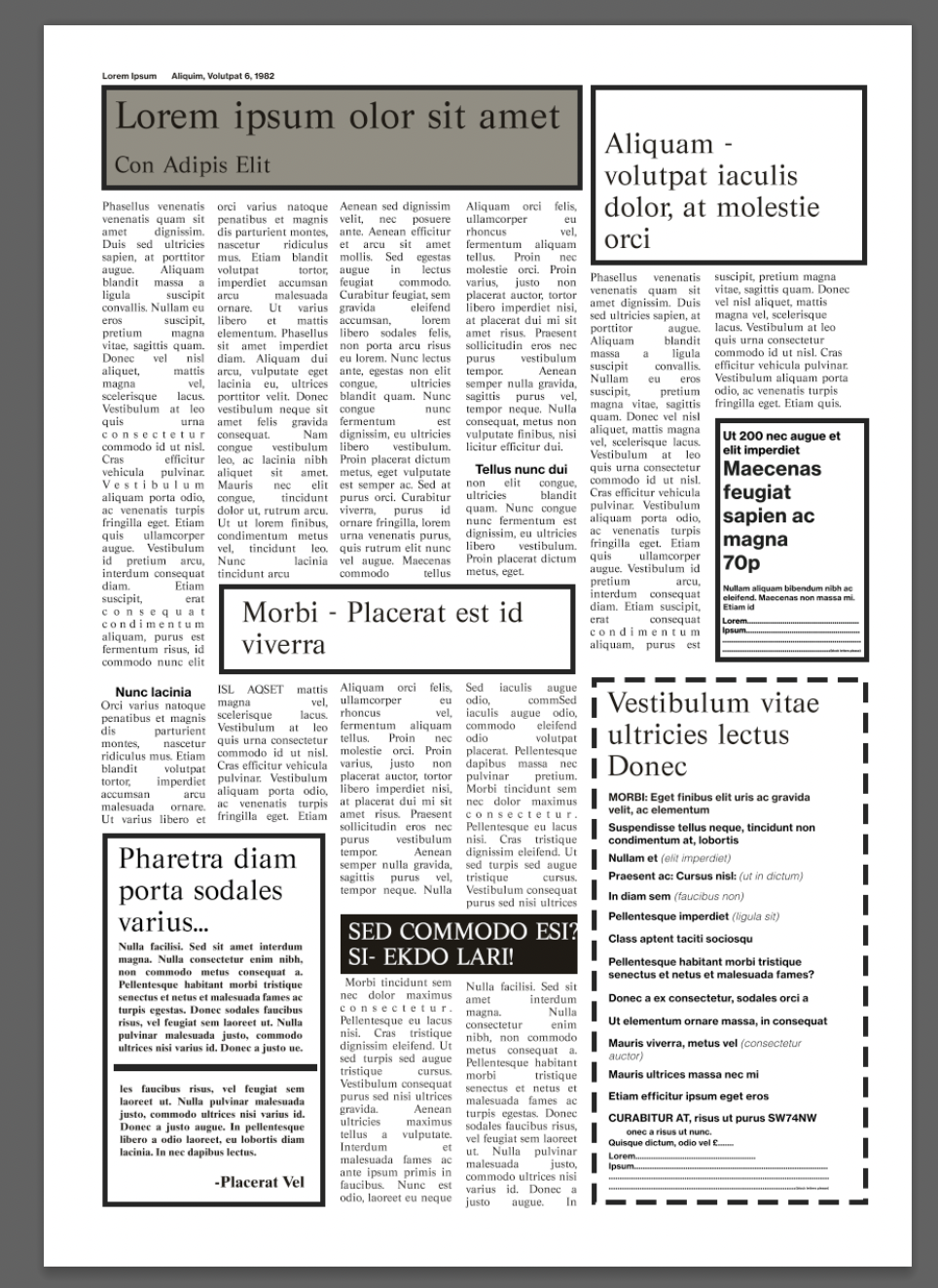
I returned to some previous work, which were copies of layouts from magazines. This was from a 60’s magazine, and the typography/colours used were to emulate a 60’s feel. By changing the typefaces to sans serif modern fonts, it gives the whole design a different feel. I chose a typeface I personally like, Gotham Black and Gotham Light. This hierarchy could work well, but it doesn’t appear to in this context. It is as if a serif font is expected, it feels older and more conversational. It would be interesting to see peoples unbiased reactions to both.
I then looked at changing the typefaces used for an old newspaper layout. The first image is the original, using a sans serif typeface for the heading and a serif typeface for the main text. I then experimented with different iterations of heading and main text using more decorative serif typefaces and went onto changing the main text of the newspaper. The final image shows the use again of Gotham in a bold and light font. I feel like this works for this context, but it changes the feel of the layout entirely. Instead of the layout appearing as an old newspaper it emulates a new styled magazine.


