Creative Book Design- Exercise 3: Alternative publications
Using your research into artists’ books and fanzines as a starting point, think about their physical or design qualities, and creatively apply some of these approaches to your own designs.
For example, there’s a distinctive visual quality to many fanzines which comes from a ‘cut and paste’ approach to designing and through the use of cheap photocopying and printing. Punk fanzines in particular make a virtue out of having limited resources, no computers and little, or no, formal training as graphic designers. Use your sketchbooks to experiment with a similar ‘cut and paste’ approach by cutting and collaging magazines and other material. What does this approach offer you as a book designer?
Alternatively, you can find other ideas you would like to test out in your sketchbook. You don’t need to make any finished designs, just give yourself room to experiment and try things out.
K T Kobel:
K T Kobel doesn’t have a lot of information about himself anywhere, but the work he creates and shows via Instagram is inspired by the fanzine culture and works by people such as Chris Ashworth. Kobel creates art and designs his own zines presenting his work and collaborations with other artists/typographers.
I really enjoy the black and white tactile aesthetic of his work, his use of screen printing followed by photocopying the work creates an almost ‘careless’ look and grainy aesthetic.
Examples of K T Kobel’s work:
Using the research collected from artists books, fanzines and my other personal interests in art/design I began to experiment.
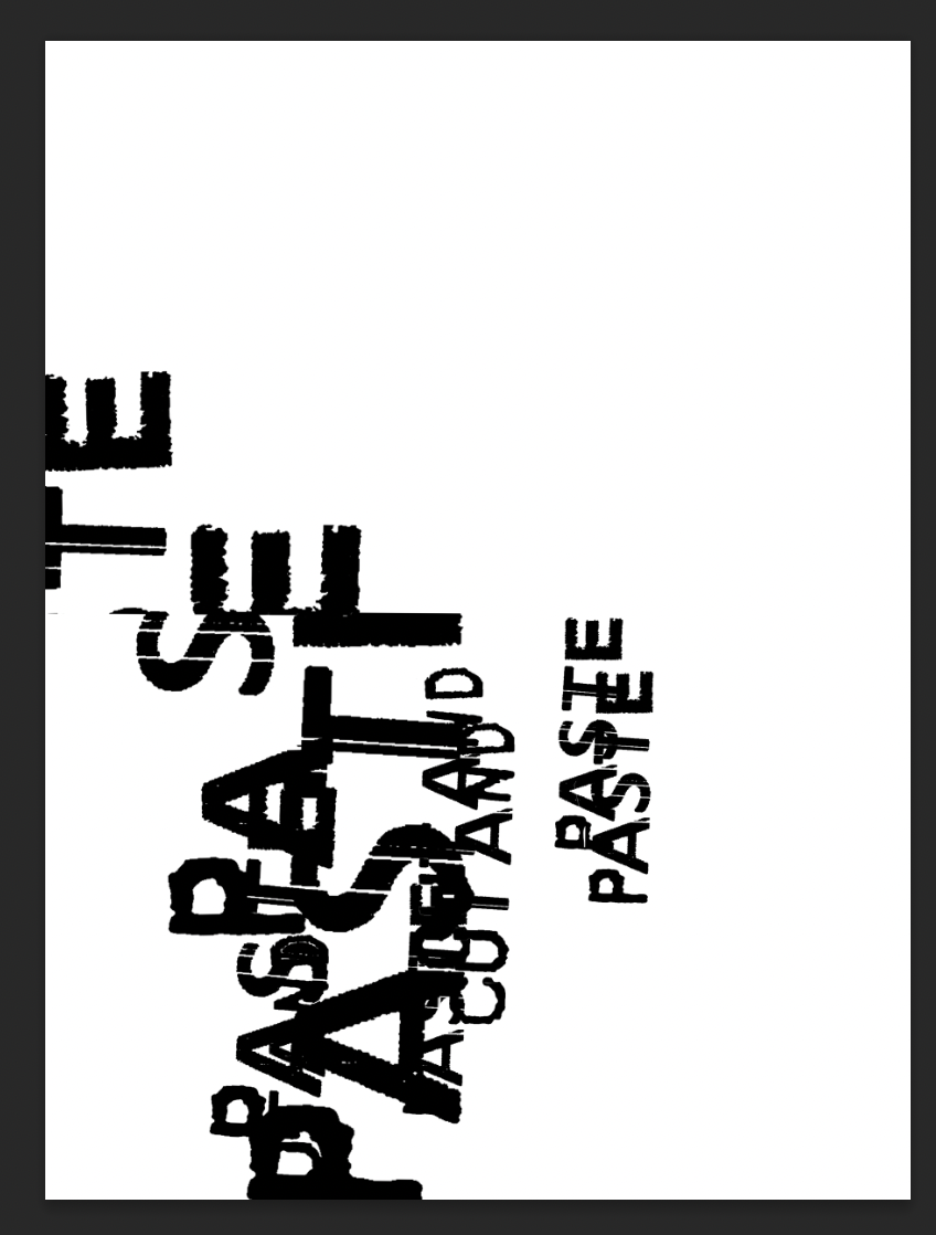
I continued experimenting with the layout, size and layers of the phrase ‘cut and paste.’ The results were interesting and sparked some ideas for my final zine.
These results I feel could look good screen printed, which I intend to experiment with more.
I wanted to experiment with collaging images and words, including mixed media such as paint and pencil. These more tactile elements interest me in design in general but the inclusion of hand drawn elements were particularly inspired by Mark Perry’s ‘Sniffin’ Glue’ zine. The hand drawn type around gritty high contrast images is aesthetically pleasing to me and is a huge element to the whole zine area of design.
I found these images by looking through various old magazines, and took these from a 70’s ‘Woman's’ magazine. I printed them out in black and white, collaged them and distressed them using a scalpel. I then added coffee, pencil and paint on top to add to the feel of the image.
When testing between black/white and colour, I quite liked the black and white result but feel like the addition of small elements of colour adds to the overall concept and emotion of the collage.
The idea of ‘pop ups’ in books or within my zine don’t appeal to me, but I was particularly interested from my research by ‘Storm Sequence’ Alisha C. The book was more of a sculpture and piece of art. the ‘looking’ through a window made me think of creating or testing with cut outs within the pages of my zine.
Chris Ashworth:
Chris Ashworth began as a designer focusing on typography and is now a creative director at Microsoft. I came across Chris’ work embarrassingly not long ago, his and David Carson’s design work for Ray Gun magazine is brilliant and an aesthetic that I find very interesting.
I particularly love Chris’ physical method to distress his type, from an interview on ‘The Futur’ he mentioned it was through many ways such as; scratching a screen print, using tape with Letraset and sticking paper with type written on it to his children’s shoes then sending them to school.
Chris Ashworth interview on ‘The Futur’:
I also referenced my ever growing collection of visuals that inspire me, whether its screenshots, images I’ve taken, clothing, textures etc it all goes into a folder than I can look through at random for visual inspiration.
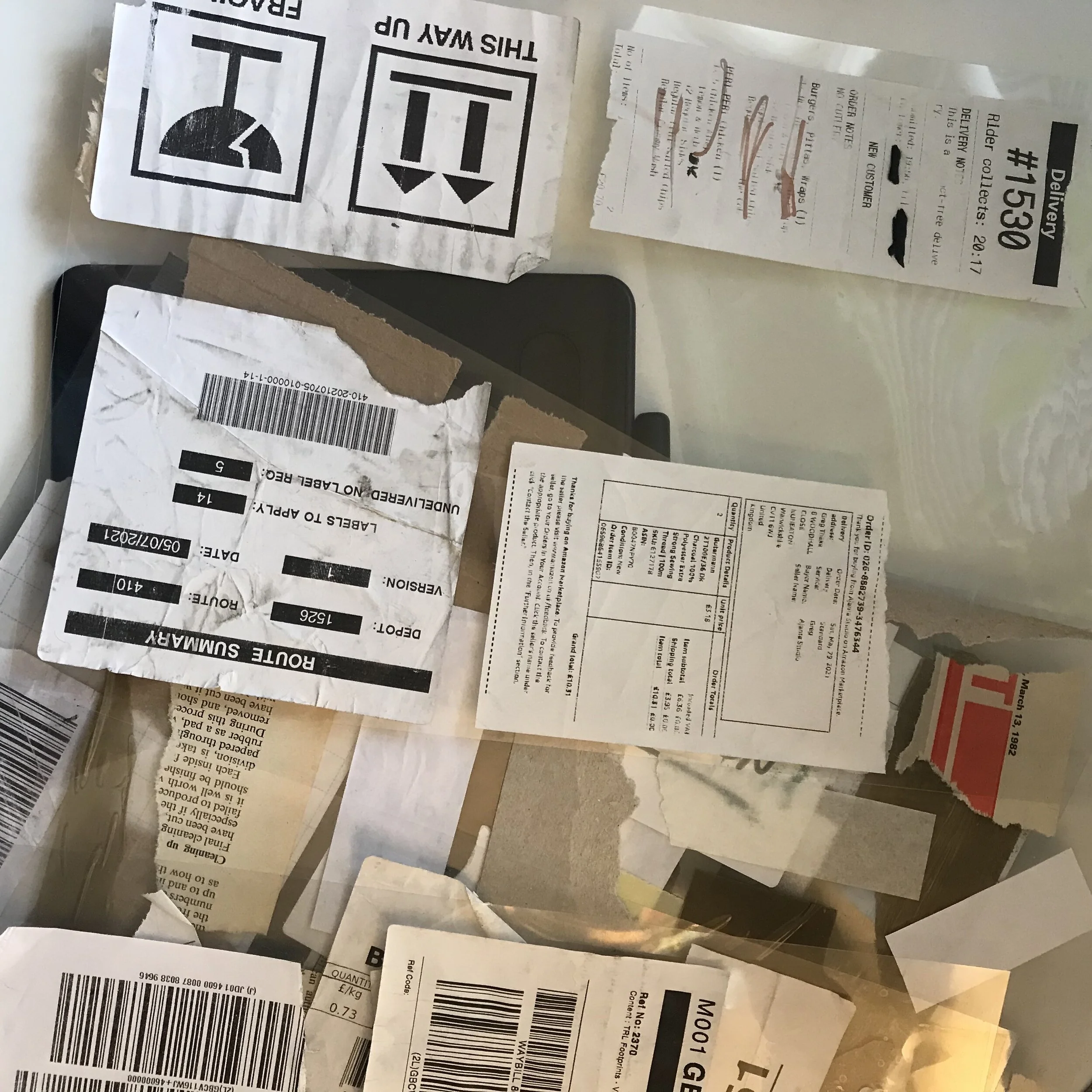
Inspired by Chris Ashworth’s typography and the general punk zine style I wanted to create and experiment with my own typeface. I looked at receipts and packaging I had collected, identifying interesting letters and numbers. I isolated the letters/numbers and then using the threshold tool in Photoshop made the, bold/distorted them further.
I wanted to test with type physically and played with a collage style involving ripping up the word ‘typography.’ The end result was interesting, which I edited further digitally.
I liked the more contrasted edited version, it had a more punk zine feel. This was heavily influenced by Jamie Reid’s work, showing the rips of paper and the physical textures created. Again this is a design I would like to experiment with screen printing.
I continued with experimenting in this style and created 3 collages simultaneously inspired by a film I’d watched recently ‘Cape Fear.’
I took images from the film, printed them off in black and white and began to collage. I used some screen printed paper, some dotted paper from a misprint, pencil and paint.
After scanning them in and testing with them in black and white I liked the results. The high contrast versions were interesting and could potentially work for my zine.
Inspired by the tactile nature of punk zines I looked through some packaging I had collected and chose to experiment with a fragile sticker. The more abstract meaning of fragile was interesting to test with. I printed then cut out the writing of the sticker, gluing the remaining parts to an image of a crowd of people. I then created a make-shift spine using masking tape and folded it to see its affect. Although it’s not finished, I think the idea could work, potentially having an image or collage behind the sticker and revealing more whilst leaving something behind. This also adds into the ‘cut and paste’ concept.
Inspired by the use of orange in my physical collages and the black ‘blocking out’ of sections of work by K.T. Kobel as shown in my research I wanted to create a collage purely digitally. I began by looking through images in magazines, and found one of a chair in an architecture magazine from 2007.
I didn’t document my process very well during this experiment, but wanted to include more hand drawn/written elements.
The concept was inspired by thinking about ‘cut and paste’ or ‘copy and paste’ with the more abstract taking of that phrase posing the question of what’s present and what isn’t? What can be taken away and what’s left?
I again tried the colour version in black and white and quite liked the result, I feel like the greyscale is nice, rather than just a contrast between black and white, which is an idea to keep in mind when designing for my zine.
I enjoyed this task and exploring the work of established designers/artists. I enjoyed searching through punk zines and finding inspiration from different sources. I really like the tactile feel of punk zines, including their typography, the hand drawn elements are something I would like to include in my zine and experiment with further. I also would like to return to some of my typography experiments and screen print them to see how they turn out, I feel like this could add a handmade feel/texture to my zine.


