Creative Book Design- Exercise 2: The future of the book
Given the current development of the book from printed to digital technologies, what do you see as the future of the book, for readers, and book designers?
Where do you see the book heading? Show and tell.
Try and summarise your thinking into a series of short statements, quotations, images (collage) or ideas. Be creative in how you approach this.
I went onto collecting some collage/design to reference as inspiration. I made a mood board including work by David Carson and Nazario Graziano.
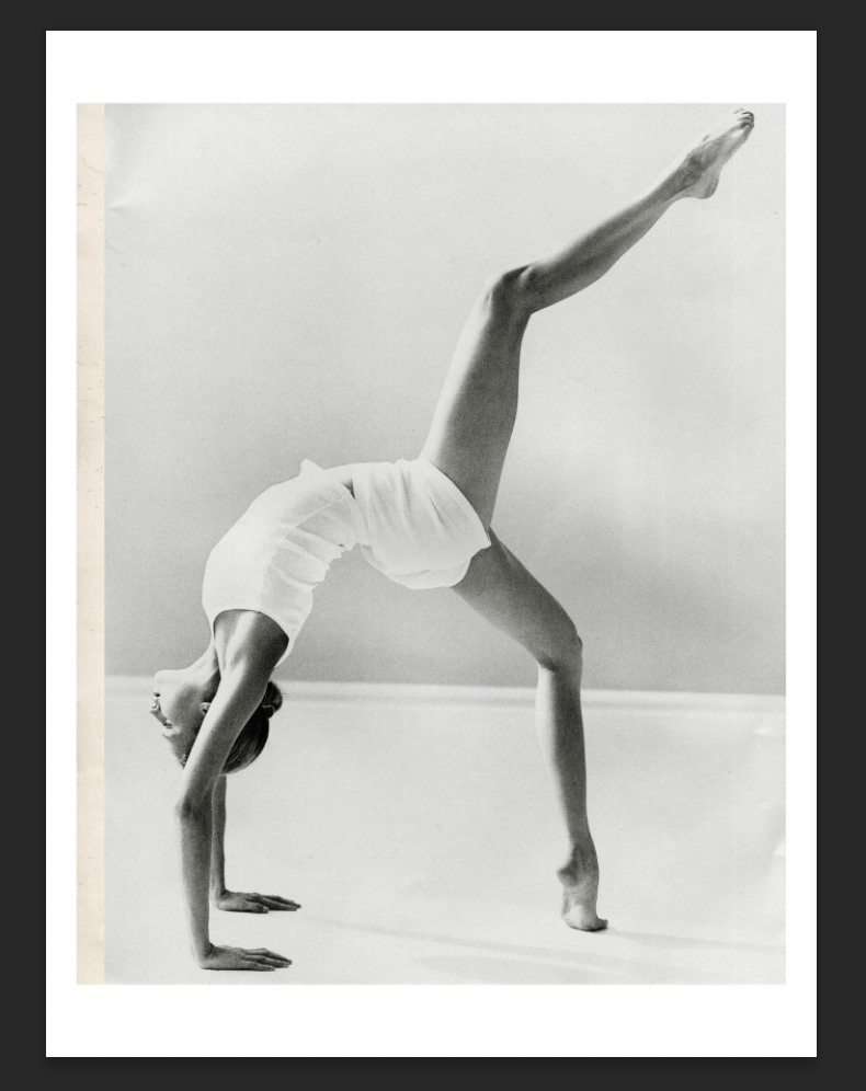
I looked through some magazines I have been collecting for potential imagery to use, referring back to my mind map for inspiration. I chose a combination of new and old magazines in hope to collect varied imagery to show the development of books from analog to digital.
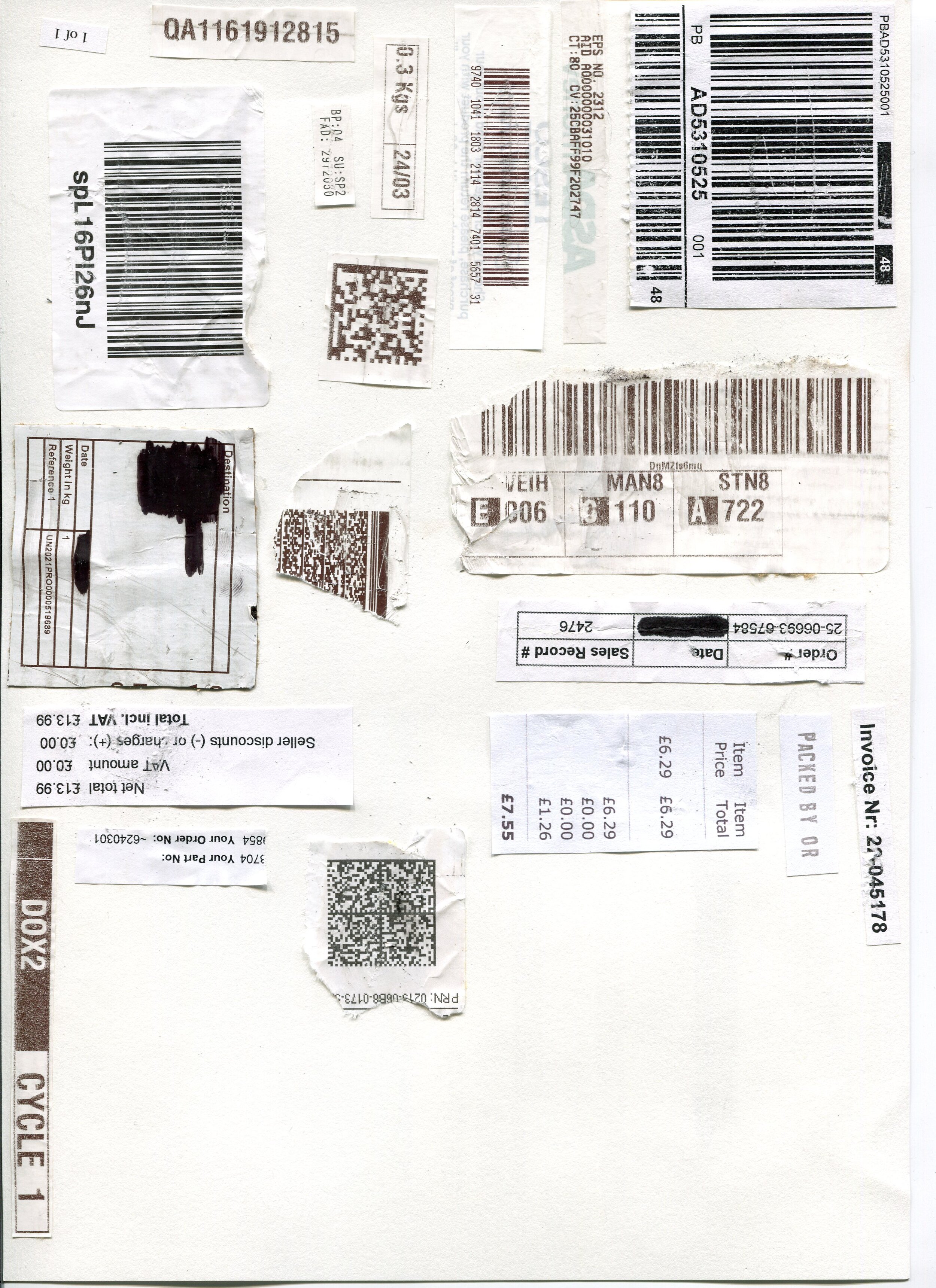
I aimed to combine physical and digital numbers/textures to represent change and reference digital technology/ coding- binary etc. My idea initially was to include numbers to show page numbers and the readers experience changing. I collected some receipts and postage stickers which looked interesting.
Final:
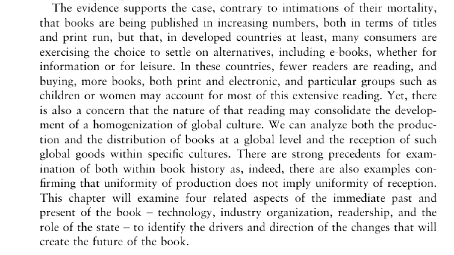
Inspired by the first research task to read ‘The Future of the Book from David Finkelstein and Alistair McCleery’s An Introduction to Book History’ I used the points I identified as inspiration.
The full response to the research task can be viewed here.
Considering these points, I began to create a mind map of relevant words and ideas to collate my inspiration and begin to plan a response to the task.
I considered creating a purely analog collage for this task, but decided that the combination of digital and physical was suiting to the context of the exercise, and in itself shows digitisation.
I came across an image of a dancer in black and white that I felt represented constant change, movement between print/digital and distraction (potential problems with digital books.)
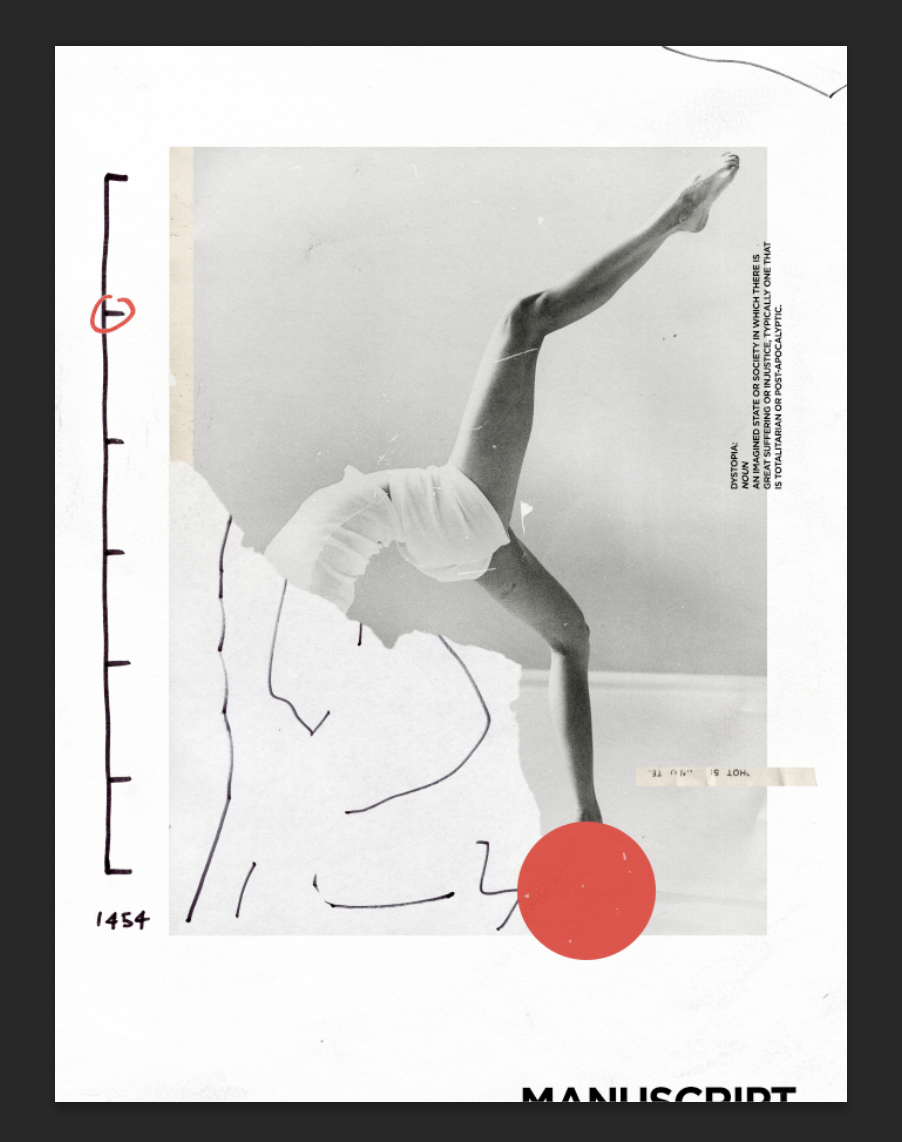
I wanted to present a more negative view of the future of books. I included some text ‘Dystopia’ giving its definition, an obvious and almost cringe worthy idea, but by making the text small and rotating it sideways it makes it less legible and more interesting. The rotation of the definition itself could present that something isn’t straightforward, which the future of books isn’t.
I created the pen markings and timeline physically using different pens/pencils to add to the physical/digital combination. The timeline shows the year Johannes Gutenberg printed the 42 line bible using a movable metal type printing press.
The red circle on the timeline represents the beginning of change, the ‘revolutionary-print-digital’ and the next notch on the timeline being the future which is unknown. The dancer can be viewed as moving or running forwards if you tilt it 90 degrees sideways, which can be perceived negatively or positively.
The dancers head is covered by lines drawn on paper to show the movement from tactile/physical print into digital. The red textured circle is to exaggerate a negative feeling towards this movement. The head being covered can also be shown as people caring less about reading now than in the past, and moving forwards without care for the past.
The word ‘manuscript’ is barely legible at the bottom behind the timeline to show that it was in the past. I felt like the word manuscript was fitting as it has religious connotations, relating to the 42 line bible and the traditional/conservative thoughts on the importance of books.
The aged paper at the left side shows a more positive view, that digital and physical (old) can work together simultaneously in the future.
I enjoyed producing a collage for this task and it was good to experiment with something new. Looking back I feel as if I could’ve tried many more compositions and other potential images. The overall image is quite abstract and without certain contextual information it could be hard to interpret, but as it wasn’t a specific ‘client’ task I took it as an opportunity to experiment.
I feel as if the finished response to the task lacks a ‘finished’ feeling or continuity, perhaps this could have been improved by trying other compositions and colour palettes.


