Core Concepts- Exercise 3: Book cover design
Exercise 3: Book cover design
Your brief is to design a stunning and contemporary cover for one of the 20th century’s most acclaimed authors, HG Wells. Known mostly for his science fiction writing, HG Wells also wrote social novels that are still relevant today, covering topics such as the mid-life crisis, class, feminism, materialism, consumerism and love. Your challenge is to create cover designs for three of his books that work as a set and establish the books as timeless fiction. The books will be published in a paperback format and need to include the title, author’s name, publishers name and trademark. You only need to design the front cover and spine.
Research:
Some of my favourite quotes from the documentary which helped shape ideas for the book covers were:
“What good is religion if it collapses under calamity.”
“One day the sea lady appeared, in a close sitting bathing dress, and with the sunlight in her hair, she took possession of my writing desk.”
“He was very excited starting his degree, he loved studying biology, but he hated studying geology he thought it was really boring. Fortunately for us he wasted a lot of his second year in the library reading English literature instead.”
“People who didn’t want to learn, he had problems with those.”
“Why too if the Eloi were masters could they not restore the machine to me, and why were they so terribly afraid of the dark.”
Producing these mind maps helped me decide which books to create covers for. I had a few initial ideas for each, helped by learning more about H.G. Wells, especially his metaphorical approach to his stories. Before drawing out any ideas I decided to take a look at other books for some more inspiration. Firstly, I looked at some of my favourite books.
Out of my favourite books I wasn’t actually drawn to any of the covers or spines in particular. I found aspects interesting, such as the white embossed section on “Why I’m no longer talking to white people about race” and the almost Rodchenko style art by Jordan Peterson on “Maps of meaning.” I had in mind something more abstract than just the title of the book originally but was inspired by the clear typography of each of the books, in particular “12 Rules of Life.” I realised that all of my books apart from “Cloud Atlas” were non fiction, maybe this is why they’re more direct and clear in their design, rather than illustrated or more abstract. “Cloud Atlas” was the most illustrated which is very interesting as it is the only fiction book. I decided to look into more books.
Despite enjoying reading quite a lot I’m embarrassed to say I haven’t read anything by H.G.Wells. I blame this on not reading enough fiction, something I will now change! Initially I was excited to start this task as it means delving deeper into the works of this well known author, his thoughts and ideas. I began by highlighting and noting important parts of the brief to refer to whilst I work (which I’ve learnt from doing my first assignment/other tasks that this is an important step for me.) I then searched through the authors book titles to get my mind thinking and to lay the foundations for ideas as I research further. Wells’ titles were very metaphorical and they gave me many ideas even without knowing anything about the author or books, I noted my favourites to keep in mind.
I thought I’d begin by reading short synopsis of each of the titles I was initially drawn to as I hadn’t read any of Wells’ work previously. I did this using ‘Super Summary’ a website that I came across that summarises books in a few hundred words. I found this very interesting and was drawn into the deeply metaphorical ideologies. This helped me to gain an idea of which books I would create covers for.
I began to create mind maps for each of the titles, which I added to with further ideas the more I found out about Wells. I came across a documentary about H.G.Wells on YouTube by the BBC from 2016. I decided to watch this whilst creating my mind maps.
I searched Pinterest and Instagram and collected book covers and work that I had recently come across that has inspired me. I really loved some of the book covers I’d found, a few favourites being; The dying detective, Regeneration, The memory Police and This is the way. Particularly with “The dying detective” I enjoyed the type writer font style, and the silhouette cut out photo, I thought this paired with the yellow background was very effective. “Regeneration” by Pat Barkers’ cover looked great. The juxtaposed new and old imagery used in the collage really represented the title well, this is something I would like to get across, a clear, yet abstract representation of the title and the book. The layering and colours of “The memory police” was my favourite part of this cover. The red and the blues contrasted nicely and again represented the title well. Blues and reds are police colours, possibly meaning blue print and red for danger or a darker side of the main character. I found looking at these book covers a massive help for inspiration.
I have been working my way through Jan Tschihold’s “The new typography” and along with reading from Assignment 1 it has brought me to the attention of early 90s art and work inspired by the Russian revolution/Dada movement. I love this more abstract style paired with bold typography and think it could be affective as a book cover.
I then began to come up with a few ideas for each of the titles, I started with the more obvious and later with more abstract to compare which will be better to produce.
On the left are my initial more obvious ideas for the book covers, I feel like the silhouette style ideas would be affective as a series, and would look modern and clean. Overall I feel like simplicity isn’t the way to go with these book covers as H.G. Wells’ ideas and life seems more metaphorical and intricate. From producing these for the 6 titles I decided to focus on 3; a modern utopia, the country of the blind and the shape of things to come. I feel like I had the better ideas for these titles.
On the right is an example of my “quick get an idea written down” method of planning. Although probably ineligible to others I found that when researching or producing other work I had rough ideas for covers that didn’t need to be neat, these very rough thumbnails included enough information to jog my memory with an idea I had.
I decided to draw up and change some of my initial ideas and used these to begin working. I find that my ideas usually change throughout the journey of creating, and with this task I looked forward to testing out some ideas.
I tend to struggle with where to start when creating, so I decided to just jump in and start with one of my ideas for “The country of the blind” and tested various scanned textures in Photoshop. I initially wanted to create an abstract landscape using material from a 1980s Soviet Weekly newspaper, graph paper and a halftone image of clouds. I found an image of children playing in a National trust magazine of all places and cut it out, then made it a threshold image. After testing different compositions and colours I wasn’t happy with the outcome.
I decided to layout most of the collage making material I had and look through it for imagery/textures, constantly referring to my mind maps to look for words and ideas that relate to the book titles. I ended up with a lot of potential images and textures, I scanned them and then began to test how each looks cut out from its original background and placed on different textures in Photoshop.
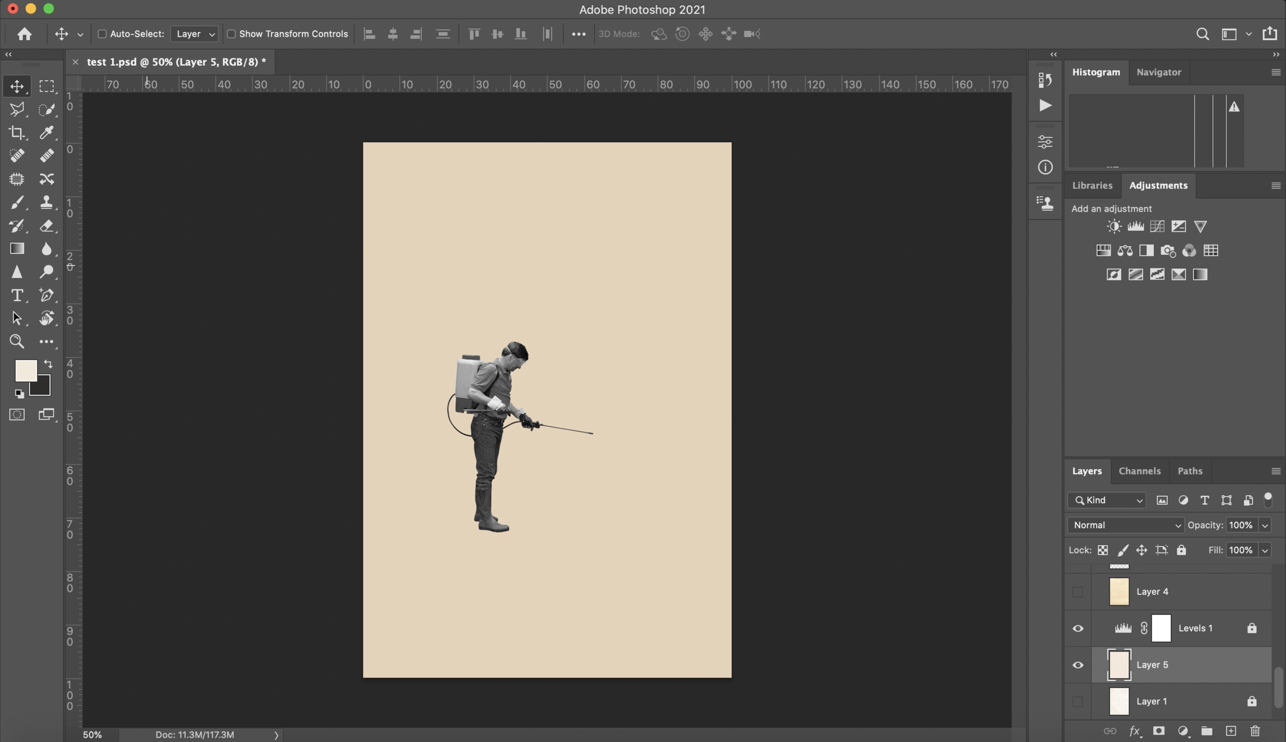
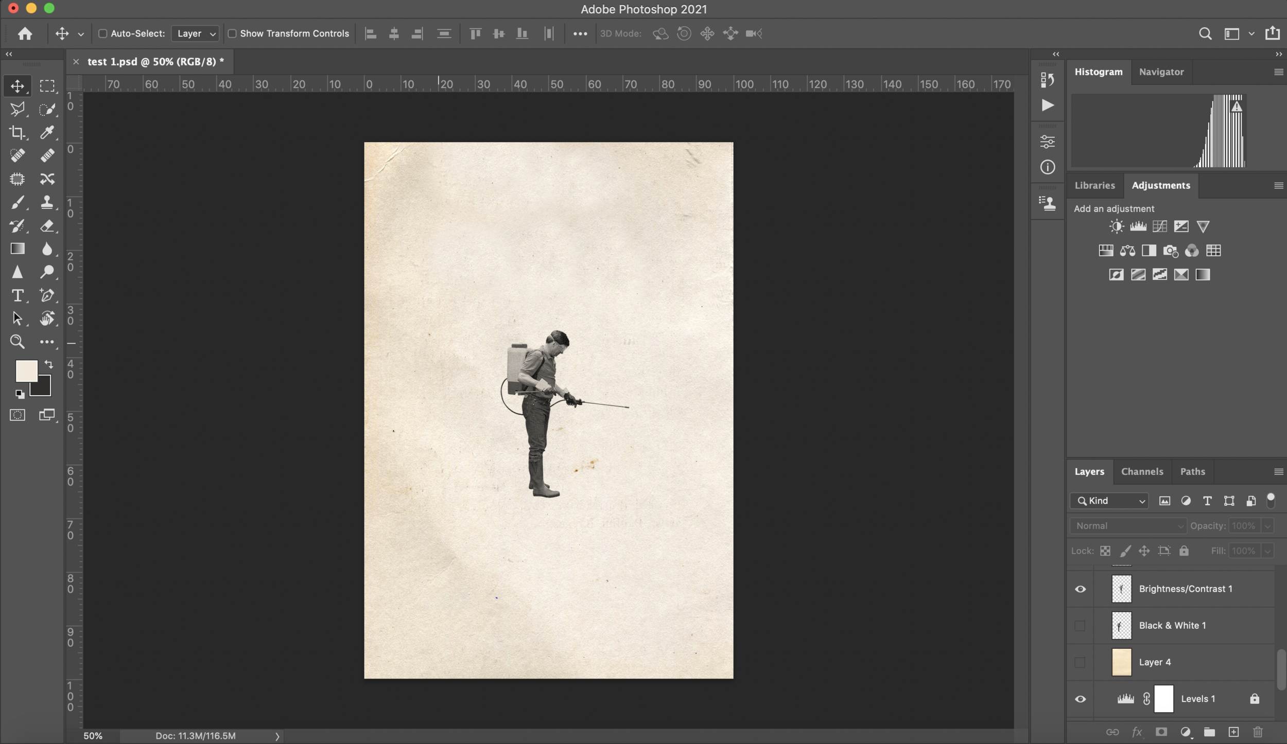
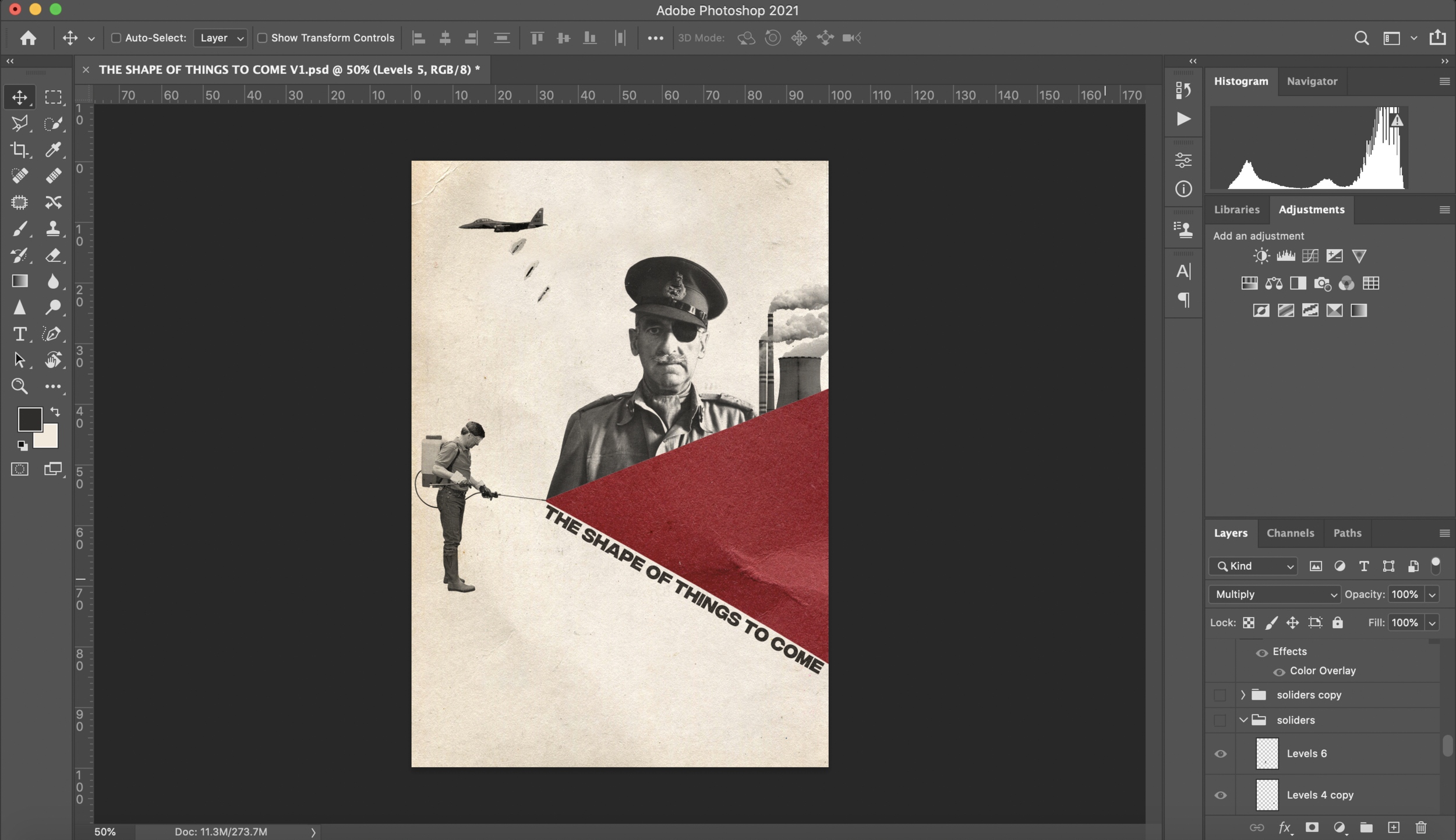
I had decided to go with the colours of red white and black inspired by the “Soviet Weekly” newspapers style. I felt like these colours well represented the titles of the books and would be a good way to create a series of books. The colour red suggests negativity and pain, as I feel some of Wells’ book titles portray, the black and white is a nice contrast and allows the images to stand out well. I started to work on an idea for “The shape of things to come.” I found the image of the chemical sprayer in a book on gardening when looking for other inspiration, I thought this was an image I was going to have to find via the internet. I find it interesting as it represented “The shape of things to come” well, referencing Wells including the idea of chemical warfare in the book. When testing I decided that a different blend mode worked nicely, and by heightening the contrast of the original image you can really make it appear almost a part of the paper. From these tests of ideas I had decided to progress further with the paper collage affect and colours.
Instead of including buildings above the chemical spray as planned I felt that the found image of the solider worked well as it references Wells suggesting a global war, and the power plant shows climate change (another element Wells includes in this book found from my research.)
I then went on to testing font types for the title. Initially I had in mind an old type writer style, incorporated around the solider. But I eventually decided on a more modern, simple font. I felt that this font worked better as it stands out among the collage style image. I also didn’t like the idea of the text being shaped around an image after producing it, although this adds to the “shape” word of the title it wasn’t as affective as other title style tests I tried.
After to my moodboards, I scanned and found a similar font to “Why I’m no longer talking to white people about race” I found this to be the most effective. I created a layer mask of a paper texture over it which worked well with the paper elements in the collage. Overall I didn’t find my work as compelling and professional as I wanted it to look, so I tried a different composition of images and title layout.
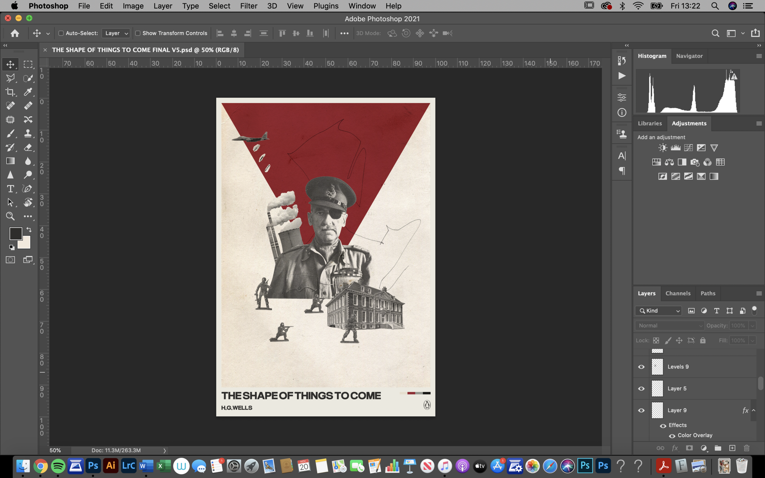
I prefer this composition. Despite liking the original idea of the chemical spray, I feel like the triangle coming from behind the solider created an ominous feeling as if the future is negative. I added in an old stately home building to imply the increase of industrialisation is to come. I feel like this works well with the toy soliders which again reference war, but are there to show that people can be played with like a toy by the powers that be, the government for example. I was unsure whether the paper texture worked well, I changed it to a digital colour, and then layered it was a chalk texture I had created. I feel like this worked better, rather than the background and the foreground looking the same, there was a slight contrast. I tested with adding some scanned text from postcards I had (from assignment 1) in the background but didn’t like the outcome. I then tested with a map with a low opacity. It was a map from a town in London and Wells was from London so I thought this was fitting, but again I didn’t like the outcome. I then decided to create some mark making from various media and see how this looked, to add to the collage feel.
I tested with arrows showing in which way things were moving, the soliders moving forwards and everything in general downwards. I then arranged a pen scribble and preferred the more abstract sense this gave, a feel of confusion. I liked the way this drew elements together in the piece. Next I needed to decide how to incorporate the text. I liked the other methods I tested before but I wanted it to look clean and simple, a contrast to the imagery.
I decided to mount my original cover onto a plain digital colour background. I feel like this works well as the digitally coloured triangle leads into the background, it frames the images and creates a ‘cleaner’ appearance. I added a colour palette in the bottom which I feel brings the background together with the images and colours. I tested the text with and without the paper texture and decided to go without it. I was unsure whether this would make the title seem lazy and boring but I think it works well.
When researching book spines I found that they were usually simple, with the clear title and maybe a small illustration representing the book. Looking at my mood board most of the books had the title clear on the side. I wanted to do this also, I feel like when looking through a rack of books you want to see the title clearly. I decided to add the triangle in and then thought this would be a good idea for all of the book covers, to have a different shape on each. This would lead to an interesting series and have something that binds them together.
Final 1: The shape of things to come
Overall I am quite happy with my first book cover’s outcome. My goal was to collage imagery related to “The shape of things to come”’s title, what I have learnt about it’s content and H.G. Wells. With this cover I wanted to capture a violent and war filled future, as Well’s referenced in the book. The toy soldiers are to show how people can be played with and forced to do violent things by others, and the power of the government. The mansion is to show the consumerism and lust for more of modern society, which is something I felt the title meant to me.
I feel that this cover works quite well, I like the continuity of the shape onto the spine of the book. I feel like I should’ve thought more about including the title within the artwork, maybe including images within the typeography, or going for a completely different composition. I am frustrated with the cover but want to continue due to time and not dwell on it, as I know it will take time to improve. I do feel like I am slowly improving and look forward to working on more projects.
I then went onto producing an idea for “The country of the blind” that came to me when searching through a photography book by Cecil Beaton for inspiration. I saw an image of 2 women lay down and thought this could be a good metaphor for this book title. I went onto testing this idea keeping the same background and blend modes as “The shape of things to come” for continuity in the series.


I added arrows around the edge of this, to suggest that their ‘blindness’ prevents them from knowing which direction to go, an idea that I felt when reading this title. I didn’t like the outcomes of this idea especially when displayed as the first book cover is, with a digital background etc. I decided to move on and looked back at my ideas, mind map and mood board for inspiration.


Leading on from wanting to have different prominent shapes throughout the series of books I tested this one with a rectangular background. I found an image of a mountain range, and decided this would be a good focus point for this cover as “The country of the blind” was about a blind man travelling to the Andes where he found a village of people, who were also blind.
I originally wanted to include different images from different times, famous and not of different people doing things not related to each other and looking in different directions, but with the male being the most prominent photo showing how society is blind to male power, the power governments have over people and how the ‘powers that be’ need changing. I decided to go with a more interesting image of a blind folded man overlooking a cult of women (again showing blindness), an image of the first bond girl Eunice Gayson (to show sexualisation of women is something ‘normal’), and an image of Leslie Caron as “Gigi” (again showing the same.) I then added a “one way” sign facing upwards, to show again that we are ‘blind’ to where we are going, and to suggest about religion and heaven (being upwards.) I tested with the layout of the collaged landscape and thought the end screenshotted version was the best.
Final 2: The country of the blind
Finally, I changed the blend mode on each of the images to the same as in the other cover so they worked better together. I tested various pencil/pen marks again for the background and went for this one. I intended it to look like a continuous trail, to show a journey to the mountains like the character in the book goes on. I then mounted it on top of the same background as the other to make it work well as a series. I feel like this cover captures the title and book quite well. I do feel like I should of tried different compositions, shapes of backgrounds and ideas, but I was also conscious of the time I was taking to complete this task. I am not entirely happy with the overall finished version of this cover but I enjoyed trying something new.
For my final design I had in mind to try the space scene style image from my plans. I feel like a circle moon shape would work well in the series. I began to look for images of spacecrafts and rockets, and test which looked best, again on the same background as the other 2 covers.
I started off with a ‘perfect’ circle shape but didn’t feel that this worked well, it looked too clean for the collage feel I wanted, I then hand drew a circle digitally and layered the paper inside. At this point I was still debating between paper and digital colours. I decided to use a Russian Proton-M rocket, which was originally designed from a proton rocket from the cold war. I felt like this was very fitting to the “Modern Utopia” book title.
When looking for images to use I came across a photo of 3 children playing in a magazine. I had this idea to include them in this book cover to show a potential dark future for the generations to come. I initially started off with all 3 images of them, but then thought that the book is about 2 time travellers so stuck with 2. I decided on going for. amore surreal image as the children aren’t in proportion to the size of the rocket, again I feel like this displays a more dystopian future. I tested a map of a church in the background to see if this would work well but decided against it. I then went onto testing hand made marks similar to the other 2 covers.
Final 3: A modern utopia
I decided on changing the size of the circle to make is slightly smaller, and went with this mark for the final image. I like this cover the best out of all 3. I like its simplicity and images.
I feel like throughout this exercise I should’ve focused more on including the typography in different ways, or at least tested more. I think the covers work well together as a series but feel like I could’ve tried more colours and compositions and compared which worked better. Overall I enjoyed this task and would be interested in designing more book covers in the future.


