Core Concepts- Exercise 22: Poster and flyer
You have been asked to design an A3 poster and an accompanying double sided A6 flyer to promote a singing course run by an organisation called SingOut (all one word). They have very little money so want to print these posters on their black and white photocopier. You can use a colour paper if you want.
You may want to include an image such as a drawing or photograph, but be very careful with photos as they tend not to reproduce well on a photocopier particularly if they are colour photos. You will need to check by printing off your design and/or photocopying it.
• Do you love to sing?
• Join us for an exciting opportunity during the day with a professional vocal coach. Learn to sing different types of music, vocal techniques, meet new people and have fun!
• 10.30 to 12.00 every Tuesday from 11 March
• The Community Centre, Charlotte Church Road • £60 for the course
• No experience needed/no requirement to read music
• For more information call 011779 8765432 www.singout.com
The first thing you need to do is work out if you have all the information you need to fulfill the brief. If not what is missing? Work out the hierarchy of the information.
How will you divide your information up to fit on both sides of your flyer?
How will you link the design for the poster with that of the flyer?
How can you make the poster eyecatching and effective with such a limited palette?
Which typeface or faces will you use and why have you made that decision? When you have finished pin your poster up and critique your work. What do you think?
I began this task by researching singing related posters, some for karaoke nights and some for singing lessons. The elements that were obvious to me here were the colours. Brighter colours, or ones with more positive connotations (red, orange, yellow) were mainly used in order to attract the viewer and present positive energy of the event/lesson. For this task, black and white must be used as the client is reproducing them on their black and white photocopier, this means that this visual element can’t be focused on as much, although a coloured background (paper) can be used, leaving my design options as black and colour, or white.
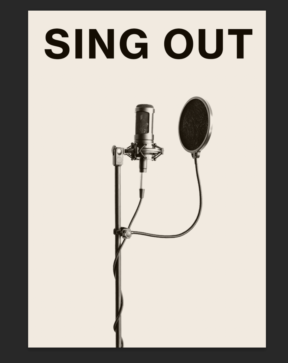
Another visual element reoccurring throughout is a microphone, this is the obvious choice of visual, along with a person singing, but it is also the most affective. The viewer immediately links the visual with the context of the poster and knows through a glance what the subject is, this is definitely something to keep in mind.
The typography hierarchy used in each poster was a quite bold heading, usually sans serif, or a handwritten font, with other sans serif fonts used for subheadings and the main text. I feel like possibly a handmade element could work well, if it was incorporated into the poster yet still looked clean and professional, this is something I can test with moving forwards. As the reproduction of this poster will be in black and white and for a course in a community centre it must appeal to everybody and therefore can’t look too stylised, the typography used must be easily legible for all ages and eye sights, and clearly laid out.
The font used for the main text is Gotham. This font is very clear and easily legible even at small sizes, which makes it work well for a poster to be viewed by all ages with no legibility issues. I kept to quite a large point size at 18, which I felt worked well and would test with a printed version later on in the process. This font would also work well on an A6 leaflet, as this is a smaller size and it still remains easily legible.
I wanted some form of interesting visual handmade element to attract the attention of the audience, and also inspired by 70s xerox style posters, but had to remain professional and keep the audience at the forefront of the design.
I sketched some initial plans for composition, and then went into Photoshop to test with various imagery and fonts I had collected. I wanted the heading to be bold, easily legible and attractive for all audiences. I looked at Helvetica Neue, Grotesk Neue and Futura. Inspired by Fere Jones’ breaking typography I changed the kerning of the letters in Futura until a few of them combined together, I felt that this added some interest to the heading, but didn’t affect it’s legibility. I didn’t want to go into ‘breaking’ the typeface further due to the nature of the audience, and it had to be attractive and legible.
I used a font I had designed myself previously, which seemed to work well, it is easily legible but adds a more playful approach that could be attractive to people who are potentially interested in a singing lesson.
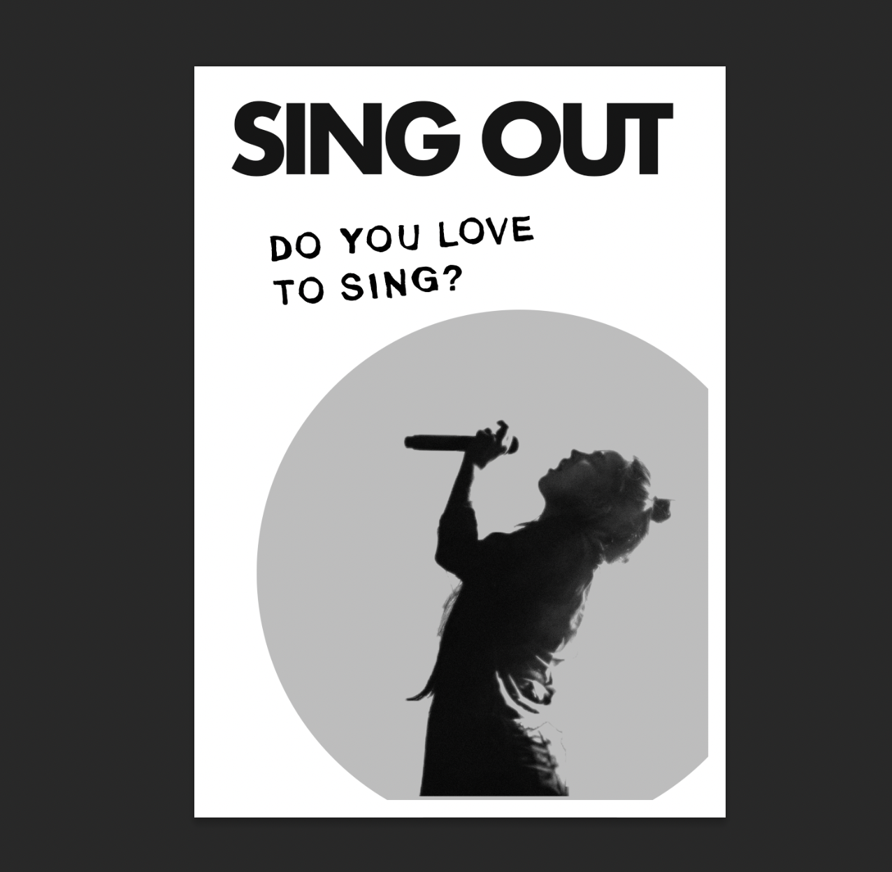
My next decisions to implement was the hierarchy of the information. Which is most important? Which should be larger? Which is viewed first? The heading being ‘SingOut’ the name of the course, was obviously of most importance. Next to this is ‘Do you love to sing?’ which I feel is an engaging question to the viewer, and if their answer is yes, they are drawn to view the poster in more detail.
The imagery used is of someone singing, I debated between using a photo, and a digitally edited black/white version. This version is easier to print, and is less likely to be changed or look less professional on a black and white photocopier, even on cheaper paper or with a ‘bad’ photocopier, so I decided to use this. The silhouette is large and is singing towards the information to draw the viewers attention in this direction.
I decided that the time and date were next important, if the viewer isn’t available then, they cannot attend. I placed this below the heading. The largest information I chose to be aligned left to right beneath ‘do you love to sing?’ I feel like having it in this way makes it appear easier to read, but I may be wrong. The contact information is at the bottom of the poster, which from my research is where it usually is, this is centrally aligned, which balances well with the heading.
I work simultaneously on the front and back of the flyer, comparing it with the poster. I wanted both sides to be visually interesting, because depending on the use of the flyer either side could be viewed first. For example if the flyer was posted in a door, or within a newspaper/magazine, either side could be viewed first. If the flyer was given out at the community centre itself, then it could be handed front side first.
Moving onto the leaflet, I researched various styles of leaflets, some being more corporate, some being more abstract. A common theme was that one side or the front was the ‘main’ visual, and most of the information was on the back, but both sides still remain visually interesting.
I need to incorporate elements from the poster in the leaflet to have continuity across both designs.
I continued with testing various compositions, including the circles and handmade text from the poster for continuity. I used the same Gotham font at 8pts which is quite small, but easily visible especially in Gotham.
Breaking up the information was harder than expected. Deciding what is important to go where took some trial and error. Should the description be on the front? Should the price be largely visible? How abstract shall I go? These are questions I debated.
Final Poster:
Overall I am not as pleased as I’d like to be with my poster outcome but I feel like it could be affective as a poster for a course at a community centre, it is easily legible, and presents the theme (singing) to the audience through imagery and type quite well. It can also reproduce easily on a black and white photocopier.
My final outcome lacks finesse and doesn’t look as professional as I would like. The composition isn’t as affective as I initially thought. I am unsure whether the use of the high contrast image relating to vintage posters was a good idea, maybe a more modern looking simple illustration could have worked. Perhaps I could have tried something more interesting such as the title coming from a microphone or mouth, as sketched in early plans. I could have tested with printing onto coloured paper and included a singular colour for the background or inverted the text/imagery so that was the coloured element. The thickness of the rectangle around the edge I feel may be too thick and close to the text, I could have made this thinner, or even utilised the space outside of the rectangle, having the photograph/illustration inside it and some information outside, this could have looked more professional.
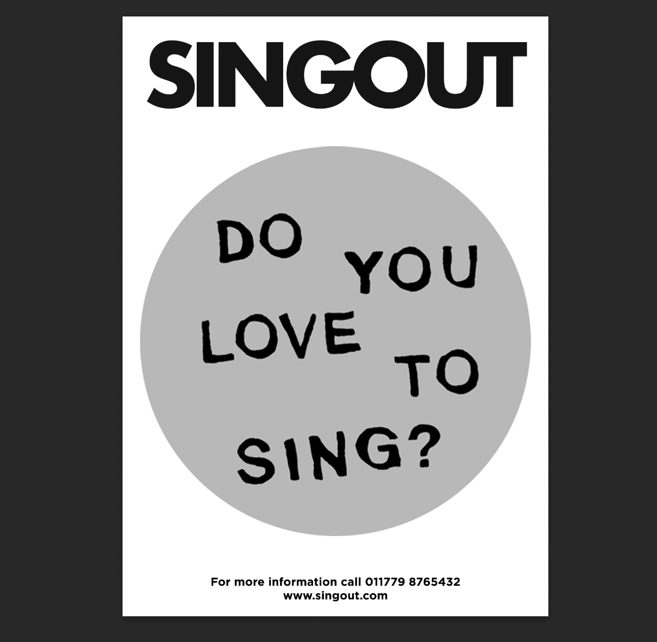
Final Flyer:
I feel like the flyer works better than the poster. I wanted the main visual on the front, with most of the information on the back. The hierarchy of information and what should go on the front and back was hard to decide.
I decided on having a simple front to the flyer, with information on what ‘SingOut’ offers, and their contact details. I feel like this information works well here as the audience will be drawn in by the illustration, then instantly can find out more, this initial information makes it easy for them to contact SingOut or turn over for more information.
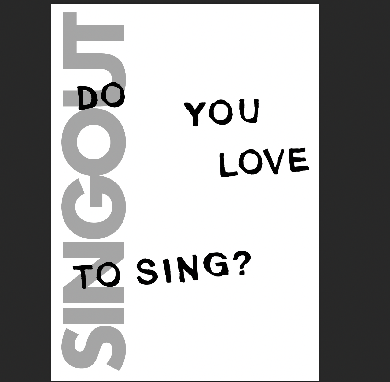
For the back of the flyer I decided on a more interesting composition. I chose to move SingOut vertically and in a light grey to match the fronts circle. The ‘do you love to sing?’ hand written type fills the page, to make it looks visually engaging, and so if the flyer is handed out the ‘wrong’ was around, or placed through a letter box, the viewer is still interested. Instead of having a visual here, the typography acts as it’s own visual element (inspired by David Carson ‘leave it where it lies’ and not using snap guides for all elements of design) and asks the viewer a question.
Overall I think this design looks more professional than the poster, but still lacks finesse. I am unsure of the imagery, and whether the back of the flyers composition is suitable for it’s audience. The flyer is easily legible, but is the hierarchy of information affective? I intended on the design being simple, and legible for its audience but is it too simple? Looking back at my research more interesting backgrounds and visual elements are used, but these may not work for a black and white photocopied poster/flyer.


