Core Concepts- Exercise 21: Birthday List
For this exercise you are going to make up a poster list for yourself. It is intended that you keep it pinned to a noticeboard or wall to remind you of the dates and, as it will be there a long time, it needs to look good.
Start by collecting all the birthdays of your friends and family. You’ll need their name and birth date, to decide whether or not you buy them presents or just send a card, text message or email.
For this exercise I need to produce a functional, clear and legible poster list of friends and families birthdays with the relevant extra information. The poster will be used by me, therefore should be appealing to be, but still useful and adhere to the necessary conventions to be functional. I began this task by researching existing birthday lists and calendars.
The common themes throughout the designs were their simplicity. I think that a simple and clear format is the best way to present this information, it should be easily legible from a glance. The nuances in the designs were illustrations, or handwritten elements- something I would be interested in testing with. Most of the designs were plain, or for younger people, or at least they seemed so due to their brighter colours and illustrations.
I need to establish a format for laying out the information before moving onto collecting it. I began to sketch potential ideas.
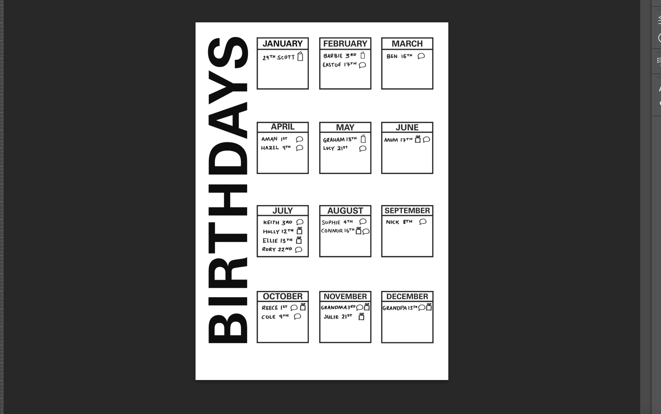
I sketches some initial layout ideas. I think the best and clearest way to present the information is to have 3 lists per month.
One list will be the name, then the date, then the method of saying happy birthday. I think that this should be in a ‘normal’ format left to right columns to make it easy to understand at a glance. I collected my information using Facebook, and a digital calendar. I noted the relevant information down, and used 3 different icons to determine whether I would be sending a text message, present or a card. I am currently unsure whether continuing with the icons is the best way forwards, or whether to use a colour code, or just the word.
I began to test with fonts, to see which would be good to use for the main heading, subheadings and text. I chose a few of my favourite fonts, from Helvetica Neue to Univers. I changed their kerning and how bold they were to see how they looked and worked next to each other. For the title I decided to use Univers, the main text I am yet to decide on.
Tobias Frere Jones:
A suggested designer to look at was Tobias Frere Jones. Tobias is an American typeface designer and has designed many fonts including Gotham! I discovered this font through the work of Chris Ashworth and am really interested now I have been informed of it’s designer! The talk shown to me by my tutor was gave an insight into the working of Tobias.
I made a few notes throughout the talk. A part that stood out to me was his love for breaking apart typefaces and letters for the sake of exploration: “Break stuff and see what happens.” This ethos just shows how Tobias has got to the position he is in, and is able to create great typefaces used by many. Moving forwards with this task, as this posters for myself I am using it as a chance to explore my chosen typefaces and see what I can do with them with this mindset of exploring.
I tested with a few different pens to add the handmade style for the poster. The thicker marker pen looked best to me. I developed the layout from my initial sketches, and the individual boxes that contain the information for that month. I continued with the use of icons, as they are simple to understand and I think that it is obvious as to what each means. I added a ‘notes’ section, an area to add any extra information on a particular birthday etc that can be viewed easily. I feel like this layout works well and now I am interested in seeing how I can change the typography/visuals but still allow the poster to be easily legible.
I immediately want to screen print this and test that way, but have decided to create some digital distressing and see how I can make something interesting just within Photoshop using texture I have already.
For my final outcome I used different paint markings and prints to create a distressed look. I really enjoyed experimenting with this, and quite like the look of the outcome. I am interested to see what the outcome would have been if I had screen printed the design. The distressing doesn’t take away from the legibility of the design, it is still clear and the layout works for me.


