Core Concepts- Exercise 12: Photomontage
Exercise 12: Photomontage
For this exercise you are going to make a montage or collage with a political message. Your subject matter could be a current issue, or something that you feel strongly about such as animal rights, the treatment of elderly people in hospital or images of women in the media. Collect images from newspapers, magazines, your own photographs or images online. Do remember that some images may be copyright – particularly anything associated with commercial companies or organisations. Create new meanings out of these extant images by juxtaposing and contrasting them. Be imaginative, playful, provocative or humourous.
To begin this task I thought it would be good to research/collect more information on some artists to gain some inspiration. I collated my findings as a few mood boards, I find this the best thing to do as it’s easy to refer to when working.
Bast:
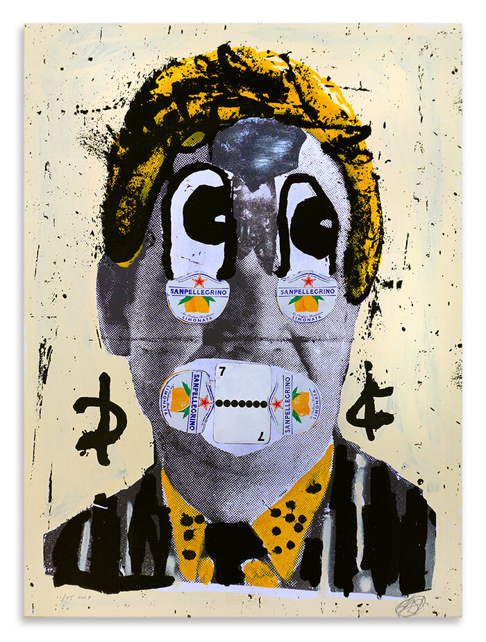
Bast is one of my favourite artists who uses collage and interesting combinations of materials/textures to create their visuals. “BAST is a Brooklyn based, New York urban artist and is one of the few international street artists to retain a level of anonymity.
Using collage to create “mutated characters” and “mutated scenes,” Bast has been embellishing urban environments in New York and Europe with his wheat-pasted posters for nearly two decades.
Bast uses iconic images from 20th- and 21st-century mass culture to create collages that combine cartoon characters, American food stores, and sex advertisements resulting in edgy, uncompromising compositions.” -A fitting description from Art shop ‘Well Hung.’
I love the combination of physical and digital methods they use, the digital photo editing, then being printed and finished by hand.


Richard Vergez:
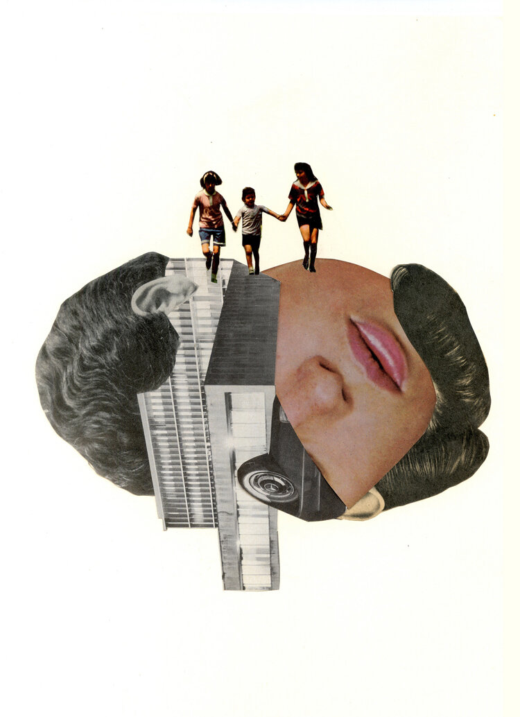
Richard Vergez is an artist I have recently came across and his work is brilliant. “Richard Vergez is a Cuban-American visual and sound artist. He was born in Philadelphia, PA, worked and lived in New York as member of the Brooklyn Collage Collective, and currently works and resides in South Florida. His background in graphic design and audio/visual collaboration is reflected through his hand-made collaged works on paper and mixed media. Imagery which combines both human and technological elements relates to ideas surrounding an ever-evolving modern dystopian identity.”- ‘Cargo Collective’ website. His use of different imagery and combining them with shapes creates very interesting visuals, I really like his minimal approach.


This image was from a 1980s ballet magazine. I initially intended on using the ballet dancer in a collage, but found that the space it left had even more potential for a good collage. I thought of including more negative imagery behind it initially, but I then went for a more positive approach and chose a page from the magazine with typography I felt added to the meaning of the image. I wanted the empty silhouette to convey lives and potential that can be taken away by ignorance, in particular police brutality. I am very glad that last year, even if it was for a short amount of time for some people, that light was shed and people listened to these issues that happen around the world, but in particular America. The words ‘dances’ and ‘profound’ stood out to me. They present the future someone could have, and the lack of imagery of a person shows unity.
I created my mind map on some topics I feel strongly about, whilst doing this I was looking through books/magazines I have collected to find suitable imagery. I eventually decided to focus on the Black lives matter movement.
I cut out and moved around images physically testing which could work together, and eventually moved into Photoshop. I began with a more minimal technique inspired by Richard Vergez’s work and produced a few interesting outcomes.
Image 1:


I recently bought a bulk buy of old vogue books form ebay to collage from, with this task in mind . There were many portraits/interesting images to go through. Inspired by the works of Bast and Hannah Hoch I wanted to create my own montage, with the aim to present black and white people as the same (human) but celebrate peoples differences. I began with the idea of using legs and arms as a sort of wheel or circle, and then moved onto creating a montage of a person.


Image 2:
I was debating between a more blended version of the collage into the background, where the overall image looked more whole and the more broken up style of coloured collage. The blended version sort of takes away from the meaning of what I wanted to convey, but looks more aesthetically pleasing. I decided to stick with the coloured collage. I chose an old piece of paper for the background to contrast with the newer more ‘clean’ looking images of the vogue models.
Overall I wasn’t very pleased with this outcome. I feel as if I should’ve stuck with my initial more minimal approach with less combinations of photos, or added to the background of the image and created a more interesting collage, or even added some type. As I look back at work I’ve created I usually am quite frustrated with the outcomes, even if I like the meaning. I hope with time to improve technically so I suffer less from this issue.
There was a style of photo montage/collage that I began to develop when creating the ‘Trump’ card from the last assignment and I took this task as an opportunity to try improve on that style and add a newer take on it.


Image 3:
I began this collage by finding lettering from various old magazines/newspapers. I then added various paper textures, black white and and orange to contrast. I originally wanted to focus on the colour red, to have more negative connotations, but as the collage went on I chose orange which has a similar strong energy, but less negative. I layered imagery of the body parts I chose from the vogue magazines going for a more surreal look of the ‘B’ having arms. The white arm was higher to show the ignorance of people with nonsensical backwards mindsets, and the black arm was inverted backwards to portray the struggle people still go through today. The pencil line was intended to lead the viewer through the image and act as a line of separation, and a finish line. The imagery of the clouds was intended to add some positivity to a more darker collage and look into a brighter future. After testing different background colours I decided to stick with the white colour as it allows the more off white colours/oranges to stand out more.
I enjoyed this task and had some interesting outcomes. I definitely want to continue with collaging and creating new/interesting visuals. This exercise helped me focus on creating visuals that portray a particular message. I did intend on creating a mixture of screen print and image collages inspired by Bast’s work, but I am aware of the time I have spent on this task already. This will definitely be something I can try with in future tasks.
