Core Concepts- Exercise 11: Abstract cities
Exercise 11: Abstract cities
Create a series of 10 abstract designs in which you balance blocks of subordinate, dominant and accent colours. These designs are going to be used as covers for guidebooks to the following cities: Madrid Malmo Managua Manchester Manhattan Marrakech Marseilles Melbourne Montreal Mumbai
When reading the brief for this task a couple of artists that I like came to mind, Isabella Cotier and Ed Cheverton. I decided to look at their work more in depth and do some further research on their practices before beginning with the exercise.
Ed Cheverton:


Ed Cheverton is an Illustrator based in Bristol. He has produced work for many companies/people such as BBH London, WIRED UK and Accent magazine. I know his work from Instagram and love how he uses coloured/textured papers/materials to collage. His abstract approach to creating almost landscapes using this method is interesting, which will be something I will consider when producing my abstract cities.
I feel like I should test with various papers/textures I have collated from personal projects and from past exercises. This approach could produce more of a ‘feel’ for the cities than plain colour in Illustrator for example, but maybe I should try both and compare.
Isabella Cotier:


I came across Isabella Cotier through this Youtube video. Isabella is an artist based in England who chooses many mediums to work with. I particularly like her drawings combined with collage. The colours and textures she uses are often very colourful, but my favourites are the more toned down ones such as the first image on the left. When thinking of creating a collage about a city this is what came to mind, interesting colours and textures.
Madrid:
I began this task by researching Madrid. I came across a website called lonely planet, where they break down cities/places to go around the world, it provided a good amount of information about Madrid and could be good for information on the other cities. Madrid looks amazing, from it’s architecture to its landscape.
“For centuries, Spanish royals showered praise and riches upon the finest artists of the day, from home-grown talents such as Goya and Velázquez to Flemish and Italian greats. Masterpieces by these and other Spanish painters such as Picasso, Dalí and Miró now adorn the walls of the city’s world-class galleries. Three in particular are giants – the Museo del Prado, Centro de Arte Reina Sofía and Museo Thyssen-Bornemisza – but in Madrid these are merely good places to start.”
“Spain's broad sweep of architectural history provides a glorious backdrop to city life, from medieval mansions and royal palaces to the unimagined angles of Spanish contemporary architecture, from the sober brickwork and slate spires of Madrid baroque to the extravagant confections of the belle époque.”


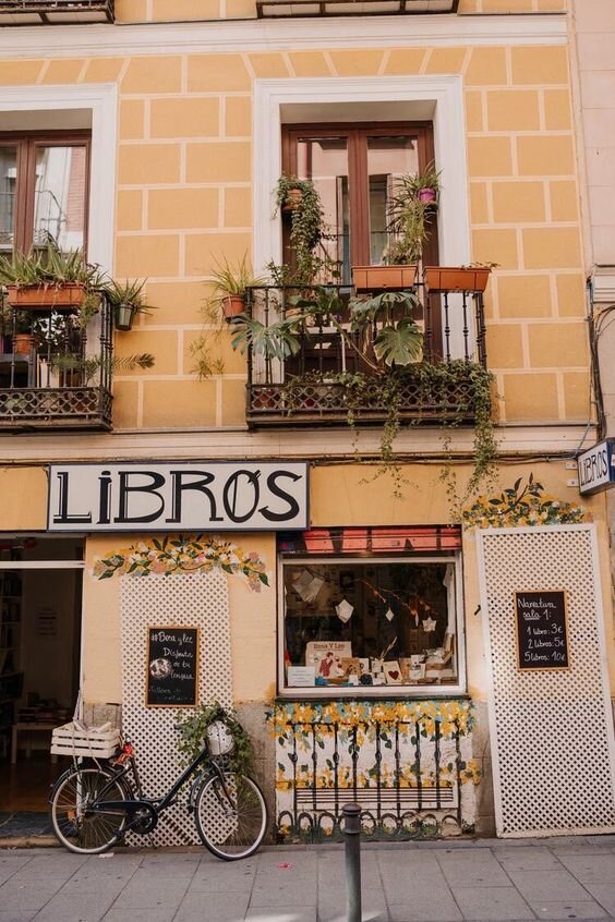


In Madrid there is the art museum Museo del Prado which is home to works by artists such as: Ruben, Rembrandt, Botticelli and Bosch, which is not my personal favourite style of art, but brilliant figurative paintings, that adds to the overall feel of the city. I decided to look at more visuals of the city, to gain more of an insight to it’s architecture and colours.
I began by laying out various papers/collage material to choose from. I had also pre painted/drawn on some paper in different colours to add some texture. For this first collage I decided on this terracotta oil pastel colour spread across the page in different shapes. This colour represents the many terracotta roofs there are which stood out to me when looking through images. The more abstract shape is to portray the varied old architecture there is in Madrid. The more beige coloured shape is also to represent the yellow/white colours of the old architecture, and also to show the warmer climate. The overall warmer ‘main’ colours are to show what I imagine to be a happy, sunny city. The small amount of green is to contrast with the orange and show the plants/nature growing within the city and on peoples balconies or outside shops. The black boxes represent the higher story old buildings and their windows within the more busy part of the city and the circle being the sun shining down on the city below. I decided to use black instead of a yellow inspired by the more urbanised areas of the city.
Malmo:
I hadn’t heart of Malmo before, Malmo is Sweden’s third largest city. “'The bridge', connecting the city to cool-cat Copenhagen and its busy international airport, has helped forge a dynamic urban conglomeration. This, and the fact that Germany is just a short hop across the Baltic, helps explain why more than 150 nationalities call Malmö home.
Indeed, Malmö is the worldliest, grittiest and most continental of Sweden's major cities, a place where Middle Eastern markets, Italian coffee culture and edgy, gritty bars challenge Nordic stereotypes at every corner.”
The city is a contrast of Dutch renaissance buildings and modern architecture. I looked further at images of Malmo. For this next city I decided to give myself a time limit on creating the collage to half an hour, then I could go back and look at it/edit, as I spent too much time changing the first one around, as I’m creating 10 I can’t spend as much as I’d like on each.


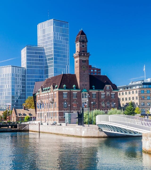


I decided on a colder colour palette for this collage. The grey semi circular shape represents the interesting modern architecture there is in Malmo, and the graph paper layered on top of it is also to show the thought and process that goes into the design of these buildings. The black and beige colour blocks above are to show the contrast between older renaissance buildings and the newer. The blue blocks are to show how the city is almost surrounded by water, I decided to have them as broken up blocks rather than one large amount of blue to show this. The yellow block in the corner represents the more vibrant colours in the city, like larger buildings in different colours, and also is a match to the blue making up the Swedish flag.
Managua:
Again, I hadn’t heard of Managua, I think this task is showing the holes in my geography knowledge! Managua is the capital of Nicaragua. “Managua is not the easiest place to get your head around. It has no discernible center; its attractions are scattered around its many neighborhoods and the trick is to know when to go where.”
“Aside from diving into the spirited whirl of sprawling markets, improbable electric trees, remarkable street art and impressive monuments, Managua also gives you easy access to nearby lagoons, the nature reserve of Chocoyero-El Brujo, plus a smattering of fun beaches like Pochomil.”
Managua is home to various brilliant looking old architecture such as the ‘Antigua Catedral,’ ‘Plaza de la Revolucion'‘ and ‘Parque Histórico Nacional Loma de Tiscapa'.’ The capital looks diverse and interesting, I’m looking forward to producing a collage for this in particular.


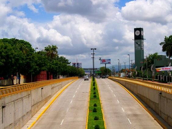


The main colours I chose for Managua were blue and green. The blues represent the clear sky, lagoons and nice weather, and the green for the more tropical surroundings. The blue and green sections are ripped to show the difference between richer and poorer people who live there, almost 45% of people live under the poverty line, mostly in rural areas in Managua. The small blue square in the green is to represent that there are a mixture of people who live there in different situations. The grey circle is to show the more urbanised areas, and the triangle represents the heat and warm weather but is shaped this way to show the interesting older architecture. I decided on a more scattered approach to this collage to display the fact that the city is spread out and that there isn’t a clear ‘centre.’
Manchester:
I have been to Manchester a few times, for nights out so not much sight seeing involved! “The one-time engine room of the Industrial Revolution and a city that incubated communism, suffragism, vegetarianism and a bunch of other 'isms' aimed at improving humanity's lot. In the 21st century, invention, discovery and progress remain the driving forces of this remarkable place.”
Manchester’s is busy, and has diverse architecture, some old and some new. It is home to Manchester Art Gallery which has ‘the best assemblage of Pre-Raphaelite art’ and different pre-17th-century art. I wanted to find more imagery to develop an idea for the colours/composition of this collage.


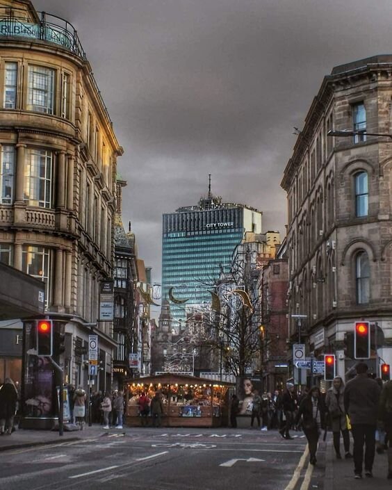


I decided on a darker colour palette to represent Manchester due to it’s weather and the fact it is an urbanised concrete city. The cut out grey shape represents the cities railway line bridges going over other areas. The grey/black textured rectangle in the bottom right is to portray the cities streets and texture of the concrete floors. The beige rectangles coming from the top are in different sizes to show the varied landscape of buildings, and the beige representing the older architecture. The scattered black/ beige rectangles are to show the denseness of the city and how busy it is. The blue circle portrays the cities canals, and also acts as a sun shining down on Manchester but is blue to show the British cold weather.
Manhattan:
Manhattan is the most dense of the New York boroughs, home to the financial district, the National September 11 Memorial and Museum, One World Observatory and Wall Street it has always been a place I have wanted to visit and hope to one day. It is also home to the statue of liberty, the Fraunces Tavern Museum and Federal Hall. Manhattan looks very diverse, home to the richest of the rich and the very poor. I look forward to producing the collage for this city.


I decided on a more grey colour palette for Manhattan as it is a very urban city. The 2 colours of yellow are to represent the September 11 memorial and the buildings that were once there. I chose yellow to represent this as it is a more positive colour in memory, and is the colour of the yellow cabs seen throughout New York. The graph paper is to show the design and grid like pattern of New York’s layout. The spray painted lines on paper cut out in a wavy line represents the graffiti and streets of Manhattan. I wanted it to be a wavy line also to show the facts it is near the sea, the blue box is also to portray this.
Marrakech:
Marrakech is a formal imperial city in Morocco. It is a densely populated city, home to many gardens, mosques and palaces. Wow does Marrakech look great, its architecture is very different to anything in western society, it is full of bright colours and interesting buildings. The medina here is full of people, and stalls selling all sorts of items, its layout is almost maze like. “Marrakesh is a city steeped in ancient artistry that continues to thrive, kept alive by the modern craftspeople of the souqs and the contemporary art and design scene of the Ville Nouvelle.”


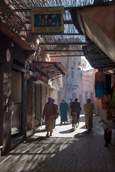

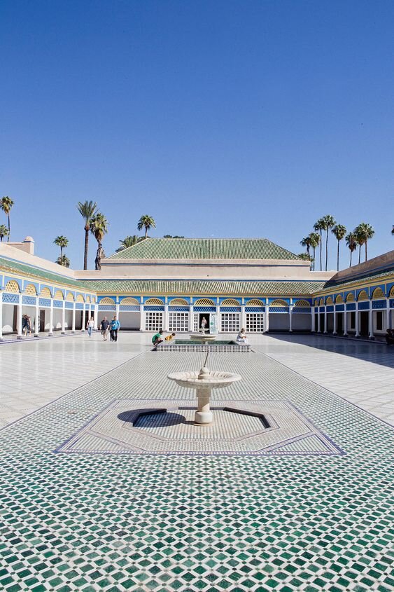

I wanted this collage to look busier and more colourful. I decided on the orange/terracotta colour for the ‘arch’ to represent the various archways and streets of Marrakech, and also to show the heat. The blue shape is to represent the sky and I wanted it to be a different shape to the brown rectangles to exaggerate them and show the varied architecture of the city. The brown rectangles are to show the maze like streets of the city, and the beige in the corner is the sun coming down on the city, but also in beige to show the colours of the buildings and palaces.
Marseilles:
Marseilles is an old port city, stretching back to classical Greece. Its architecture is beautiful and old, full of higher rise buildings. There are many museums in Marseilles including ‘Musée des Civilisations de l’Europe et de la Méditerranée and Musée d’Histoire de Marseille. ‘Château d’If’ is an interesting castle in Marseilles port, where political prisoners were incarcerated, including people that started the French revolution in 1871. This city if packed with history and will be an interesting collage to create.
I wanted this collage to be scattered and separate to represent the boats in the harbour and the different buildings in the city. The 2 blue rectangles represent the sea and the harbour. The spray painted paper is to show the graffiti within the streets and is overlapping the cooked paper which is the colours of some of the older architecture, this shows how the modern overlaps and lives side by side with the new. The orange circle is to show the pockets of colour in the city and the buildings roof. The scattered beige boxes are to show the high rise windows.


Melbourne:
Melbourne is the 2nd largest city, found along the coat of south Australia. Home to amazing buildings, bridges and is considered the most ‘European’ of Australian cities. It is full of restaurants, bars, and interesting street life, including great street art. There is the Royal Botanic Garden in the middle of the city, full of different plants/flowers and looks brilliaint. The city was established in 1835 and named after the British Prime Minister at the time, Lord Melbourne.


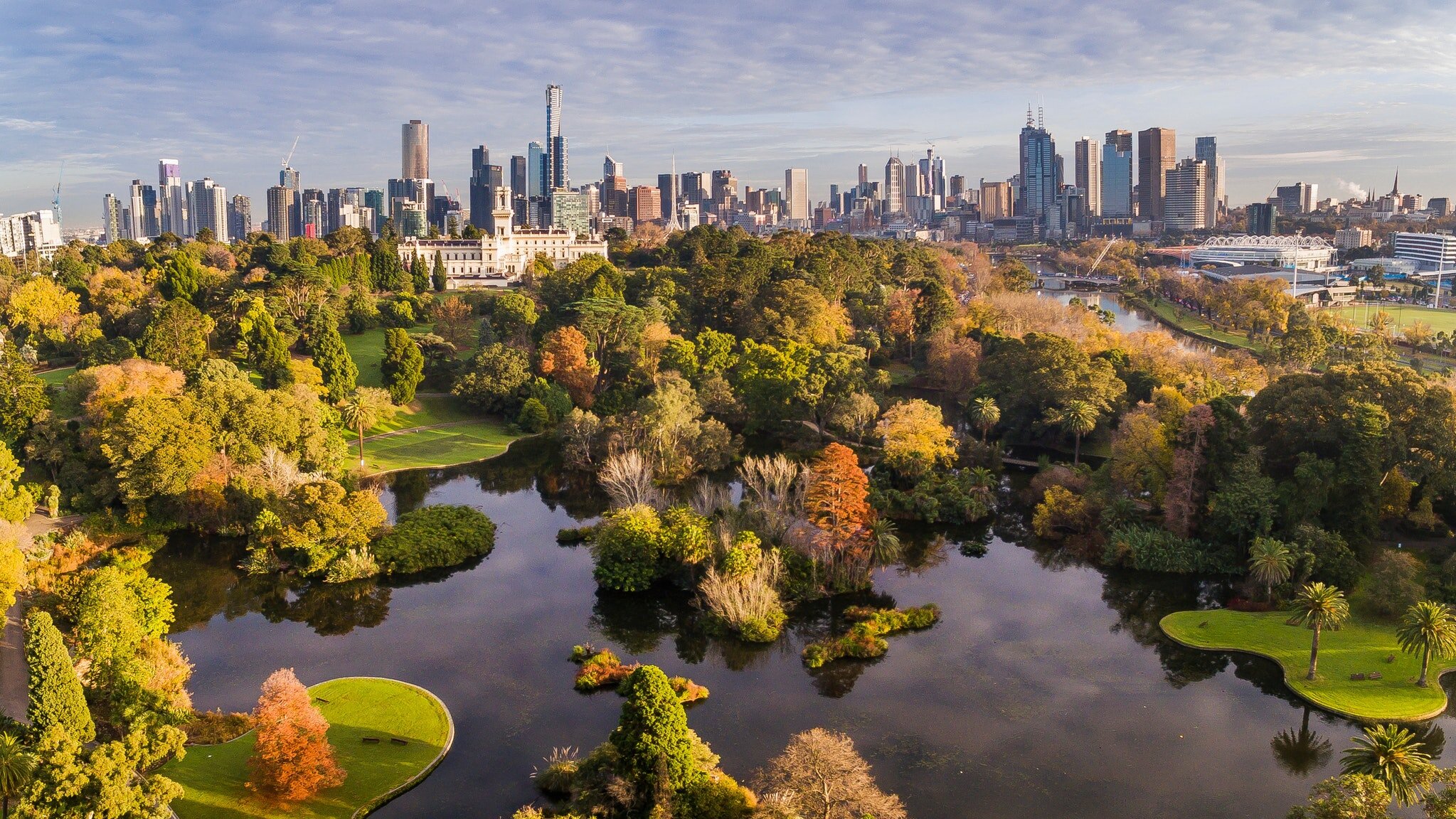


I loved the look of Melbourne’s cityscape and wanted to portray this the most in this collage. The rectangle/triangle are to show the varied landscape, the blue box below represents the sea, and the merge between the city and nature. The graph paper in the sky is to show how Melbournes city is designed upwards and how if you look up you’ll still see the cityscape. This is also the reason I chose to put the yellow circle representing the sun, below the graph paper to show the sun coming between the buildings. The black textured paper is to show the street art and urban areas of Melbourne.
Montreal:


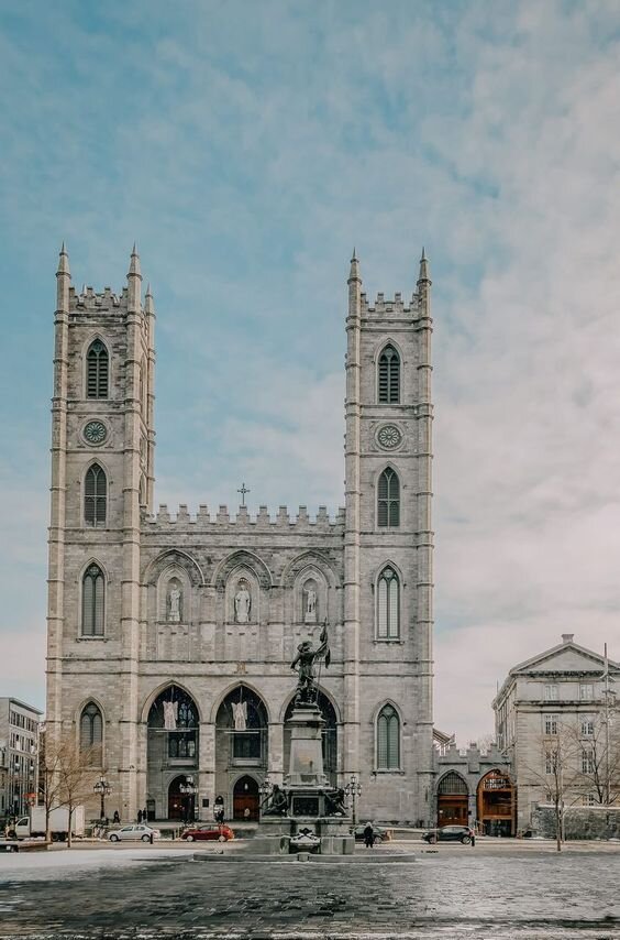

Montreal is in the south east of Canada, and is Canada’s second largest city. It is a French province and the largest city if Quebec. “The architectural sweep of the city takes in a wealth of heritage churches such as the breathtaking Basilique Notre-Dame, as well as 20th-century icons like the Stade Olympique and Habitat 67. Montréal's hotels and museums additionally push the edges of contemporary interior design.”
“There are some 250 theater and dance companies, more than 90 festivals and a fascinating medley of neighborhoods where artists, writers and musicians have helped cement the city’s reputation as a great arts center.” Montreal seems to be packed with culture and interesting architecture, I looked forward to producing a collage for this city.
I wanted this collage to represent the different ages of architecture within Montreal, from the old churches to the more contemporary buildings. The hole in the grey square is to show the new within the old. The green next to it represents the gardens and greenery, and the orange is again the contrasts within the city. The blue rectangle is from an old book spine to show the cold temperatures and again the age. The semi circle is ‘on top’ of the city is Saint Joseph's Oratory, which is the largest church in Canada, and I feel is a big part of the city.
Mumbai:
Mumbai, is located in southwestern India. Mumbai is the 2nd most populated city in India home to over 18.4 million people! Despite Mumbai being the country’s financial and commercial centre it has many issues such as air and water pollution, substandard housing, and overcrowding. The city is very dense but full of colour and life. The cities most famous landmark, the Taj Mahal Palace is an amazing building built in 1903 by Parsi industrialist JN Tata, after he was refused entry to nearby European hotels on account of being ‘a native.’


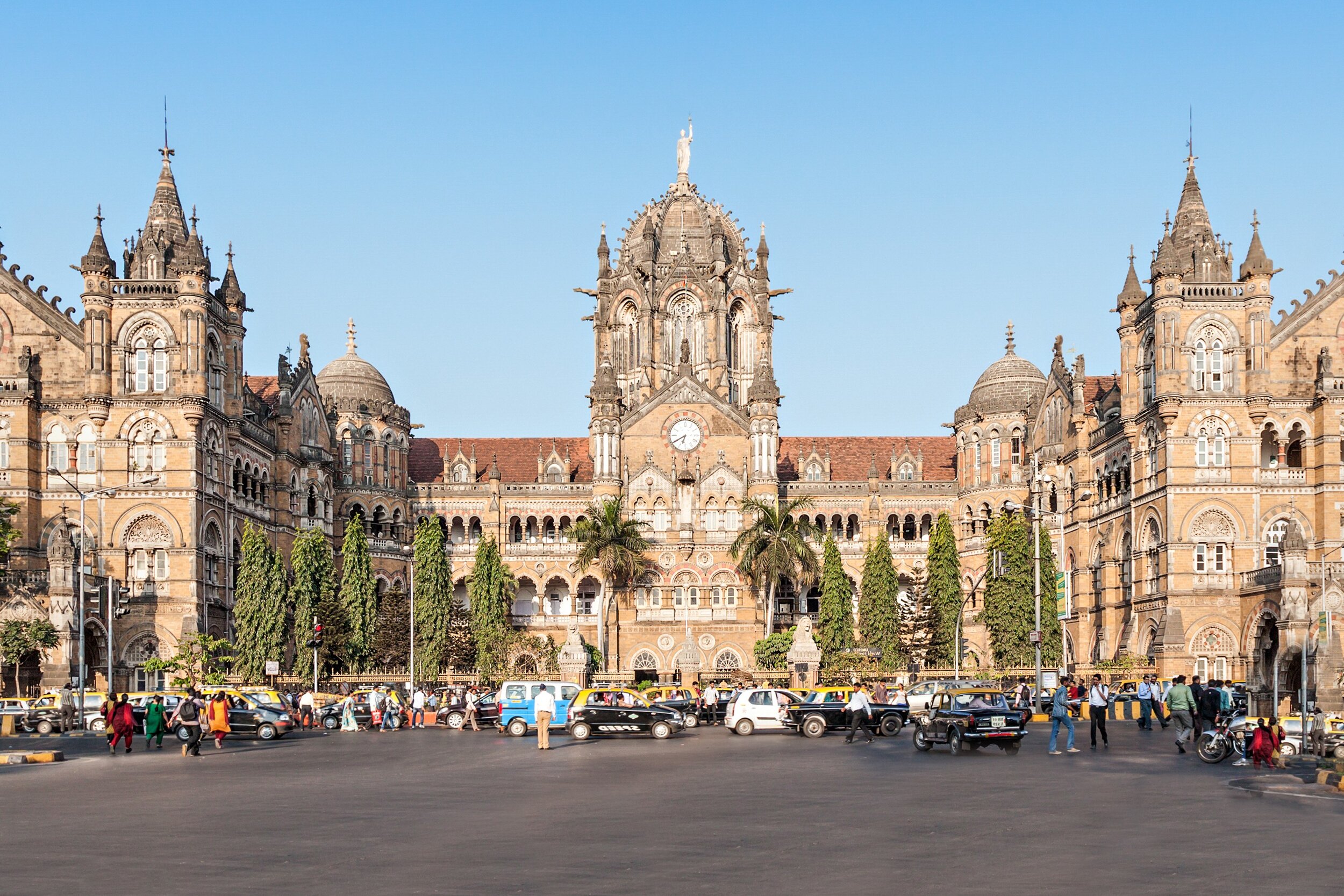

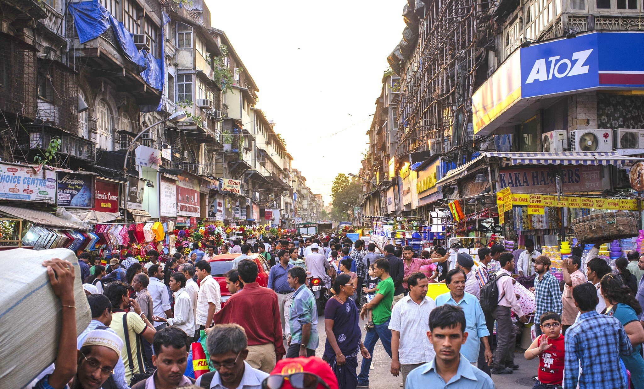


For this last collage I wanted to portray the busy streets and colours of Mumbai. The cardboards represent the extreme poverty and pollution problem within the city, and are at each end to show that within it is still colour and people. The orange and yellow represent the heat and vibrant colours in the markets, but are separated by blue, being a more cool and sad colour, representing the overcrowding issues (the rectangle cut out the middle is more people being crammed into the city.)
Overall I enjoyed the task and testing with different colours/shapes. I found it interesting to think why and how to form each abstract collage. I don’t particularly like my results from the task, but it was good to try and I can definitely take some of the shapes/more abstract ideas further in future work. I wanted this task to be analog rather than in Photoshop/Illustrator to test with colours and textures which was also helpful.

