Graphic Design 2.1: Professional Practice, Project 8: ‘Branching Out’ Assignment 8
Assignment 8: Working with a Difficult Client
Part 1- First select your client. Will you be working on a project for:
The bigshot: This client has a huge budget and a huge ego.
The penny-pincher: This client will cut corners and limit spending.
The misinformed: This client doesn’t understand exactly what they need.
The wanna-be-designer: This client wants to art direct your work.
Now select one design brief:
Branding. Design the masthead and a selection of spreads for a catalogue of a national travelling exhibition titled ‘Gold of the Incas’. Each location the exhibition visits will also need branded site plans and guides specific to the location.
Information Design. Design a wayfinding system for a transport hub. Create the environmental signage system, this can include dynamic signage (screen displays) and static signage (directional navigation), printed schedules and route maps, vehicle stickers etc.
Type, lettering and printing. Create an innovative calendar for a font foundry to use as a marketing tool. The calendar should demonstrate novel ways of using some of the foundries' popular typefaces.
Next, you will start the design work. Complete your research, conceptual development, thumbnail sketches, and initial drafts right through to early prototypes or mockups. Prepare 2-3 concepts to share with your client for feedback before proceeding to part 2.
Part 2- You will share your mid-stage design work mockups or prototypes with your difficult client for feedback before you finalise the work. This part requires using your imagination.
Read the feedback you receive from the client you selected:
The bigshot: “I don’t like the way it looks. Can we just replace it with this image I found on the internet?”
The penny-pincher: “We don’t have the budget available. Can we strip away some of the excess?”
The misinformed: “It looks nice, but can you make it more modern by using AI or something?”
The wanna-be-designer: “The colour needs to look more luxurious and the size is all wrong.”
Having heard the feedback you will need to decide how to respond to the client.
Document your response in your learning log. Imagine what it would be like working with the person. Would you refine your work to satisfy the client, get the project done and move on? Would you try to rationalise your design choices and convince them to implement your ideas? Would you try to find a middle ground?
Your final design solution needs to include the response you would send to the client.
I was intrigued by this task and the varied, interesting briefs/clients. I began by choosing the client and design brief. I decided to go with the 2nd client The penny-pincher: “We don’t have the budget available. Can we strip away some of the excess?” as I felt that could possibly be the most frequent type of client to come across. I could imagine many business owners wanting to save as much money as possible, especially if a start up, or if taking a bet on something they were unsure of, for example this calendar for marketing reasons.
The brief design I selected was ‘Type, lettering and printing. Create an innovative calendar for a font foundry to use as a marketing tool. The calendar should demonstrate novel ways of using some of the foundries' popular typefaces.’ This brief jumped out at me to be the most interesting but it also has a high potential for awkward exchanges between designer/client, which makes it challenging. Reading the potential client response for part 2 being“We don’t have the budget available. Can we strip away some of the excess?”. The client may feel a certain way about the design and budget, but the designer will have designed the calendar in a certain way for specific reasons. With all of this in mind, I moved forwards with brainstorming and researching the brief.
Figure 1 shows ‘Fontshare’ by Indian Type Foundry (ITF). They have a great collection of free to use fonts and even show examples of good font pairings.
‘Uncut’ is another type foundry I return to regularly to find new typefaces, or to just remind myself of what I have/they have to offer. Their website is great, it’s simple and a really nice way to show the user how each typeface looks.
Whilst making notes and jotting down ideas, I researched calendars, collating some of the more interesting compositions to refer to (figures 5-9).
Whilst making some brief thumbnail sketches of composition ideas/general concepts I researched some more visual inspiration, focusing on typography. The main idea of the calendar was to demonstrate ‘novel ways’ of using the type, which gave me an idea to have a different typography experiment for each month. The first experimental typography designer I thought of was Wolfgang Weingart, I collated some work by him shown in figure 10.
Studio 245 (figure 11) aka ‘Unseen Sketchbooks’ is a studio ran by Gavin Ambrose who designs and prints books. Figure 11 shows some imagery taken from his Instagram page, which are great examples of fun, experimental typography.
I decided with the type foundry ‘Uncut’ as they have a great range of interesting and different typefaces to choose from, some of which could be more of a challenge to produce designs for as they are quite experimental.
I took some time going through the type available, testing and collating my favourites to represent each month. My original plan was to have typography that visually represented each month, but decided to use colour within my designs to represent the month instead (e.g. blues for winter months). I intended for this to have a more ‘random’ feel that focused on celebrating the typography.
I intended for the designs to be experimental, but simple in the sense of not having large spaces for notes for each day of the month etc and focus on mainly the design aspect of it but still remain functional for seeing which day it is.
I made thumbnail notes of my design ideas, with intentions to combine tactile and digital design techniques to promote the type foundry’s various typefaces. I decided that a ‘typography collage’ for each month of the year could work well as a calendar.
For April I began by layering the type in Photoshop and printing it out using an inkjet printer onto the wrong side of acetate made for a Xerox printer. This allows for the ink to sit on top of the acetate and becomes able to be re-printed, allowing for a range of interesting textures. After a few re-prints applying different pressure to the ink, I scanned in the best version and continued to edit digitally.
I tried a different transfer technique for June. Here I printed the text out normally, onto copy paper, then experimented with spraying water across the print, placing it onto a fresh sheet of copy and applying pressure until it prints. This had interesting results, which were hard to control as some of the ink seemed to transfer and other parts did not. This allowed for a fun looking result, especially after digitally editing.
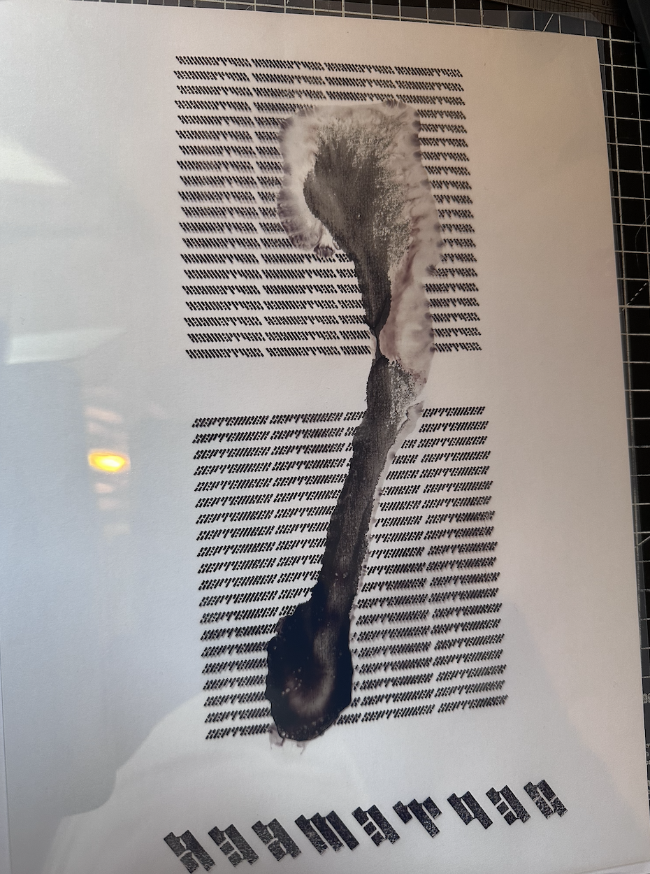
September was quite a hard typeface to create a design for. The type foundry ‘Uncut’ has some great typography and this style of type was really interesting to me. Inspired by the previous design for June, I decided to experiment again with water, this time creating a large singular drip, as if something was spilled.
For October I printed various sizes of the type and cut out sections of it. I compiled them together, once scanned the ‘cut’ lines were visible, making an interesting result when cropped into.
CONCEPT 2:
After brainstorming/coming up with a rough plan, I started with researching my favourite font foundries that I always go to when looking for new typefaces.
‘The League of Moveable Type’ (Figure 2) were founded in 2009 and offer open source fonts. They began with an aim ‘To raise the design standards of the web.’ The League of Moveable Type has a more limited range of typefaces, but each are different from the last and all stand out- this could be a fun foundry to produce the calendar for.
‘Collletttivo’ (figure 4) has some really nice and original typefaces. I particularly like the ‘vintage’ style type that they produce, each typeface (Mazius Display being my favourite) feels like a complete design in itself due to their interesting lines, serifs and negative space.
Figure 12 shows work by Piet Zwart, a multi-disciplined designer. Zwart experimented with type in the early 1900s, creating compositions that are still visually interesting today.
After considering the calendars shape, I moved forwards with the standard square design (figure 13 mock up), again to put focus onto the typography as this is a promotional design for the type foundry and not a calendar company nor intending to just promote as a calendar brand.
I began by using January’s bold type and layering it digitally to intertwine the letters. I aimed to create a balanced design, solely using the type, inspired by Wolfgang Weingart’s work (figure 10.
I then used the serif style type for February to create a ‘pile’ of letters that looked visually interesting. I tried to have the month be relatively obvious/legible immediately, whilst still being visually interesting.
Using the liquify and blur tool in Photoshop, I tried to emulate the effect of a scanner/type technique, dragging the type in different directions. My colour palettes for each design were based on representing the weather and ‘mood’ of each month, with march being a colder, but green colours as there is spring on the horizon.
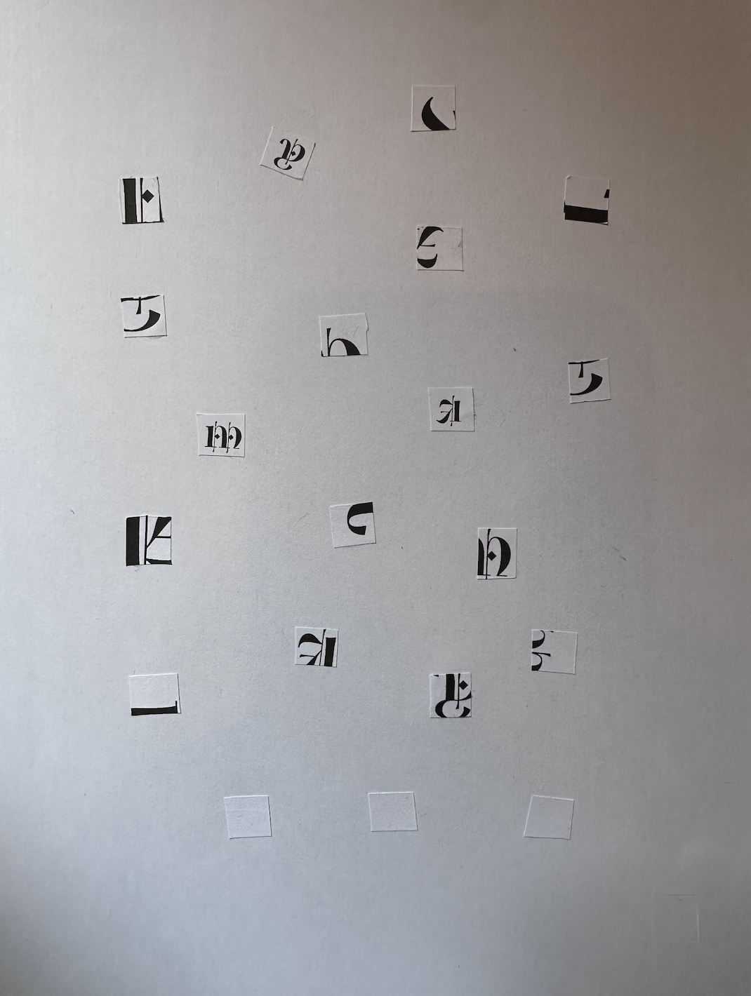
For May I wanted to create a grid collage, breaking the ‘old english’ gothic style type into sections. To add more visual interest and give it a more tactile feel, I cut squares out from the type physically, stuck them down and scanned them in. This produced a nice line shadow around the edges of some of the squares, which I reproduced to form a grid.
For July, I tried a similar digital technique to March, this time creating a slight spiral movement and sizing the letters differently in hopes to make it more dynamic. I then chose a warm yellow colour to represent the July weather.
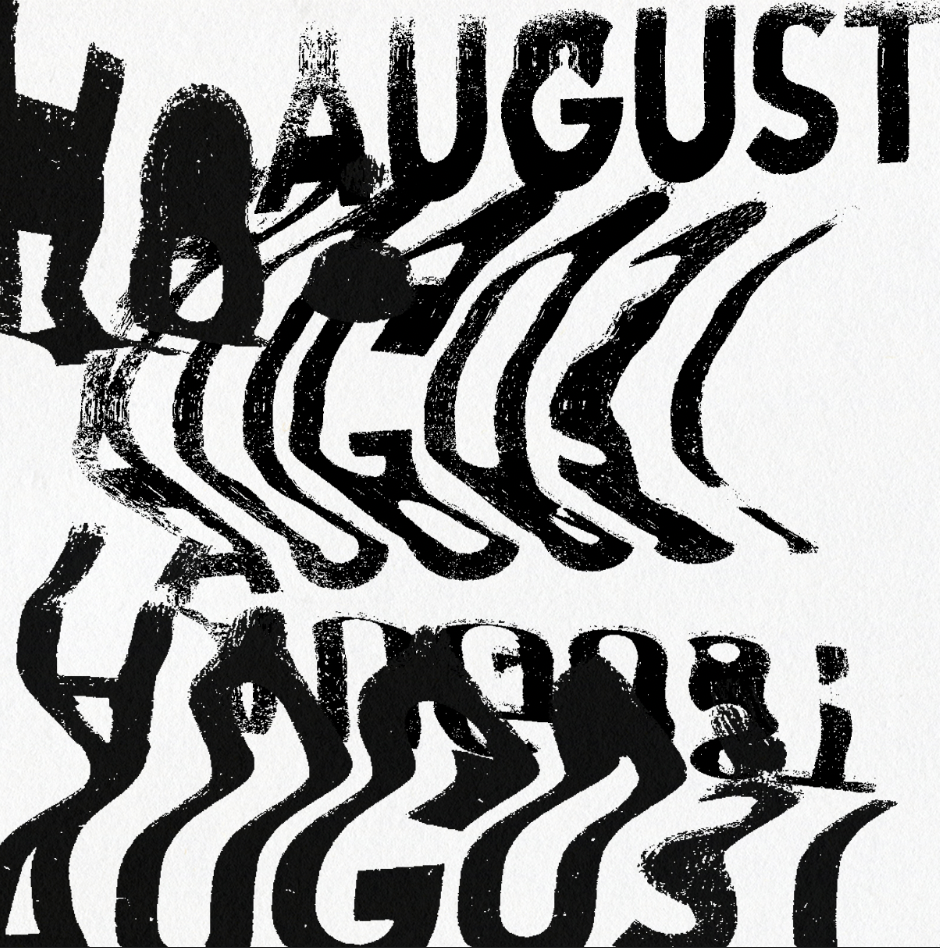
Instead of digitally editing August, I used a scanner to hand scan the typography, creating interesting results, especially when layered. I then layered these digitally, which created a fun design.
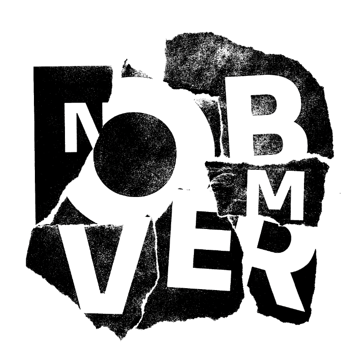
For November I created a paper collage, printing white onto black, scanning it in and digitally editing. With December I created a simple composition of the letters, only adjusting them sideways.
CONCEPT 1:
CONCEPT 3:
I moved forwards with concept 2. This allowed the design to have room and stand out on it’s own whilst being a functional calendar. I like the 2 page per month classic calendar style as it is very clear what the date is, the aesthetics of the calendar imagery is there and more importantly the typography is presented for the type foundry in a different/ ‘innovative’ way.
I chose bold colours to represent each month’s weather/general feeling to add a more fun style to the calendar.
The penny-pincher: “We don’t have the budget available. Can we strip away some of the excess?”
I completely understand your concerns regarding your budget. The concept I had designed is visually strong and would work best in full colour, as presented. If this is not an option for you, there are a few options that I can suggest which would still offer the same quality design, but in a more affordable manner. Option 1 (which I would recommend): A black and white printed version of the calendar. This option removes the more expensive multi colours, leaving you with a bold, monochromatic design, which still promotes your fun and original typefaces in an interesting way with the original design layout. Here is an example of what this option will look like:
Option 2: A different concept, layering the dates above the design, which can be kept in colour or used in black and white. If in colour, space is saved as half of the pages will be used. This cost can be reduced further by having half of the space and in black and white. Here is an example of what this option will look like:
Resources:
Figure 1: Fontshare: Quality fonts. Free (no date) Fontshare: Quality Fonts. Free. Available at: https://www.fontshare.com/ (Accessed: 1 August 2024).
Figure 2: The league of moveable type (no date) Theleagueofmoveabletype.com. Available at: https://www.theleagueofmoveabletype.com/ (Accessed: 1 August 2024).
Figure 3: UNCUT.Wtf (no date) UNCUT.wtf. Available at: https://uncut.wtf/ (Accessed: 1 August 2024).
Figure 4: Studio (no date) Collletttivo. Available at: https://www.collletttivo.it/studio (Accessed: 1 August 2024).
Figure 5: Behance (no date) Behance.net. Available at: https://www.behance.net/gallery/27982879/kalendarcalendar?tracking_source=search_projects_recommended%7Ccalendar+design+2020+calendar (Accessed: 1 August 2024).
Figure 6: (No date) Pinimg.com. Available at: https://i.pinimg.com/originals/2b/65/06/2b650667257866902b514d142dc8116f.jpg (Accessed: 1 August 2024).
Figure 7: (No date) Pinimg.com. Available at: https://i.pinimg.com/originals/16/0e/04/160e046e61b4f0e532535f0c29e79b08.jpg (Accessed: 1 August 2024).
Figure 8: Behance (no date) Behance.net. Available at: https://www.behance.net/gallery/31112257/2016?utm_medium=email&utm_source=transactional&utm_campaign=project-published (Accessed: 1 August 2024).
Figure 9: Pin on wht (no date) Pinterest. Available at: https://www.pinterest.co.uk/pin/85709199153066262/ (Accessed: 1 August 2024).
Figure 10: Wolfgang weingart - typo/graphic posters (no date) typo/graphic posters. Available at: https://www.typographicposters.com/wolfgang-weingart (Accessed: 1 August 2024).
Figure 11: Instagram (no date) Instagram. Available at: https://www.instagram.com/studio245/?hl=en-gb (Accessed: 1 August 2024).
Figure 12: Modernism101.com (no date) Modernism101.com. Available at: https://modernism101.com/products-page/graphic-design/zwart-piet-30-rassegna-piet-zwart-lopera-tipografica-1923-1933-the-typographical-work-1923-1933-bruno-monguzzi-bologna-cipia-1987-duplicate/ (Accessed: 1 August 2024).
Figure 13: Free calendar mockups (no date) Mockuptree.com. Mockuptree. Available at: https://mockuptree.com/free/category/calendar-mockup/ (Accessed: 1 August 2024).


