Graphic Design 2.1: Professional Practice, Project 6: ‘Professional Bodies and Graphic Design Competitions’ Assignment 6
Depending on when you arrive at this point, you may or may not be able enter the annual Penguin books student competition. But if it is the case that you are out of sync with the timeframe do not worry, you can enter for a later year. Regardless of this, a range of titles will be posted onto the unit Padlet Professional Practice Padlet, which you can design instead. Alternatively look at the competitions that you explored in the research task. If you are unsure how to proceed with this, then please contact your tutor, who will provide further guidance.
Firstly, visit the Penguin Cover Design Award page; this link takes you to the current Penguin Student Awards home page. There you will find three titles that are changed annually. The categories are Adult Fiction, Adult Non Fiction and Children’s Fiction.
Review entries from previous years, and read the judges comments and advice. Often the titles will be accompanied by a short video outlining key considerations by art directors and designers. Highlight useful pointers and write up in your learning log.
Visit bookshops, large and small, new and secondhand; find effective and arresting examples from the three book categories. Document this in your learning log.
Choose one title which you would like to tackle. Sit back, enjoy and read your chosen book. Also read reviews of the book, from diverse sources, i.e newspapers, journals or Goodreads.
Lastly, stick with your chosen book and fully exhaust a broad range of ideas and directions. Your previous exercise and research tasks should help with this. Annotate your iterations and work up a final outcome. Ensure you have fully understood the brief’s requirements (highlight the mandatories and deliverables) and download the provided templates and official logotypes.
Over the next few days I listened to the book, took notes on interesting or important parts and areas that prompted visuals/metaphors. I also continued to review and research The Penguin Awards and previous entries.
FIGURE 5:
Figure 5 shows my favourites from this years shortlist for the ‘Atomic Habits’ cover design. I particularly like the tactile visuals of 1 and 4.
FIGURE 6:
I made notes and highlighted key areas of importance listed on the ‘what the judges are looking for’ section of Penguin’s site (notes 1). I also took notes of the requirements such as format and sizing (figure 7).
FIGURE 8:
I began this task by viewing the Penguin Cover Design Award Categories. I am usually drawn to non-fiction books over fiction and this was the case here. I hadn’t heard of ‘Atomic Habits’ by James Clear before, the title was intriguing to me, despite the fact that I tend to avoid any self-help related books as I find many of them repeat/capitalise on the same few ideas.
I thought that developing a cover for a book I may not be interested in/wouldn’t of normally picked up to read could be a challenge and good practise. I put aside my preconceived ideas of the book and began to listen to it as this was easily accessible to me via Spotify (figure 4).
Figure 8 shows some of the previous winners of the cover design awards. I selected my favourites from the designs and drew comparisons across why they appealed to me and why they are so effective.
I feel that the minimal colour palettes across the designs make them the most effective. They are all visually cohesive, brought together by colour and careful use of it. The ‘How to be a woman’ cover is great, using a pink highlighter texture across the front and back cover, making the hierarchy of information very clear and the overall design visually interesting.
The texture of ‘Diary of a young naturalist’ is perfect and the negative space of the white sky allows the title to stand out, again exaggerating the visual hierarchy of information. ‘The night manager’ is a simple, yet extremely effective visual of a gun firing. The bullet travelling to the back page allows the design to be visually interesting and cohesive. The use of orange, white and black work so well, allowing important information to stand out immediately.
I collated some of my favourites of Bickford-Smith’s work in figure 10. The use of colour is great, they are usually 2 colours that work so well together creating immediate visual interest for the viewer.
FIGURE 13:
Figure 14 shows a few examples of Peter Mendelsund’s work. Similarly to Jack Smyth, Mendelsund uses tactile elements throughout his work which creative visuals that are immediately engaging for the viewer. Often, the book title and author aren’t the ‘main’ visual of the cover but become a part of the cover and design. This just shows how expert and skilled Mendelsund is as he is able to combine the typography is an almost painterly way to the book covers. The difference between his work and many others’ is that the typography doesn’t feel at all like an after thought or a simple design, but works in synergy with other elements to the design.
Notes 4: I made notes of metaphors related to the word ‘habits’ and expanded on them with related words/visuals. I found from previous tasks that these word diagrams/lists really help with picturing visual metaphors/beginning to create rough sketches of ideas.
Figure 15 presents a few of my favourite designs by Elisha Zepeda. Zepeda focuses mainly on book cover design and creates some great social media content. I found him through Instagram and thought his work would be great inspiration for this task. I looked through his website and headed over to the ‘non-fiction’ section, taking a mental note of the similarities and differences between the fiction and non-fiction designs.
The non-fiction designs were generally more simple in the sense that they included less patterns and fanciful imagery. Similarly to Peter Mendelsund, Zepeda integrates the text into the design very cleverly, whilst remaining legible and adding to the overall design. This synergy is something I strive to achieve with this task.
Under the ‘cover design resources’ section via the Penguin website there are links to some really informative videos. Figure 9 is an example of one, Coralie Bickford-Smith discusses her design process briefly.
Figure 12 is a video of Jack Smyth talking through the process behind one of his book designs. Figure 13 is a few of my favourites of his book cover designs.
A similar theme throughout Symths work which is also similar to the Penguin competition winners is the use of limited but impactful colour palettes which have an emotive, tactile feel to them.
I am very glad I have now stumbled across Jack Smyth’s work, it is particularly inspiring to me, especially the combination of tactile/handmade techniques with digital techniques. Smyth’s work will be great to reference for this task and future projects.
FIGURE 14:
Notes 2 and 3 are my notes of important takeaways from the book, key words and ideas for visuals.
Notes 5: Referring back to the brief and Penguin’s ‘what the judges are looking for’ section I made notes of important contextual points to consider when designing such as the audience ‘who is the design for?’. I also noted various other important questions to consider when sketching and designing alongside general ideas.
FIGURE 15:
I continued to research book covers from fiction and non-fiction books, this time looking at some books I have. I chose varied styles of books with the goal of analysing how the front, back cover and spine work together.
The key elements are:
-Use of minimal colour palettes so the colours used have maximal impact and make each area of the book cover cohesive.
-Imagery used that can be repeated or interact across each area is best.
-Keep typography the same, use a limited 1-3 (usually 2) typefaces.
I sketched some brief thumbnails for design ideas, referring back to my research for visual inspiration and notes for concepts.
A key element of many modern non-fiction books is the use of a sans serif typeface. I experimented with various typefaces, seeing which worked best. The typeface I moved forwards with for my first design was ‘Railroad Gothic ATF’. The typeface was bold which I felt expressed the importance of the information within the book and the word ‘atomic’ as it looks well arranged and aligned with no serifs or ab-normal shapes to it.
The boxes represented dominoes and ‘the domino effect’. I was specifically trying to represent the concept of ‘habit stacking’ that James Clear references throughout the book and felt like ‘the domino effect’ could convey the action of implementing habits and the knock-on effects of doing so.
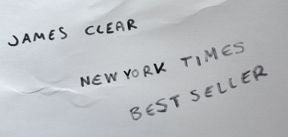
Using a bold broad tip Berol pen that was nearly empty of ink, I wrote out a few elements for the cover- the authors name and ‘New York Best Seller’. I wanted to create a few versions of the cover, some with more information on them and others with less. The lesser information versions are more inspired by Peter Mendelsund’s work (figure 14).
The hand written text was aiming to represent the act of note taking and creating lists- all things you would do if organised. I wanted the type to look like it was almost scribbled quickly as if in a rush to convey a sense of urgency and importance. The contrast of the simple and bold sans serif typeface and hand drawn typeface I felt worked well.
I experimented with various tones of red/orange and blue. These 2 colours despite them being contrasting I felt represented ‘Atomic Habits’ well, in different ways. The red/orange colours create a sense of urgency and lean towards the more violent connotations of ‘Atomic’ such as bombs/explosions where as the blue is more calming but feels more positive and perhaps more endearing/less stressful for the viewer.
Another concept for the whole book cover was that the dominoes will follow around to the back cover appearing as if they knock each other downwards and onto the back cover from the front.
For the next cover I wanted to try using a photo and integrating a pattern/type over the top of it inspired by Elisha Zepeda’s covers in figure 15.
I began with Midjourney, asking it various prompts to create a blue and gold coloured butterfly wing/blue and gold butterfly. The butterfly was meant to represent ‘the butterfly effect’ which I felt as a concept represents the book well. After many attempts and different versions I cropped the image down, spreading it across the book cover. With this cover I decided to work with the whole cover as opposed to just the front with an aim to create a cohesive design.
I hand sketched a atom/map inspired pattern inspired by atomic structure (figure 16) and maps with an aim for it to represent direction, a to do-list and the brain thinking/neurons firing.
Moving forwards I tried to integrate the ‘map’ pattern again within another design. Here I wanted to convey a sense of contemplation and thought through the character with his shadow and past behind them, looking forwards.
Using the same type and combining the colours of the first cover, I aimed to create a more chaotic side (red/orange) and a more orderly side (blue) with the book being the link between them both.
I hand sketched a atom/map inspired pattern inspired by atomic structure (figure 16) and maps with an aim for it to represent direction, a to do-list and the brain thinking/neurons firing.
The end result felt across being a Science related book and a novel. The cover did not convey the feelings I had initially aimed for it to do, the butterfly image looks more like a background for a novel and the lines across the butterfly wings interacted in a way with the pattern overlayed that did not work well visually or conceptually.
Next, I wanted to try an alternative style, inspired by Jack Smyth (figure 12) and Peter Mendelsund.
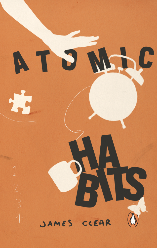
I collated imagery which I felt represented ‘habits’ using found material from an old magazine (map and mug) and Midjourney to develop other imagery that was more specific, such as the arm angle and alarm clock.
The idea behind this cover was again the order and chaos, with a textured orange background full of imagery and type, contrasted by the book title on a calm, cream background. I quite liked the direction the cover was going in, but after going back and re-viewing my initial idea sketches, work by Peter Mendelsund and Elisha Zepeda’s I thought that the issue was perhaps the lack of the title interacting with the imagery and it felt separate from the book cover design.
After reviewing the design, I remembered my tutor mentioning previously about scale of images/elements within my design work and adjusted the sizes and scales of the collage. This lead to the visuals being more effective and interesting.
The goal was then to intertwine the type within the collage, but after experimenting I felt that the flat silhouette shapes of the designs were more visually strong and worked better for being a non-fiction book.
I arranged the type with ‘atomic’ being slightly separated aiming for it to appear as if it is ‘moving’ as if part of an atomic structure. The letters that formed ‘habits’ I stacked on top of each other in a way as legible as possible but still to remain obviously stacked, referencing a key idea of the book to ‘stack habits’.
Looking back at my final result after some time and seeing it with fresh eyes, there is still a lot I would change and this may be a task that I come back to improve on.
The main point I am unsure of is the stacking of the word ‘habits’ I spent some time arranging to see if this was still legible, but if you just see the front cover of the book, it may not work as I intended. This would be a good point to test with people and receive feedback on what they see/read and the legibility of it.
I like the choice of colours and I feel that they are effective in conveying a sense of the book, with the orange being more energetic/chaotic but not too vibrant and the cream/white colours being more orderly and silhouettes of habits that form order. I do feel like more colours could’ve been explored and even inverted colours to see what else could work. Despite it not working as well conceptually, perhaps the title text in white may work well.
Overall I feel that there is something missing from this cover, perhaps more depth as it looks more flat that I had initially thought. The way the text interacts with the illustrations is not as dynamic as I had thought. This could be changed by altering the scale and hierarchy of illustrations/words within the title. I think further exploration is needed here, but there is an idea there.
I like the hand drawn elements that tie in with the note or list taking concept, perhaps more of this could be explored with the title typeface and the spine of the book as this looks quite bare and less appealing in comparison to the front and back cover.
I really enjoyed this assignment, book cover design is an area of design that I definitely would like to continue with and improve upon, I look forward to the next task and may return to this one to work further on the design.
Resources:
Figure 1: Adult non-fiction category (no date) Penguin.co.uk. Available at: https://www.penguin.co.uk/company/work-with-us/cover-design-award/adult-non-fiction-cover-award (Accessed: 7 June 2024).
Figure 2: Adult fiction category (no date) Penguin.co.uk. Available at: https://www.penguin.co.uk/company/work-with-us/cover-design-award/adult-fiction-cover-award (Accessed: 7 June 2024).
Figure 3: Children’s category (no date) Penguin.co.uk. Available at: https://www.penguin.co.uk/company/work-with-us/cover-design-award/children-s-cover-award (Accessed: 7 June 2024).
Figure 4: Atomic Habits - audiobook (no date) Spotify. Available at: https://open.spotify.com/episode/4ZfkipeIxgsnb5sbtUi4ak (Accessed: 8 June 2024).
Figure 5: Adult non-fiction cover shortlist (no date) Penguin.co.uk. Available at: https://www.penguin.co.uk/company/work-with-us/cover-design-award/2024-shortlist/adult-non-fiction-cover-shortlist (Accessed: 7 June 2024).
Figure 6: What the judges are looking for (no date) Penguin.co.uk. Available at: https://www.penguin.co.uk/company/work-with-us/cover-design-award/what-the-judges-are-looking-for (Accessed: 7 June 2024).
Figure 7: Uk, P. co U. (no date) 129mm 20mm 129mm, Penguin.co.uk. Available at: https://wp.penguin.co.uk/wp-content/uploads/2023/10/Penguin-Standard-Template.pdf (Accessed: 7 June 2024).
Figure 8: Former winners (no date) Penguin.co.uk. Available at: https://www.penguin.co.uk/company/work-with-us/cover-design-award/former-winners (Accessed: 7 June 2024).
Figure 9: Uk, P. B. (2022) The designer behind penguin’s clothbound classics | work in progress with Coralie Bickford-Smith. Youtube. Available at: https://www.youtube.com/watch?v=TGpmVO03GfA (Accessed: 7 June 2024).
Figure 10: Coralie Bickford-smith (no date) Coralie Bickford-Smith. Available at: https://cb-smith.com/ (Accessed: 7 June 2024).
Figure 11: Uk, P. R. H. (2022) How to turn a story into an impactful book cover | Penguin Cover Design Award. Youtube. Available at: https://www.youtube.com/watch?v=kMAfQfSs3Ik (Accessed: 7 June 2024).
Figure 12: Uk, P. R. H. (2022) How to effectively use typography on book covers | Penguin Cover Design Award. Youtube. Available at: https://www.youtube.com/watch?v=3R1xidlqegU (Accessed: 7 June 2024).
Figure 13: Jack Smyth (no date) Jacksmyth.co. Available at: https://www.jacksmyth.co/ (Accessed: 7 June 2024).
Figure 14: Design (no date) Peter Mendelsund. Available at: https://www.petermendelsund.com/covers (Accessed: 7 June 2024).
Figure 15: Elisha Zepeda - fiction (no date) Elishazepeda.com. Available at: https://www.elishazepeda.com/fiction (Accessed: 8 June 2024).
Figure 16: McGrayne, S. B., Trefil, J. and Bertsch, G. F. (2024) ‘atom’, Encyclopedia Britannica. Available at:https://www.britannica.com/science/atom (Accessed: 9 June 2024).


