Graphic Design 2.1: Professional Practice, Project 10: ‘Refining Your Professional Practise’ Assignment 10
Assignment 10: Create a Process Book
Now that you have reviewed your feedback and revisited work produced earlier in the unit, we would like you to create a ‘Process’ book.
So what is a process book? Quite simply, a process book documents your research, development, experimentation, use of materials and mediums, testing and finally, resolution. So what is the difference between your OCA Learning log and a process book? Not a great deal with regard to content, however, a process book allows far greater control of how your material is designed and presented. It gives you complete control of layout, typography, format, paper stock and length.
The proliferation of digital printers, such as Blurb, allows your process book to be printed as a one off very cheaply. Alternatively companies such as Issuu, can publish your process book as an interactive flip book. So why should I design a process book? As well as giving you complete freedom and control, a process book can become a tangible part of your portfolio. A carefully designed book showcases not only your thinking but your practical command of graphic communication skills.
This might seem a daunting task but you already have the written and practical content from the exercises and assignments. So it just becomes a question of organising and editing the material and then creating a layout. To get you started, you will need to use a layout programme such as Adobe InDesign, QuarkXPress or Affinity publisher. All three have powerful tools that will help you to complete the book with speed and consistency. Once you have created the process book, it can become a template for subsequent units.
Figure 1 process book is very well composed, the ‘process’ type covering both pages really draws you in as a viewer. The use of both pages is really interesting and something to keep in mind for my book.
FIGURE 2:
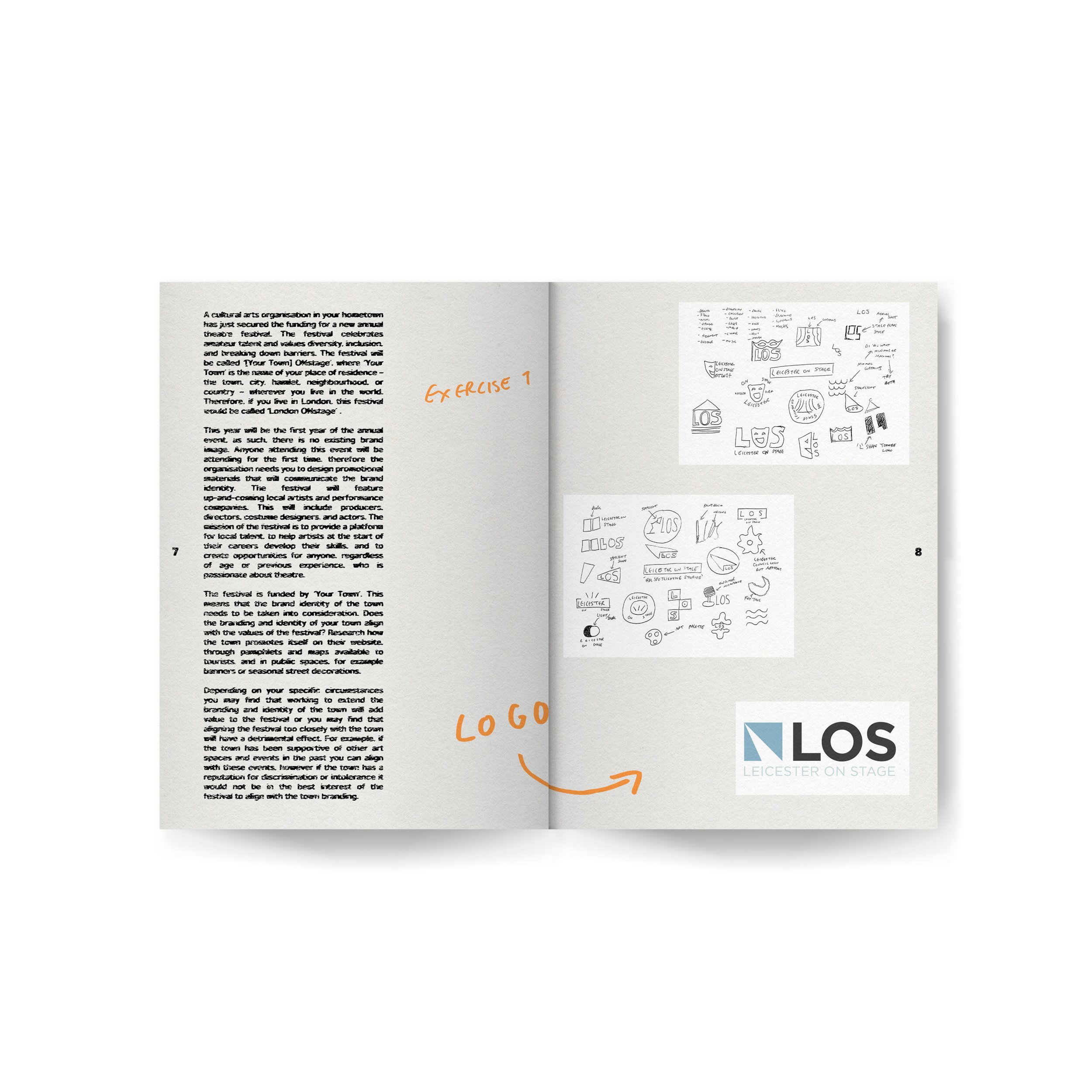
Figure 3 shows a CV/portfolio layout process book, describing different illustrations. I really like the simple layout and again use of colour within this book.
FIGURE 7:
Figure 6 shows some work by Chris Ashworth, his typography is always interesting and inspiring. I really like the grunge style and this could be something I try to emulate with my process book.
Looking at some of the books I owned, I looked at Dieter Roth’s diary book for some visual inspiration. This book documents some of his diary entries and photos. I really like the simple, tactile feel to the book and handwriting.
FIGURE 9:
I used the previous few tasks as an opportunity to review, collate and consider which works to present within my process book. I arranged them into files and reviewed them when sketching a draft.
I experimented with various typefaces, laying out all of my favourites, deciding which I could use for titles and any other text. I went with Aktiv Grotesk, a nice weighted typeface which has potential to look interesting when re-printed/edited.
For my front cover, I wanted to use my logo, designed in a previous ‘personal branding’ task. To create a sense of cohesion and inspired by Ashworth/Carson I printed the text and the logo onto acetate, to use to re-print and create interesting textures by hand as opposed to digitally. The by hand method leaves there more room for fun accidents and original results.
Referring to my rough sketches for the layout, I collated the pages, including 2 page spreads to mark each project. I used further elements from the personal branding section to add texture to the backgrounds, such as paint splats.
I added hand drawn notes, originally with a thinner pen, later changing to a thicker Berol broad tip, which paired better with the bold typeface.
I began this task by noting down a rough plan/any ideas for my process book. I then moved onto researching other process books, magazines and other visual inspiration.
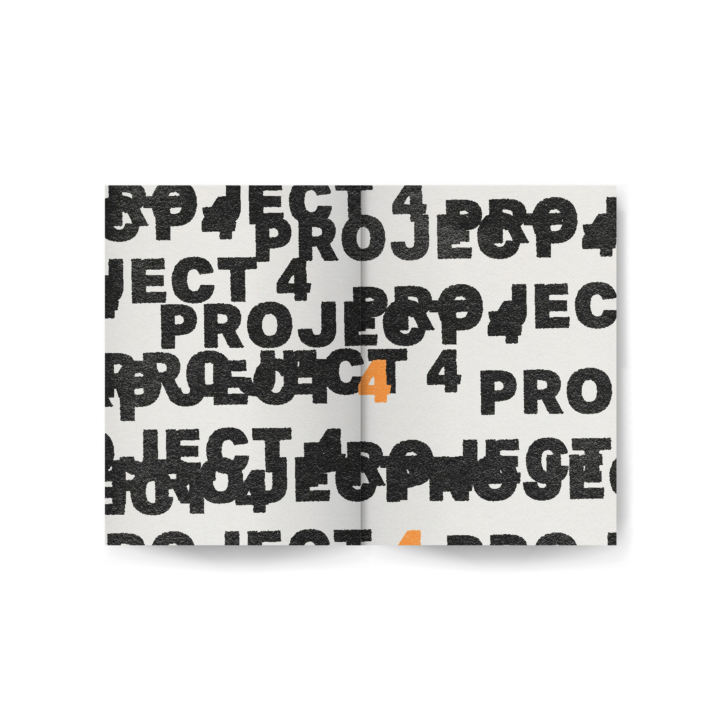
I really like the simple use of colour within figure 2. The orange really pops and works perfectly with the cream and black. The layout is also visually interesting, using solely typography.
FIGURE 3:
Moving forwards, I wanted to collate some different visual inspiration in hopes to design a book that is my ‘style’ or representative of work that I enjoy the look of. Figures 4 and 5 are excerpts from ‘Emigre’ magazines that I find interesting. This was such a fun magazine, each one being different.
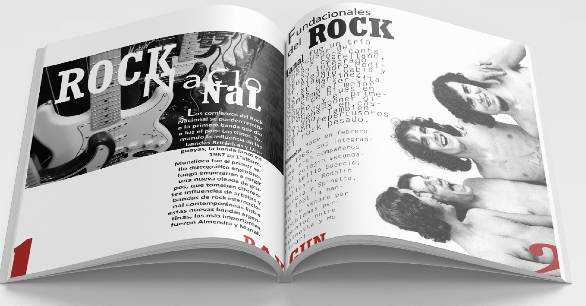
Figure 7 shows some work inspired by ‘Raygun’ magazine. I really like the clever use of typography, bringing both pages together.
FIGURE 8:
Figure 9 is ‘The End of Print’ by David Carson, showcasing some of his best works. Carson’s design is great, merging tactile processes to create original designs.
I sketched rough drafts of each pages, making notes to refer to my folders with all of the designs and design process photos.
Again, referencing my ‘personal branding’ I used the colours from the previous personal branding task, an off-white colour and lighter black. I then experimented with various tones of orange- a colour I like to use and inspired by figure 2.
As there was a lot of text, I created a Photoshop action that would ‘randomly’ edit the type in a print-like way. I used various layers of blurs, motion blurs, ripple effects and displacement maps to make the type look printed.
Resources:
Figure 1: Behance (no date) Behance.net. Available at: https://www.behance.net/gallery/55174301/Mohawk-Maker-Quarterly-11-Process (Accessed: 14 August 2024).
Figure 2: Baird, R. (2020) Queremos Sonreír by Mucho — BP&O - branding, packaging and opinion, BP&O - Branding, Packaging and Opinion. Available at: https://bpando.org/2020/03/18/book-design-queremos-sonreir/ (Accessed: 14 August 2024).
Figure 3: Curriculum Vitae Harry Oakley (no date) The Dots. Available at: https://the-dots.com/projects/curriculum-vitae-harry-oakley-163798 (Accessed: 14 August 2024).
Figure 4: (No date) Letterformarchive.org. Available at: https://oa.letterformarchive.org/item?workID=lfa_emigre_0004&targPic=lfa_emigre_0004_021.jpg (Accessed: 14 August 2024).
Figure 5: (No date) Letterformarchive.org. Available at: https://oa.letterformarchive.org/item?workID=lfa_emigre_0005&targPic=lfa_emigre_0005_005.jpg (Accessed: 14 August 2024).
Figure 6: Instagram (no date) Instagram. Available at: https://www.instagram.com/ashworthchris/?hl=en (Accessed: 17 August 2024).
Figure 7: Behance (no date) Behance.net. Available at: https://www.behance.net/gallery/169679623/Ray-Gun-inspired-magazine?tracking_source=search_projects|ray+gun+magazine&l=6 (Accessed: 17 August 2024).
Figure 8: Dieter Roth book
Figure 9: David Carson: The End of Print book


