Core Concepts- ‘Layout’ Research Points:
Research Point 1:
Many hundreds of paperback books have been produced over the years. Look at as many variations as you can find to see how different publishing houses designed their covers and how the covers fit together as a series. Select a particular publishing house and describe their design style in your learning log.
I began with researching the first publisher that came to mind, and one of the largest: Penguin. On Penguin’s website there is a description of their history, and examples of some of their books through time.
Penguin:


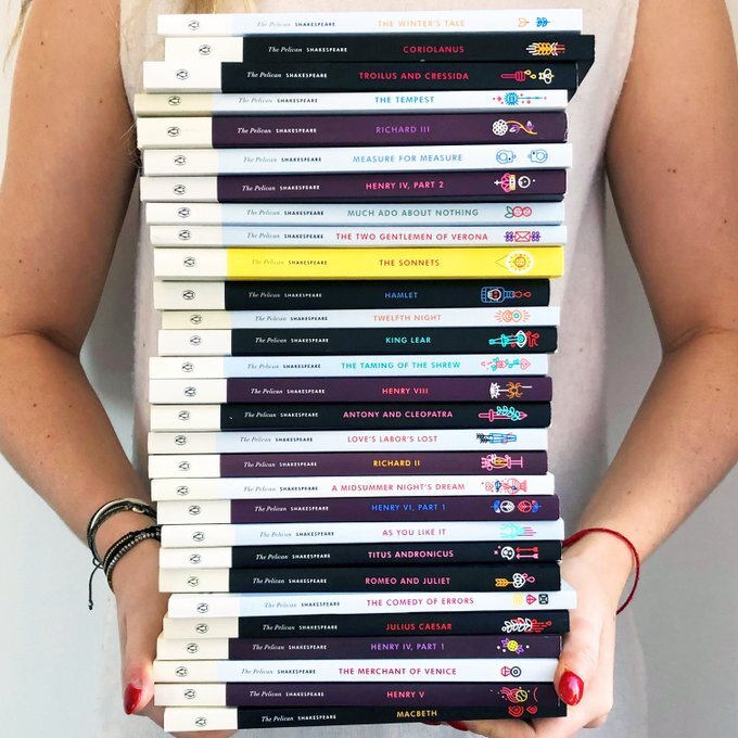
Penguin have a few ranges, the ‘Puffin’ and ‘classics’ range are 2 examples. The puffin is for children’s books and distinguishes which stories are written for children and which aren’t. The classics, are older books through time published by Penguin such as King Lear by Shakespeare or Pride and Prejudice by Jane Austen. These classics feature similar covers, including a smaller illustration and the Penguin logo. I really like the cohesive aesthetic of the classics range.
Simon and Schuster:
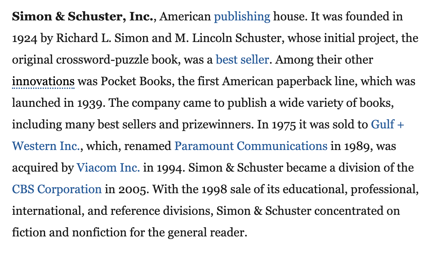
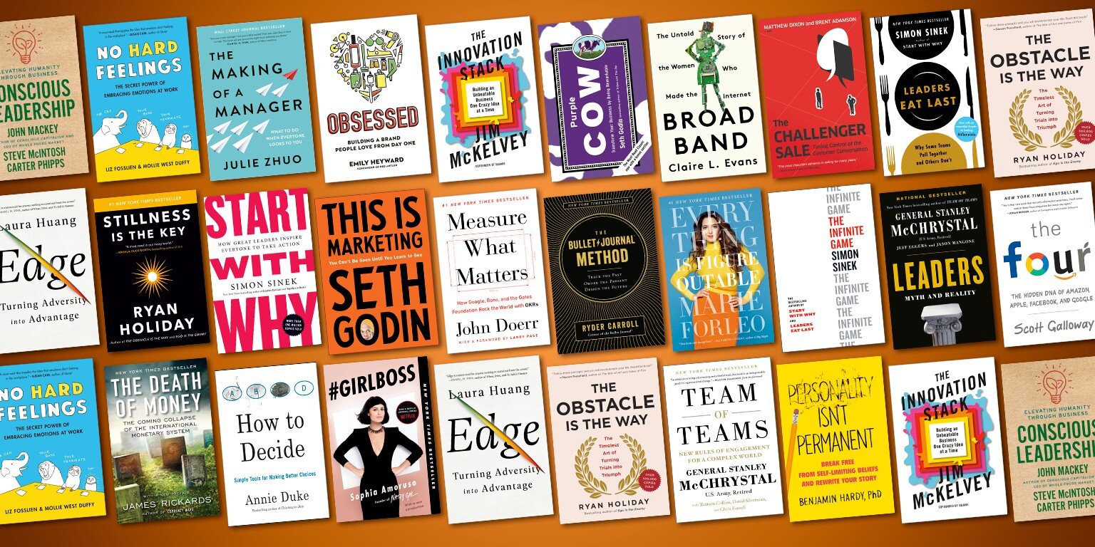
I hadn’t heard of Simon and Schuster so I researched some more into them, I found a good short synopsis of the publishing house via Britannica. The front covers of the books published by Simon and Schuster are mainly very colourful with a large title, which is understandably an obvious element to comment on, but it was particularly obvious to me. They also include a small circle on the front of some of their books including extra information, which I believe allows them to stand out more from other books, or at least the extra information is easily distinguished from the rest of the front cover.


When viewed together, the similar elements that could draw them together as a series, or make them distinguishable as published by Simon and Schuster is the use of circles as mentioned and the brighter colours. There isn’t much else that is very cohesive, unlike Penguin, which I feels Penguin icon that appears on many of the books front covers or spines, is very well known and easily relatable. The Simon and Schuster logo is less recognisable or memorable, to me at least.
Pan Macmillan:
“Pan Macmillan is one of the largest general book publishers in the UK. Our imprints include Macmillan, Pan, Picador, Boxtree, Sidgwick & Jackson, Tor, Macmillan Children's Books, Young Picador and Campbell Books. Pan Macmillan is part of the Macmillan group which was founded in 1843, is one of the largest and best-known international publishers in the world and operates in over 70 countries worldwide. Macmillan is known for its high-quality academic and scholarly, educational, fiction and non-fiction and reference publishing.” -IPG books
Pan Macmillan has a similar classics series to Penguin. They are also particularly distinguishable, I really like their aesthetic and the way the covers are very clearly a series. The top half being a simple, elegant blue/green with an almost golden title and the bottom half an illustration works very well.

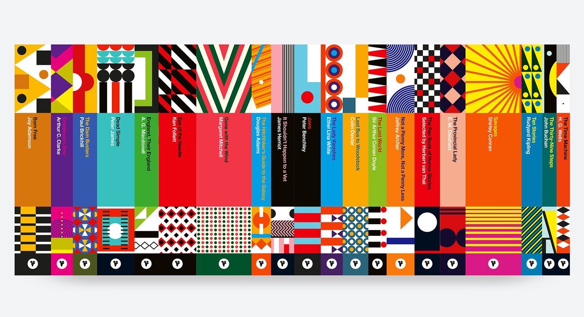
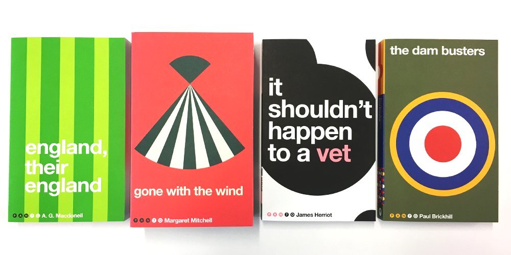
Pan Macmillan released a series of book covers for their 70th anniversary which I think are great. The sans serif lowercase font, works really well with the simple computerised illustrations. The covers are very bright and not cohesive colour wise, but their simplicity and the continuation of the lowercase font makes them interesting and memorable. The positioning of the author is consistent throughout which also ties the covers together as a series.
Research Point 2:
Posters have a long and rich history documenting everything from boxing matches to Bollywood films, the Soviet Revolution to punk, encouraging young men to join the army to persuading women to buy bras. There are many collections in books in museums and galleries and on the internet. Find out more about your own particular areas of interest. Make notes in your learning log.
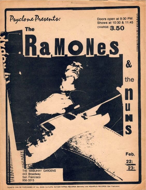
My interests in posters, lean more towards the dada movement and punk style. There are many artists that I have come across, drawn in by their more ‘anti-art’ aesthetic. Many of these posters are for music events, or album promotion, as the synergy between design and certain types of music is best presented with this aesthetic.
Jamie Reid:
I found some information on Reid here. Reid’s Sex Pistol’s album cover and promotion posters I feel are recognised by most people, due to the nature of the Sex Pistol’s music, but also the design itself. His political, socialist background was a massive influence on his art. The anti-establishment feel is presented through cut and torn handmade elements, and photocopying. I am drawn to this aesthetic, and like the photomontage/collage elements. These are elements I want to improve on using tastefully within my own work.
I have a large and ever growing digital collection of posters/visuals with this similar aesthetic, many are 70s punk posters and others by more modern artists/designers inspired by the style. These are a few of my favourites.
The handmade elements including the typography is interesting to me. It allows each of the designs to have an individual element, rather than look processed and purely digital, it gives the designs feeling.
These elements come from the Dada movement, full of photomontage and interesting use of typography. I decided to research some more Dada era artists/designers.
Kurt Schwitters:
Kurt Schwitters was a German artist who created work across various mediums. I feel like artists who are multi faceted create work in more interesting ways. Kurt Schwitters’ design is quite abstract, and his use of typography and letters as individual elements makes his work visually exciting.
Despite his work not being considered directly ‘posters’ (although some of it is,) their visual elements and abstract layouts are carried forwards into more contemporary design, like in Jamie Reid’s work.
“Schwitters’s best known graphic design work was the periodical Merz, which he self-published from 1923 through 1932. It was a revolutionary venture—covering a new topic for each issue and featured artist profiles, children stories and poetry. Collaborators for Merz included famed creatives El Lissitzky, van Doesburg and Jan Tschichold.
The word Merz was a term invented by Schwitters that applied to all his creative activities including art, collage and poetry. As he described: “In the war, things were in terrible turmoil. What I had learned at the academy was of no use to me and the useful new ideas were still unready. Everything had broken down and new things had to be made out of the fragments; and this is Merz. It was like a revolution within me, not as it was, but as it should have been.”-Shillington Education
The breaking down of elements is a common theme in artists and designers I am interested in, this description is similar to the one made by typeface designer Tobias Frere Jones a designer I was introduced to via my tutor. Despite their fields being different and from completely different eras their ethos of taking elements apart is the same.
Ed Davis:
Ed Davis is the art director at the brand Brain Dead. There is not much available information on him, but I have followed his work and Instagram for a long time. He releases posters, of graphics he has created for clothing, or his personal artwork, these focus of imagery and digital editing, mixed with screen printing. The ‘breaking down’ of visual elements and typography is also strong within his design and it is clear that his aesthetic is also drawn from more abstract art, punk and Dada style work.
Davis’ work is very personal and doesn’t serve a direct design purpose, it is quite commentary and self expressionist. Despite this, there are many elements I can draw form when producing my own designs for a specific audience or client. The use of photo editing is a main element I can use, this allows the design to feel more complete, and less handmade, which certain clients may not like the aesthetics of.
Research Point 3:
How many logos can you name? Macdonalds? Nike? Apple? All huge multinational corporations with millions to spend on building brand recognition. Have a look at logos and see how they work – pay attention to the colour schemes and simple designs. You will probably also find that, although you couldn’t recall them immediately when you see them you immediately recognise them – banks, shops and products. Can you immediately recall the OCA logo?
Can I recall the OCA logo? I can definitely immediately visualise the OCA logo. This is obviously because of viewing it so much, tagged onto emails etc, but it is also very simple. The red and white branding is exaggerated in the logo and the ‘A’ is simple but still memorable as it is textured as if drawn. Simplicity is key with logos I feel, as all logos I can visualise and recall from thought are the simplest and most integrated ones in my life.
These are brands/companies such as; Nike, Apple, Amazon, Mcdonalds, Adidas, New Balance, BMW, Volkswagen, Coca Cola, Sprite, LG, Subway, Microsoft. Even though some of these brand include their brand name within their logo, I feel like the strongest ones are so easily recognised that they’re almost ignored. Huge global brands such as Nike, Apple and Amazon have the simplest logos that we see and use daily. I decided to compare these.
The first element that I notice when looking a these logos is the colour palettes. The lack of colour, and use of black (including amazons logo which is also usually seen in black on packages) allows the logos to be easily reproduced onto packaging, signs and are easily recognisable as icons on websites/apps. The shapes used are also very simple with minimal detail and have one main ‘block,’ for example the bitten apple and the leaf above. These shapes are also simply relatable to the brand name and identity. The nike tick, a swoosh represents movement and based off the goddesses wings, this brand logo has remained the same, simple design throughout time and as a result of this, is known globally. The apple logo is simply a bitten apple, and amazons being an arrow showing movement from A to B. These distinguishable symbols help engrain the brands into our lives, and allow them to be easily recognised.
