Core Concepts- Assignment 2: Thinking of you
Assignment 2: Thinking of you
Create a range of cards for sentiments or events that are worthy of a greetings card, but are currently not catered for by card manufactures. The cards could be linked to other calendar events, obscure Saints days, sporting calendars or any other happening that is worth celebrating or commiserating. You may wish to explore some of life’s other landmarks that currently don’t feature in greetings cards, like getting your first grey hairs, being released from prison or any other personal landmark someone might want to share.
After annotating the brief, I came up with some initial ideas for ‘new’ cards, most ending up to be satirical. I looked forward to exploring these ideas more. I decided to research already existing cards for some inspiration before sketching some visual ideas.
I personally am attracted to more minimal illustrative cards. I love David Shrigley and he definitely came to mind when initially thinking of greetings cards. Before looking for further visual research I felt that it was important to look into greetings cards, their uses and origins. I found this very helpful and interesting in previous tasks.
Greetings cards- A brief history:
A form of greetings card was used as early as the Egyptians. They would send letters written on Papyrus scrolls and communicated with the ancient Chinese. At new year they sent letters exchanging good will.
To the right is a screenshot of the uses/evolution of the greetings card since the 1400s from The Greetings Card Association website and is linked via the image.
Today the card industry is estimated to be worth $7.5 billion and on average each person sends out 55 cards a year! I found these numbers crazy. 55 on average per person!
An example of the Egyptian Papyrus letters sold for £300,000 via Sotheby’s.
After further research into satirical cards, I noticed again the minimal colours/easy to read and simple typography. I also noted the usual card size being a5/a6. I feel like this is a good size, but I prefer a slightly wider canvas so thought I’d start with 6x8 inches and see what that looks like. I came up with some ideas and got straight into playing around in Photoshop/physically.
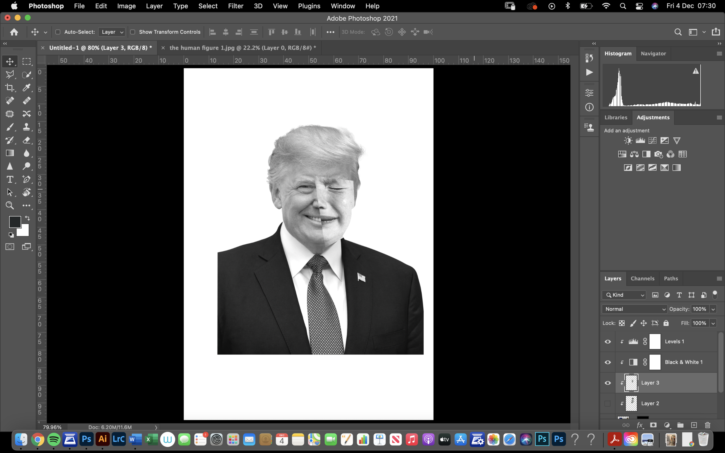
I began to create a collage initially from my idea for ‘insomnia’ but decided to try and produce one for the ‘loosing election’ idea and see where that takes me. I feel like this could be a good medium to display this idea for a satirical card.
I found an image from a life drawing book I have by Erik Ruby which is of a child crying. I tested the images position, wasn’t entirely happy but decided to move on and look back at it later when I have developed more of the collage.
I eventually came to a background that I liked but still didn’t feel that the main image worked. I decided to change the colour of the paper in the background and continue working with it. I went with a ‘nice’ Trump orange as I thought that was best fitting.
After some playing around I eventually found a way to make the 2 main images work. I added a pencil drawn mark from a previous scan I had made. Next, I needed to design the inside of the card, and possibly add some text to the front.
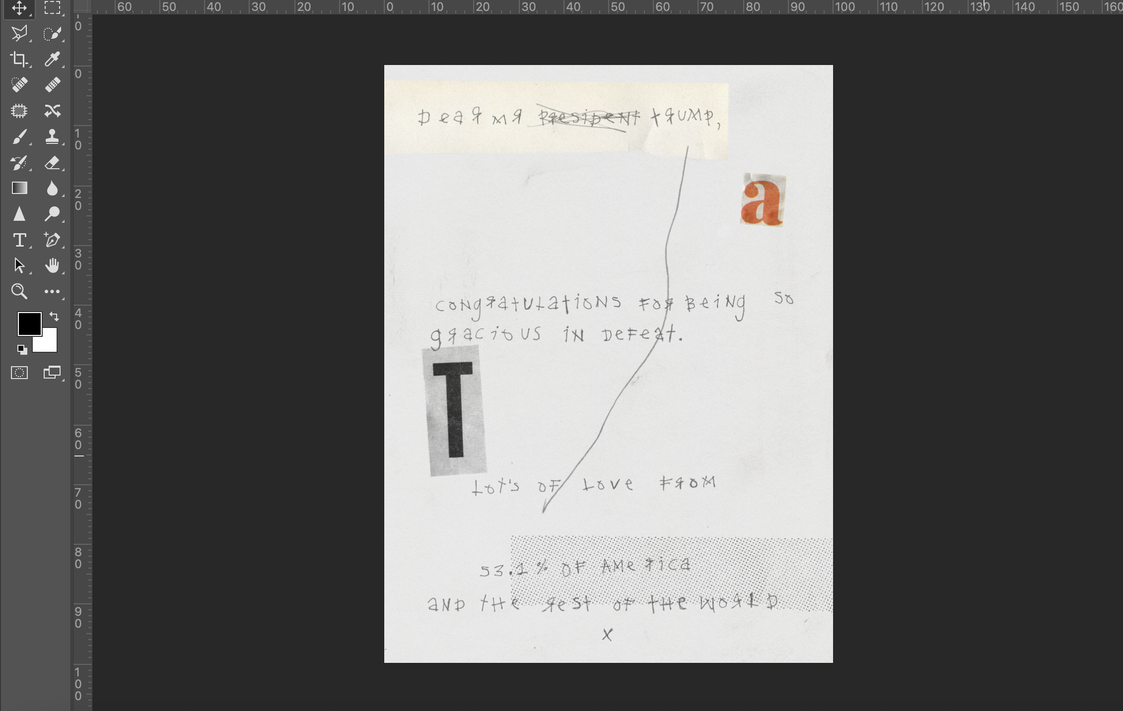
For continuity, I used the same grey background with a chalk texture applied, and a grain over the whole image. I began by choosing a more formal font, I thought that this would look good and add to the ‘joke’ of the type. I decided to include elements from the front collage here to make it look for interesting and a part of each other/adding to the ‘organised chaos’ type look.
I wasn’t sure on the outcome, and wanted to try something different, so I hand wrote the type, scanned it in and tested how this would look.
Final 1:
Overall I feel quite pleased with the outcome. I came across a lot of technical issues with Photoshop when producing this which prolonged the time, but despite that it still would of taken quite a while to produce. I wanted to combine textures/colours that represent Trump’s presidency. I chose the orange in the end to relate to his fake tan, cut out T and A from a newspaper (“fake news”) standing for Trump and America. The orange A I liked because it alone represents Trump’s America. I added a graphic of the stock market declining at the start of the Covid-19 pandemic to show the downfall of his presidency.
I feel like I should’ve tested more with colours and graphics, maybe added a blue from the American flag, or even an American flag somewhere. As always the more I look at this card the more I dislike it and see elements that I would change.
Looking back I also feel I could’ve used a different image of Trump, in a more interesting angle or point for example. This could’ve made the collage more interesting and given it a ‘direction’ to move towards with markings/textures. I also could’ve used different imagery on the other side of the face and perhaps ripped it physically rather than cutting it out digitally. These are elements I will keep in mind for future pieces.
My next favourite idea was the hangover card. I wasn’t sure whether to stick to doing this one digitally and apply textures or create it physically. I began by producing the image in Photoshop and quickly decided to try make it physically. I am relatively new to screen printing but think it could be an affective method to use and would like to practise.
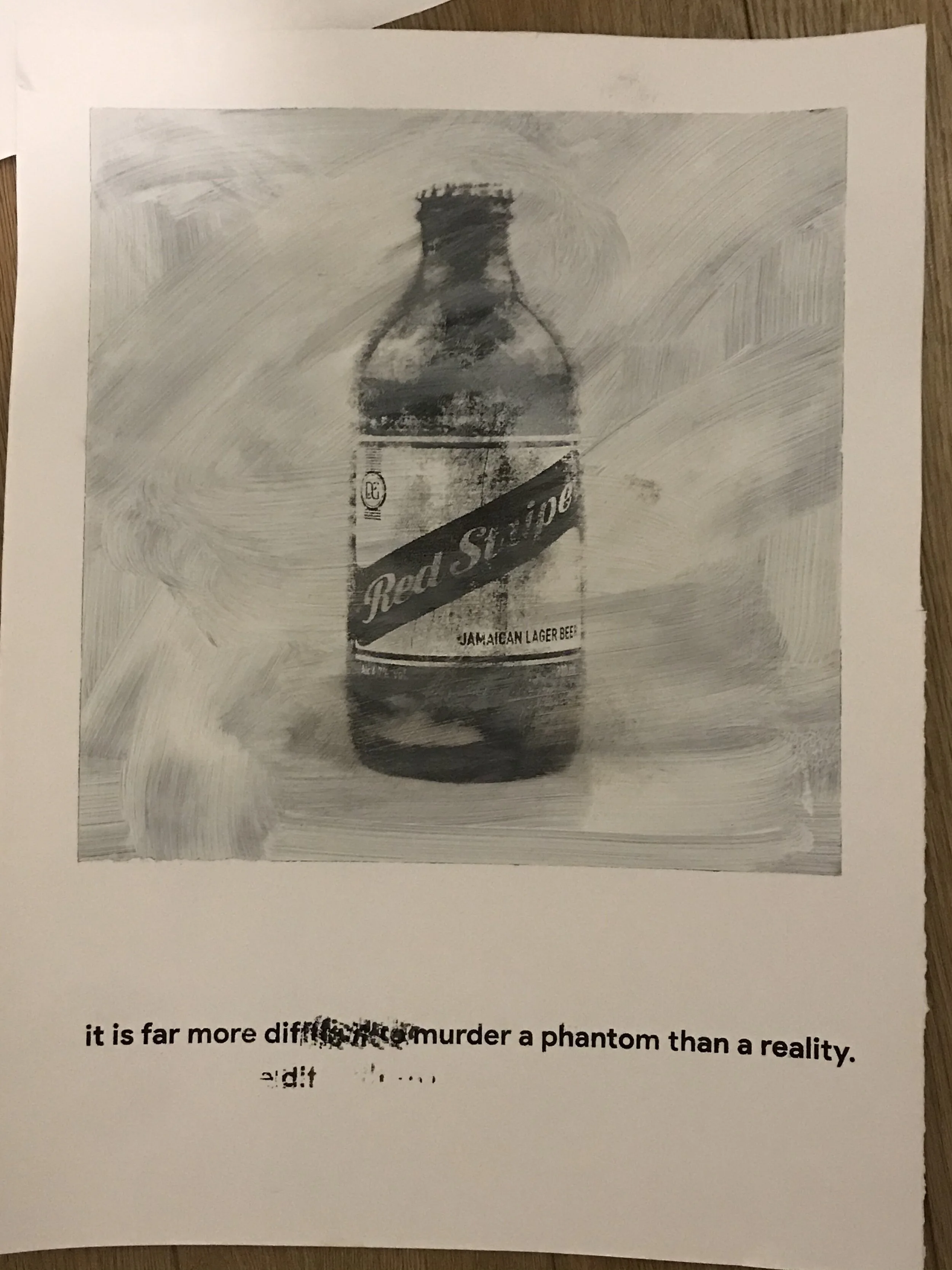
The quote I chose to go for is by Virginia Woolf, and paired with a humorous statement on the inside of the card I feel like it could work well. I tested with various font types and imagery. Firstly I took a photo of a Jack Daniel’s bottle, paired with font type “Warwonia” and made the bottle a halftone ready for screen printing. I didn’t like this font in the end, I feel like it didn’t suit the quote and looked more as if it should be a title, it was too bold. I went for product sans in the end, a common font that I feel is quite ‘easy’ to view. I tested the red stripe can as a more handmade drawing style by creating shapes over the top of the can and filling it in, I didn’t like the end result of this. Unsure as for which to go for I decided to try and print both the Jack Daniel’s and the Red Stripe version.
The Red Stripe version was on the larger screen and the Jack Daniel’s on a smaller one. When printed it was clear that the Red Stripe version was better. It took a few attempts to get a good take. I printed it onto plain hot press paper and the same paper with a sponge/brush painted grey and white square. The aim was for this to imitate a polaroid and be a ‘snapshot’ of a lifestyle and/or mood.
I then painted over the photo slightly using brushes and sponges to make it look more a part of the background. To add a ‘drunken haze’ to the image. I then photographed it and moved into Photoshop to create the final front for this card.
The inside of the card I initially thought should be blank, with just the writing in the matching font type. I tested with different compositions and ended up preferring the painted box/ broken up text. I decided to have the type in lower case to match the front of the card and lowered its opacity then overlaid a white layer to make the type blend in a little more.
Final 2 version 1:
I feel quite pleased with the outcome of this card. I enjoyed screen printing and feel that as I improve this could be an interesting idea to add to future projects. Despite the darker humour I think this presents a different type of card for a hangover quite well.
I feel like I should’ve screen printed the type and tried different textures for the background, maybe a paper texture for example. Initially I wanted there to be a clear contrast between the image and the background, but perhaps this would’ve been more effective. In fact as I type the more I wish I’d of done this so I will as it’s not too time consuming to produce. Below is the revised final version!
Final 2 version 2:
For my next card I decided on having it based on being caught in a daydream, the ‘head in the clouds’ moments. I wanted to create a surreal landscape looking ‘dream like.’ I began to look through various books/magazines I had recently collected for some imagery. For the writing inside the card I am currently unsure but as I work through and bring together this image it will jog some more ideas.
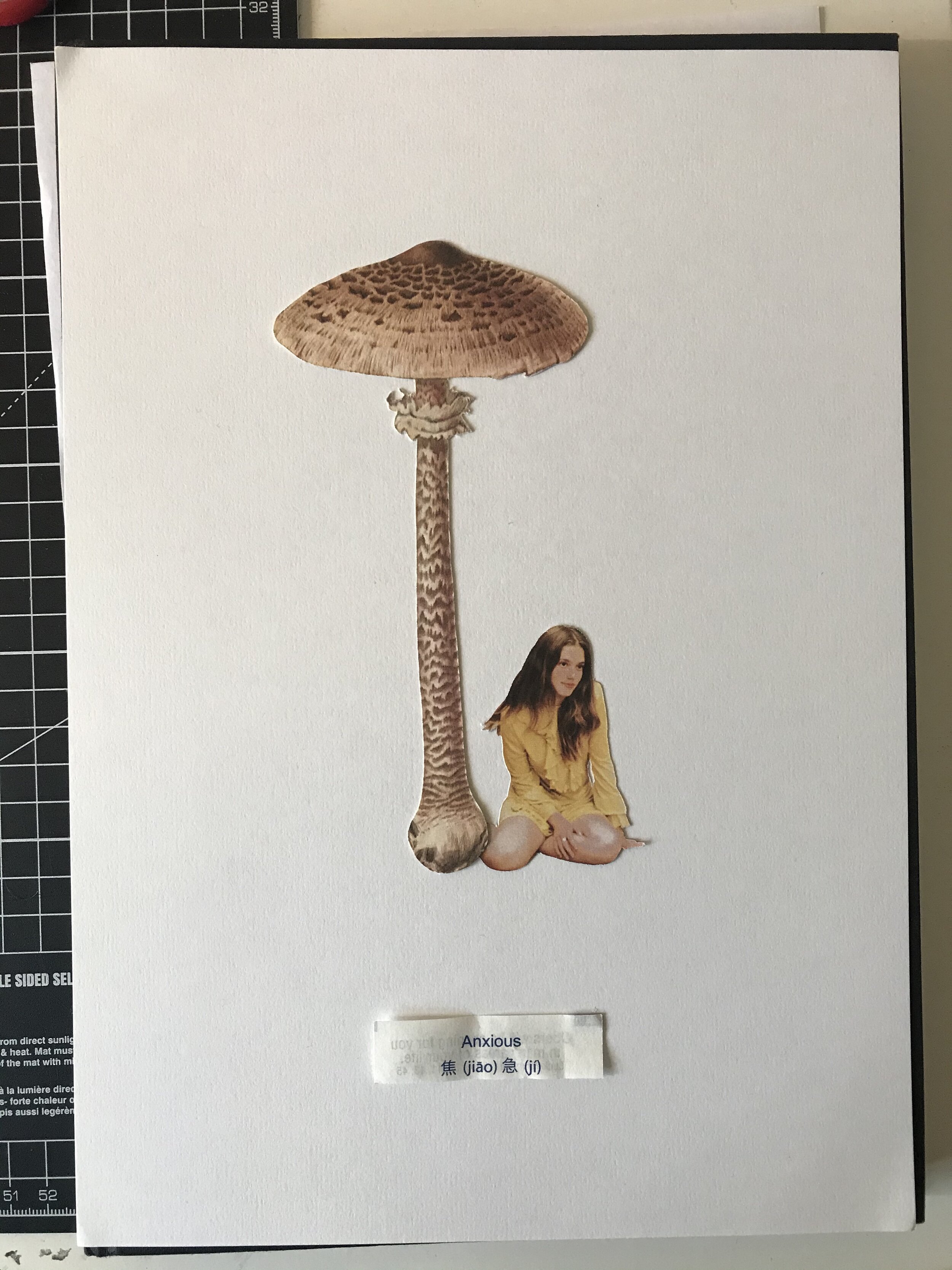
These 2 images were similar to the ones I had in mind when planning/drawing my ideas. I scanned them in and began to work out a background/how to bring them together.
I started to collect some potential images, cut them out and began to see which worked together physically before taking it into Photoshop. From my original sketch (which was a very loose idea) I was able to find fitting images. I was unsure of how to create a ‘landscape’ or background and started to play around in Photoshop to see which was most affective.
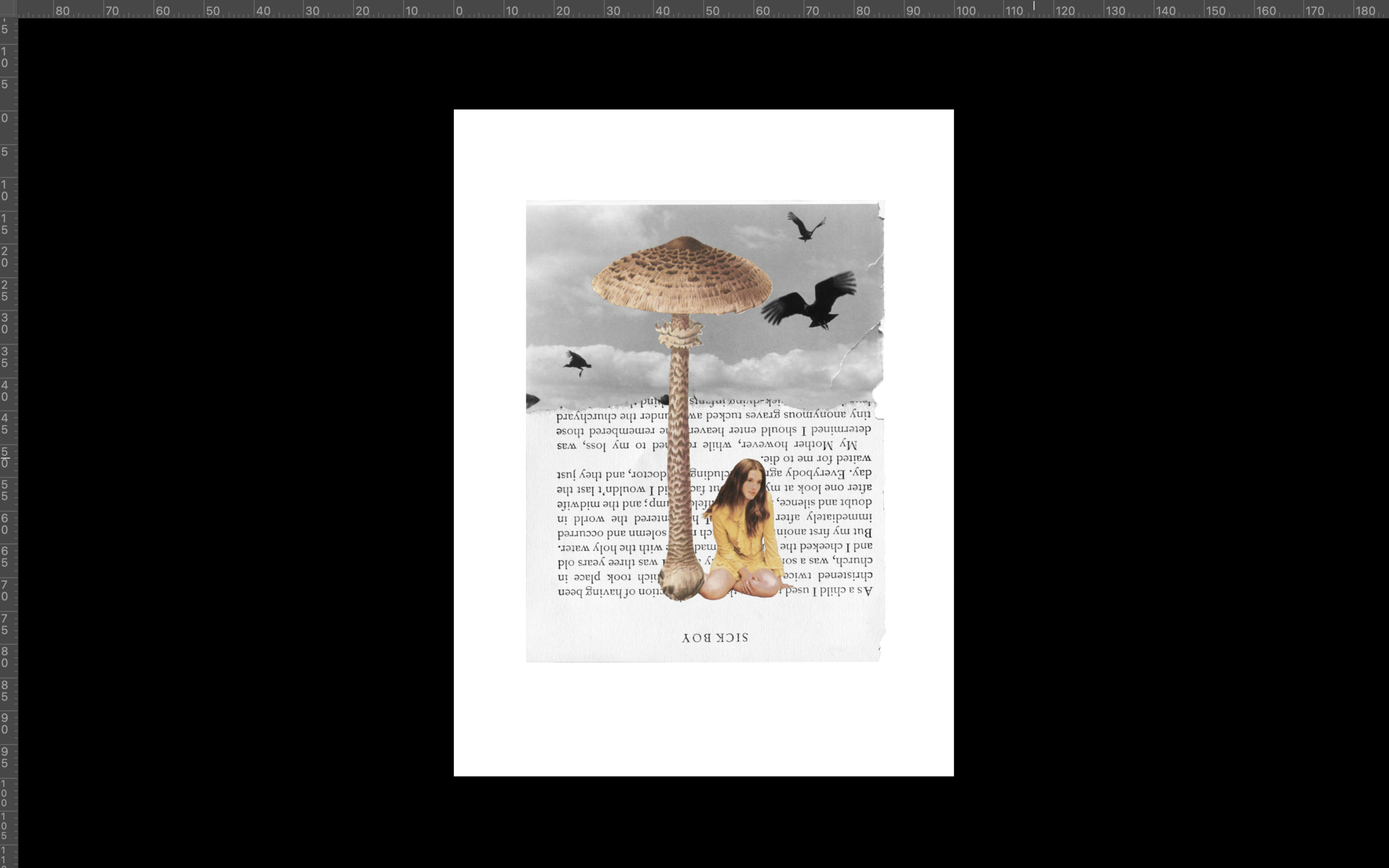
I found an image from one of my favourite photographers Larry Towell and it worked great as a background. I was intending for a cloudy sky/halftone image but these clouds/birds made it an even more surreal image. This image was intended to convey the ‘head in the clouds’ phrase, which I could use for the inside of my card. I am debating between something like “welcome back! was it cold up in the clouds?” or “I just wanted to say thank you for your full attention, your heads been in the clouds lately.”
I quite liked the blank background with just the girl sat under the mushroom, I feel like this even though very simple was quite affective as the girl is looking away as if in a daydream and the mushroom being a surreal dream-like mind state.
I tested with a clipping from a recent newspaper article discussing corona virus, I thought this could be a good current idea to add, showing where my mind is at the moment and during a ‘daydream'.’ I then tried including an extract from Laurie Lee’s ‘A cider with Rosie’ a sort of memoir on his life. I liked the type and words of this page, mentioning christenings, heaven and god, I felt it was a good fit to add to the overall day dream and cloudy sky idea of this image. If the passage is read it is a good metaphor for life and being told from the time of a child it again relates to the photo of the girl. I wanted to make this page work within the collage upside down, representing a clouded mind and having different/upside down thoughts.
I switched between a white paper background and the off white colour of the book, and found this to work the best. I then tested different handmade marks/scribbles to show confusion and draw the imagery together. I then added a small grain over the whole image and added a layer of rubbed out chalk for some more texture.
I wanted to use the same book page for the inside of the card. I decided to use the clone tool to create a plain piece of paper from this page. I then tried to find a similar font to the one used, and found “whatthefont” which worked quite well. I decided to go with Adobes Casion Pro font which looked the most similar. After laying it out, adjusting the background size and the types opacity/blend modes it still didn’t look a part of the background how I wanted it to.
I then decided to test by printing the type physically using an acetone transfer method, leaving the writing slightly distressed and then scan it back into Photoshop and see how this worked.
Final 3:
For the final I added a paper background, a thin chalk layer and a small amount of grain to bring the image together a bit more. The final outcome is simple, but I think it presents the message of the card quite well. A critique is that it isn’t very obvious, if it was to be sold in a shop, without context or seeing the inside message it may be looked past. I did think this when designing the card but took it as an opportunity to try and be more creative with the more open ranged brief.
I didn’t initially intend for the range of cards to be viewed as a series initially, but after creating the second card I continued with the grey/paper style backgrounds, and used similar layers over the top of the finished images to make them look similar.
I feel like I should’ve tested with more backgrounds and compositions. I think I need to start creating an idea and when I think it’s done, completely restart or deconstruct/rearrange it to create something new or adapt the original and see which I prefer.


