Creative Book Design- Assignment Five: Your choice
Your final assignment asks you to draw on all the skills, insight and experience you have gained so far, by designing and producing a book of your choice. Use the following options to as a starting point or alternatively identify your own project.
Emin also uses various print method to produce her work, amongst them being screen-printing. This interests me as I aim to screen-print my final book for this task.
David Carson’s work has had a massive affect on me, I always seem to refer to his collage/typography work whenever I begin to work on something. Here are some close ups from his book ‘The End of Print’ second edition. I really like his use of texture and type, his use of imagery interests me for my topic as he draws energy from the images he uses through mark making and colour.
I began this task by referring back to my initial notes/ideas for this assignment from exercise 2. I expanded on the idea of ‘mundane’ and exploring alternative meanings further, beginning with researching artists/creating mood boards.
Tracey Emin has been very well known in the art world since the early 90’s for installations, sculptures and drawing. The images below are collated of her exhibition with Edvard Munch ‘The Loneliness of the Soul’. I viewed this exhibition in person last summer and it was great. When thinking about my chosen topic for this assignment being the ‘mundane’ it reminded me of Emin’s work. The angles of the portraits/textures/colours represent a deep sadness/’loneliness’ and the imagery Emin uses are very emotive/have multiple interpreted meanings.
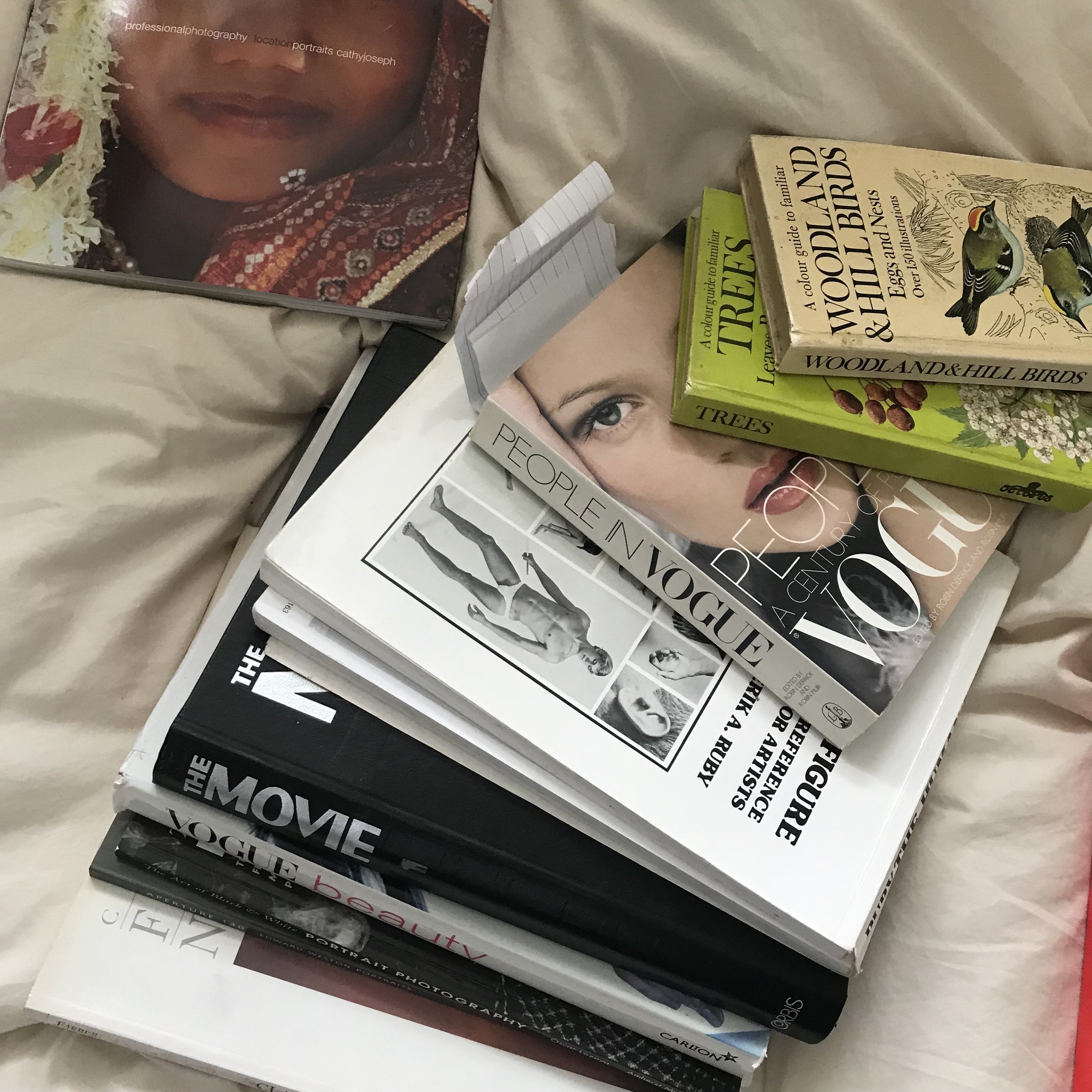
When looking at my mind maps the words coming to mind reminded me of a book I have of Robert Farber’s photography. Similar to Emin, he captures figures in an interesting way, showing a darker side and almost a feeling of frustration. The colours of his photos are particularly interesting and I feel represent the ‘mundane’.
Whilst researching I continued to add to my mind maps and create more rough thumbnails jotting down ideas.
I began to photograph close-ups/textures around me when out which I felt related to my topic/could inspire designs. I particularly like the textures of the concrete and orange colours of the rock.
I started by collaging one of Robert Farber’s images digitally with some hand drawn type. I initially liked the colours of the image, later changing it to a black and white version with a textured background. The image itself I felt was exactly what ‘mundane’ is. Sitting in a chair with a bag over your head…I wasn’t very pleased with the outcome so continued to experiment.
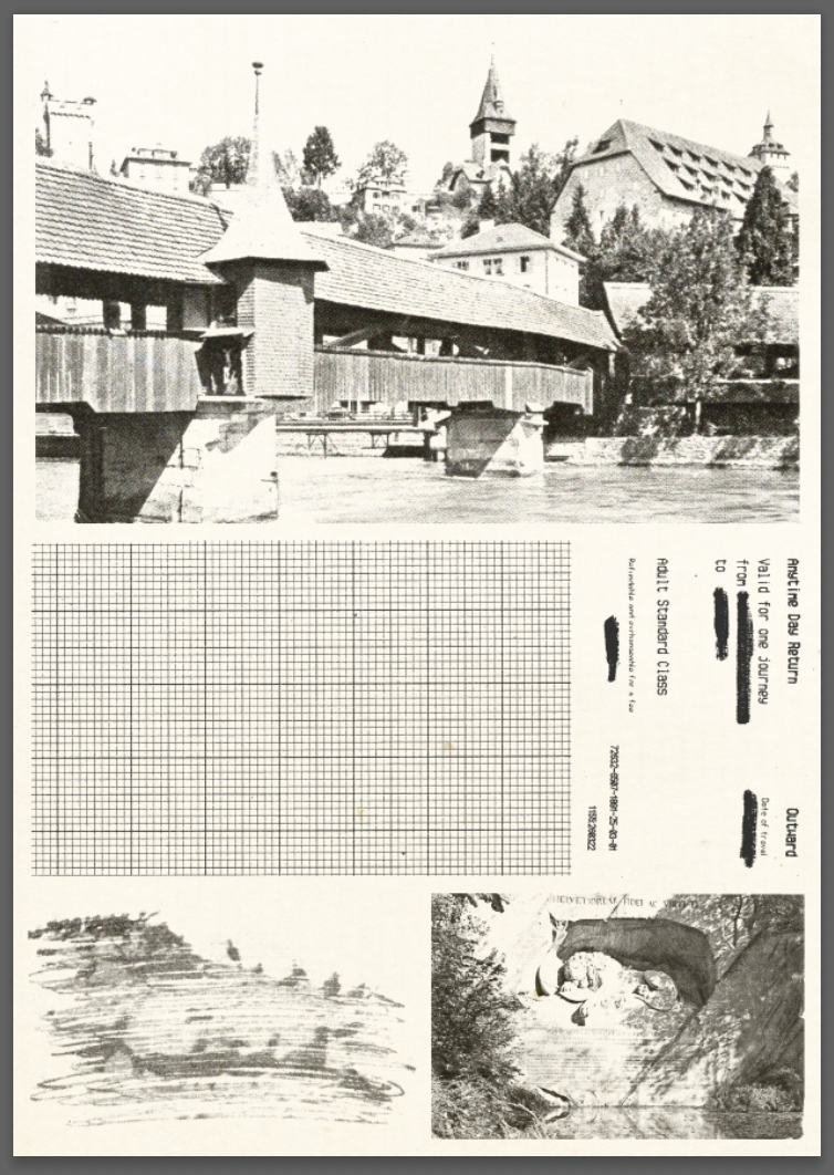
My next design was a collage of various images including a train ticket of mine, an old postcard, graph paper and other found photos. I used an acetone transfer method to create the scribbled image style in the bottom left hand corner. I used a finger print over the top to bring the collage together and show my ‘mundane’. I then added some writing in pencil stating ‘you are here’ pointing at the image in reference to being present during ‘mundane’ times or daily activities.
Looking back at a rough thumbnail sketch I wanted to create a design using packaging. Packaging is seen and used every day by people and I wanted to see if alternative meanings could be derived from something as simple and robotic as packaging.
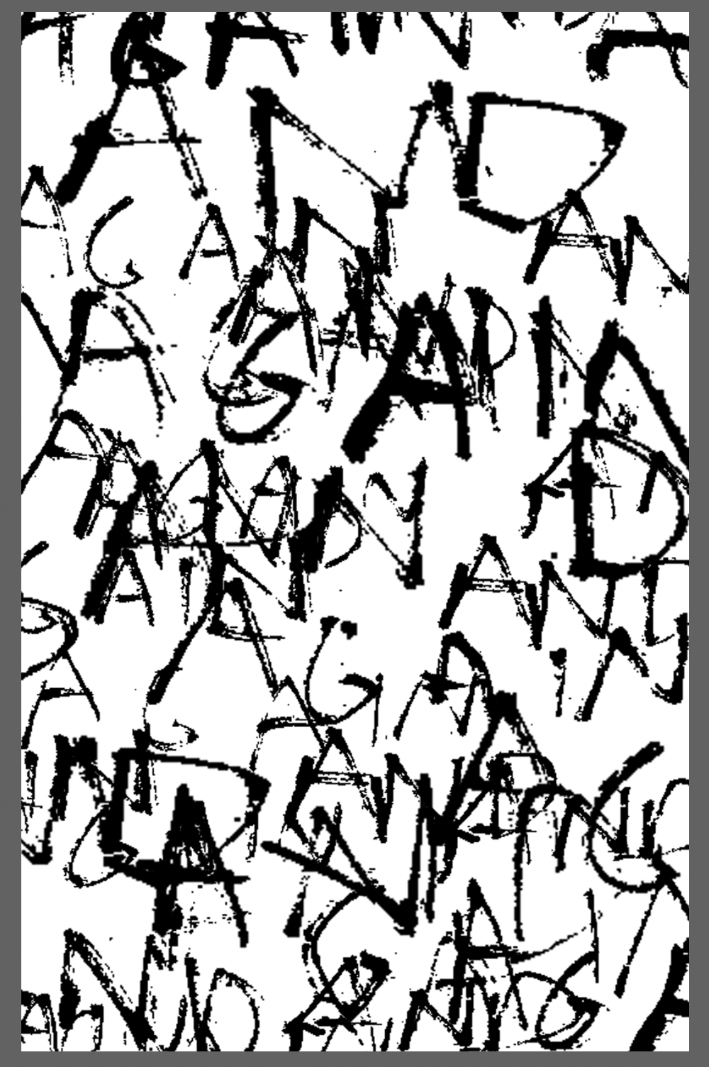
Next I decided to focus on typography. I chose the word ‘Again’ which I felt represented the mundane acts of the everyday. I began to layer the word creating a collage which could potentially work as a screen print. I finally tested with the repeated words ‘All work and no play makes Jack a dull boy’ quote from ‘The Shining’. This quote came to mind when repeatedly writing ‘Again’.
I came across an image of a lady stood next to a train with ‘way out’ showing on the sign above her. This inspired the silhouette cut from the image representing someone choosing a different direction or ‘way out’ from the mundane. The end result was quite dark but I felt worked well.
The next few images were planned through thumbnails and were focusing on things you see everyday (mundane) and giving them new meanings. With the skull being your head or face I printed off an image of it and used acetate to draw over the top. I then went back to digitally editing the skull.
The bite from the apple references a more religious theme, the garden of Eden, gaining knowledge of good and evil. The flowers which were dying also I felt represented this.
I edited the images so they could be printed with a single colour screen-print. I felt that black and white was best to use as it represents the darker themes of the book. I began by arranging an initial order of pages which eventually changed.
When searching via Instagram for inspiration for my book I came across Thibault Tourmente. His work is brilliant, I really like the collage style. In particular his work relates to my subject as he uses imagery which evokes different meanings. For example imagery of a rock would be considered mundane, but here out of context, paired with the other page it is rich with alternative interpretations.
I went back to a previous design made in E4 and used the same textured background to try with a new design. My plan for this wasn’t to be composed as it is, but when cutting out the images in Photoshop I was interested with how they arranged and worked with it further. I used a method learnt by accident during a previous task of using tape to remove parts of a word and scanned in the result, laying it over the top of the image.
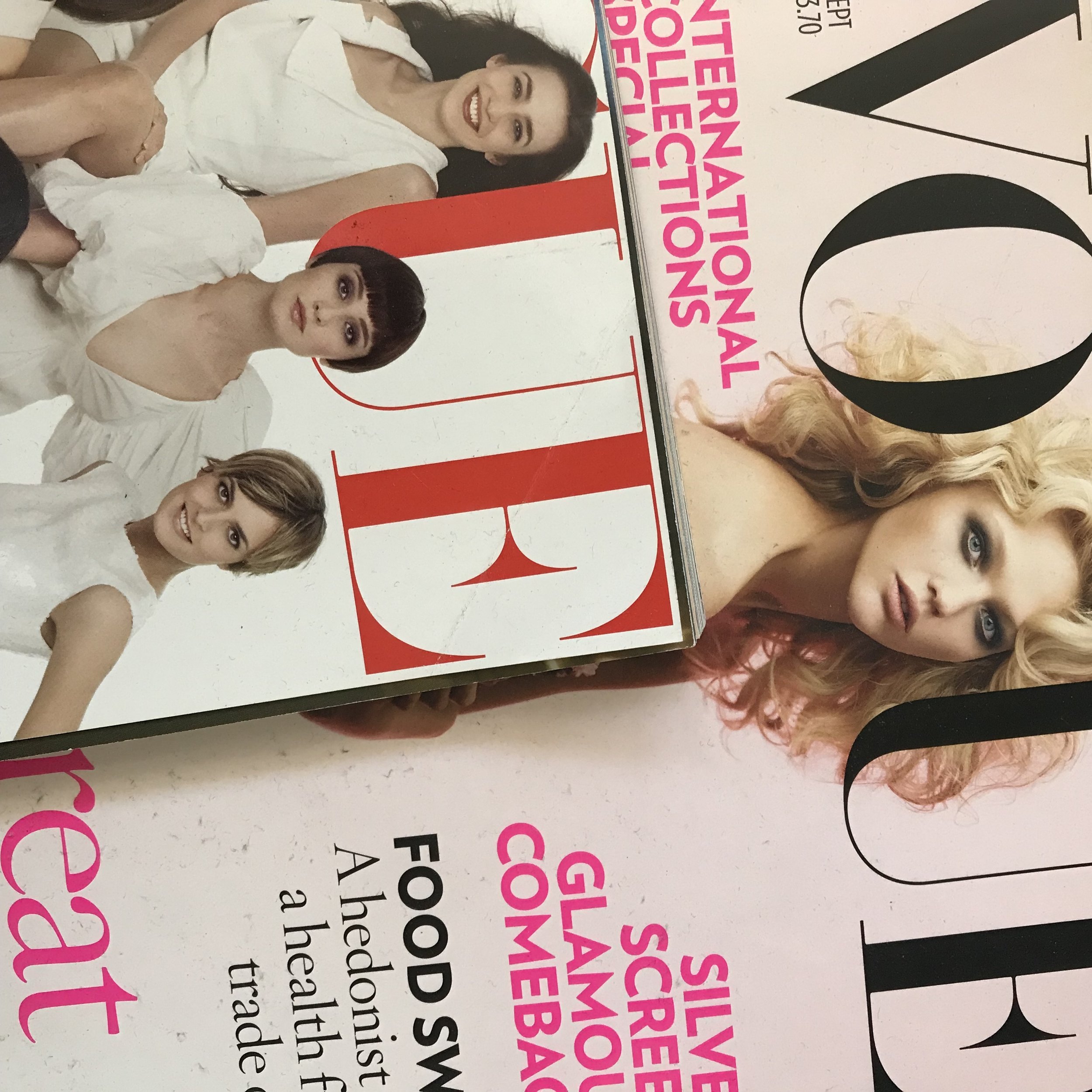
I continued looking through various books/magazines for imagery that inspired me/related to my subject. I came across an image of what looks like a mother and a child. I initially combined this with a word made from a receipt used in my previous design that read ‘copy’. I then went onto isolating the woman from the photo and creating a more gestural design around her inspired by Emin and Picardo’s work discussed earlier in this task and this section.
I wanted to test with a physical collage. I looked through various old magazines/books and found some technical drawings of cars and woodwork. I then used images found within the woodwork book to create ‘hollow’ photos. The images are of a wardrobe and a chest of drawers, something mundane and used every day. I chose different colours to contrast within the collage and show ‘interest’ or ‘hope’ within the hollow hole of the mundane.
I found an image of a deep sea animal which I felt represented negativity and appeared almost evil. I paired this with a straight faced portrait cutting off the persons eyes, making them blind to how they feel. The next image was more positive and more of a ‘day dream’ within the boredom of daily life to a place you would rather be.
I was debating whether to use my hand-made book from E5 but finally decided to use some small moleskin notebooks as my book as I felt that it tied in with the theme of mundane. A notebook is something seen everyday. The notebooks had a nice 110GSM slightly off-white colour which took to screen-printing well during a test.
I had some issues when screen-printing to do with exposure times and the amount of emulsion applied to the screen. This resulted in a few lost images where the emulsion wouldn’t come off or came off too much.
Final Images:
Final Book:
Overall I was quite pleased with the end result of my book. Screen-printing the whole thing was a fun but labour intensive task with a lot of mistakes but it was great to do a lot of prints back to back. I like the repeating ‘mundane’ front cover as it literally shows the repetition and also links to the repeating words within the book. Some pages and the pairing of the imagery I prefer to others particularly 4-5 and 7-8, I feel that the contrast in sizing works.
Looking back at my final result I seemed quite definitive with where I would end up from quite early during this section- a screen-printed book. This perhaps left me with less space to experiment. I feel as if I should’ve tried other potential methods and compared them, or potentially different colours. Overall the images seem quite flat and lack texture (black and white was deliberate to make them seem boring/mundane, but still I feel that way more could’ve been experimented with). The fact that the book was handmade meant that I could’ve also leant into this further by distressing the paper itself, or incorporating a more mixed media approach to it. I could’ve used daily items to distress the pages such as tea/coffee/any other daily item which would’ve tied in well with the subject and perhaps gave it more depth.
Something else that I struggle with is producing a lot of work and whittling it down to the best or my favourites. I stew over potential subjects or themes/ideas too much as oppose to acting and creating without fear of something not working how I intend it to.


